 Jump to content
Summer Sport Games 2026
1/13
Tanki Online V-LOG: Episode 551
2/13
The “Challenge Accepted” Event Is Available Again
3/13
Invite a friend #7
4/13
Winter Major Rankings I 2026
5/13
Office 2026
6/13
Technical issues
7/13
Summer eSports TankiFund 2026 Giveaway
8/13
UFO day 2026
9/13
Tanki Online V-LOG: Episode 550
10/13
New English Instagram Account ‼️
11/13
Event Calendar
12/13
Tanki Classic mass test
13/13


Summer Sport Games 2026

Summer has passed its midpoint, which means it’s time for the traditional Summer Sport Games in Tanki!
A festive program awaits you in the game: 3 special modes – “Gold Rush”, “Pyromaniac”, and “Railgun Grenadiers”. 30% discounts, XT skins for Tesla and Viking, augments for Tesla and Crusader in Epic Containers, a new Elite Pass with a Legendary Key and the “Large Caliber” augment for Vulcan, plus plenty of missions and special offers!
Event dates: From July 17, 2 AM to August 7, 2 AM UTC.
Discounts
Stock up with big savings from July 17 to July 20.
All discounts start and end with the server restart at 2 AM UTC.
For 3 whole days, you will be able to obtain the following items with a 30% discount:
-30%
Shop (17.07 — 20.07)
Crystals

Stars
Early Access items
Premium Pass
-30%
Garage (17.07 — 20.07)
Augments
Supplies
Paints
Drones
Modules
Grenades
-30%
Upgrades (17.07 — 20.07)
Special Modes
3 exciting modes await you in the game!
Important: Boosted battle funds and experience points are only active within the festive weekend game modes.
Each mode starts and ends with the server restart at 2 AM UTC.
SPECIAL MODE
GOLD RUSH
July 17 – July 20
Mode
DM
Turret
Any
Hull
Any
Bonus Boxes
Upgrades
Augments
Gold Boxes
Equipment Change
Overdrives
Supplies
Nuclear Energy
Smart Supplies
Drones
Protection Modules
Groups
Grenades
More Gold Boxes
Crush everyone in a Deathmatch and catch plenty of gold! A lot more of the elusive boxes will be dropping in this mode!
- Massacre MM
- Yorkshire MM
SPECIAL MODE
PYROMANIAC
July 24 – July 27
Mode
CP
Turret
Firebird
Hull
Wasp
Bonus Boxes
Upgrades
Augments
Gold Boxes
Equipment Change
Overdrives
Supplies
Nuclear Energy
Smart Supplies
Drones
Protection Modules
Groups
Grenades
More Gold Boxes
Burn everyone and capture the points to win! While you move between points, capture gold boxes!
- Polygon PRO
- Camp PRO
SPECIAL MODE
RAILGUN GRENADIERS
July 31 – August 3
Mode
CTF
Turret
Railgun
Hull
Hornet
Bonus Boxes
Upgrades
Augments
Gold Boxes
Equipment Change
Overdrives
Supplies
Nuclear Energy
Smart Supplies
Drones
Protection Modules
Groups
Grenades
More Gold Boxes
This is the game mode for Tanki virtuosos! In addition to well-aimed Grenade throws, you also need well-aimed Railgun shots. An accurate shot at a thrown Grenade and there will be no trace left of your enemy. Shoot, detonate, and win!
- Sandal Remaster
- Highland Remaster
Special Offers
Hurry to grab great deals at awesome prices!
July 17th — August 3rd:
July 17th — August 7th:
Daily Ruby Pass

×500
Tankoins*

×4500
Rubies**
* 500 Tankoins instantly.
** For 30 days, each day the player can access a pre-completed mission upon logging in, from which they can claim a reward of 150 Rubies.
Note: One-time purchase
** For 30 days, each day the player can access a pre-completed mission upon logging in, from which they can claim a reward of 150 Rubies.
Note: One-time purchase
PURCHASE

July 24th — August 7th:
July 31st — August 7th:

Epic Containers
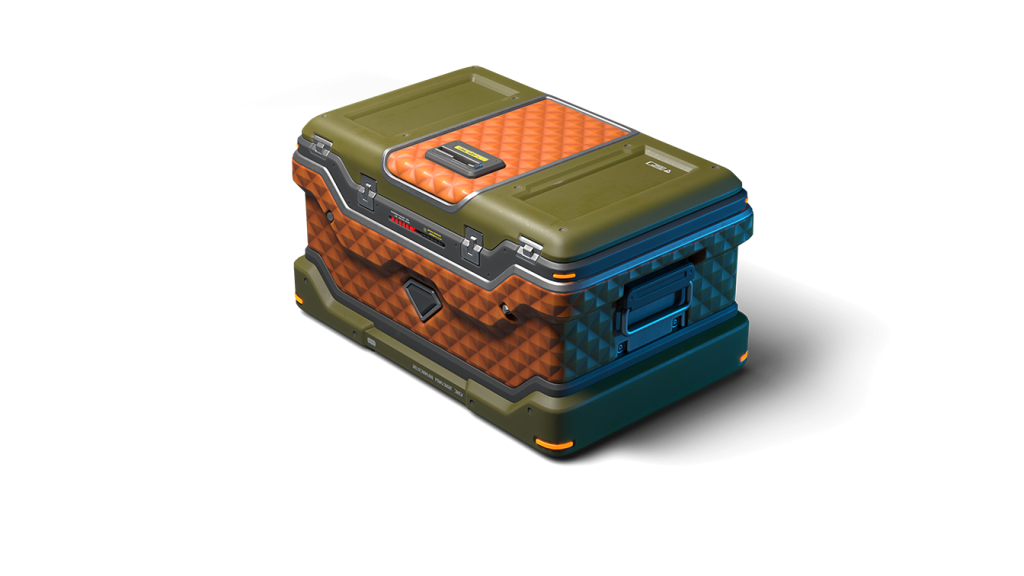
Treat yourself with the updated content of Epic Containers!
- SKIN Tesla XT
- SKIN Viking XT
- “Shock Therapy” augment for Tesla
- “Increased Voltage” augment for Tesla
- “Excelsior” augment for Tesla
- “Driver” augment for Crusader
- “Excelsior” augment for Crusader
- And everything you can get from Common Containers
Special Missions
We’ve prepared a large list of missions where everyone can find something for themselves!
Your progress in completing missions is only counted from the moment you first enter the “Missions” screen after the event begins.
Missions follow the Encore system, with the second set of missions appearing only after the first set is completed.
SPECIAL
Part 1. July 17 – July 24
Part 2. July 24 – July 31
Part 3. July 31 – August 7
CHAMPION’S GOLD
TASK
Finish 2 battles in the festive mode.
REWARD

×3
EPIC KEY
EPIC KEY
FIERCE RIVALRY
TASK
Finish 2 battles in the festive mode.
REWARD
×3
EPIC KEY
EPIC KEY
A SHOT INTO THE VOID
TASK
Finish 2 battles in the festive mode.
REWARD
×3
EPIC KEY
EPIC KEY
SET 1
Set 1. July 17 – August 7
SUPERMISSION: RELAY! PART 1
TASK
Complete «Start! Part 1», «Legend of Sports. Part 1», «Sprint. Part 1», «It’s Not About Winning. Part 1», «Best of the Best. Part 1», «Shopping. Part 1», «Sport Rage», «Daily Routine», «Three Sets» and «Shot Put» missions.
REWARD
×5
EPIC KEY
EPIC KEY

×1
RARE KEY
RARE KEY
×1000
EXPERIENCE POINTS
EXPERIENCE POINTS
START! PART 1
TASK
Enter the game at least once.
REWARD
×1
COMMON KEY
COMMON KEY
×100
EXPERIENCE POINTS
EXPERIENCE POINTS
LEGEND OF SPORTS. PART 1
TASK
Earn 5000 reputation points in matchmaking battles.
REWARD
×1
COMMON KEY
COMMON KEY
×100
EXPERIENCE POINTS
EXPERIENCE POINTS
SPRINT. PART 1
TASK
Earn 3000 reputation points in Quick Battle mode in matchmaking battles.
REWARD
×1
COMMON KEY
COMMON KEY
×100
EXPERIENCE POINTS
EXPERIENCE POINTS
IT’S NOT ABOUT WINNING. PART 1
TASK
Finish 10 battles in matchmaking battles.
REWARD
×1
COMMON KEY
COMMON KEY
×100
EXPERIENCE POINTS
EXPERIENCE POINTS
BEST OF THE BEST. PART 1
TASK
Be in the winning team of 2 battles in matchmaking battles.
REWARD
×1
COMMON KEY
COMMON KEY
×100
EXPERIENCE POINTS
EXPERIENCE POINTS
SHOPPING. PART 1
TASK
Make any purchase in the game’s Shop.
REWARD
×1
COMMON KEY
COMMON KEY
×100
EXPERIENCE POINTS
EXPERIENCE POINTS
SPORT RAGE
TASK
Use boosted damage 150 times in matchmaking battles.
REWARD
×1
COMMON KEY
COMMON KEY
×100
EXPERIENCE POINTS
EXPERIENCE POINTS
DAILY ROUTINE
TASK
Complete 15 Daily missions.
REWARD
×1
COMMON KEY
COMMON KEY
×100
EXPERIENCE POINTS
EXPERIENCE POINTS
THREE SETS
TASK
Complete 3 Weekly missions.
REWARD
×1
COMMON KEY
COMMON KEY
×100
EXPERIENCE POINTS
EXPERIENCE POINTS
SHOT PUT
TASK
Use any grenade 10 times.
REWARD
×1
COMMON KEY
COMMON KEY
×100
EXPERIENCE POINTS
EXPERIENCE POINTS
SET 2
Set 2. July 24 – August 7
SUPERMISSION: RELAY! PART 2
TASK
Complete «Start! Part 2», «Legend of Sports. Part 2», «Sprint. Part 2», «It’s Not About Winning. Part 2», «Best of the Best. Part 2», «Shopping. Part 2», «Protective Equipment», «By Blood and Sweat», «Unsportsmanlike Conduct» and «Mortal Blow» missions.
REWARD
×5
EPIC KEY
EPIC KEY
×1
RARE KEY
RARE KEY
×1000
EXPERIENCE POINTS
EXPERIENCE POINTS
START! PART 2
TASK
Enter the game at least once.
REWARD
×1
COMMON KEY
COMMON KEY
×100
EXPERIENCE POINTS
EXPERIENCE POINTS
LEGEND OF SPORTS. PART 2
TASK
Earn 5000 reputation points in matchmaking battles.
REWARD
×1
COMMON KEY
COMMON KEY
×100
EXPERIENCE POINTS
EXPERIENCE POINTS
SPRINT. PART 2
TASK
Earn 3000 reputation points in Quick Battle mode in matchmaking battles.
REWARD
×1
COMMON KEY
COMMON KEY
×100
EXPERIENCE POINTS
EXPERIENCE POINTS
IT’S NOT ABOUT WINNING. PART 2
TASK
Finish 10 battles in matchmaking battles.
REWARD
×1
COMMON KEY
COMMON KEY
×100
EXPERIENCE POINTS
EXPERIENCE POINTS
BEST OF THE BEST. PART 2
TASK
Be in the winning team of 2 battles in matchmaking battles.
REWARD
×1
COMMON KEY
COMMON KEY
×100
EXPERIENCE POINTS
EXPERIENCE POINTS
SHOPPING. PART 2
TASK
Make any purchase in the game’s Shop.
REWARD
×1
COMMON KEY
COMMON KEY
×100
EXPERIENCE POINTS
EXPERIENCE POINTS
PROTECTIVE EQUIPMENT
TASK
Use boosted armor 150 times in matchmaking battles.
REWARD
×1
COMMON KEY
COMMON KEY
×100
EXPERIENCE POINTS
EXPERIENCE POINTS
BY BLOOD AND SWEAT
TASK
Earn 3000 experience points in matchmaking battles.
REWARD
×1
COMMON KEY
COMMON KEY
×100
EXPERIENCE POINTS
EXPERIENCE POINTS
UNSPORTSMANLIKE CONDUCT
TASK
Use overdrive 10 times in matchmaking battles.
REWARD
×1
COMMON KEY
COMMON KEY
×100
EXPERIENCE POINTS
EXPERIENCE POINTS
MORTAL BLOW
TASK
Destroy 1 tank using grenades in matchmaking battles.
REWARD
×1
COMMON KEY
COMMON KEY
×100
EXPERIENCE POINTS
EXPERIENCE POINTS
SET 3
Set 3. July 31 – August 7
SUPERMISSION: RELAY! PART 3
TASK
Complete «Start! Part 3», «Legend of Sports. Part 3», «Sprint. Part 3», «It’s Not About Winning. Part 3», «Best of the Best. Part 3», «Shopping. Part 3», «Trick Play», «Prize Fund», «Star Title» and «Without Compromise» missions.
REWARD
×5
EPIC KEY
EPIC KEY
×1
RARE KEY
RARE KEY
×1000
EXPERIENCE POINTS
EXPERIENCE POINTS
START! PART 3
TASK
Enter the game at least once.
REWARD
×1
COMMON KEY
COMMON KEY
×100
EXPERIENCE POINTS
EXPERIENCE POINTS
LEGEND OF SPORTS. PART 3
TASK
Earn 5000 reputation points in matchmaking battles.
REWARD
×1
COMMON KEY
COMMON KEY
×100
EXPERIENCE POINTS
EXPERIENCE POINTS
SPRINT. PART 3
TASK
Earn 3000 reputation points in Quick Battle mode in matchmaking battles.
REWARD
×1
COMMON KEY
COMMON KEY
×100
EXPERIENCE POINTS
EXPERIENCE POINTS
IT’S NOT ABOUT WINNING. PART 3
TASK
Finish 10 battles in matchmaking battles.
REWARD
×1
COMMON KEY
COMMON KEY
×100
EXPERIENCE POINTS
EXPERIENCE POINTS
BEST OF THE BEST. PART 3
TASK
Be in the winning team of 2 battles in matchmaking battles.
REWARD
×1
COMMON KEY
COMMON KEY
×100
EXPERIENCE POINTS
EXPERIENCE POINTS
SHOPPING. PART 3
TASK
Make any purchase in the game’s Shop.
REWARD
×1
COMMON KEY
COMMON KEY
×100
EXPERIENCE POINTS
EXPERIENCE POINTS
TRICK PLAY
TASK
Use mines 150 times in matchmaking battles.
REWARD
×1
COMMON KEY
COMMON KEY
×100
EXPERIENCE POINTS
EXPERIENCE POINTS
PRIZE FUND
TASK
Earn 4000 crystals in matchmaking battles.
REWARD
×1
COMMON KEY
COMMON KEY
×100
EXPERIENCE POINTS
EXPERIENCE POINTS
STAR TITLE
TASK
Earn 45 stars in matchmaking battles.
REWARD
×1
COMMON KEY
COMMON KEY
×100
EXPERIENCE POINTS
EXPERIENCE POINTS
WITHOUT COMPROMISE
TASK
Deal 100000 damage in matchmaking battles.
REWARD
×1
COMMON KEY
COMMON KEY
×100
EXPERIENCE POINTS
EXPERIENCE POINTS
Advent Calendar
We are launching the festive advent calendar for you!
Attention! The Advent Calendar and its missions become available only after purchasing the “Advent Calendar” special offer.
After purchasing the “Advent Calendar” special offer, you will get access to:
- 5 Standard Missions
- 1 Supermission with unique rewards!
All you need to do is log into the game during the event and claim your gifts.
Task: Complete all “One More Day” missions that appear after July 17th.
Completing 5 standard missions will unlock the final Supermission.
Supermission
RECRUIT
PAINT
×200
RUBIES
Mission
×12
EPIC Key
×200
RUBIES
Elite Pass
The most luxurious pass is here! It consists of 20 levels.
Your goal is to earn stars and unlock new levels, and for each level reached, you will receive additional prizes!
In order to complete the whole pass and reach the main prize, you will need to earn 1000 stars.

Elite Pass
Important: All stars earned during the event will be counted. Progress begins with the start of the event. Stars earned before the purchase of the «Elite Pass» will also be counted. The «Elite Pass» itself is required to claim the prizes. By purchasing it, you will be able to claim all the unlocked prizes to your Garage!
The Main Prizes are Legendary Key ×1 and “Large Caliber” augment for Vulcan!
The price of this «Elite Pass» is 2300 Rubies.
Festive Decorations
- Festive paint on drones
- Festive paint
- Festive Gold Box drop zone skin
- Festive loading screen
- Changed billboards
We look forward to seeing you on the battlefield! Wishing everyone a sporty mood!
Tanki Online V-LOG: Episode 551
In today’s episode, we will be announcing new updates. We’ll also be launching the Summer Sport Games event and asking a new question in the Tanki Quiz contest.
The “Challenge Accepted” Event Is Available Again
We were previously forced to suspend the “Challenge Accepted” event for technical reasons and cancel its second part, which was scheduled for June.
All prizes for the second part of the May event and for the first part of the June event have already been credited.
Today, the “Challenge Accepted” event website is once again available. Rewards for the first part of the July event will be credited in the usual manner, within 7 business days from the end of the event.
All subsequent events, including the second July event, will proceed according to schedule.
We apologize for the inconvenience and thank you for your patience and understanding.
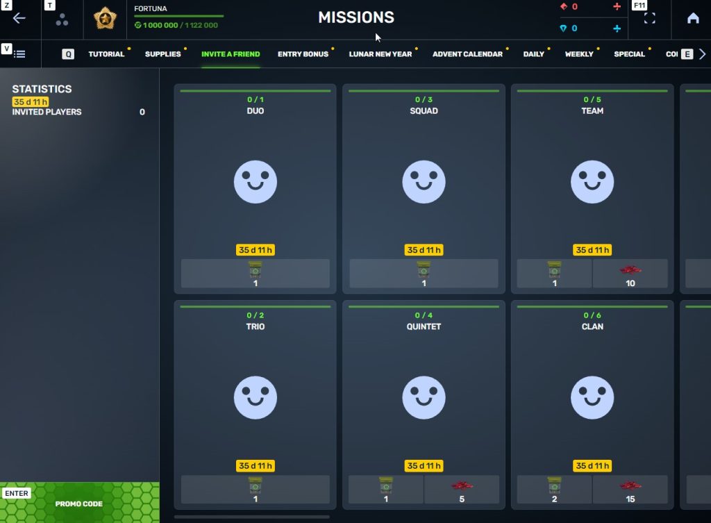
Invite a friend #7

Invite friends to the game and get rewards!
We are launching a new referral event! During this event, you can get rewards for inviting new players or players who stopped playing the game. Also, as the friends you’ve invited complete special missions, you will receive additional bonuses!
Dates: From July 10th 2 AM to August 19th 2 AM UTC
Let’s get into the details:
How to invite
IMPORTANT: The option to invite new players is only available to accounts created before the start of the event, July 10th 2 AM.
Referrals are players who you invited to the game.
You need to follow these steps to make a new player your referral:
STEP 1 Your rank should be at least Master Sergeant.
STEP 2 You need to enter the game and go to the Missions menu.
STEP 3 There, you need to open the special «Invite a friend» category of missions.
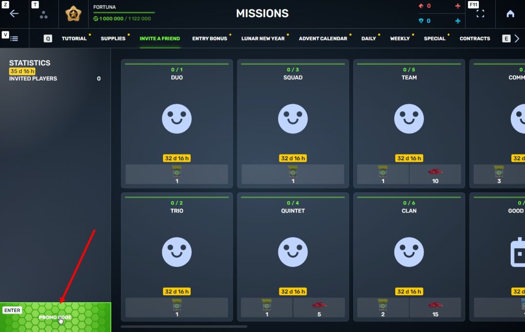
STEP 4 In that section, you need to generate a special invite promo code.
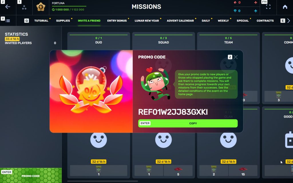
STEP 5 Share this Promocode with people you want to invite to the game and tell them how they can activate it (read below).
IMPORTANT: If you are a player who was invited to the game during this referral event, you cannot generate your own promo code to invite other players.
Who can become your referral
There are two types of players who can become your referrals:
- Players who created their account since July 10th 2 AM.
- Player who last entered the game before June 3rd 2 AM UTC.
Pay attention to the fact that in order to activate an invite promo code, a player should have at least Private rank.
Important: A player who generated a promo code to send it to other players cannot activate their own promo code or a Promocode of any other player.
What do I get for inviting players?
- Once you generate your invite promo code, send it to your friends and acquaintances.
- In the special «Invite a friend» category of missions, you will get a set of special missions.
3. Once they activate your promo code, players who have been invited will also get a set of their own special missions in the «Missions from a friend» category. In your «Invite a friend» category you can track how your referrals complete their missions, and thus your missions get completed and you can claim rewards for the efforts of the players you have referred.
Missions for those who invite
There are two types of missions for inviting players. The first type gives you rewards for players who just activated your promo code. The second type gives you rewards once your invited players complete the required missions.
Bonuses for inviting players
Important: An invited player is counted towards mission progress only once they activate your promocode.
Duo
TASK
Invite 1 player to the game.
REWARD
×1
COMMON KEY
COMMON KEY
×100
EXPERIENCE POINTS
EXPERIENCE POINTS
Trio
TASK
Invite 2 players to the game.
REWARD
×1
COMMON KEY
COMMON KEY
×100
EXPERIENCE POINTS
EXPERIENCE POINTS
Squad
TASK
Invite 3 players to the game.
REWARD
×1
COMMON KEY
COMMON KEY
×100
EXPERIENCE POINTS
EXPERIENCE POINTS
Quintet
TASK
Invite 4 players to the game.
REWARD
×1
COMMON KEY
COMMON KEY
×100
EXPERIENCE POINTS
EXPERIENCE POINTS
×5
RUBY
RUBY
Team
TASK
Invite 5 players to the game.
REWARD
×1
COMMON KEY
COMMON KEY
×100
EXPERIENCE POINTS
EXPERIENCE POINTS
×10
RUBY
RUBY
Clan
TASK
Invite 6 players to the game.
REWARD
×2
COMMON KEY
COMMON KEY
×100
EXPERIENCE POINTS
EXPERIENCE POINTS
×15
RUBY
RUBY
Community
TASK
Invite 7 players to the game.
REWARD
×3
COMMON KEY
COMMON KEY
×100
EXPERIENCE POINTS
EXPERIENCE POINTS
×40
RUBY
RUBY
Bonuses for efforts of your referrals
Important: An invited player is counted towards mission progress only once they activate your promocode and complete the required referral missions.
Good Start
TASK
Invited players completed 10 referral event missions
REWARD
×1
RARE KEY
RARE KEY
×100
EXPERIENCE POINTS
EXPERIENCE POINTS
Makes Progress
TASK
Invited players completed 20 referral event missions
REWARD
×1
RARE KEY
RARE KEY
×100
EXPERIENCE POINTS
EXPERIENCE POINTS
Can Play Together
TASK
Invited players completed 30 referral event missions
REWARD
×1
RARE KEY
RARE KEY
×100
EXPERIENCE POINTS
EXPERIENCE POINTS
×5
RUBY
RUBY
They Trust You
TASK
Invited players completed 40 referral event missions
REWARD
×1
RARE KEY
RARE KEY
×100
EXPERIENCE POINTS
EXPERIENCE POINTS
×10
RUBY
RUBY
Social Butterfly
TASK
Invited players completed 50 referral event missions
REWARD
×1
RARE KEY
RARE KEY
×100
EXPERIENCE POINTS
EXPERIENCE POINTS
×15
RUBY
RUBY
Influencer
TASK
Invited players completed 60 referral event missions
REWARD
×2
RARE KEY
RARE KEY
×100
EXPERIENCE POINTS
EXPERIENCE POINTS
×20
RUBY
RUBY
Celebrity
TASK
Invited players completed 80 referral event missions
REWARD
×3
RARE KEY
RARE KEY
×100
EXPERIENCE POINTS
EXPERIENCE POINTS
×60
RUBY
RUBY
Full Pack
TASK
Invited players completed 1 referral event supermission
REWARD
×1
EPIC KEY
EPIC KEY
×100
EXPERIENCE POINTS
EXPERIENCE POINTS
Aspiring Expert
TASK
Invited players completed 2 referral event supermissions
REWARD
×1
EPIC KEY
EPIC KEY
×100
EXPERIENCE POINTS
EXPERIENCE POINTS
×5
RUBY
RUBY
Forward to Victory
TASK
Invited players completed 3 referral event supermissions
REWARD
×1
EPIC KEY
EPIC KEY
×100
EXPERIENCE POINTS
EXPERIENCE POINTS
×10
RUBY
RUBY
Good Mentor
TASK
Invited players completed 4 referral event supermissions
REWARD
×1
EPIC KEY
EPIC KEY
×100
EXPERIENCE POINTS
EXPERIENCE POINTS
×15
RUBY
RUBY
Thunderstorm of Matchmaking
TASK
Invited players completed 5 referral event supermissions
REWARD
×1
EPIC KEY
EPIC KEY
×100
EXPERIENCE POINTS
EXPERIENCE POINTS
×20
RUBY
RUBY
Preparing for eSports
TASK
Invited players completed 6 referral event supermissions
REWARD
×2
EPIC KEY
EPIC KEY
×100
EXPERIENCE POINTS
EXPERIENCE POINTS
×60
RUBY
RUBY
Professional Referrer
TASK
Invited players completed 7 referral event supermissions
REWARD
×3
EPIC KEY
EPIC KEY
×700
RUBY
RUBY
×1
LEGENDARY KEY
LEGENDARY KEY
How it works for referrals
Once you invite a friend and give them your promo code, your friend should do the following:
STEP 1 Create an account (or log into an existing one, if it meets the criteria)
STEP 2 Get the «Private» rank. It won’t take much time.
STEP 3 Enter the Shop
STEP 4 Go to the «Promocode» section
STEp 5 Activate the promo code
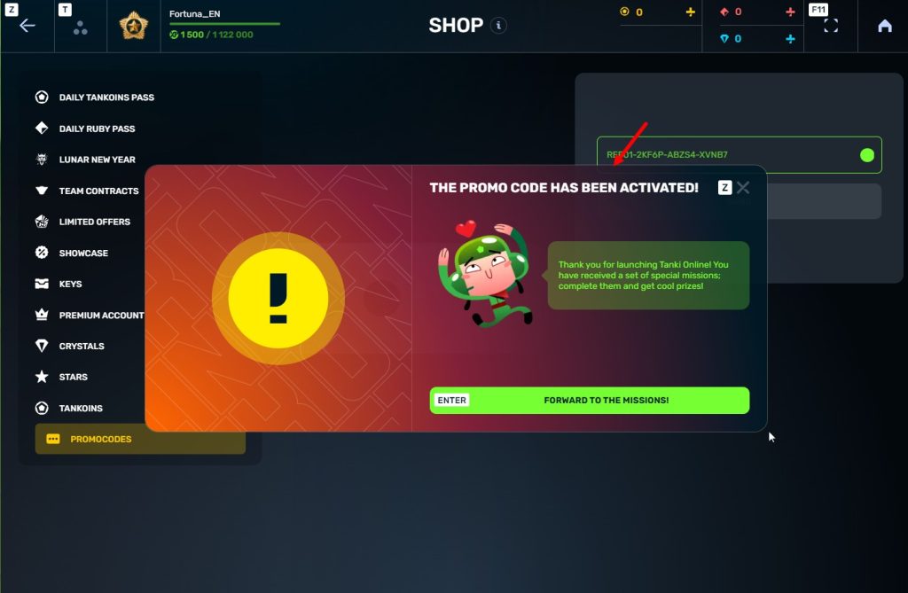
STEP 6 Press the «Forward to the missions!» button
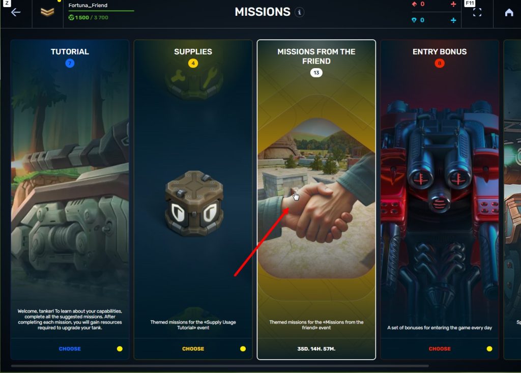
STEP 7 In the Missions menu, there will be a section called «Missions from the friend» with a set of special missions to complete
STEP 8 Complete the missions and claim the rewards
Important: During a referral event, a player can become a referral of only one player (activate only one referral promo code).
Bonuses for referrals for completing missions
WELCOME!
TASK
Supermission. Complete all referral missions.
REWARD

×1
legendary key
×300
ruby
CONSTANCY
TASK
Complete 30 daily missions.
REWARD

×1
epic key
×100
EXPERIENCE POINTS
EXPERIENCE POINTS
×10
ruby
WEEKLY COMBO
TASK
Complete 15 weekly missions.
REWARD
×1
epic key
×100
EXPERIENCE POINTS
EXPERIENCE POINTS
×10
ruby
GARAGE RESTOCKING
TASK
Open 15 Common Containers
REWARD
×1
epic key
×100
EXPERIENCE POINTS
EXPERIENCE POINTS
×10
ruby
BEST NOVELTIES
TASK
Open 10 Epic Containers.
REWARD
×1
epic key
×100
EXPERIENCE POINTS
EXPERIENCE POINTS
×10
ruby
EXPERIENCED TANKER
TASK
Earn 30 000 experience points.
REWARD
×1
epic key
×100
EXPERIENCE POINTS
EXPERIENCE POINTS
×10
ruby
PROVEN YOURSELF
TASK
Earn 15 000 reputation points.
REWARD
×1
epic key
×100
EXPERIENCE POINTS
EXPERIENCE POINTS
×10
ruby
START-UP CAPITAL
TASK
Earn 10 000 crystals.
REWARD
×1
epic key
×100
EXPERIENCE POINTS
EXPERIENCE POINTS
×10
ruby
TEMPORARY BOOSTS
TASK
Activate supplies 300 times.
REWARD
×1
epic key
×100
EXPERIENCE POINTS
EXPERIENCE POINTS
×10
ruby
ULTIMATIVE ATTACK
TASK
Use overdrive 15 times.
REWARD
×1
epic key
×100
EXPERIENCE POINTS
EXPERIENCE POINTS
×10
ruby
FIRST DOZEN IS OVER
TASK
Finish 20 battles.
REWARD
×1
epic key
×100
EXPERIENCE POINTS
EXPERIENCE POINTS
×10
ruby
WINNER
TASK
Be in the winning team of 5 battles.
REWARD
×1
epic key
×100
EXPERIENCE POINTS
EXPERIENCE POINTS
×10
ruby
RANK UP
TASK
Get a new rank.
REWARD
×1
epic key
×100
EXPERIENCE POINTS
EXPERIENCE POINTS
×10
ruby
You can track the progress of completing missions by your referrals in the «Statistics» column of the «Invite a friend» category in missions.
Invite friends and get rewards!
Winter Major Rankings I 2026

Summer Major 2026 is finished so we are ready to announce the first ranking tournament of the Winter season!
If you’re still unsure whether to participate in tournaments or not, then now is the time to decide! After all, as we said earlier, the eSport format is designed to simplify participation in eSports, which means that everyone has a chance to compete for impressive in-game rewards and even for real cash rewards.
Who knows, perhaps it will be you and your team that will achieve the highest results.
We also want to remind you that in order to simplify the search for players and teams, we have updated our eSports website and added a special section in which teams search for players, and players search for teams.
Tournament rules
- Ranks: First Sergeant — Legend
- The team consists of 7 players.
- In battle – 5 tankers from each team.
- Your garage doesn’t matter as battles are played in Sport mode.
- On the battlefield, in each team, hulls and turrets should not be repeated. For example, if you use Hornet and Ricochet, no one else from your team should be in the battle with Ricochet or Hornet.
- More detailed rules can be found on the tournament page on the eSports portal.
Prizes
- Unique «Impulse» paint
- 96,000 Rubies
- 88,000,000 crystals
- 2,835 epic keys
- 1,071 days of «Premium Pass»
- TMR points
Tournament dates
- Tournament registration will last from 17:00 UTC on July 3rd till 17:00 UTC on July 17th.
- The first match will start on July 18th.
- The tournament will end before August 13th.
- The transfer is open and will last until 17:00 UTC on July 17th.
The tournament will be attended by 32 to 128 teams.
Almost immediately after the first rating tournament, we will announce the second one and after all the rating tournaments there will be a Major one. In the Major tournament, they will fight not only for in-game rewards, but also for real cash.
Go to the eSports portal, create your team, read the rules, register and get ready for the next rating tournament! And if you have any questions, visit our eSports Discord server, they will definitely help you.
See you on the battlefields and eSports broadcasts!
Office 2026

Office is back in session! You would think that aliens have forgotten the road to Perm… but no! They’ve abducted all the employees again, and the office’s work is paralyzed once more.
Now it’s up to you to recover the office’s work and prove that you are the best employee. To do that, it is required to complete the tasks of different departments for the whole duration of the event, using Skills that can be earned in Matchmaking battles after purchasing a Contract to earn prizes: Common, Rare, Epic Keys, “Excelsior” augments for Hornet, Dictator, Scorpion, and Ares; a Legendary Key; and the main prize – the new “Megatsunami” augment for Tsunami.
Event Dates: From July 3rd 2 AM UTC until July 17th 2 AM UTC
How to participate
To participate in the “Office” event, you must purchase the special “Event Pass” offer in the game Shop.


You can participate in the event starting from the Master Sergeant rank.
Company’s office
The company’s office, consisting of 12 Departments, is displayed on the event’s website:
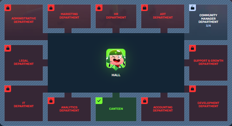
- Community Manager Department
- Development Department
- Accounting Department
- Art Department
- Legal Department
- HR Department
- Analytics Department
- Support & Growth Department
- Marketing Department
- IT Department
- Administrative Department
- Canteen
You begin your journey in the Hall and can freely choose which Departments to unlock.
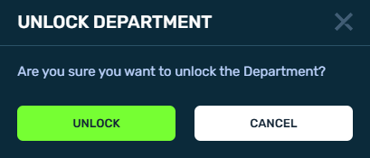
There is no required order and no daily limit on the number of Departments you can unlock.

Each Department offers 4 tasks that you can complete in any order.
Even if you unlocked one Department but haven’t finished its tasks, you can still unlock the rest.
Each Department contains 4 tasks categorized by urgency and importance:
Make a commercial that will blow up the player’s chat stronger than a Wasp’s bomb in a battle.
Urgent & Important (Red Task): Requires 15 Skills to complete
Create a road map that is as accurate as a sniper shot.
Not Urgent but Important (Green Task): Requires 10 Skills to complete
Make a poll to figure out who is more often responsible in losses – tankers or internet.
Urgent but not Important (Yellow Task): Requires 10 Skills to complete
Draw a success chart.
Not Urgent and not Important (Blue Task): Requires 5 Skills to complete
Tasks can be completed in any order.
You have complete freedom of action — only you decide the way to earn prizes!
Skills
Skills
To complete tasks of a Department, you need Skills. This is the event’s special currency.
Track your Skill count on the event page.
Skills are awarded for completing Contracts by earning Reputation points in Matchmaking:
- 5000 Reputation points = 10 Skills (with the Bronze contract)
- 4500 Reputation points = 15 Skills (with the Silver contract)
- 3000 Reputation points = 50 Skills (with the Golden contract)
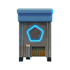
Contracts
To participate, it is required to purchase one out of three Contracts.

Contract
A Contract is a task that requires earning Reputation points in Matchmaking battles.
Contracts can be purchased starting from July 3rd, 2 AM UTC until July 17th, 2 AM UTC in the Shop for Crystals or Rubies.
Contracts are available starting from the Master Sergeant rank.
After purchasing a Contract, it is required to enter the “Contracts” category in the “Missions” section and “Activate” the contract.
There are 3 types of Contracts in the event:
Bronze Contract
- Time to complete: Till 2 AM UTC, July 17th
- Time to collect the prize: Till 2 AM UTC, July 17th
- Alternative reward if not completed in time: 49900 Crystals
- Alternative reward if not collected in time: 49900 Crystals
- Early completion: Instead of earning points, you may purchase early Contract completion. The price of early completion depends on your progress towards completing the contract.
- Early completion price: From 175 Rubies to 1 Ruby.
Silver Contract
- Time to complete: Till 2 AM UTC, July 17th
- Time to collect the prize: Till 2 AM UTC, July 17th
- Alternative reward if not completed in time: 290 Rubies
- Alternative reward if not collected in time: 290 Rubies
- Early completion: Instead of earning points, you may purchase early Contract completion. The price of early completion depends on your progress towards completing the contract.
- Early completion price: From 700 Rubies to 1 Ruby.
Golden Contract
- Time to complete: Till 2 AM UTC, July 17th
- Time to collect the prize: Till 2 AM UTC, July 17th
- Alternative reward if not completed in time: 990 Rubies
- Alternative reward if not collected in time: 990 Rubies
- Early completion: Instead of earning points, you may purchase early Contract completion. The price of early completion depends on your progress towards completing the contract.
- Early completion price: From 1000 Rubies to 1 Ruby.
IMPORTANT Information:
- Only one Contract can be activated at a time.
- If you have already completed the Contract conditions and earned the required number of Reputation points, the reward should be collected immediately; otherwise a new Contract cannot be activated.
- After the event is over, you will get an alternative reward for a completed but not claimed Contract depending on the Contract’s price.
- You will have the ability to spend earned Skills on the event website until 2 AM UTC, July 20th.
Starting from July 17th, 2 AM UTC, all Contracts will become inactive and expire – they will be highlighted in red.
Before completing a Contract, DO NOT FORGET to activate it.
Rewards
We have prepared 3 types of rewards for you:
For completing all tasks of a Department:

Completed 1 Department
Common Key ×5
Completed 2 Departments
Common Key ×5
Completed 3 Departments
Common Key ×5
Completed 4 Departments
Common Key ×5
Completed 5 Departments
Common Key ×5
Completed 6 Departments
Rare Key ×3
Completed 7 Departments
Rare Key ×3
Completed 8 Departments
Rare Key ×3

Completed 9 Departments
Epic Key ×5
Completed 10 Departments
Epic Key ×5
Completed 11 Departments
Epic Key ×5
Completed 12 Departments
Legendary Key ×1
Upon completing all the tasks of a certain Color, you will receive:
All blue tasks

HORNET
Excelsior
All yellow tasks
DICTATOR
Excelsior
All green tasks

SCORPION
Excelsior
All red tasks
ARES
Excelsior
Main Prize: (for completing all the tasks of a all colors):

TSUNAMI’s «Megatsunami» augment
Increases damage and reduces the cannons’ fire rate.
Conversion of the medium caliber barrels into high caliber ones. To improve the barrel cooling, the turret’s fire rate had to be reduced.
Attention: Prizes will be given automatically after the event is completed.
Achievements

Achievements
Special achievements can be received for completing all tasks of a Department.
They don’t give any extra rewards, but they will surely brighten your mood and highlight your progress!
We wish you success in recovering the office’s work and getting all the rewards!
P.S. Employees will surely be returned. Probably. If the aliens don’t change their minds.
Technical issues
Tankers!
Right now, we are experiencing problems with the availability of the «Tanki Online» servers. In this regard, you may experience inability to load into the game and lag in battles.
We are aware of this issue and are working hard to get our servers back up and running as soon as possible. At the moment we can’t say how long the troubleshooting will take, but we promise to keep you updated.
We apologize for the temporary inconvenience.
Summer eSports TankiFund 2026 Giveaway

The giveaway is coming soon!
Today the giveaway of the “eSports TankiFund” will commence. It was launched together with the “Summer Major 2026” tournament!
Soon we will randomly choose the winners of the giveaway among the players that purchased the special offers of the event.
Someone may be lucky enough to win an entire fortune and become a true Tanki magnate.
The more special offers you have purchased, the higher your chance is to be among the winners!
When will this happen?
You will be able to see the winners get chosen on the special livestream which will start at 12 PM UTC.
The prizes will be added to the accounts within 24 hours after the stream.
Don’t miss it, since you can be one of the lucky ones!
UFO day 2026

It has become a good tradition for our alien friends to return to Tanki Online in the heat of summer!
A festive program awaits you in the game: three special modes — “Meteor Shower,” “UFO,” and “Interceptors”, 30% discounts, GT skins, and augments for Hammer and Viking in Epic Containers. New Elite Pass with a Legendary Key and Dark skin for Tsunami as rewards, drones and Gold Boxes that look like UFOs, lots of missions and special offers!
Event dates: from June 26th, 2 AM UTC till July 17th, 2 AM UTC.
Updated Gold Box
In honor of the celebration, we changed the looks of the Gold Box.
For the duration of the event, UFOs will fall from the sky!
Take screenshots and share them on the forum and social media.

Meteorites in the “Meteor Shower” and “UFO” Festive Modes
Be careful! When aliens arrive in our universe, gold boxes turn into meteorites falling from the sky at high speed. Carefully examine the explosion craters – they hold a valuable reward in the form of a gold box or container.
Discounts
Take advantage of the beneficial discounts from June 26th to June 29th.
All discounts start and end with the server restart at 2 AM UTC.
For 3 whole days, you will be able to obtain the following items with a 30% discount:
-30%
SHOP (26.06 — 29.06)
Crystals
Stars
Early Access items
Premium Pass
-30%
GARAGE (26.06 — 29.06)
Augments
Supplies
Paints
Drones
Modules
Grenades
-30%
Upgrades (26.06 — 29.06)
Special Modes
3 exciting modes await you in the game!
Important: Boosted battle funds and experience points are only active within the festive weekend game modes.
Each mode starts and ends with the server restart at 2 AM UTC.
SPECIAL MODE
METEOR SHOWER
June 26th — June 29th
Mode
DM
Turret
Any
Hull
Any
Bonus Boxes
Upgrades
Augments
Gold Boxes
Equipment Change
Overdrives
Supplies
Nuclear Energy
Smart Supplies
Drones
Protection Modules
Groups
Grenades
More Gold Boxes
Weather forecasters predict meteor showers that will bring a lot of gold boxes and containers. Take every precaution! The fall of space bodies is unpredictable and may cause destructive damage to tanks in the blast zone!
- Madness 2 PRO
SPECIAL MODE
UFO
July 3rd — July 6th
Mode
DM
Turret
Ricochet
Hull
Hopper
Bonus Boxes
Upgrades
Augments
Gold Boxes
Equipment Change
Overdrives
Supplies
Nuclear Energy
Smart Supplies
Drones
Protection Modules
Groups
Grenades
More Gold Boxes
The special «UFO» mode with flying Hoppers and fast shooting Ricochets. What a pleasure it will be to catch dozens of gold boxes from our space friends!
- Highways PRO Space
- Skyscrapers PRO Space
- Rio PRO Space
SPECIAL MODE
BRAWL
July 10th — July 13th
Mode
DM
Turret
B0-NK
Hull
Any
Bonus Boxes
Upgrades
Augments
Gold Boxes
Equipment Change
Overdrives
Supplies
Nuclear Energy
Smart Supplies
Drones
Protection Modules
Groups
Grenades
More Gold Boxes
Brawl is a deathmatch mode where you can choose any hull and attack everyone who gets in your way using the B0-NK turret. The use of supplies and grenades makes this mode even more dynamic and interesting!
- Parma (Remaster)
- Sandbox (Remaster)
- Forest (Remaster)
- Sandal (Remaster)
- Cross (Remaster)
- Highland (Remaster)
Special Offers
What’s any holiday without some great deals at awesome prices?
June 26th — July 13th:
June 26th — July 17th:
Daily Ruby Pass
×500
Tankoins*
×4500
Rubies**
* 500 Tankoins instantly.
** For 30 days, each day the player can access a pre-completed mission upon logging in, from which they can claim a reward of 150 Rubies.
Note: One-time purchase
** For 30 days, each day the player can access a pre-completed mission upon logging in, from which they can claim a reward of 150 Rubies.
Note: One-time purchase
PURCHASE
Orbital Module
×15
EPIC KEY

×1
RARE KEY
×1
NUCLEAR ENERGY

July 3rd — July 17th:
Special Access
×15
EPIC KEY
×3
PREMIUM PASS
×1
NUCLEAR ENERGY
July 10th — July 17th:

Epic Containers
Treat yourself with the updated content of Epic Containers!
- SKIN Hammer GT
- SKIN Viking GT
- Hammer’s “Assault Magazine” augment
- Hammer’s “Needle Gun” augment
- Hammer’s “Excelsior” augment
- Viking’s “Grenadier” augment
- Viking’s “Excelsior” augment
- And everything you can get from Common Containers
Special Missions
Challenge yourself in a series of missions and claim valuable rewards!
Your progress in completing missions is only counted from the moment you first enter the “Missions” screen after the event begins.
Missions follow the Encore system, with the second set of missions appearing only after the first set is completed.
SPECIAL
Part 1. June 26th — July 3rd
Part 2. July 3rd — July 10th
Part 3. July 10th — July 17th
POSSIBLE PRECIPITATION
TASK
Finish 2 battles in the festive mode.
REWARD
×3
EPIC KEY
EPIC KEY
UNIDENTIFIED FLYING OBJECT
TASK
Finish 2 battles in the festive mode.
REWARD
×3
EPIC KEY
EPIC KEY
MADNESS
TASK
Finish 2 battles in the festive mode.
REWARD
×3
EPIC KEY
EPIC KEY
SET 1
Set 1. June 26th — July 17th
SUPERMISSION: ULTIMATE LIFE FORM! PART 1
TASK
Complete «Invasion. Part 1», «Star Lord. Part 1», «Choice Without a Choice. Part 1», «Space Debris. Part 1», «Galactic Elite. Part 1», «Purchase Zone. Part 1», «Crop Circles», «Experienced One», «Preemptive Play» and «Round and Flying» missions.
REWARD
×5
EPIC KEY
EPIC KEY
×1
RARE KEY
RARE KEY
×1000
EXPERIENCE POINTS
EXPERIENCE POINTS
INVASION. PART 1
TASK
Enter the game at least once.
REWARD
×1
COMMON KEY
COMMON KEY
×100
EXPERIENCE POINTS
EXPERIENCE POINTS
STAR LORD. PART 1
TASK
Earn 5000 reputation points in matchmaking battles.
REWARD
×1
COMMON KEY
COMMON KEY
×100
EXPERIENCE POINTS
EXPERIENCE POINTS
CHOICE WITHOUT A CHOICE. PART 1
TASK
Earn 3000 reputation points in Quick Battle mode in matchmaking battles.
REWARD
×1
COMMON KEY
COMMON KEY
×100
EXPERIENCE POINTS
EXPERIENCE POINTS
SPACE DEBRIS. PART 1
TASK
Finish 10 battles in matchmaking battles.
REWARD
×1
COMMON KEY
COMMON KEY
×100
EXPERIENCE POINTS
EXPERIENCE POINTS
GALACTIC ELITE. PART 1
TASK
Be in the winning team of 2 battles in matchmaking battles.
REWARD
×1
COMMON KEY
COMMON KEY
×100
EXPERIENCE POINTS
EXPERIENCE POINTS
PURCHASE ZONE. PART 1
TASK
Make any purchase in the game’s Shop.
REWARD
×1
COMMON KEY
COMMON KEY
×100
EXPERIENCE POINTS
EXPERIENCE POINTS
CROP CIRCLES
TASK
Use boosted armor 150 times in matchmaking battles.
REWARD
×1
COMMON KEY
COMMON KEY
×100
EXPERIENCE POINTS
EXPERIENCE POINTS
EXPERIENCED ONE
TASK
Earn 3000 experience points in matchmaking battles.
REWARD
×1
COMMON KEY
COMMON KEY
×100
EXPERIENCE POINTS
EXPERIENCE POINTS
PREEMPTIVE PLAY
TASK
Destroy 1 tank using grenades in matchmaking battles.
REWARD
×1
COMMON KEY
COMMON KEY
×100
EXPERIENCE POINTS
EXPERIENCE POINTS
ROUND AND FLYING
TASK
Use any grenade 10 times.
REWARD
×1
COMMON KEY
COMMON KEY
×100
EXPERIENCE POINTS
EXPERIENCE POINTS
SET 2
Set 2. July 3rd — July 17th
SUPERMISSION: ULTIMATE LIFE FORM! PART 2
TASK
Complete «Invasion. Part 2», «Star Lord. Part 2», «Choice Without a Choice. Part 2», «Space Debris. Part 2», «Galactic Elite. Part 2», «Purchase Zone. Part 2», «Sign», «Milky Way», «Critical Mass» and «Event Horizon» missions.
REWARD
×5
EPIC KEY
EPIC KEY
×1
RARE KEY
RARE KEY
×1000
EXPERIENCE POINTS
EXPERIENCE POINTS
INVASION. PART 2
TASK
Enter the game at least once.
REWARD
×1
COMMON KEY
COMMON KEY
×100
EXPERIENCE POINTS
EXPERIENCE POINTS
STAR LORD. PART 2
TASK
Earn 5000 reputation points in matchmaking battles.
REWARD
×1
COMMON KEY
COMMON KEY
×100
EXPERIENCE POINTS
EXPERIENCE POINTS
CHOICE WITHOUT A CHOICE. PART 2
TASK
Earn 3000 reputation points in Quick Battle mode in matchmaking battles.
REWARD
×1
COMMON KEY
COMMON KEY
×100
EXPERIENCE POINTS
EXPERIENCE POINTS
SPACE DEBRIS. PART 2
TASK
Finish 10 battles in matchmaking battles.
REWARD
×1
COMMON KEY
COMMON KEY
×100
EXPERIENCE POINTS
EXPERIENCE POINTS
GALACTIC ELITE. PART 2
TASK
Be in the winning team of 2 battles in matchmaking battles.
REWARD
×1
COMMON KEY
COMMON KEY
×100
EXPERIENCE POINTS
EXPERIENCE POINTS
PURCHASE ZONE. PART 2
TASK
Make any purchase in the game’s Shop.
REWARD
×1
COMMON KEY
COMMON KEY
×100
EXPERIENCE POINTS
EXPERIENCE POINTS
SIGN
TASK
Use repair kit 150 times in matchmaking battles.
REWARD
×1
COMMON KEY
COMMON KEY
×100
EXPERIENCE POINTS
EXPERIENCE POINTS
MILKY WAY
TASK
Earn 45 stars in matchmaking battles.
REWARD
×1
COMMON KEY
COMMON KEY
×100
EXPERIENCE POINTS
EXPERIENCE POINTS
CRITICAL MASS
TASK
Destroy 10 tanks using critical damage in matchmaking battles.
REWARD
×1
COMMON KEY
COMMON KEY
×100
EXPERIENCE POINTS
EXPERIENCE POINTS
EVENT HORIZON
TASK
Complete 15 Daily missions.
REWARD
×1
COMMON KEY
COMMON KEY
×100
EXPERIENCE POINTS
EXPERIENCE POINTS
SET 3
Set 3. July 10th — July 17th
SUPERMISSION: ULTIMATE LIFE FORM! PART 3
TASK
Complete «Invasion. Part 3», «Star Lord. Part 3», «Choice Without a Choice. Part 3», «Space Debris. Part 3», «Galactic Elite. Part 3», «Purchase Zone. Part 3», «War of the Worlds», «Crystal Chain», «No Principles» and «Particle Converter» missions.
REWARD
×5
EPIC KEY
EPIC KEY
×1
RARE KEY
RARE KEY
×1000
EXPERIENCE POINTS
EXPERIENCE POINTS
INVASION. PART 3
TASK
Enter the game at least once.
REWARD
×1
COMMON KEY
COMMON KEY
×100
EXPERIENCE POINTS
EXPERIENCE POINTS
STAR LORD. PART 3
TASK
Earn 5000 reputation points in matchmaking battles.
REWARD
×1
COMMON KEY
COMMON KEY
×100
EXPERIENCE POINTS
EXPERIENCE POINTS
CHOICE WITHOUT A CHOICE. PART 3
TASK
Earn 3000 reputation points in Quick Battle mode in matchmaking battles.
REWARD
×1
COMMON KEY
COMMON KEY
×100
EXPERIENCE POINTS
EXPERIENCE POINTS
SPACE DEBRIS. PART 3
TASK
Finish 10 battles in matchmaking battles.
REWARD
×1
COMMON KEY
COMMON KEY
×100
EXPERIENCE POINTS
EXPERIENCE POINTS
GALACTIC ELITE. PART 3
TASK
Be in the winning team of 2 battles in matchmaking battles.
REWARD
×1
COMMON KEY
COMMON KEY
×100
EXPERIENCE POINTS
EXPERIENCE POINTS
PURCHASE ZONE. PART 3
TASK
Make any purchase in the game’s Shop.
REWARD
×1
COMMON KEY
COMMON KEY
×100
EXPERIENCE POINTS
EXPERIENCE POINTS
WAR OF THE WORLDS
TASK
Use boosted damage 150 times in matchmaking battles.
REWARD
×1
COMMON KEY
COMMON KEY
×100
EXPERIENCE POINTS
EXPERIENCE POINTS
CRYSTAL CHAIN
TASK
Earn 4000 crystals in matchmaking battles.
REWARD
×1
COMMON KEY
COMMON KEY
×100
EXPERIENCE POINTS
EXPERIENCE POINTS
NO PRINCIPLES
TASK
Destroy 30 tanks in matchmaking battles.
REWARD
×1
COMMON KEY
COMMON KEY
×100
EXPERIENCE POINTS
EXPERIENCE POINTS
PARTICLE CONVERTER
TASK
Deal 100000 damage in matchmaking battles.
REWARD
×1
COMMON KEY
COMMON KEY
×100
EXPERIENCE POINTS
EXPERIENCE POINTS
Advent Calendar
We are launching the festive advent calendar for you!
Attention! The Advent Calendar and its missions become available only after purchasing the “Advent Calendar” special offer.
After purchasing the “Advent Calendar” special offer, you will get access to:
- 5 Standard Missions
- 1 Supermission with unique rewards!
All you need to do is log into the game during the event and claim your gifts.
Task: Complete all “One More Day” missions that appear after June 26th.
Completing 5 standard missions will unlock the final Supermission.
Supermission
RECRUIT
PAINT
×200
RUBIES
Mission
×12
EPIC Key
×200
RUBIES
Elite Pass
The most luxurious pass is here! It consists of 20 levels.
Your goal is to earn stars and unlock new levels, and for each level reached, you will receive additional prizes!
In order to complete the whole pass and reach the main prize, you will need to earn 1000 stars.
Elite Pass
Important: All stars earned during the event will be counted. Progress begins with the start of the event. Stars earned before the purchase of the «Elite Pass» will also be counted. The «Elite Pass» itself is required to claim the prizes. By purchasing it, you will be able to claim all the unlocked prizes to your Garage!
The Main Prizes are the Dark skin for Tsunami and a LEGENDARY KEY!
The price of this «Elite Pass» is 2300 Rubies.
Festive Decorations
- Festive paint on drones
- Festive paint
- Festive Gold Box drop zone skin
- Festive loading screen
- Changed billboards
- UFO Drones
- UFO Gold Boxes
Wishing everyone a cosmically fun mood!
Tanki Online V-LOG: Episode 550
In today’s episode, we will be announcing the UFO day event. We’ll also be discussing the Summer Major tournament and Tankifund, and revealing the new Tanki Quiz question.
New English Instagram Account ‼️

Our old Instagram account was blocked due to reasons beyond our control.
So we’ve created a new page — and we’re waiting for you there!
We will be publishing some of the upcoming posts on our new Instagram account exclusively one hour earlier than anywhere else.
Event announcements, development news, exclusive content, game highlights, and much more — all in one place for you.
Follow us to stay updated on all the game news and events ❤️
Event Calendar

Don’t miss the important details during in-game events!
We’ve launched a Google Calendar that every player can subscribe to for automatic notifications about event starts, discounts, missions, and other in-game activities.
If you like the idea, we will regularly update the calendar for future events too, so you can always keep in touch with what’s happening in the game!
Tanki Classic mass test

We are officially launching the “Tanki Classic” mass test!
During the test, you will be able to get onto separate “Tanki Classic” test servers, if you have purchased one of the early access special offers.
How to get there?
You can get onto “Tanki Classic” only through the announcement window in the main game lobby.
Attention! There are no other ways to get onto the game. Other sites you see on the Internet are scams and are made to steal your account details. You do not need to enter your password to log into the Tanki Classic test servers. If someone asks for your password to access Tanki Classic, it is definitely a scam. Be careful.
You will only have access if you are an early access participant.
How to get Early Access?
The special Early Access offers for “Tanki Classic” were only available for a limited time. With the start of the mass testing phase, we are bringing these special offers back on sale. This is your chance to become a part of the legendary “Tanki Classic” project ahead of everyone else!
Early Access offers are available from rank 8.
Personalized
×1000
(TO) Rubies

(TO) Bronze medal Tanki Classic
(TC) Nickname reservation
Nostalgia
×3000
(TO) Rubies

(TO) SILVER medal Tanki Classic
(TC) Nickname reservation
(TC) VETERAN PAINT
(TC) EARLY ACCESS

(TC) Voting option
Old School
×10000
(TO) Rubies

(TO) Gold medal Tanki Classic
(TC) Nickname reservation
(TC) VETERAN PAINT
(TC) EARLY ACCESS
(TC) Voting option
×200
(TC) CONTAINERS
What is there in the game?
This is a test version of the game. It is possible to encounter bugs, issues, unfinished features, and anomalies.
During the test, we will restart the game several times and even temporarily pause the testing process.
We will also wipe the test server database several times, which will reset all your progress.
For testing Tanki Classic, we use new server infrastructure. This may cause unstable server performance during the first weeks of testing. We will be configuring and fixing everything.
Is this early access already?
No. Early access will be announced separately, 2 weeks before the game is released. You will be able to get access to the game earlier than anybody else and progress your account earlier than others.
What is the “Development Plans” section on the Tanki Classic website?
Alongside the launch of Tanki Classic testing, we are adding a special “Development Plans” section to the project’s website. From now on, this section will be the primary, first-source of information on the development of the Tanki Classic project.
There, we will announce the key development areas of the project earlier than anywhere else.
Please note: the presented plans reflect our current goals and may be adjusted based on your feedback and voting results.
In the future, we will launch the promised polls for the game mechanics. You, the players, will define the future of “Tanki Classic!”
Feedback can be left on the forum topic of this news.
Recommended Posts