 Jump to content
New English Instagram Account ‼️
1/11
Cancellation of the “Challenge Accepted” Event
2/11
Event Calendar
3/11
Hornet Steampunk
4/11
Release on Sony PlayStation®
5/11
Summer eSports TankiFund 2026
6/11
Tanki Online V-LOG: Episode 549
7/11
Tanki Online turns 17!
8/11
Tsunami XT HD
9/11
Summer Major 2026
10/11
Tanki Classic mass test
11/11


New English Instagram Account ‼️

Our old Instagram account was blocked due to reasons beyond our control.
So we’ve created a new page — and we’re waiting for you there!
We will be publishing some of the upcoming posts on our new Instagram account exclusively one hour earlier than anywhere else.
Event announcements, development news, exclusive content, game highlights, and much more — all in one place for you.
Follow us to stay updated on all the game news and events ❤️
Cancellation of the “Challenge Accepted” Event
Due to some technical reasons, the second part of this month’s “Challenge Accepted” event has been cancelled.
The event website is currently unavailable.
Do not worry — all rewards for May and June will be credited as soon as the technical issues are resolved.
Our specialists are actively working to resolve the technical problems.
We apologize for any inconvenience caused and thank you for your patience and understanding.
Event Calendar

Don’t miss the important details during in-game events!
We’ve launched a Google Calendar that every player can subscribe to for automatic notifications about event starts, discounts, missions, and other in-game activities.
If you like the idea, we will regularly update the calendar for future events too, so you can always keep in touch with what’s happening in the game!
Hornet Steampunk

The Steampunk collection continues to expand!
Hornet has now joined the series. This skin combines the signature mechanical charm of steampunk: massive armor plates, copper details, and glowing elements that create an atmosphere of industrial power.

How to get:
The Hornet SP skin is available as one of the prizes in the Summer eSports Tanki Fund event. All participants will be able to receive it if the fund reaches level 12.
This skin will be a true highlight for any collection and another step towards a complete steampunk lineup.
Good luck in the game!
Release on Sony PlayStation®

We have important news! Tanki Online is now available on the Sony PlayStation® platform!
Just like on other platforms, you can play completely free of charge!
Another birthday gift!
Even while preparing for the launch on Nintendo Switch™, we actively began working on bringing the game to other console platforms. Our next step was the task of porting the game to Sony PlayStation®, and we have accomplished that goal!
Now, owners of any version of PlayStation®4 or PlayStation®5 can search for Tanki Online and download the game for free.
Important notes for the Sony PlayStation® version:
- At the moment, to play you will need to register a new Tanki account on the platform. We are working on adding the ability to play using the same accounts as on other platforms. As soon as this becomes available, we will let you know immediately!
- Sony PlayStation® users play in the same battles as users from other platforms.
Now playing Tanki becomes even more convenient and comfortable!
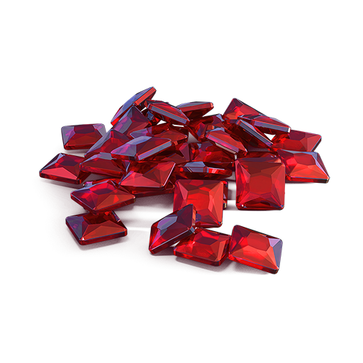
Summer eSports TankiFund 2026

The Summer Major 2026 tournament is in full swing, so alongside it, we commence the specially themed TankiFund event!
A wealth of rewards awaits you! 12 levels of general prizes, 30 special levels for TankiFund Boosters and 4 categories of prizes for the most active tankers! Among the prizes are the new Hornet SP skin, Keys, Augments, Grenades, and units of the «Nuclear Energy» supply. And most importantly — millions of Rubies that we will be given away at the end of the event.
We have already found out which 16 teams will proceed to the next stage, where they will be fighting for the 8 places in the final stage where the fate of the real cash prize, unique paints, and modules offering 20–30% protection from all turrets will be determined!
Event dates: from June 5th, 2 AM UTC, till June 28th, 2 AM UTC.
What is «eSports Tanki Fund»?
eSports Tanki Fund is a prize pool of Rubies that increases when players purchase any of the 3 main special offers.
At the end of the Summer eSports TankiFund event, the fund will be divided equally among the winners of the giveaway.
There are several ways to receive prizes in this event:
Ruby giveaway
Winners will be randomly selected from event participants, and they will receive equal shares of the accumulated fund.
General bonuses
All players who have purchased at least one of the 3 main special offers will receive additional bonuses, depending on the size of the fund.
Booster rewards
A special reward line is available for those who purchase the «Booster» special offer (only available to event participants).
Top Player Rewards
Special additional prizes for those who reach the event’s leaderboard.
The Summer eSports TankiFund will be growing from June 5th, 2 AM UTC, till June 28th, 2 AM UTC.
How to take part?
During the event, 3 main special offers will be available in the Shop. By purchasing any of them, you automatically become a participant of the TankiFund.
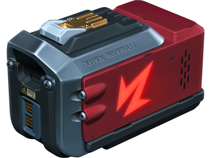
Doping
×3
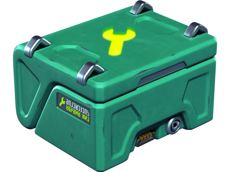
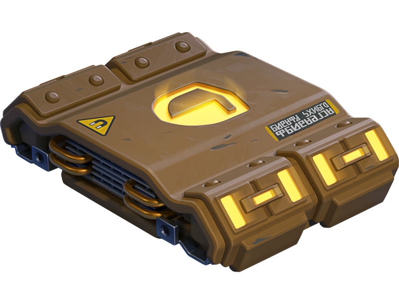
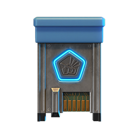
NUCLEAR ENERGY
×400
REPAIR KIT
×400
BOOSTED DAMAGE
×400
BOOSTED ARMOR
×400
SPEED BOOST
×400
MINE
Buying this special offer grants you +1 slot in the Summer eSports TankiFund draw.
Note: One-time purchase.
Adds 1000 Rubies to the fund.
Note: One-time purchase.
Adds 1000 Rubies to the fund.
Price
1390 RUBIES
Fan’s Bundle

×20
EPIC KEY
×13000
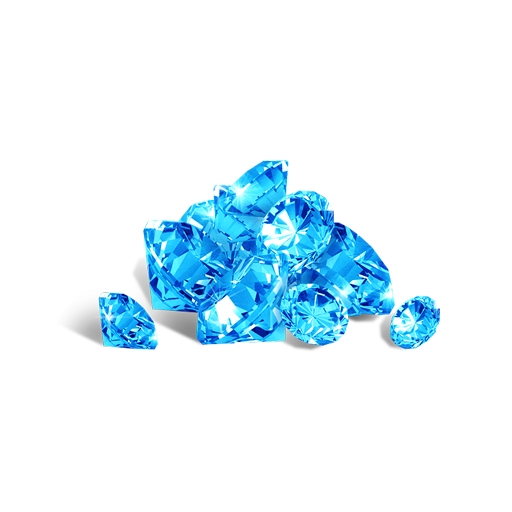
CRYSTALS

×1
FAN PAINT

×1
FAN PAINT

×1
FAN PAINT

×1
FAN PAINT

×1
FAN PAINT

×1
FAN PAINT

×1
FAN PAINT

×1
FAN PAINT
Buying this special offer grants you +1 slot in the Summer eSports TankiFund draw (+1 extra slot for each repeated purchase).
Note: Multiple purchases allowed.
Adds 1500 Rubies to the fund.
Note: Multiple purchases allowed.
Adds 1500 Rubies to the fund.
Price
2990 RUBIES
Spectacular Appearance
×250
EPIC KEY

Toxic
Freeze
Toxic
HAMMER
Toxic
Ricochet
Toxic
Striker
Green
RAILGUN
Toxic
MAGNUM
Green
SHAFT
Buying this special offer grants you +1 slot in the Summer eSports TankiFund draw.
Note: One-time purchase.
Adds 10000 Rubies to the fund.
Note: One-time purchase.
Adds 10000 Rubies to the fund.
Price
19990 RUBIES
The more bundles you purchase, the higher your chances of receiving a share of the Summer eSports TankiFund!
Booster
Important! For the “Booster” special offer to appear in the shop, you need to purchase any of the event’s special offers, then re-enter the shop. After re-entering the shop, the “Booster” special offer will be available for purchase an unlimited number of times.
In the Summer eSports TankiFund, you can level up your personal progress by purchasing the “Booster” special offer.

Booster
Booster is a special offer that allows you to receive rewards from the personal progress bar. One Booster purchase grants one unit of energy, which increases your personal progress level by 1.
Each Booster you buy unlocks a new reward level for you. In total, there are 30 levels with valuable prizes.
Booster
×1
LEVEL
Booster purchases do not increase your chances in the Ruby draw.
Booster appears immediately after purchasing any of the three participant special offers, following a re-entry into the shop.
We will add part of the revenue from “Booster” purchases to the prize pool of the “Summer Major 2026” eSports tournament.
Prizes for the Summer eSports TankiFund
All prizes — Rubies and additional bonuses will be credited after the end of the tournament and after the winners of the draw are determined.
With every 8000 Rubies added to the fund, the number of giveaway winners increases by 1. All winners of the draw will receive equal shares of the Summer eSports TankiFund, and some of you may instantly become truly rich!
Winners of the draw are players randomly chosen from among those who have purchased the event’s special offers. The selection of participants will take place on June 29th at 12 AM UTC. The number of winners depends on the total number of special offers purchased.
You will be able to track the growth of the fund and the number of giveaway participants on the special event website. The fund will start to grow only after the first purchase is made. For now, there are 0 Rubies in it.
Leaderboard
The leaderboard is based on the number of Boosters purchased. The more purchases, the higher your rank and the more valuable the rewards! There is no limit on the number of purchases.
By securing the highest positions in the ranking, you will also receive rewards for lower categories.

Top 1
Animated «Holi» paint

Top 10
LEGENDARY key ×3
Top 30
EPIC key ×120

Top 100
RARE key ×30
Prizes
Every player who buys at least one of the special offers receives additional bonuses depending on the size of the fund. Every time the amount increases by 1 million Rubies, the Summer eSports TankiFund moves to a new level.
LEVEL 1
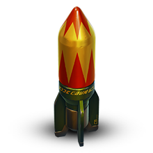
«Salyut» GRENADE ×100

LEVEL 2
COMMON KEY ×15

LEVEL 3
VULCAN GT
LEVEL 4
RARE KEY ×15

LEVEL 5
Striker GT

LEVEL 6
EPIC KEY ×15

LEVEL 7
Tsunami Pulsar
LEVEL 8
EPIC KEY ×15

LEVEL 9
«Tsar» GRENADE ×30
LEVEL 10
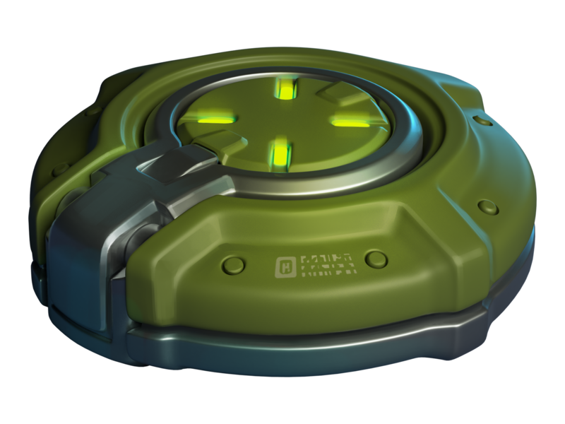
«Armadillo» module
LEVEL 11
LEGENDARY Key ×1

LEVEL 12
Hornet SP
Rewards for purchasing the “Booster” offer
LEVEL 1
EPIC KEY ×30
LEVEL 2
NUCLEAR ENERGY ×15
LEVEL 3
EPIC KEY ×30
LEVEL 4
«Salyut» GRENADE ×100
LEVEL 5
EPIC KEY ×30

LEVEL 6
«Tsar» GRENADE ×10
LEVEL 7
EPIC KEY ×30
LEVEL 8
NUCLEAR ENERGY ×15
LEVEL 9
EPIC KEY ×30
LEVEL 10
«Salyut» GRENADE ×100
LEVEL 11
EPIC KEY ×30
LEVEL 12
«Tsar» GRENADE ×10
LEVEL 13
EPIC KEY ×30
LEVEL 14
NUCLEAR ENERGY ×15
LEVEL 15
EPIC KEY ×30
LEVEL 16
«Salyut» GRENADE ×100
LEVEL 17
EPIC KEY ×30
LEVEL 18
«Tsar» GRENADE ×10
LEVEL 19
EPIC KEY ×30

LEVEL 20
LEGENDARY key ×1
LEVEL 21
EPIC KEY ×30
LEVEL 22
NUCLEAR ENERGY ×15
LEVEL 23
EPIC KEY ×30
LEVEL 24
«Salyut» GRENADE ×100
LEVEL 25
EPIC KEY ×30
LEVEL 26
«Tsar» GRENADE ×10
LEVEL 27
EPIC KEY ×30
LEVEL 28
NUCLEAR ENERGY ×15
LEVEL 29
EPIC KEY ×30
LEVEL 30
LEGENDARY key ×1
Match livestreams
To fully feel the atmosphere of this intense eSports event, watch the eSports livestreams on our Twitch channels.
Remember that for 30 minutes of watch time, you can receive a special Twitch Drop containing 1 EPIC Key — and another one for 60 minutes of watch time.
Livestreams start at 5 PM and 6 PM UTC. You can follow the match schedule on the TankiSport website.
The event is held in accordance with the Regulations and General Rules for Promotions and Contests.
Tanki Online V-LOG: Episode 549
In today’s episode, we will be announcing Tanki release on PlayStation. We’ll also be launching eSports Tanki Fund and launching the new season of Tanki Quiz.
Tanki Online turns 17!

Tanki Online is turning 17! We invite you to celebrate this holiday together, among loyal friends and like-minded tankers!
A festive program awaits you in the game: 4 special modes – “Gold Rush”, “Team Arms Race”, “Hazelball”, and “Railgun Grenadiers.” 50% discounts, the new Tsunami XT HD skin, and many other XT and DK series skins in Epic Containers, an Elite Pass with a Legendary Key and the new Duplet Firing Mode Augment for Tsunami as rewards, an Advent Calendar, a festive garage, a gold cake, and special gifts for everyone!
Event dates: May 29th — June 26th, 2 AM UTC.
Tsunami on Sale
As promised, the Tsunami turret is now freely available! Now anyone can purchase it for their account.
May 29th — June 22nd

Additionally, the turret will be added to containers.
50% Discounts
All prices are cut in half! You can’t miss a sale like this! Stock up with big savings from May 29th to June 1st.
All discounts start and end with the server restart at 2 AM UTC.
For 3 whole days, you will be able to obtain the following items with a 50% discount:
-50%
Shop (29.05 — 1.06)
Crystals

Stars
Early Access items
Premium Pass

-50%
GARAGE (29.05 — 1.06)
Augments
Supplies
Paints
Drones
Modules
Grenades
-50%
UPGRADES (29.05 — 1.06)
Special Tankoin Offers
Only in honor of the Birthday, buy Tankoins at a great value!
Hurry to the in-game Shop and get double rewards for each first purchase of any special Tankoin offer!
The doubling applies once for each special Tankoin offer. For example, you buy the special offer for 300 Tankoins and get an additional 300 Tankoins as a bonus. If you buy the 300 Tankoin offer again, there will be no bonus, but if you buy the 750 Tankoin offer, you will again receive 750 bonus Tankoins.

Special Modes
4 exciting modes await you in the game!
Important: Boosted battle funds and experience points are only active within the festive weekend game modes.
Each mode starts and ends with the server restart at 2 AM UTC.
SPECIAL MODE
GOLD RUSH
May 29th — June 1st
Mode
DM
Turret
Any
Hull
Any
Bonus Boxes
Upgrades
Augments
Gold Boxes
Equipment Change
Overdrives
Supplies
Nuclear Energy
Smart Supplies
Drones
Protection Modules
Groups
Grenades
More Gold Boxes
Crush everyone in a Deathmatch and catch plenty of gold! A lot more of the elusive boxes will be dropping in this mode!
Maps:
- Forest (Remaster)
- Sandal (Remaster)
- Parma (Remaster)
- Highland (Remaster)
SPECIAL MODE
TEAM ARMS RACE
June 5th — June 8th
Mode
Team Arms Race
Turret
Changes Every 3 Kills
Hull
Viking
Bonus Boxes
Upgrades
Augments
Gold Boxes
Equipment Change
Overdrives
Supplies
Nuclear Energy
Smart Supplies
Drones
Protection Modules
Groups
Grenades
More Gold Boxes
Crush enemies with BO-NK in the updated team mode and catch a lot of gold boxes, because this weekend, we have increased their dropping frequency!
Maps:
- Deathtrack PRO
- Kolhoz PRO
- Subway PRO
SPECIAL MODE
RAILGUN GRENADIERS
June 12th — June 15th
Mode
CTF
Turret
Railgun
Hull
Hornet
Bonus Boxes
Upgrades
Augments
Gold Boxes
Equipment Change
Overdrives
Supplies
Nuclear Energy
Smart Supplies
Drones
Protection Modules
Groups
Grenades
More Gold Boxes
This is the game mode for Tanki virtuosos! In addition to well-aimed Grenade throws, you also need well-aimed Railgun shots. An accurate shot at a thrown Grenade and there will be no trace left of your enemy. Shoot, detonate, and win!
Maps:
- Sandbox (Remaster)
- Cross (Remaster)
SPECIAL MODE
HAZELBALL
June 19th — June 22nd
Mode
RGB
Turret
B0-NK
Hull
Any
Bonus Boxes
Upgrades
Augments
Gold Boxes
Equipment Change
Overdrives
Supplies
Nuclear Energy
Smart Supplies
Drones
Protection Modules
Groups
Grenades
More Gold Boxes
Let’s play a hot match in the Rugby mode with a ball in the shape of hazelnut and legendary BO-NK turrets?! Sounds fun, doesn’t it?…
Maps:
- Stadium MM
- Parma MM
- Magistral MM
Special Offers
Don’t miss out on these great special offers!
May 29th — June 26th
Daily Ruby Pass

×500
Tankoins*
×4500
Rubies**
* 500 Tankoins instantly.
** For 30 days, each day the player can access a pre-completed mission upon logging in, from which they can claim a reward of 150 Rubies.
Note: One-time purchase
** For 30 days, each day the player can access a pre-completed mission upon logging in, from which they can claim a reward of 150 Rubies.
Note: One-time purchase
PURCHASE

June 5th — June 26th
Sweet Present
×15
EPIC key
×3
RARE key
×1
Nuclear Energy
June 12th — June 26th

June 19th — June 26th
Reason for Happiness
×20
EPIC key
×1
RARE key

×4
Premium Pass
Epic Containers
Treat yourself to refreshed Epic Containers! Their composition is truly festive – a whole sea of skins!
- NEW SKIN Tsunami XT (HD)
- SKIN Ares XT (HD)
- SKIN Hopper XT (HD)
- SKIN Crusader XT (HD)
- SKIN Paladin XT (HD)
- SKIN Tesla XT (HD)
- SKIN Scorpion XT (HD)
- SKIN Striker XT (HD)
- SKIN Viking XT (HD)
- SKIN Freeze XT (HD)
- SKIN Thunder XT (HD)
- SKIN Hornet XT (HD)
- SKIN Thunder DK
- SKIN Viking DK
- SKIN Hornet DK
- SKIN Ares DK
- SKIN Tesla DK
- SKIN Scorpion DK
- SKIN Freeze DK
- SKIN Striker DK
- SKIN Hopper DK
- Crisis Drone
- Armadillo Module
- And everything you can get from Common Containers
Special Missions
Challenge yourself in a series of missions and claim valuable rewards!
Your progress in completing missions is only counted from the moment you first enter the “Missions” screen after the event begins.
Missions follow the Encore system, with the second set of missions appearing only after the first set is completed.
SPECIAL
Part 1. May 29th — June 5th
Part 2. June 5th — June 12th
Part 3. June 12th — June 19th
Part 4. June 19th — June 26th
GOLD
TASK
Finish 2 battles in the festive mode.
REWARD
×3
EPIC KEY
EPIC KEY
CONTEST WITH CHANGING CLOTHES
TASK
Finish 2 battles in the festive mode.
REWARD
×3
EPIC KEY
EPIC KEY
FESTIVE FIREWORKS
TASK
Finish 2 battles in the festive mode.
REWARD
×3
EPIC KEY
EPIC KEY
HAZEL PASTE
TASK
Finish 2 battles in the festive mode.
REWARD
×3
EPIC KEY
EPIC KEY
SET 1
May 29th — June 26th
SUPERMISSION: WISHLIST! PART 1
TASK
Complete «Special Invitation. Part 1», «Guest of Honor. Part 1», «Indiscriminate. Part 1», «It’s About Participating! Part 1», «Right Choice. Part 1», «Cherished Wish. Part 1», «Volatile Mixture», «Regular Guest», «Tears of Joy» and «Gifts Time. Part 1» missions.
REWARD
×5
EPIC KEY
EPIC KEY
×1
RARE KEY
RARE KEY
×1000
EXPERIENCE POINTS
EXPERIENCE POINTS
SPECIAL INVITATION. PART 1
TASK
Enter the game at least once.
REWARD
×1
COMMON KEY
COMMON KEY
×100
EXPERIENCE POINTS
EXPERIENCE POINTS
GUEST OF HONOR. PART 1
TASK
Earn 5000 reputation points in matchmaking battles.
REWARD
×1
COMMON KEY
COMMON KEY
×100
EXPERIENCE POINTS
EXPERIENCE POINTS
INDISCRIMINATE. PART 1
TASK
Earn 3000 reputation points in Quick Battle mode in matchmaking battles.
REWARD
×1
COMMON KEY
COMMON KEY
×100
EXPERIENCE POINTS
EXPERIENCE POINTS
IT’S ABOUT PARTICIPATING! PART 1
TASK
Finish 10 battles in matchmaking battles.
REWARD
×1
COMMON KEY
COMMON KEY
×100
EXPERIENCE POINTS
EXPERIENCE POINTS
RIGHT CHOICE. PART 1
TASK
Be in the winning team of 2 battles in matchmaking battles.
REWARD
×1
COMMON KEY
COMMON KEY
×100
EXPERIENCE POINTS
EXPERIENCE POINTS
CHERISHED WISH. PART 1
TASK
Make any purchase in the game’s Shop.
REWARD
×1
COMMON KEY
COMMON KEY
×100
EXPERIENCE POINTS
EXPERIENCE POINTS
VOLATILE MIXTURE
TASK
Use boosted damage 150 times in matchmaking battles.
REWARD
×1
COMMON KEY
COMMON KEY
×100
EXPERIENCE POINTS
EXPERIENCE POINTS
REGULAR GUEST
TASK
Earn 3000 experience points in matchmaking battles.
REWARD
×1
COMMON KEY
COMMON KEY
×100
EXPERIENCE POINTS
EXPERIENCE POINTS
TEARS OF JOY
TASK
Earn 4000 crystals in matchmaking battles.
REWARD
×1
COMMON KEY
COMMON KEY
×100
EXPERIENCE POINTS
EXPERIENCE POINTS
GIFTS TIME. PART 1
TASK
Open 15 any Containers.
REWARD
×1
COMMON KEY
COMMON KEY
×100
EXPERIENCE POINTS
EXPERIENCE POINTS
SET 2
June 5th — June 26th
SUPERMISSION: WISHLIST! PART 2
TASK
Complete «Special Invitation. Part 2», «Guest of Honor. Part 2», «Indiscriminate. Part 2», «It’s About Participating! Part 2», «Right Choice. Part 2», «Cherished Wish. Part 2», «Aspirin», «Meteor Shower», «The King of the Party» and «Joke After Joke» missions.
REWARD
×5
EPIC KEY
EPIC KEY
×1
RARE KEY
RARE KEY
×1000
EXPERIENCE POINTS
EXPERIENCE POINTS
SPECIAL INVITATION. PART 2
TASK
Enter the game at least once.
REWARD
×1
COMMON KEY
COMMON KEY
×100
EXPERIENCE POINTS
EXPERIENCE POINTS
GUEST OF HONOR. PART 2
TASK
Earn 5000 reputation points in matchmaking battles.
REWARD
×1
COMMON KEY
COMMON KEY
×100
EXPERIENCE POINTS
EXPERIENCE POINTS
INDISCRIMINATE. PART 2
TASK
Earn 3000 reputation points in Quick Battle mode in matchmaking battles.
REWARD
×1
COMMON KEY
COMMON KEY
×100
EXPERIENCE POINTS
EXPERIENCE POINTS
IT’S ABOUT PARTICIPATING! PART 2
TASK
Finish 10 battles in matchmaking battles.
REWARD
×1
COMMON KEY
COMMON KEY
×100
EXPERIENCE POINTS
EXPERIENCE POINTS
RIGHT CHOICE. PART 2
TASK
Be in the winning team of 2 battles in matchmaking battles.
REWARD
×1
COMMON KEY
COMMON KEY
×100
EXPERIENCE POINTS
EXPERIENCE POINTS
CHERISHED WISH. PART 2
TASK
Make any purchase in the game’s Shop.
REWARD
×1
COMMON KEY
COMMON KEY
×100
EXPERIENCE POINTS
EXPERIENCE POINTS
ASPIRIN
TASK
Use repair kit 150 times in matchmaking battles.
REWARD
×1
COMMON KEY
COMMON KEY
×100
EXPERIENCE POINTS
EXPERIENCE POINTS
METEOR SHOWER
TASK
Earn 45 stars in matchmaking battles.
REWARD
×1
COMMON KEY
COMMON KEY
×100
EXPERIENCE POINTS
EXPERIENCE POINTS
THE KING OF THE PARTY
TASK
Destroy 30 tanks in matchmaking battles.
REWARD
×1
COMMON KEY
COMMON KEY
×100
EXPERIENCE POINTS
EXPERIENCE POINTS
JOKE AFTER JOKE
TASK
Deal 100000 damage in matchmaking battles.
REWARD
×1
COMMON KEY
COMMON KEY
×100
EXPERIENCE POINTS
EXPERIENCE POINTS
SET 3
June 12th — June 26th
SUPERMISSION: WISHLIST! PART 3
TASK
Complete «Special Invitation. Part 3», «Guest of Honor. Part 3», «Indiscriminate. Part 3», «It’s About Participating! Part 3», «Right Choice. Part 3», «Cherished Wish. Part 3», «Energy Drink», «Preemptive Play», «Dangerous Trick» and «7 Days» missions.
REWARD
×5
EPIC KEY
EPIC KEY
×1
RARE KEY
RARE KEY
×1000
EXPERIENCE POINTS
EXPERIENCE POINTS
SPECIAL INVITATION. PART 3
TASK
Enter the game at least once.
REWARD
×1
COMMON KEY
COMMON KEY
×100
EXPERIENCE POINTS
EXPERIENCE POINTS
GUEST OF HONOR. PART 3
TASK
Earn 5000 reputation points in matchmaking battles.
REWARD
×1
COMMON KEY
COMMON KEY
×100
EXPERIENCE POINTS
EXPERIENCE POINTS
INDISCRIMINATE. PART 3
TASK
Earn 3000 reputation points in Quick Battle mode in matchmaking battles.
REWARD
×1
COMMON KEY
COMMON KEY
×100
EXPERIENCE POINTS
EXPERIENCE POINTS
IT’S ABOUT PARTICIPATING! PART 3
TASK
Finish 10 battles in matchmaking battles.
REWARD
×1
COMMON KEY
COMMON KEY
×100
EXPERIENCE POINTS
EXPERIENCE POINTS
RIGHT CHOICE. PART 3
TASK
Be in the winning team of 2 battles in matchmaking battles.
REWARD
×1
COMMON KEY
COMMON KEY
×100
EXPERIENCE POINTS
EXPERIENCE POINTS
CHERISHED WISH. PART 3
TASK
Make any purchase in the game’s Shop.
REWARD
×1
COMMON KEY
COMMON KEY
×100
EXPERIENCE POINTS
EXPERIENCE POINTS
ENERGY DRINK
TASK
Use speed boost 150 times in matchmaking battles.
REWARD
×1
COMMON KEY
COMMON KEY
×100
EXPERIENCE POINTS
EXPERIENCE POINTS
PREEMPTIVE PLAY
TASK
Destroy 1 tank using grenades in matchmaking battles.
REWARD
×1
COMMON KEY
COMMON KEY
×100
EXPERIENCE POINTS
EXPERIENCE POINTS
DANGEROUS TRICK
TASK
Destroy 10 tanks using critical damage in matchmaking battles.
REWARD
×1
COMMON KEY
COMMON KEY
×100
EXPERIENCE POINTS
EXPERIENCE POINTS
7 DAYS
TASK
Complete 3 Weekly missions.
REWARD
×1
COMMON KEY
COMMON KEY
×100
EXPERIENCE POINTS
EXPERIENCE POINTS
SET 4
June 19th — June 26th
SUPERMISSION: WISHLIST! PART 4
TASK
Complete «Special Invitation. Part 4», «Guest of Honor. Part 4», «Indiscriminate. Part 4», «It’s About Participating! Part 4», «Right Choice. Part 4», «Cherished Wish. Part 4», «Surprise!», «Magician», «Juggler» and «Gifts Time. Part 2» missions.
REWARD
×5
EPIC KEY
EPIC KEY
×1
RARE KEY
RARE KEY
×1000
EXPERIENCE POINTS
EXPERIENCE POINTS
SPECIAL INVITATION. PART 4
TASK
Enter the game at least once.
REWARD
×1
COMMON KEY
COMMON KEY
×100
EXPERIENCE POINTS
EXPERIENCE POINTS
GUEST OF HONOR. PART 4
TASK
Earn 5000 reputation points in matchmaking battles.
REWARD
×1
COMMON KEY
COMMON KEY
×100
EXPERIENCE POINTS
EXPERIENCE POINTS
INDISCRIMINATE. PART 4
TASK
Earn 3000 reputation points in Quick Battle mode in matchmaking battles.
REWARD
×1
COMMON KEY
COMMON KEY
×100
EXPERIENCE POINTS
EXPERIENCE POINTS
IT’S ABOUT PARTICIPATING! PART 4
TASK
Finish 10 battles in matchmaking battles.
REWARD
×1
COMMON KEY
COMMON KEY
×100
EXPERIENCE POINTS
EXPERIENCE POINTS
RIGHT CHOICE. PART 4
TASK
Be in the winning team of 2 battles in matchmaking battles.
REWARD
×1
COMMON KEY
COMMON KEY
×100
EXPERIENCE POINTS
EXPERIENCE POINTS
CHERISHED WISH. PART 4
TASK
Make any purchase in the game’s Shop.
REWARD
×1
COMMON KEY
COMMON KEY
×100
EXPERIENCE POINTS
EXPERIENCE POINTS
SURPRISE!
TASK
Use mines 150 times in matchmaking battles.
REWARD
×1
COMMON KEY
COMMON KEY
×100
EXPERIENCE POINTS
EXPERIENCE POINTS
MAGICIAN
TASK
Use overdrive 10 times in matchmaking battles.
REWARD
×1
COMMON KEY
COMMON KEY
×100
EXPERIENCE POINTS
EXPERIENCE POINTS
JUGGLER
TASK
Use any grenade 10 times in matchmaking battles.
REWARD
×1
COMMON KEY
COMMON KEY
×100
EXPERIENCE POINTS
EXPERIENCE POINTS
GIFTS TIME. PART 2
TASK
Complete 15 Daily missions.
REWARD
×1
COMMON KEY
COMMON KEY
×100
EXPERIENCE POINTS
EXPERIENCE POINTS
Advent Calendar
We are launching the festive Advent Calendar for you!
Attention! The Advent Calendar and its missions become available only after purchasing the “Advent Calendar” special offer.
After purchasing the “Advent Calendar” special offer, you will get access to:
- 5 Standard Missions
- 1 Supermission with unique rewards!
All you need to do is log into the game during the event and claim your gifts.
Task: Complete all “One More Day” missions that appear after May 29th.
Completing 5 standard missions will unlock the final Supermission.
Supermission
×1
Recruit Paint
×200
Rubies
Mission
×12
EPIC Key
×200
Rubies
Special Gifts
We value every tanker, and in honor of our Birthday — gifts for you!
Special Gifts
From June 4th, 2 AM to June 26th, 2 AM UTC, log into the game and claim a special gift. Its value depends on how many years you’ve spent with us — the longer you’ve been with Tanki Online, the more generous the reward!
Don’t miss it — log into the game and claim your reward!
Important: Available from the rank of Master Sergeant.
Elite Pass
The most luxurious pass is here! It consists of 20 levels.
Your goal is to earn stars and unlock new levels, and for each level reached, you will receive additional prizes!
In order to complete the whole pass and reach the main prize, you will need to earn 1000 stars.

Elite Pass
Important: All stars earned during the event will be counted. Progress begins with the start of the event. Stars earned before the purchase of the «Elite Pass» will also be counted. The «Elite Pass» itself is required to claim the prizes. By purchasing it, you will be able to claim all the unlocked prizes to your Garage!
The Main Prizes are the “Duplet” Firing Mode Augment for Tsunami and a LEGENDARY KEY!
The price of this “Elite Pass” is 2300 Rubies.

“Duplet” Firing Mode Augment for Tsunami
Both barrels fire at the same time.
Removes the restriction of the simultaneous work of loading mechanisms of both cannons. Works with no problems in 98.46% of the cases before the average expected time of an enemy tank’s death.
Festive Decorations
- Festive paint on drones
- Festive paint
- Festive Gold Box drop zone skin
- Gold cake
- Festive loading screen
- Festive garage
- Hazelball
- Festive billboards
Happy Birthday!!!
Tsunami XT HD

We are adding a new HD-skin into the game!
A new detailed XT skin for Tsunami will appear in the game for the celebration of the 17th birthday of Tanki Online.
From May 29, Tsunami XT HD will be added to Epic Containers. Enter the game, open updated containers, and maybe you will be lucky enough to get this new skin to appear in your garage!

Tsunami XT HD
The XT series of skins is a collection of exclusive skins for various tanks, each with its own unique appearance.
The model of the turret is more detailed and large-scale, which gives it a powerful and spectacular look. Even the smallest details are taken into account!
The owners of these rare skins are always in the spotlight.
Join the celebration, good luck to everyone!
Summer Major 2026

Summer Major 2026 is coming!
There are just a few days left until the start of the biggest eSports tournament this summer, so now is the right time to share all the details of the upcoming event!
What is eSports up to nowadays?
eSports nowadays consists of two seasons per year, and each of them includes a series of qualifying ranking tournaments and finishes with a Major event.
The 24 best teams (according to rating points) have taken part in three rating (qualifying) tournaments to get a place in the main tournament of the half-year – Major, and to compete for a solid cash prize.
I don’t play eSports, what can I do?
Don’t worry. All the qualifying tournaments of the year are over, and the teams participating in the final tournament have been determined, which means it’s time to become a viewer!Join livestreams on our Twitch channels, follow them, watch eSports matches, and keep track of results.
Twitch Drops
For watching eSports livestreams, we reward each tanker with Epic Keys on each broadcast. To have your watch time counted, you first must link your Twitch account in the game settings.
Read more about how the «Twitch Drops» system works in the special article.
Follow the news in the game so as not to miss our livestreams!
When will it start?
The «Challengers» Stage begins on May 13th and will last until May 24th.
The 16 lowest-rated teams out of the total 24 will take part in this stage. The best 8 have already received a place in the next stage.
Next, we will have the «Legends» Stage from June 1st until June 12th. The top 8 teams that have automatically advanced to this stage will join the 8 best teams from the Challengers Stage. These 16 teams will compete for a spot in the «Champions» Stage.
Will there be Tanki Fund?
Of course, what is eSports without the Tanki Fund? In addition to the Epic Keys you receive for each livestream, right during the «Legends» Stage, we will announce the «eSports Tanki Fund».
In the «Legends» Stage, you can choose your favorite team, purchase special offers in the Shop, and thus not only help your favorite team but also get a chance to win Rubies as well as receive guaranteed prizes from Tanki Fund levels.
When will The Grand Finals take place?
The last 14 matches will happen in the «Champions» stage, and the 8 best teams will fight for cash prizes from June 21st to June 28th.
The hottest matches and the fate of the cash prize lie in these final matches!
Anyone who has seen at least one Grand Finals livestream before knows that no one should miss it!Don’t miss the livestreams of eSports matches on our Twitch channels! Root for your favorite teams, watch interesting matches, and get yourself some cool rewards!
Tanki Classic mass test

We are officially launching the “Tanki Classic” mass test!
During the test, you will be able to get onto separate “Tanki Classic” test servers, if you have purchased one of the early access special offers.
How to get there?
You can get onto “Tanki Classic” only through the announcement window in the main game lobby.
Attention! There are no other ways to get onto the game. Other sites you see on the Internet are scams and are made to steal your account details. You do not need to enter your password to log into the Tanki Classic test servers. If someone asks for your password to access Tanki Classic, it is definitely a scam. Be careful.
You will only have access if you are an early access participant.
How to get Early Access?
The special Early Access offers for “Tanki Classic” were only available for a limited time. With the start of the mass testing phase, we are bringing these special offers back on sale. This is your chance to become a part of the legendary “Tanki Classic” project ahead of everyone else!
Early Access offers are available from rank 8.
Personalized
×1000
(TO) Rubies

(TO) Bronze medal Tanki Classic
(TC) Nickname reservation
Nostalgia
×3000
(TO) Rubies

(TO) SILVER medal Tanki Classic
(TC) Nickname reservation
(TC) VETERAN PAINT
(TC) EARLY ACCESS

(TC) Voting option
Old School
×10000
(TO) Rubies

(TO) Gold medal Tanki Classic
(TC) Nickname reservation
(TC) VETERAN PAINT
(TC) EARLY ACCESS
(TC) Voting option
×200
(TC) CONTAINERS
What is there in the game?
This is a test version of the game. It is possible to encounter bugs, issues, unfinished features, and anomalies.
During the test, we will restart the game several times and even temporarily pause the testing process.
We will also wipe the test server database several times, which will reset all your progress.
For testing Tanki Classic, we use new server infrastructure. This may cause unstable server performance during the first weeks of testing. We will be configuring and fixing everything.
Is this early access already?
No. Early access will be announced separately, 2 weeks before the game is released. You will be able to get access to the game earlier than anybody else and progress your account earlier than others.
What is the “Development Plans” section on the Tanki Classic website?
Alongside the launch of Tanki Classic testing, we are adding a special “Development Plans” section to the project’s website. From now on, this section will be the primary, first-source of information on the development of the Tanki Classic project.
There, we will announce the key development areas of the project earlier than anywhere else.
Please note: the presented plans reflect our current goals and may be adjusted based on your feedback and voting results.
In the future, we will launch the promised polls for the game mechanics. You, the players, will define the future of “Tanki Classic!”
Feedback can be left on the forum topic of this news.

Recommended Posts