 Jump to content
Cosmonautics Day 2026
1/5
«Tsunami» turret Early Access!
2/5
Tanki Online V-LOG: Episode 546
3/5
Summer Major Rankings III 2026
4/5
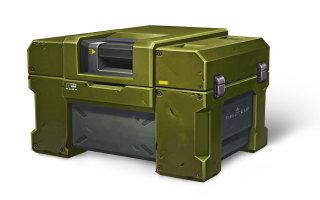
Tanki Classic mass test
5/5


Cosmonautics Day 2026

The long awaited Cosmonautics Day is starting in Tanki Online – it’s the holiday that brings the space mood into every battle.
In honor of the celebration, “UFO,” “Ace Combat,” and “Interceptors” special modes, 30% discounts, XT skins and augments for Freeze and Hopper in Epic containers, new Elite Pass with a Legendary Key and Medic grenades as rewards, and lots of festive missions with valuable prizes are waiting for you.
Event dates: April 10th, 2 AM — May 1st, 2 AM UTC.
Discounts
Take advantage of the beneficial discounts from April 10th to April 13th.
All discounts start and end with the server restart at 2 AM UTC.
For 3 whole days, you will be able to obtain the following items with a 30% discount:
-30%
SHOP (10.04 — 13.04)
Crystals

Stars
Early Access Items
Premium Pass
-30%
GARAGE (10.04 — 13.04)
Augments
Supplies
Paints
Modules
Drones
Grenades
-30%
Upgrades (10.04 — 13.04)
Special Modes
This time, three festive modes await you in the game!
Each mode starts and ends with the server restart at 2 AM UTC.
Important: Boosted battle funds and experience points are only active within the festive weekend game modes.
SPECIAL MODE
UFO
April 10th — April 13th
Mode
DM
Turret
Ricochet
Hull
Hopper
Bonus Boxes
Upgrades
Augments
Gold Boxes
Equipment Change
Overdrives
Supplies
Nuclear Energy
Smart Supplies
Drones
Protection Modules
Groups
Grenades
More Gold Boxes
The special «UFO» mode with flying Hoppers and fast shooting Ricochets. What a pleasure it will be to catch dozens of gold boxes from our space friends!
Maps:
- Madness 2 PRO Space
SPECIAL MODE
ACE COMBAT
April 17th — April 20th
Mode
DM
Turret
Striker
Hull
Hopper
Bonus Boxes
Upgrades
Augments
Gold Boxes
Equipment Change
Overdrives
Supplies
Nuclear Energy
Smart Supplies
Drones
Protection Modules
Groups
Grenades
More Gold Boxes
The special «Ace Combat» mode with flying Hoppers and fast-aiming Strikers to catch more and more gold boxes that our green friends will send us in large quantities.
Maps:
- Madness 2 PRO Space
- Rio PRO Space
- Highways PRO Space
SPECIAL MODE
INTERCEPTORS
April 24th — April 27th
Mode
DM
Turret
Railgun HYPER
Hull
Hopper HYPER
Bonus Boxes
Upgrades
Augments
Gold Boxes
Equipment Change
Overdrives
Supplies
Nuclear Energy
Smart Supplies
Drones
Protection Modules
Groups
Grenades
More Gold Boxes
Main task is to perform a graceful jump and catch a gold box! And in case your opponents try to prevent you from doing so — smash them with a Railgun shot!
Maps:
- Madness 2 PRO Space
- Skyscrapers PRO Space
- Silence PRO Space
Special Offers
Don’t miss out on these great special offers!
April 10th — April 27th
April 10th — May 1st
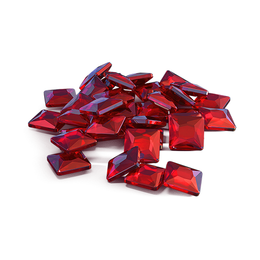
Daily Ruby Pass

×500
Tankoins*
×4500
Rubies**
* 500 Tankoins instantly.
** For 30 days, each day the player can access a pre-completed mission upon logging in, from which they can claim a reward of 150 Rubies.
Note: One-time purchase
** For 30 days, each day the player can access a pre-completed mission upon logging in, from which they can claim a reward of 150 Rubies.
Note: One-time purchase
PURCHASE
First Backup Module
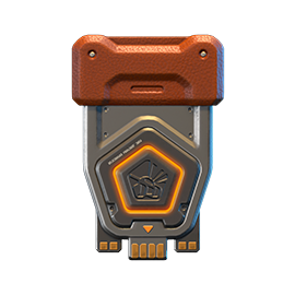
×15
EPIC KEY
×1
RARE KEY
×1
Nuclear Energy

April 17th — May 1st
Second Backup Module
×15
EPIC KEY
×2
RARE KEY
×1
Nuclear Energy
April 24th — May 1st

Epic Containers
Treat yourself with the updated content of Epic Containers!
- SKIN Freeze XT HD
- SKIN Hopper XT HD
- Freeze’s “Critical Mix” Augment
- Freeze’s “Stable Mix” Augment
- Freeze’s “Excelsior” Augment
- Hopper’s “Driver” Augment
- Hopper’s “Excelsior” Augment
- And everything you can get from Common Containers
Special Missions
Challenge yourself in a series of missions and claim valuable rewards!
Your progress in completing missions is only counted from the moment you first enter the “Missions” screen after the event begins.
Missions follow the Encore system, with the second set of missions appearing only after the first set is completed.
SPECIAL
Part 1. April 10th — April 17th
Part 2. April 17th — April 24th
Part 3. April 24th — May 1st
GRAVITY. PART 1
TASK
Finish 2 battles in the festive mode.
REWARD
×3
EPIC KEY
EPIC KEY
GRAVITY. PART 2
TASK
Finish 2 battles in the festive mode.
REWARD
×3
EPIC KEY
EPIC KEY
GRAVITY. PART 3
TASK
Finish 2 battles in the festive mode.
REWARD
×3
EPIC KEY
EPIC KEY
SET 1
Set 1. April 10th — May 1st
SUPERMISSION: MILKY WAY! PART 1
TASK
Complete «Sense of Presence. Part 1», «Star Marshal. Part 1», «Serenity. Part 1», «Space Debris. Part 1», «Stellar Team. Part 1», «Trading Station. Part 1», «Annihilation Mode», «Proficient Way», «Death Capsule» and «Comet Shards» missions.
REWARD
×5
EPIC KEY
EPIC KEY
×1
RARE KEY
RARE KEY
×1000
EXPERIENCE POINTS
EXPERIENCE POINTS
SENSE OF PRESENCE. PART 1
TASK
Enter the game at least once.
REWARD
×1
COMMON KEY
COMMON KEY
×100
EXPERIENCE POINTS
EXPERIENCE POINTS
STAR MARSHAL. PART 1
TASK
Earn 5000 reputation points in matchmaking battles.
REWARD
×1
COMMON KEY
COMMON KEY
×100
EXPERIENCE POINTS
EXPERIENCE POINTS
SERENITY. PART 1
TASK
Earn 3000 reputation points in Quick Battle mode in matchmaking battles.
REWARD
×1
COMMON KEY
COMMON KEY
×100
EXPERIENCE POINTS
EXPERIENCE POINTS
SPACE DEBRIS. PART 1
TASK
Finish 10 battles in matchmaking battles.
REWARD
×1
COMMON KEY
COMMON KEY
×100
EXPERIENCE POINTS
EXPERIENCE POINTS
STELLAR TEAM. PART 1
TASK
Be in the winning team of 2 battles in matchmaking battles.
REWARD
×1
COMMON KEY
COMMON KEY
×100
EXPERIENCE POINTS
EXPERIENCE POINTS
TRADING STATION. PART 1
TASK
Make any purchase in the game’s Shop.
REWARD
×1
COMMON KEY
COMMON KEY
×100
EXPERIENCE POINTS
EXPERIENCE POINTS
ANNIHILATION MODE
TASK
Use boosted damage 150 times in matchmaking battles.
REWARD
×1
COMMON KEY
COMMON KEY
×100
EXPERIENCE POINTS
EXPERIENCE POINTS
PROFICIENT WAY
TASK
Earn 3000 experience points in matchmaking battles.
REWARD
×1
COMMON KEY
COMMON KEY
×100
EXPERIENCE POINTS
EXPERIENCE POINTS
DEATH CAPSULE
TASK
Use any grenade 10 times in matchmaking battles.
REWARD
×1
COMMON KEY
COMMON KEY
×100
EXPERIENCE POINTS
EXPERIENCE POINTS
COMET SHARDS
TASK
Earn 4000 crystals in matchmaking battles.
REWARD
×1
COMMON KEY
COMMON KEY
×100
EXPERIENCE POINTS
EXPERIENCE POINTS
SET 2
Set 2. April 17th — May 1st
SUPERMISSION: MILKY WAY! PART 2
TASK
Complete «Sense of Presence. Part 2», «Star Marshal. Part 2», «Serenity. Part 2», «Space Debris. Part 2», «Stellar Team. Part 2», «Trading Station. Part 2», «Protection Module», «Meteor Shower», «Preemptive Play» and «Fighter Jet» missions.
REWARD
×5
EPIC KEY
EPIC KEY
×1
RARE KEY
RARE KEY
×1000
EXPERIENCE POINTS
EXPERIENCE POINTS
SENSE OF PRESENCE. PART 2
TASK
Enter the game at least once.
REWARD
×1
COMMON KEY
COMMON KEY
×100
EXPERIENCE POINTS
EXPERIENCE POINTS
STAR MARSHAL. PART 2
TASK
Earn 5000 reputation points in matchmaking battles.
REWARD
×1
COMMON KEY
COMMON KEY
×100
EXPERIENCE POINTS
EXPERIENCE POINTS
SERENITY. PART 2
TASK
Earn 3000 reputation points in Quick Battle mode in matchmaking battles.
REWARD
×1
COMMON KEY
COMMON KEY
×100
EXPERIENCE POINTS
EXPERIENCE POINTS
SPACE DEBRIS. PART 2
TASK
Finish 10 battles in matchmaking battles.
REWARD
×1
COMMON KEY
COMMON KEY
×100
EXPERIENCE POINTS
EXPERIENCE POINTS
STELLAR TEAM. PART 2
TASK
Be in the winning team of 2 battles in matchmaking battles.
REWARD
×1
COMMON KEY
COMMON KEY
×100
EXPERIENCE POINTS
EXPERIENCE POINTS
TRADING STATION. PART 2
TASK
Make any purchase in the game’s Shop.
REWARD
×1
COMMON KEY
COMMON KEY
×100
EXPERIENCE POINTS
EXPERIENCE POINTS
PROTECTION MODULE
TASK
Use boosted armor 150 times in matchmaking battles.
REWARD
×1
COMMON KEY
COMMON KEY
×100
EXPERIENCE POINTS
EXPERIENCE POINTS
METEOR SHOWER
TASK
Earn 45 stars in matchmaking battles.
REWARD
×1
COMMON KEY
COMMON KEY
×100
EXPERIENCE POINTS
EXPERIENCE POINTS
PREEMPTIVE PLAY
TASK
Destroy 1 tank using grenades in matchmaking battles.
REWARD
×1
COMMON KEY
COMMON KEY
×100
EXPERIENCE POINTS
EXPERIENCE POINTS
FIGHTER JET
TASK
Destroy 30 tanks in matchmaking battles.
REWARD
×1
COMMON KEY
COMMON KEY
×100
EXPERIENCE POINTS
EXPERIENCE POINTS
SET 3
Set 3. April 24th — May 1st
SUPERMISSION: MILKY WAY! PART 3
TASK
Complete «Sense of Presence. Part 3», «Star Marshal. Part 3», «Serenity. Part 3», «Space Debris. Part 3», «Stellar Team. Part 3», «Trading Station. Part 3 », «Quantum Accelerator», «Emergency Call», «Cargo Module» and «Dark Energy» missions.
REWARD
×5
EPIC KEY
EPIC KEY
×1
RARE KEY
RARE KEY
×1000
EXPERIENCE POINTS
EXPERIENCE POINTS
SENSE OF PRESENCE. PART 3
TASK
Enter the game at least once.
REWARD
×1
COMMON KEY
COMMON KEY
×100
EXPERIENCE POINTS
EXPERIENCE POINTS
STAR MARSHAL. PART 3
TASK
Earn 5000 reputation points in matchmaking battles.
REWARD
×1
COMMON KEY
COMMON KEY
×100
EXPERIENCE POINTS
EXPERIENCE POINTS
SERENITY. PART 3
TASK
Earn 3000 reputation points in Quick Battle mode in matchmaking battles.
REWARD
×1
COMMON KEY
COMMON KEY
×100
EXPERIENCE POINTS
EXPERIENCE POINTS
SPACE DEBRIS. PART 3
TASK
Finish 10 battles in matchmaking battles.
REWARD
×1
COMMON KEY
COMMON KEY
×100
EXPERIENCE POINTS
EXPERIENCE POINTS
STELLAR TEAM. PART 3
TASK
Be in the winning team of 2 battles in matchmaking battles.
REWARD
×1
COMMON KEY
COMMON KEY
×100
EXPERIENCE POINTS
EXPERIENCE POINTS
Trading Station. Part 3
TASK
Make any purchase in the game’s Shop.
REWARD
×1
COMMON KEY
COMMON KEY
×100
EXPERIENCE POINTS
EXPERIENCE POINTS
QUANTUM ACCELERATOR
TASK
Use speed boost 150 times in matchmaking battles.
REWARD
×1
COMMON KEY
COMMON KEY
×100
EXPERIENCE POINTS
EXPERIENCE POINTS
EMERGENCY CALL
TASK
Use overdrive 10 times in matchmaking battles.
REWARD
×1
COMMON KEY
COMMON KEY
×100
EXPERIENCE POINTS
EXPERIENCE POINTS
CARGO MODULE
TASK
Open 15 any Containers.
REWARD
×1
COMMON KEY
COMMON KEY
×100
EXPERIENCE POINTS
EXPERIENCE POINTS
DARK ENERGY
TASK
Deal 100000 damage in matchmaking battles.
REWARD
×1
COMMON KEY
COMMON KEY
×100
EXPERIENCE POINTS
EXPERIENCE POINTS
Advent Calendar
We are launching the festive advent calendar for you!
Attention! The Advent Calendar and its missions become available only after purchasing the “Advent Calendar” special offer.
After purchasing the “Advent Calendar” special offer, you will get access to:
- 5 Standard Missions
- 1 Supermission with unique rewards!
All you need to do is log into the game during the event and claim your gifts.
Task: Complete all “One More Day” missions that appear after April 10th.
Completing 5 standard missions will unlock the final Supermission.
Supermission
Recruit
Paint
×200
Rubies
Mission
×12
EPIC KEY
×200
Rubies
Elite Pass
The most luxurious pass is here! It will consist of 20 levels.
Your goal is to earn stars and unlock new levels, and for each level reached, you will receive additional prizes!
In order to complete the whole pass and reach the main prize, you will need to earn 1000 stars.

Elite Pass
All stars earned during the event will be counted. Progress begins with the start of the event. Stars earned before the purchase of the «Elite Pass» will also be counted. The «Elite Pass» itself is required to claim the prizes. By purchasing it, you will be able to claim all the unlocked prizes to your Garage!
The Main Prizes are ×100 Medic grenades and a LEGENDARY KEY!
The price of this “Elite Pass” is 2300 Rubies.
Festive Decorations
- Festive paint on drones
- Festive paint
- Festive Gold Box drop zone skin
- Festive loading screen
- Festive billboards
- Satellite Gold Boxes

Forward to stellar victories!
«Tsunami» turret Early Access!

Tsunami arrives in Tanki Online!
Starting April 10th, a new twin-barreled turret, “Tsunami,” arrives in Tanki Online — and you can get it before anyone else as part of a special offer.
Why «Tsunami»?
The name was chosen for a reason: the turret’s mechanics fully reflect its character.
The first shot is like the first wave, and the second is a powerful automatic finishing strike.
You manually fire from the right barrel, and the second shot triggers automatically after a short delay.
Tsunami Features:
- Twin-barreled turret
- Effective at medium and long range
- First shot — manual
- Second shot — automatic, following the first
What’s included in the Early Access bundle: (Price: 7000 Tankoins)
- Tsunami turret in the Mk1 modification
- Raven module for protection from the Tsunami turret
- Legendary Excelsior augment for Tsunami
The special offer will be available till May 22nd, 2 AM UTC.
Important: During Early Access, the developers will closely monitor how the Tsunami performs in battles. If necessary, the turret’s parameters may be adjusted for balance.
By the time of Tanki’s birthday, the Tsunami will become available in the garage for Crystals and will be accessible to all players.
Tanki Online V-LOG: Episode 546
In today’s episode, we will be releasing the new turret. We’ll also be announcing the Cosmonautics Day event and sharing Tanki Quiz interim results.
Summer Major Rankings III 2026

Summer Major Rankings II 2026 is finished so we are ready to announce the third ranking tournament of the Summer season!
If you’re still unsure whether to participate in tournaments or not, then now is the time to decide! After all, as we said earlier, the eSport format is designed to simplify participation in eSports, which means that everyone has a chance to compete for impressive in-game rewards and even for real cash rewards.
Who knows, perhaps it will be you and your team that will achieve the highest results.
Who knows, perhaps it will be you and your team that will achieve the highest results.We also want to remind you that in order to simplify the search for players and teams, we have updated our eSports website and added a special section in which teams search for players, and players search for teams.
Tournament rules
- Ranks: First Sergeant — Legend
- The team consists of 7 players.
- In battle – 5 tankers from each team.
- Your garage doesn’t matter as battles are played in Sport mode.
- On the battlefield, in each team, hulls and turrets should not be repeated. For example, if you use Hornet and Ricochet, no one else from your team should be in the battle with Ricochet or Hornet.
- More detailed rules can be found on the tournament page on the eSports portal.
Prizes
- Unique «Acid» paint
- 96,000 Rubies
- 88,000,000 crystals
- 2,835 epic keys
- 1,071 days of «Premium Pass»
- TMR points
Tournament dates
- Tournament registration will last from 17:00 UTC on March 24th till 17:00 UTC on April 5th.
- The first match will start on April 6th.
- The tournament will end before May 6th.
- The transfer is open and will last until 17:00 UTC on April 5th.
The tournament will be attended by 32 to 128 teams.
Almost immediately after the third rating tournament, we will announce a Major one. In the Major tournament, they will fight not only for in-game rewards, but also for real cash.
Go to the eSports portal, create your team, read the rules, register and get ready for the next rating tournament! And if you have any questions, visit our eSports Discord server, they will definitely help you.
See you on the battlefields and eSports broadcasts!
Tanki Classic mass test

We are officially launching the “Tanki Classic” mass test!
During the test, you will be able to get onto separate “Tanki Classic” test servers, if you have purchased one of the early access special offers.
How to get there?
You can get onto “Tanki Classic” only through the announcement window in the main game lobby.
Attention! There are no other ways to get onto the game. Other sites you see on the Internet are scams and are made to steal your account details. You do not need to enter your password to log into the Tanki Classic test servers. If someone asks for your password to access Tanki Classic, it is definitely a scam. Be careful.
You will only have access if you are an early access participant.
How to get Early Access?
The special Early Access offers for “Tanki Classic” were only available for a limited time. With the start of the mass testing phase, we are bringing these special offers back on sale. This is your chance to become a part of the legendary “Tanki Classic” project ahead of everyone else!
Early Access offers are available from rank 8.
Personalized
×1000
(TO) Rubies

(TO) Bronze medal Tanki Classic
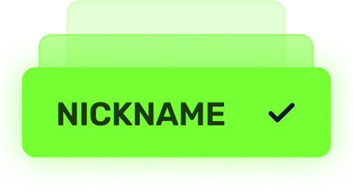
(TC) Nickname reservation
Nostalgia
×3000
(TO) Rubies

(TO) SILVER medal Tanki Classic
(TC) Nickname reservation

(TC) VETERAN PAINT
(TC) EARLY ACCESS

(TC) Voting option
Old School
×10000
(TO) Rubies

(TO) Gold medal Tanki Classic
(TC) Nickname reservation
(TC) VETERAN PAINT
(TC) EARLY ACCESS
(TC) Voting option
×200
(TC) CONTAINERS
What is there in the game?
This is a test version of the game. It is possible to encounter bugs, issues, unfinished features, and anomalies.
During the test, we will restart the game several times and even temporarily pause the testing process.
We will also wipe the test server database several times, which will reset all your progress.
For testing Tanki Classic, we use new server infrastructure. This may cause unstable server performance during the first weeks of testing. We will be configuring and fixing everything.
Is this early access already?
No. Early access will be announced separately, 2 weeks before the game is released. You will be able to get access to the game earlier than anybody else and progress your account earlier than others.
What is the “Development Plans” section on the Tanki Classic website?
Alongside the launch of Tanki Classic testing, we are adding a special “Development Plans” section to the project’s website. From now on, this section will be the primary, first-source of information on the development of the Tanki Classic project.
There, we will announce the key development areas of the project earlier than anywhere else.
Please note: the presented plans reflect our current goals and may be adjusted based on your feedback and voting results.
In the future, we will launch the promised polls for the game mechanics. You, the players, will define the future of “Tanki Classic!”
Feedback can be left on the forum topic of this news.
Recommended Posts
Archived
This topic is now archived and is closed to further replies.