 Jump to content
Miner 2026
1/10
Global Warming
2/10
Tanki Online V-LOG: Episode 544
3/10
Summer Major Rankings II 2026
4/10
Tanki Online and Sakura Blossom 2026
5/10
Tanki Online V-LOG: Episode 543
6/10
Lunar New Year 2026
7/10
Tanki Online V-LOG: Episode 542
8/10
Invite a friend #5
9/10
Tanki Classic mass test
10/10


Miner 2026

Introducing a new explosive event in Tanki Online — “Miner”.
Ready to test your intuition? Then we welcome you to our minefields! Reveal all cells without mines, earn new “Medic” grenades as a reward for each field, and for the last cleared field — a new GT skin for Scorpion. Also, earn points for clearing fields, which you can later exchange for valuable prizes in the Event Shop, where you’ll find many augments, including the new “Increased Voltage” augment for Tesla, Epic and Rare keys, modules, and a Legendary Key.
Event duration: March 13th, 2 AM — April 3rd, 2 AM UTC.
Prizes in the Shop can be claimed until April 5th, 2 AM UTC.
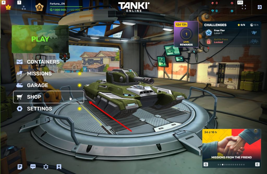
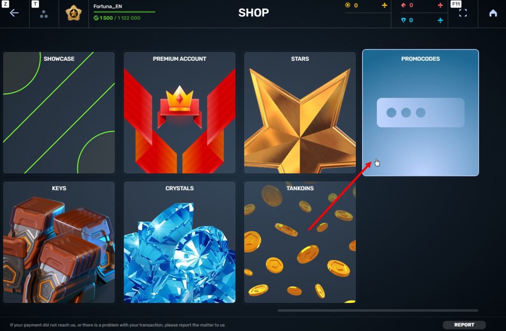
How to Participate
To participate in the “Miner” event, you will need to purchase the special “Event Pass” offer in the in-game Shop.
Event Pass

Access to the event

Unique participant paint
You will also need to complete contracts and special missions in the game. Completing them will reward you with energy, which you can use to make moves on the minefield.
1 move = 1 energy unit
How to Play?
Miner is an event where you need to demonstrate your skill in clearing minefields. To do this, you must reveal all cells without mines on the field using numerical clues.
Minefield
A player who purchases the Event Pass will have access to 5 minefields, varying in size (number of cells).

Minefield
At the start, the minefield is displayed with all cells covered. When the player makes the first click (move) on a cell, cells begin to be revealed.
Types of Cells on the Minefield:

1) Empty Cell – This cell contains no mine and becomes unclickable for the player.
2) Numerical Clue – The number on the cell indicates the count of mines surrounding it, in a 3×3 area centered on this cell.
Using these numerical clues, the player can determine the exact location of mines.


3) Mine – The most dangerous cell. Hitting one makes you lose 10 points.
The number of mines on the minefields will increase with each new field opened:
- Wasp Field – 7 mines (7×7 field)
- Hornet Field – 8 mines (8×8 field)
- Viking Field – 9 mines (9×9 field)
- Titan Field – 10 mines (10×10 field)
- Mammoth Field – 11 mines (11×11 field)
After completely clearing a field, a new minefield becomes available to the player.
Important: To win, you must reveal all cells without mines! (not just find all the mines on the field).
Points

Points
For each completely cleared field, the player will receive points.
- Wasp – 80 points
- Hornet – 90 points
- Viking – 100 points
- Titan – 110 points
- Mammoth – 120 points
All points are cumulative and can be exchanged for valuable prizes in the Event Shop.
There is another way to get points — you can purchase them as part of special bundles on the event website. The more points you have, the more prizes you can choose.


Mines

Mines
The most dangerous cells on the field!
After hitting a mine, the game continues, but points are deducted from the total points earned for that field. 1 mine deducts 10 points, 2 mines deduct 20 points, and so on.
So be extremely careful and check yourself before clicking to reveal a cell!
Flag Markers
To help you, special flags have been added to the game. They help the player mark a cell where they believe a mine might be located.
A flag can be removed from a cell if, during the game, you realize there is no mine there.

The number of flags equals the number of mines on the field.
Placing and removing flags is free and does not consume energy.
Metal Detector
The player’s main assistant!

Use the Metal Detector, and one undiscovered mine on the field will be revealed for you.
Price: 1 Metal Detector – 50 Rubies.
Multiple purchases available.
Important: If a mine is correctly marked with a flag, the Metal Detector will reveal a different mine.
Energy

Energy
Energy is a special event currency that can be obtained by completing contracts and special missions.
With energy, you can make moves and reveal cells on the minefield.
Contracts

Contract
Contract is a mission where you need to earn reputation points in matchmaking battles.
Contracts can be purchased from March 13th, 2 AM to April 3rd, 2 AM UTC in the Shop for Crystals or Rubies.
After purchase, you need to go to “Missions,” then the “Contracts” section, and be sure to activate the contract.
There are 2 types of contracts in the game:
Silver Contract
Condition: Earn 5000 reputation points in battles
Reward: Energy ×3
Multiple purchases available.
Reward: Energy ×3
Multiple purchases available.
Price
49900 CRYSTALS
- Time to complete: Until April 3rd, 2 AM UTC
- Time to claim prize: Until April 3rd, 2 AM UTC
- Alternative reward if not completed in time: Crystals ×49900
- Alternative reward if prize not claimed in time: Crystals ×49900
- Early completion: You can skip completing the contract and buy its completion. The price depends on how much of the contract you have already completed. Price: from 175 Rubies down to 1 Ruby.
Golden Contract
Condition: Earn 5000 reputation points in battles
Reward: Energy ×15
Multiple purchases available.
Reward: Energy ×15
Multiple purchases available.
Price
290 RUBIES
- Time to complete: Until April 3rd, 2 AM UTC
- Time to claim prize: Until April 3rd, 2 AM UTC
- Alternative reward if not completed in time: Rubies ×290
- Alternative reward if prize not claimed in time: Rubies ×290
- Early completion: You can skip completing the contract and buy its completion. The price depends on how much of the contract you have already completed. Price: from 700 Rubies down to 1 Ruby.
IMPORTANT information
- You can have only 1 contract activated at one time.
- If you have already completed the contract requirement and earned 5000 reputation points, the reward should be claimed immediately, otherwise a new contract cannot be activated.
- At the end of the event, if you completed a contract, but didn’t claim its reward, you can receive an alternative reward depending on the contract’s price.
- After April 3rd, 2 AM UTC, all contracts will become unavailable and expire. They will be marked with a red color.
Before completing a contract, DON’T FORGET to activate it.
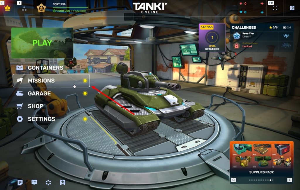
Missions
To get energy, you can also complete special missions in the game. Completing them will give you the ability to make moves and reveal cells on the minefield.
Each day of the event, starting March 13, a new mission will appear in the game.
If you missed a day, don’t worry, you can complete these missions until the end of the event.
If you missed a day, don’t worry, you can complete these missions until the end of the event.
There will be 21 missions in total:
PART 1
PODIUM
TASK
Get into the TOP-3 1 time in matchmaking battles. IMPORTANT: The mission is only available for «Event Pass» owners.
REWARD
×1
ENERGY
ENERGY
TEAM PLAYER
TASK
Be in the winning team of 3 battles in matchmaking battles. IMPORTANT: The mission is only available for «Event Pass» owners.
REWARD
×1
ENERGY
ENERGY
THE RIGHT CHOICE
TASK
Make any purchase in the game’s Shop. IMPORTANT: The mission is only available for «Event Pass» owners.
REWARD
×1
ENERGY
ENERGY
CRYSTAL CHAIN
TASK
Earn 30000 crystals in matchmaking battles. IMPORTANT: The mission is only available for «Event Pass» owners.
REWARD
×1
ENERGY
ENERGY
BATTLE AFTER BATTLE
TASK
Earn 5000 reputation points in matchmaking battles. IMPORTANT: The mission is only available for «Event Pass» owners.
REWARD
×1
ENERGY
ENERGY
SERENITY. PART 1
TASK
Finish 5 battles in matchmaking battles. IMPORTANT: The mission is only available for «Event Pass» owners.
REWARD
×1
ENERGY
ENERGY
REGENERATION
TASK
Use repair kit 150 times in matchmaking battles. IMPORTANT: The mission is only available for «Event Pass» owners.
REWARD
×1
ENERGY
ENERGY
PLAYING AHEAD
TASK
Destroy 30 tanks using grenades in matchmaking battles. IMPORTANT: The mission is only available for «Event Pass» owners.
REWARD
×1
ENERGY
ENERGY
DEADLY TRAP
TASK
Destroy 1 tank using mines in matchmaking battles. IMPORTANT: The mission is only available for «Event Pass» owners.
REWARD
×1
ENERGY
ENERGY
KISS OF DEATH. PART 1
TASK
Deal 50 critical shots in matchmaking battles. IMPORTANT: The mission is only available for «Event Pass» owners.
REWARD
×1
ENERGY
ENERGY
PART 2
SHIELD
TASK
Use boosted armor 150 times in matchmaking battles. IMPORTANT: The mission is only available for «Event Pass» owners.
REWARD
×1
ENERGY
ENERGY
TASK
Destroy 100 tanks in matchmaking battles. IMPORTANT: The mission is only available for «Event Pass» owners.
REWARD
×1
ENERGY
ENERGY
MINEFIELD
TASK
Use mines 150 times in matchmaking battles. IMPORTANT: The mission is only available for «Event Pass» owners.
REWARD
×1
ENERGY
ENERGY
SERENITY. PART 2
TASK
Finish 7 battles in matchmaking battles. IMPORTANT: The mission is only available for «Event Pass» owners.
REWARD
×1
ENERGY
ENERGY
FURY
TASK
Use boosted damage 150 times in matchmaking battles. IMPORTANT: The mission is only available for «Event Pass» owners.
REWARD
×1
ENERGY
ENERGY
SPECIAL OCCASION
TASK
Use overdrive 10 times in matchmaking battles. IMPORTANT: The mission is only available for «Event Pass» owners.
REWARD
×1
ENERGY
ENERGY
FASTER THAN A BULLET
TASK
Use speed boost 150 times in matchmaking battles. IMPORTANT: The mission is only available for «Event Pass» owners.
REWARD
×1
ENERGY
ENERGY
FAREWELL PARTY. PART 2
TASK
Destroy 50 tanks in matchmaking battles. IMPORTANT: The mission is only available for «Event Pass» owners.
REWARD
×1
ENERGY
ENERGY
SIGNATURE MOVE
TASK
Destroy 30 tanks using critical damage in matchmaking battles. IMPORTANT: The mission is only available for «Event Pass» owners.
REWARD
×1
ENERGY
ENERGY
PART 3
KISS OF DEATH. PART 2
TASK
Deal 30 critical shots in matchmaking battles. IMPORTANT: The mission is only available for «Event Pass» owners.
REWARD
×1
ENERGY
ENERGY
SERENITY. PART 3
TASK
Finish 4 battles in matchmaking battles. IMPORTANT: The mission is only available for «Event Pass» owners.
REWARD
×1
ENERGY
ENERGY
Victory and Rewards
To clear a minefield, the player needs to reveal all cells that do not contain mines. If the player reveals all safe cells, the remaining closed cells are automatically considered mines, and the game ends in victory.
Prizes
Throughout the event, for completing fields, you will earn points that you can exchange at any time until April 5th, 2 AM UTC inclusive for valuable rewards in the Event Shop, including the new “Increased Voltage” augment for Tesla!
Rewards:
- “Fox” module
- “Badger” module
- “Ocelot” module
- “Weasel” module
- “Wolf” module
- “Panther” module
- “Lion” module
- “Dolphin” module
- “Orka” module
- “Shark” module
- “Grizzly” module
- “Vulture” module
- “Falcon” module
- “Owl” module
- “Eagle” module
- NEW Tesla’s “Increased Voltage” augment
- Firebird’s “Critical Mix” augment
- Freeze’s “Pulsar” augment
- Isida’s “Vampire nanobots” augment
- Isida’s “Sustainable Nanobots” augment
- Hammer’s “Pulsar” augment
- Twins’ “Plasma Turbo Accelerators” augment
- Twins’ “Tempest” augment
- Ricochet’s “Berserk” augment
- Ricochet’s “Helios” augment
- Ricochet’s “Boxer” augment
- Vulcan’s “Rubberized Rounds” augment
- Vulcan’s “Shredder” augment
- Vulcan’s “Large Caliber” augment
- Smoky’s “Autocannon” augment
- Smoky’s “Sorted Ammunition” augment
- Striker’s “Missile Launcher «Faust»” augment
- Striker’s “Missile Launcher «Meteor»” augment
- Striker’s “Missile Launcher «Brass Knuckles»” augment
- Thunder’s “Pulsar” augment
- Railgun’s “Detonator” augment
- Magnum’s “Vacuum core” augment
- Magnum’s “Bombard” augment
- Magnum’s “Carronade” augment
- Gauss’ “Boxer” augment
- Gauss’ “Super Solenoids” augment
- Shaft’s “Rapid-fire mode” augment
- Shaft’s “Healing Emitters” augment
- Shaft’s “Quasar” augment
- Shaft’s “Stellarator” augment
- Rare key
- Epic key
- Legendary key

“Increased Voltage” augment FOR Tesla
Regular damage to targets in the chain is not reduced.
Increasing the output voltage on the Tesla coils, far beyond safe limits fundamentally, changes the efficiency level of the chain lightning. Under standard conditions, only rare critical damage shots ensure a consistent chain lightning breakthrough. With the new increased voltage coils, the effect of damage reduction when the number of targets in the chain increases becomes almost negligible with each chain lightning strike.
The second most effective way, after the N2 bomb, to make enemy tanks avoid clustering.
And also for each completed field you will receive a guaranteed reward:
- Wasp Field – “Medic” Grenade ×100
- Hornet Field – “Medic” Grenade ×100
- Viking Field – “Medic” Grenade ×100
- Titan Field – “Medic” Grenade ×100
- Mammoth Field – GT skin for Scorpion

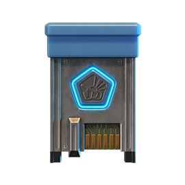
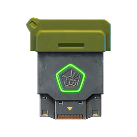
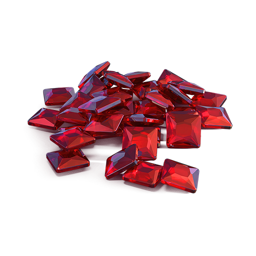
GRENADE
MEDIC

SCORPION
GT

New “Medic” Grenade
A specialized Grenade that repairs allied tanks, including your own.
During a throw it behaves like a normal grenade. After the grenade explodes, it immediately repairs all allied tanks in the area of effect. It is pointless to use it against enemy tanks.
Even if you are not thanked this time, rest assured — every medic is loved and respected.

New GT Skin for Scorpion
This special series of GT skins for turrets is not just a good addition to any wheeled hull but also a manifestation of extraordinary courage. Not every tanker is ready to sacrifice stealth and caution on the battlefield to flaunt the uniqueness and the peculiarity of their tank in its entirety.
The GT series of skins for turrets are powerful and beautiful weapons designed for the most determined and daring players. GT turrets stand out with their unique design, making them recognizable on the battlefield. They are equipped with advanced technologies and materials, and have a stylish design that emphasizes their power and elegance.
Victory requires not only luck but also a bit of logic. We believe in our tankers! Good luck to everyone!
The event is held by APL Publishing Ltd. in accordance with the General Rules for Promotions and Contests and Event’s Regulation.
Global Warming

Springtime finally emerges, and with it comes the warmth!
The temperature is rising in Tanki Online, bringing heated battles in three special modes, scorching 30% discounts, refreshed Epic Containers featuring the Shaft GT and Mammoth UT skins, a new Elite Pass with the Excelsior augment for Paladin and a Legendary Key as rewards, plenty of special missions with valuable prizes, and festive decorations!
Event dates: March 6th, 2 AM — March 27th, 2 AM UTC.
Discounts
Take advantage of the beneficial discounts from March 6th to March 9th.
All discounts start and end with the server restart at 2 AM UTC.
For 3 whole days, you will be able to obtain the following items with a 30% discount:
-30%
SHOP (06.03 — 09.03)
Crystals

Stars
Early Access items
Premium Pass
-30%
Garage (06.03 — 09.03)
Augments
Supplies
Paints
Drones
Modules
Grenades
-30%
UPGRADES (06.03 — 09.03)
Special Modes
Time to turn up the heat in three special modes!
Important: Boosted battle funds and experience points are only active within the festive weekend game modes.
Each mode starts and ends with the server restart at 2 AM UTC.
SPECIAL MODE
LEGENDARY GOLD RUSH
March 6 — March 9
Mode
DM
Turret
Any
Hull
Any
Bonus Boxes
Upgrades
Augments
Gold Boxes
Equipment Change
Overdrives
Supplies
Nuclear Energy
Smart Supplies
Drones
Protection Modules
Groups
Grenades
More Gold Boxes
Deathmatch. Everyone wants to catch as many gold boxes as possible, risking being left without any loot in a fight with other players.
Maps:
- Gubakha PRO
- Novel PRO
- Station PRO
SPECIAL MODE
PYROMANIAC
March 13 — March 16
Mode
CP
Turret
Firebird
Hull
Wasp
Bonus Boxes
Upgrades
Augments
Gold Boxes
Equipment Change
Overdrives
Supplies
Nuclear Energy
Smart Supplies
Drones
Protection Modules
Groups
Grenades
More Gold Boxes
Burn everyone and capture the points to win! While you move between points, capture gold boxes!
Map:
- Madness 2 PRO
SPECIAL MODE
«CAPTURE THE FLAG» CLASSIC
March 20 — March 23
Mode
CTF
Turret
Any
Hull
Any
Bonus Boxes
Upgrades
Augments
Gold Boxes
Equipment Change
Overdrives
Supplies
Nuclear Energy
Smart Supplies
Drones
Protection Modules
Groups
Grenades
More Gold Boxes
The standard «Capture the Flag» mode without additional enhancements such as overdrives and drones. Rely only on your basic skills and standard equipment, focus on pure gameplay and tactics!
Maps:
- Boombox PRO
- Fort Knox PRO
- Pass PRO
Special Offers
It’s time to replenish your supplies and upgrade your Garage! We have assembled Special offers with maximum benefits for you.
March 6th — March 23rd
March 6th — March 27th
Daily Ruby Pass
×500
Tankoins*

×4500
Rubies**
* 500 Tankoins instantly.
** For 30 days, each day the player can access a pre-completed mission upon logging in, from which they can claim a reward of 150 Rubies.
Note: One-time purchase
** For 30 days, each day the player can access a pre-completed mission upon logging in, from which they can claim a reward of 150 Rubies.
Note: One-time purchase
PURCHASE
Bare Minimum

×15
EPIC KEYS

×4
PREMIUM PASS
×1
NUCLEAR ENERGY

March 13th — March 27th
Ancestors’ Gifts
×15
EPIC KEYS
×2
RARE KEYS
×1
NUCLEAR ENERGY
March 20th — March 27th

Epic Containers
Treat yourself with the updated content of Epic Containers!
- SKIN Shaft GT
- SKIN Mammoth UT
- “Healing Emitters” augment for Shaft
- “Stellarator” augment for Shaft
- “Excelsior” augment for Shaft
- “Driver” augment for Mammoth
- “Excelsior” augment for Mammoth
- And everything you can get from Common Containers
Special Missions
Challenge yourself in a series of hot missions and claim your rewards!
Your progress in completing missions is only counted from the moment you first enter the “Missions” screen after the event begins.
Missions follow the Encore system, with the second set of missions appearing only after the first set is completed.
SPECIAL
Part 1. March 6th — March 13th
Part 2. March 13th — March 20th
Part 3. March 20th — March 27th
GOLDFALL
TASK
Finish 2 battles in the festive mode.
REWARD
×3
EPIC KEY
EPIC KEY
GREENHOUSE EFFECT
TASK
Finish 2 battles in the festive mode.
REWARD
×3
EPIC KEY
EPIC KEY
PLACE UNDER THE SUN
TASK
Finish 2 battles in the festive mode.
REWARD
×3
EPIC KEY
EPIC KEY
SET 1
Set 1. March 6th — March 27th
SUPERMISSION: RESURRECTION! PART 1
TASK
Complete «New Sunrise. Part 1», «Mastodon. Part 1», «Skirmish. Part 1», «Serenity. Part 1», «Higher Kind. Part 1», «Natural Exchange. Part 1», «The Last Hazelnut», «Predator Kind», «Ancestors’ Experience. Part 1», «Ice Shards» and «North Star» missions.
REWARD
×5
EPIC KEY
EPIC KEY
×1
RARE KEY
RARE KEY
×1000
EXPERIENCE POINTS
EXPERIENCE POINTS
NEW SUNRISE. PART 1
TASK
Enter the game at least once.
REWARD
×1
COMMON KEY
COMMON KEY
×100
EXPERIENCE POINTS
EXPERIENCE POINTS
MASTODON. PART 1
TASK
Earn 5000 reputation points in matchmaking battles.
REWARD
×1
COMMON KEY
COMMON KEY
×100
EXPERIENCE POINTS
EXPERIENCE POINTS
SKIRMISH. PART 1
TASK
Earn 3000 reputation points in Quick Battle mode in matchmaking battles.
REWARD
×1
COMMON KEY
COMMON KEY
×100
EXPERIENCE POINTS
EXPERIENCE POINTS
SERENITY. PART 1
TASK
Finish 10 battles in matchmaking battles.
REWARD
×1
COMMON KEY
COMMON KEY
×100
EXPERIENCE POINTS
EXPERIENCE POINTS
HIGHER KIND. PART 1
TASK
Be in the winning team of 2 battles in matchmaking battles.
REWARD
×1
COMMON KEY
COMMON KEY
×100
EXPERIENCE POINTS
EXPERIENCE POINTS
NATURAL EXCHANGE. PART 1
TASK
Make any purchase in the game’s Shop.
REWARD
×1
COMMON KEY
COMMON KEY
×100
EXPERIENCE POINTS
EXPERIENCE POINTS
THE LAST HAZELNUT
TASK
Earn 1000 reputation points in RGB mode in matchmaking battles.
REWARD
×1
COMMON KEY
COMMON KEY
×100
EXPERIENCE POINTS
EXPERIENCE POINTS
PREDATOR KIND
TASK
Use boosted damage 150 times in matchmaking battles.
REWARD
×1
COMMON KEY
COMMON KEY
×100
EXPERIENCE POINTS
EXPERIENCE POINTS
ANCESTORS’ EXPERIENCE. PART 1
TASK
Earn 3000 experience points in matchmaking battles.
REWARD
×1
COMMON KEY
COMMON KEY
×100
EXPERIENCE POINTS
EXPERIENCE POINTS
ICE SHARDS
TASK
Earn 4000 crystals in matchmaking battles.
REWARD
×1
COMMON KEY
COMMON KEY
×100
EXPERIENCE POINTS
EXPERIENCE POINTS
NORTH STAR
TASK
Earn 45 stars.
REWARD
×1
COMMON KEY
COMMON KEY
×100
EXPERIENCE POINTS
EXPERIENCE POINTS
SET 2
Set 2. March 13th — March 27th
SUPERMISSION: RESURRECTION! PART 2
TASK
Complete «New Sunrise. Part 2», «Mastodon. Part 2», «Skirmish. Part 2», «Serenity. Part 2», «Higher Kind. Part 2», «Natural Exchange. Part 2», «Battle of the Titans », «Shell», «Natural Selection», «Mortal Blow» and «Outbreak of Rage» missions.
REWARD
×5
EPIC KEY
EPIC KEY
×1
RARE KEY
RARE KEY
×1000
EXPERIENCE POINTS
EXPERIENCE POINTS
NEW SUNRISE. PART 2
TASK
Enter the game at least once.
REWARD
×1
COMMON KEY
COMMON KEY
×100
EXPERIENCE POINTS
EXPERIENCE POINTS
MASTODON. PART 2
TASK
Earn 5000 reputation points in matchmaking battles.
REWARD
×1
COMMON KEY
COMMON KEY
×100
EXPERIENCE POINTS
EXPERIENCE POINTS
SKIRMISH. PART 2
TASK
Earn 3000 reputation points in Quick Battle mode in matchmaking battles.
REWARD
×1
COMMON KEY
COMMON KEY
×100
EXPERIENCE POINTS
EXPERIENCE POINTS
SERENITY. PART 2
TASK
Finish 10 battles in matchmaking battles.
REWARD
×1
COMMON KEY
COMMON KEY
×100
EXPERIENCE POINTS
EXPERIENCE POINTS
HIGHER KIND. PART 2
TASK
Be in the winning team of 2 battles in matchmaking battles.
REWARD
×1
COMMON KEY
COMMON KEY
×100
EXPERIENCE POINTS
EXPERIENCE POINTS
NATURAL EXCHANGE. PART 2
TASK
Make any purchase in the game’s Shop.
REWARD
×1
COMMON KEY
COMMON KEY
×100
EXPERIENCE POINTS
EXPERIENCE POINTS
BATTLE OF THE TITANS
TASK
Earn 1000 reputation points in TJR mode in matchmaking battles.
REWARD
×1
COMMON KEY
COMMON KEY
×100
EXPERIENCE POINTS
EXPERIENCE POINTS
SHELL
TASK
Use boosted armor 150 times in matchmaking battles.
REWARD
×1
COMMON KEY
COMMON KEY
×100
EXPERIENCE POINTS
EXPERIENCE POINTS
NATURAL SELECTION
TASK
Destroy 30 tanks in matchmaking battles.
REWARD
×1
COMMON KEY
COMMON KEY
×100
EXPERIENCE POINTS
EXPERIENCE POINTS
MORTAL BLOW
TASK
Destroy 1 tank using grenades in matchmaking battles.
REWARD
×1
COMMON KEY
COMMON KEY
×100
EXPERIENCE POINTS
EXPERIENCE POINTS
OUTBREAK OF RAGE
TASK
Destroy 10 tanks using critical damage in matchmaking battles.
REWARD
×1
COMMON KEY
COMMON KEY
×100
EXPERIENCE POINTS
EXPERIENCE POINTS
SET 3
Set 3. March 20th — March 27th
SUPERMISSION: RESURRECTION! PART 3
TASK
Complete «New Sunrise. Part 3», «Mastodon. Part 3», «Skirmish. Part 3», «Serenity. Part 3», «Higher Kind. Part 3», «Natural Exchange. Part 3», «Herd Mentality», «Survival Instinct», «From Dusk till Dawn», «7 Days» and «Stone Stash» missions.
REWARD
×5
EPIC KEY
EPIC KEY
×1
RARE KEY
RARE KEY
×1000
EXPERIENCE POINTS
EXPERIENCE POINTS
NEW SUNRISE. PART 3
TASK
Enter the game at least once.
REWARD
×1
COMMON KEY
COMMON KEY
×100
EXPERIENCE POINTS
EXPERIENCE POINTS
MASTODON. PART 3
TASK
Earn 5000 reputation points in matchmaking battles.
REWARD
×1
COMMON KEY
COMMON KEY
×100
EXPERIENCE POINTS
EXPERIENCE POINTS
SKIRMISH. PART 3
TASK
Earn 3000 reputation points in Quick Battle mode in matchmaking battles.
REWARD
×1
COMMON KEY
COMMON KEY
×100
EXPERIENCE POINTS
EXPERIENCE POINTS
SERENITY. PART 3
TASK
Finish 10 battles in matchmaking battles.
REWARD
×1
COMMON KEY
COMMON KEY
×100
EXPERIENCE POINTS
EXPERIENCE POINTS
HIGHER KIND. PART 3
TASK
Be in the winning team of 2 battles in matchmaking battles.
REWARD
×1
COMMON KEY
COMMON KEY
×100
EXPERIENCE POINTS
EXPERIENCE POINTS
NATURAL EXCHANGE. PART 3
TASK
Make any purchase in the game’s Shop.
REWARD
×1
COMMON KEY
COMMON KEY
×100
EXPERIENCE POINTS
EXPERIENCE POINTS
HERD MENTALITY
TASK
Earn 1000 reputation points in TDM mode in matchmaking battles.
REWARD
×1
COMMON KEY
COMMON KEY
×100
EXPERIENCE POINTS
EXPERIENCE POINTS
SURVIVAL INSTINCT
TASK
Use speed boost 150 times in matchmaking battles.
REWARD
×1
COMMON KEY
COMMON KEY
×100
EXPERIENCE POINTS
EXPERIENCE POINTS
FROM DUSK TILL DAWN
TASK
Complete 15 Daily missions.
REWARD
×1
COMMON KEY
COMMON KEY
×100
EXPERIENCE POINTS
EXPERIENCE POINTS
7 DAYS
TASK
Complete 3 Weekly missions.
REWARD
×1
COMMON KEY
COMMON KEY
×100
EXPERIENCE POINTS
EXPERIENCE POINTS
STONE STASH
TASK
Open 15 any Containers.
REWARD
×1
COMMON KEY
COMMON KEY
×100
EXPERIENCE POINTS
EXPERIENCE POINTS
Advent Calendar
We are launching the festive advent calendar for you!
Attention! The Advent Calendar and its missions become available only after purchasing the “Advent Calendar” special offer.
After purchasing the “Advent Calendar” special offer, you will get access to:
- 5 standard missions
- 1 Supermission with unique rewards!
All you need to do is log into the game during the event and claim your gifts.
Task: Complete all “One More Day” missions that appear after March 6th. Completing 5 standard missions will unlock the final Supermission.
Supermission
×1
Recruit Paint
×200
RUBIES
Missions
×12
EPIC KEYS
×200
RUBIES
Elite Pass
The most luxurious pass is here! It will consist of 20 levels.
Your goal is to earn stars and unlock new levels, and for each level you reach, you will receive additional prizes!
In order to complete the whole pass and reach the main prize, you will need to earn 1000 stars.

Elite Pass
Important: All stars earned during the event will be counted. Progress begins with the start of the event. Stars earned before the purchase of the «Elite Pass» will also be counted. The «Elite Pass» itself is required to claim the prizes. By purchasing it, you will be able to claim all the unlocked prizes to your Garage!
The Main Prizes are x1 Legendary Key and the Excelsior augment for Paladin!
The price of this “Elite Pass” is 2300 Rubies.
Festive Decorations
- Festive paint on cargo drones
- Festive paint
- Festive Gold Box drop zone skin
- Festive loading screen
- Festive billboards
Great mood to everyone!
Tanki Online V-LOG: Episode 544
In today’s episode, we will be releasing a huge update for Nintendo Switch. We’ll also be announcing the Medic grenade and launching the new Global Warming event.
Summer Major Rankings II 2026

Summer Major Rankings I 2026 is finished so we are ready to announce the second ranking tournament of the Summer season!
If you’re still unsure whether to participate in tournaments or not, then now is the time to decide! After all, as we said earlier, the eSport format is designed to simplify participation in eSports, which means that everyone has a chance to compete for impressive in-game rewards and even for real cash rewards.
Who knows, perhaps it will be you and your team that will achieve the highest results.
Who knows, perhaps it will be you and your team that will achieve the highest results.We also want to remind you that in order to simplify the search for players and teams, we have updated our eSports website and added a special section in which teams search for players, and players search for teams.
Tournament rules
- Ranks: First Sergeant — Legend
- The team consists of 7 players.
- In battle – 5 tankers from each team.
- Your garage doesn’t matter as battles are played in Sport mode.
- On the battlefield, in each team, hulls and turrets should not be repeated. For example, if you use Hornet and Ricochet, no one else from your team should be in the battle with Ricochet or Hornet.
- More detailed rules can be found on the tournament page on the eSports portal.
Prizes
- Unique «Prism» paint
- 96,000 Rubies
- 88,000,000 crystals
- 2,835 epic keys
- 1,071 days of «Premium Pass»
- TMR points
Tournament dates
- Tournament registration will last from 17:00 UTC on February 17th till 17:00 UTC on March 1st.
- The first match will start on March 2nd.
- The tournament will end before March 29th.
- The transfer is open and will last until 17:00 UTC on March 1st.
The tournament will be attended by 32 to 128 teams.
Almost immediately after the second rating tournament, we will announce the third one and after all the rating tournaments there will be a Major one. In the Major tournament, they will fight not only for in-game rewards, but also for real cash.
Go to the eSports portal, create your team, read the rules, register and get ready for the next rating tournament! And if you have any questions, visit our eSports Discord server, they will definitely help you.
See you on the battlefields and eSports broadcasts!
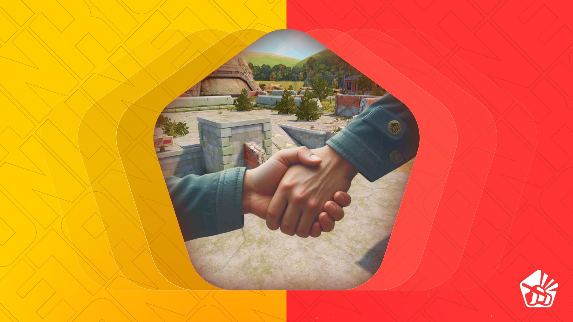
Tanki Online and Sakura Blossom 2026

We are launching the event dedicated to The Land of the Rising Sun – Sakura Blossom.
In the brutal war for jade riches, skillful ninjas, fearless samurai, and tricky ronins will face each other! The winner will be the faction whose members earn the most coins before the event ends, and the main prizes will be the Thunder DK and Hopper DK skins. But personal achievements won’t be left without a reward – among individual prizes, lots of supplies, augments, grenades, and even a LEGENDARY key are waiting for you!
The event will last from February 20th, 2 AM till March 12th, 2 AM UTC.
You will have time to claim the prizes until March 16th 2 AM UTC.
How to take part
In order to take part in the Sakura Blossom event, you first need to walk the path of a warrior. The “Draw of Fate” will assign you one of three factions, and you will need to fight for the greatness of your clan.

Right after buying the offer, you will become a warrior of one of the following factions: “Ninja Cats”, “Samurai Dogs”, or “Ronin Foxes”.
A special website will become available with the start of the event. You will be able to follow the progress of your faction as well as your individual progress there.
Event rules
After the factions are drawn, you will have to fight for victory by collecting as many Coins as possible.
Coins
A special event currency, which can be obtained by completing special event missions, purchased in the Shop for crystals, or bought with Rubies as part of Special offers.
Special Missions
Only those who have obtained the special «Draw of Fate» offer have access to these missions.
We have prepared multiple missions, unlocked on every consecutive day of the event, and they will be available until the end of the event. The more missions you complete, the more individual prizes you will win, and thus a higher chance your faction will have for victory!
You will have to complete missions and earn coins from February 20th, 2 AM till March 12th, 2 AM UTC.
Important: Each day, for the duration of the event, one new mission will become available.
SET 1
February 20th 2 AM — March 12th, 2 AM UTC
CIRCLE OF FAVORITES
TASK
Get into the TOP-3 5 times in matchmaking battles. IMPORTANT: The mission is only available for «Event Pass» owners.
REWARD

×1
coin
coin
NEW DAN
TASK
Get a new rank. IMPORTANT: The mission is only available for «Event Pass» owners.
REWARD
×1
coin
coin
CLAN
TASK
Be in the winning team of 10 battles in matchmaking battles. IMPORTANT: The mission is only available for «Event Pass» owners.
REWARD
×1
coin
coin
DRAGON’S TEARS
TASK
Earn 30000 crystals in matchmaking battles. IMPORTANT: The mission is only available for «Event Pass» owners.
REWARD
×1
coin
coin
STEP BY STEP
TASK
Earn 5000 reputation points in matchmaking battles. IMPORTANT: The mission is only available for «Event Pass» owners.
REWARD
×1
coin
coin
DEADLY HARVEST
TASK
Destroy 300 tanks in matchmaking battles. IMPORTANT: The mission is only available for «Event Pass» owners.
REWARD
×1
coin
coin
STEP INTO THE VOID. PART 1
TASK
Destroy 3 tanks using mines in matchmaking battles. IMPORTANT: The mission is only available for «Event Pass» owners.
REWARD
×1
coin
coin
BANNER
TASK
Capture 1 flag in matchmaking battles. IMPORTANT: The mission is only available for «Event Pass» owners.
REWARD
×1
coin
coin
ENERGY OF LIFE
TASK
Use repair kit 100 times in matchmaking battles. IMPORTANT: The mission is only available for «Event Pass» owners.
REWARD
×1
coin
coin
DEATH GRIP. PART 1
TASK
Use overdrive 30 times in matchmaking battles. IMPORTANT: The mission is only available for «Event Pass» owners.
REWARD
×1
coin
coin
SET 2
February 20th 2 AM — March 12th, 2 AM UTC
DRAGON’S SKIN
TASK
Use boosted armor 100 times in matchmaking battles. IMPORTANT: The mission is only available for «Event Pass» owners.
REWARD
×1
coin
coin
COBRA’S ATTACK
TASK
Destroy 30 tanks using grenades in matchmaking battles. IMPORTANT: The mission is only available for «Event Pass» owners.
REWARD
×1
coin
coin
STEP INTO THE VOID. PART 2
TASK
Use mines 100 times in matchmaking battles. IMPORTANT: The mission is only available for «Event Pass» owners.
REWARD
×1
coin
coin
DEATH GRIP. PART 2
TASK
Use overdrive 20 times in matchmaking battles. IMPORTANT: The mission is only available for «Event Pass» owners.
REWARD
×1
coin
coin
ENERGY OF DEATH
TASK
Use boosted damage 100 times in matchmaking battles. IMPORTANT: The mission is only available for «Event Pass» owners.
REWARD
×1
coin
coin
FATAL BLOW
TASK
Destroy 30 tanks using critical damage in matchmaking battles. IMPORTANT: The mission is only available for «Event Pass» owners.
REWARD
×1
coin
coin
ENERGY OF WIND
TASK
Use speed boost 100 times in matchmaking battles. IMPORTANT: The mission is only available for «Event Pass» owners.
REWARD
×1
coin
coin
DEATH GRIP. PART 3
TASK
Use overdrive 10 times in matchmaking battles. IMPORTANT: The mission is only available for «Event Pass» owners.
REWARD
×1
coin
coin
DEATH’S BREATH
TASK
Deal 50 critical shots in matchmaking battles. IMPORTANT: The mission is only available for «Event Pass» owners.
REWARD
×1
coin
coin
RELIC MERCHANT
TASK
Make any purchase in the game’s Shop. IMPORTANT: The mission is only available for «Event Pass» owners.
REWARD
×1
coin
coin
Packs of Coins
You can find packs of Coins in the Shop during the whole duration of the event.
×1 COIN
200 000 CRYSTALS
×3 COINs
400 000 CRYSTALS

×5 COINs
600 000 CRYSTALS
×1 COIN
500 RUBIES
×3 COINs
1000 RUBIES
×5 COINs
1500 RUBIES
Special Offers
Purchase a special offer and make a significant contribution towards the victory of your faction!
Prizes
There are several prizes, so there’s something to fight for!
Important: In order to receive prizes to your account, you will need to enter the website after the end of the event (March 12th, 2 AM UTC) and press the “Claim the prizes” button. You will have time to claim the prizes until March 16th 2 AM UTC. If you miss to claim the prizes, they will be annulled.
Team Progress
The faction of players that obtains the most amount of Coins will win and receive the main prizes — Thunder DK and Hopper DK skins.

Thunder
DK

Hopper
DK
In team progress, all the obtained Coins are counted for the current faction that the player is in.
The participation of every tanker is necessary for victory!
Individual Progress
- Each player receives a collection of individual missions. Completing these helps the player move forward in the personal standings.
- The more Coins a player has, the more prizes the player will be able to obtain.
- For each completed mission, upon the completion of the event, a player receives the prizes (all prizes are listed on the website): lots of keys, grenades, mountains of supplies, augments, and a Legendary key.

Isida
Shock Nanobot Injection
Railgun
«Excalibur» Rounds

Scorpion
Vacuum shell

Railgun
Detonator

Magnum
Carronade

Thunder
Yamato
«Vacuum shell» FOR Scorpion
Shells deal damage in a large radius. Damage is reduced, but the farther the target is from the shell’s impact point, the more damage it receives.
What exactly is inside these shells is unknown. According to one developer, it contains pure liquid vacuum. Be that as it may, the explosion of such a shell deals more damage the farther the target is from the epicenter of the blast.
«Yamato» FOR Thunder
Significantly increases damage and reduces the fire rate of the turret.
Installation of the high-caliber “Yamato” cannon into the Thunder turret turns every shot into a solemn event. The heavy cannon significantly slows down reload and turret turning speed. However, you can penetrate the armor of a battleship with one shot. This cannon must be treated with maximum attention and respect, adapting the usage tactic.
Let the fight begin!
The event is held by APL Publishing Ltd. in accordance with the General Rules for Promotions and Contests and Event’s Regulation.
Tanki Online V-LOG: Episode 543
In today’s episode, we will be launching the Sakura Blossom event. We’ll also be introducing the improved Boombox map and showing the Teleport grenade.
Lunar New Year 2026

Congratulations on the Lunar New Year!
We’ve prepared a special celebration just for you: four exciting game modes, a generous 30% discount, updated Epic Containers with augments for Titan and Gauss, a UT skin for Gauss and a GT skin for Titan, an Advent Calendar, and a brand-new Elite Pass featuring the Excelsior augment for Viking, plus a Legendary Key as rewards.
On top of that, enjoy plenty of special missions packed with valuable prizes and festive decorations to set the mood!
Event dates: February 6th, 2 AM UTC — March 6th, 2 AM UTC.
Discounts
Take advantage of the beneficial discounts from February 6th to February 9th.
All discounts start and end with the server restart at 2 AM UTC.
For 3 whole days, you will be able to obtain the following items with a 30% discount:
-30%
SHOP (06.02 — 09.02)
Crystals
Stars
Early Access items
Premium Pass
-30%
Garage (06.02 — 09.02)
Augments
Supplies
Paints
Drones
Modules
Grenades
-30%
UPGRADES (06.02 — 09.02)
Special Event Modes
During the event, we’ve prepared special modes for you.
Important: Boosted battle funds and experience points are only active within the festive weekend game modes.
Each mode starts and ends with the server restart at 2 AM UTC.
SPECIAL MODE
DRAGON’S GOLD
February 6th — February 9th
Mode
JGR
Map
Turret
Any
Hull
Any
Bonus Boxes
Upgrades
Augments
Gold Boxes
Equipment Change
Overdrives
Supplies
Nuclear Energy
Smart Supplies
Drones
Protection Modules
Groups
Grenades
More Gold Boxes
«Dragon’s gold» — one of the players is equipped with the «Juggernaut» super tank
- Magistral MM
- Massacre MM
- Osa MM
SPECIAL MODE
LEGENDARY GOLD RUSH
February 13th — February 16th
Mode
DM
Map
Turret
Any
Hull
Any
Bonus Boxes
Upgrades
Augments
Gold Boxes
Equipment Change
Overdrives
Supplies
Nuclear Energy
Smart Supplies
Drones
Protection Modules
Groups
Grenades
More Gold Boxes
Deathmatch. Everyone wants to catch as many gold boxes as possible, risking being left without any loot in a fight with other players.
- Station Winter PRO
- Novel Winter PRO
- Gubakha Winter PRO
SPECIAL MODE
OLD SCHOOL
February 20th — February 23rd
Mode
CTF
Map
Turret
Smoky
Hull
Wasp
Bonus Boxes
Upgrades
Augments
Gold Boxes
Equipment Change
Overdrives
Supplies
Nuclear Energy
Smart Supplies
Drones
Protection Modules
Groups
Grenades
More Gold Boxes
Don’t miss the special «Old school» mode with Wasp and Smoky auto-equipped and gold boxes will fall more often.
- Arena PRO
- Atra PRO
- Boombox PRO
- Combe PRO
- Deck-9 PRO
- Duality PRO
- Farm PRO
- Hill PRO
- Island PRO
- Magadan PRO
- Ping-Pong PRO
- Short bridge PRO
- Valley PRO
- Wave PRO
- Zone PRO
SPECIAL MODE
«CONTROL POINTS» CLASSIC
February 27th — March 2nd
Mode
CP
Map
Turret
Any
Hull
Any
Bonus Boxes
Upgrades
Augments
Gold Boxes
Equipment Change
Overdrives
Supplies
Nuclear Energy
Smart Supplies
Drones
Protection Modules
Groups
Grenades
More Gold Boxes
The standard «Control Points» mode without additional enhancements such as overdrives and drones. Rely only on your basic skills and standard equipment, focus on pure gameplay and tactics!
- Kungur MM
- Magistral MM
- Massacre MM
Special Offers
What’s any holiday without some great deals at awesome prices?
February 6th — March 2nd
February 6th — March 6th
Daily Ruby Pass
×500
Tankoins*
×4500
Rubies**
* 500 Tankoins instantly.
** For 30 days, each day the player can access a pre-completed mission upon logging in, from which they can claim a reward of 150 Rubies.
Note: One-time purchase
** For 30 days, each day the player can access a pre-completed mission upon logging in, from which they can claim a reward of 150 Rubies.
Note: One-time purchase
PURCHASE
Bamboo Stash
×15
EPIC KEYS
×3
PREMIUM PASS
×1
NUCLEAR ENERGY

February 13th — March 6th
Dragon’s Box
×20
EPIC KEYS
×1
NUCLEAR ENERGY
×5
PREMIUM PASS
February 20th — March 6th

February 27th — March 6th
Epic Containers
Treat yourself with the updated content of Epic Containers!
- SKIN Gauss UT
- SKIN Titan GT
- Gauss’ “Boxer” augment
- Gauss’ “Solenoid Cooling” augment
- Gauss’ “Excelsior” augment
- Titan’s “Blaster” augment
- Titan’s “Excelsior” augment
- And everything you can get from Common Containers
Special Missions
We have prepared a plethora of exciting missions that will make the event more exciting!
Your progress in completing missions is only counted from the moment you first enter the “Missions” screen after the event begins.
Missions follow the Encore system, with the second set of missions appearing only after the first set is completed.
SPECIAL
Part 1. February 6th — February 13th
Part 2. February 13th — February 20th
Part 3. February 20th — February 27th
Part 3. February 27th — March 6th
DANCE OF THE GOLDEN DRAGON
TASK
Finish 2 battles in the festive mode.
REWARD
×3
EPIC KEY
EPIC KEY
DANCE OF THE GOLDEN LION
TASK
Finish 2 battles in the festive mode.
REWARD
×3
EPIC KEY
EPIC KEY
DANCE OF THE OLD MASTER
TASK
Finish 2 battles in the festive mode.
REWARD
×3
EPIC KEY
EPIC KEY
DANCE OF THE SHADOWS
TASK
Finish 2 battles in the festive mode.
REWARD
×3
EPIC KEY
EPIC KEY
SET 1
Set 1. February 6th — March 6th
SUPERMISSION: WAY OF THE DRAGON. PART 1
TASK
Complete «The Sun’s First Ray. Part 1», «A Word Outrunning the Wind. Part 1», «Choice Without a Choice. Part 1», «A Walk Along the River. Part 1», «Links of the Steel Chain. Part 1», «The Merchant. Part 1», «Garden of Stones», «Stone Armor», «Flicker of the Celestial Vault», «Every Style, Versatile» and «Chests of Fortune. Part 1» missions.
REWARD
×5
EPIC KEY
EPIC KEY
×1
RARE KEY
RARE KEY
×1000
EXPERIENCE POINTS
EXPERIENCE POINTS
THE SUN’S FIRST RAY. PART 1
TASK
Enter the game at least once.
REWARD
×1
COMMON KEY
COMMON KEY
×100
EXPERIENCE POINTS
EXPERIENCE POINTS
A WORD OUTRUNNING THE WIND. PART 1
TASK
Earn 5000 reputation points in matchmaking battles.
REWARD
×1
COMMON KEY
COMMON KEY
×100
EXPERIENCE POINTS
EXPERIENCE POINTS
CHOICE WITHOUT A CHOICE. PART 1
TASK
Earn 3000 reputation points in Quick Battle mode in matchmaking battles.
REWARD
×1
COMMON KEY
COMMON KEY
×100
EXPERIENCE POINTS
EXPERIENCE POINTS
A WALK ALONG THE RIVER. PART 1
TASK
Finish 10 battles in matchmaking battles.
REWARD
×1
COMMON KEY
COMMON KEY
×100
EXPERIENCE POINTS
EXPERIENCE POINTS
LINKS OF THE STEEL CHAIN. PART 1
TASK
Be in the winning team of 2 battles in matchmaking battles.
REWARD
×1
COMMON KEY
COMMON KEY
×100
EXPERIENCE POINTS
EXPERIENCE POINTS
THE MERCHANT. PART 1
TASK
Make any purchase in the game’s Shop.
REWARD
×1
COMMON KEY
COMMON KEY
×100
EXPERIENCE POINTS
EXPERIENCE POINTS
GARDEN OF STONES
TASK
Earn 1000 reputation points in CP mode in matchmaking battles.
REWARD
×1
COMMON KEY
COMMON KEY
×100
EXPERIENCE POINTS
EXPERIENCE POINTS
STONE ARMOR
TASK
Use boosted armor 150 times in matchmaking battles.
REWARD
×1
COMMON KEY
COMMON KEY
×100
EXPERIENCE POINTS
EXPERIENCE POINTS
FLICKER OF THE CELESTIAL VAULT
TASK
Earn 45 stars in matchmaking battles.
REWARD
×1
COMMON KEY
COMMON KEY
×100
EXPERIENCE POINTS
EXPERIENCE POINTS
EVERY STYLE, VERSATILE
TASK
Destroy 30 tanks in matchmaking battles.
REWARD
×1
COMMON KEY
COMMON KEY
×100
EXPERIENCE POINTS
EXPERIENCE POINTS
CHESTS OF FORTUNE. PART 1
TASK
Open 15 any Containers.
REWARD
×1
COMMON KEY
COMMON KEY
×100
EXPERIENCE POINTS
EXPERIENCE POINTS
SET 2
Set 2. February 13th — March 6th
SUPERMISSION: PATH OF THE DRAGON. PART 2
TASK
Complete «The Sun’s First Ray. Part 2», «A Word Outrunning the Wind. Part 2», «Choice Without a Choice. Part 2», «A Walk Along the River. Part 2», «Links of the Steel Chain. Part 2», «The Merchant. Part 2», «Siege of the Monastery», «Energy of Fire», «Crystals of Fate», «Fireball» and «Dragon’s Breath» missions.
REWARD
×5
EPIC KEY
EPIC KEY
×1
RARE KEY
RARE KEY
×1000
EXPERIENCE POINTS
EXPERIENCE POINTS
THE SUN’S FIRST RAY. PART 2
TASK
Enter the game at least once.
REWARD
×1
COMMON KEY
COMMON KEY
×100
EXPERIENCE POINTS
EXPERIENCE POINTS
A WORD OUTRUNNING THE WIND. PART 2
TASK
Earn 5000 reputation points in matchmaking battles.
REWARD
×1
COMMON KEY
COMMON KEY
×100
EXPERIENCE POINTS
EXPERIENCE POINTS
CHOICE WITHOUT A CHOICE. PART 2
TASK
Earn 3000 reputation points in Quick Battle mode in matchmaking battles.
REWARD
×1
COMMON KEY
COMMON KEY
×100
EXPERIENCE POINTS
EXPERIENCE POINTS
A WALK ALONG THE RIVER. PART 2
TASK
Finish 10 battles in matchmaking battles.
REWARD
×1
COMMON KEY
COMMON KEY
×100
EXPERIENCE POINTS
EXPERIENCE POINTS
LINKS OF THE STEEL CHAIN. PART 2
TASK
Be in the winning team of 2 battles in matchmaking battles.
REWARD
×1
COMMON KEY
COMMON KEY
×100
EXPERIENCE POINTS
EXPERIENCE POINTS
THE MERCHANT. PART 2
TASK
Make any purchase in the game’s Shop.
REWARD
×1
COMMON KEY
COMMON KEY
×100
EXPERIENCE POINTS
EXPERIENCE POINTS
SIEGE OF THE MONASTERY
TASK
Earn 1000 reputation points in SGE mode in matchmaking battles.
REWARD
×1
COMMON KEY
COMMON KEY
×100
EXPERIENCE POINTS
EXPERIENCE POINTS
ENERGY OF FIRE
TASK
Use boosted damage 150 times in matchmaking battles.
REWARD
×1
COMMON KEY
COMMON KEY
×100
EXPERIENCE POINTS
EXPERIENCE POINTS
CRYSTALS OF FATE
TASK
Earn 4000 crystals in matchmaking battles.
REWARD
×1
COMMON KEY
COMMON KEY
×100
EXPERIENCE POINTS
EXPERIENCE POINTS
FIREBALL
TASK
Destroy 1 tank using grenades in matchmaking battles.
REWARD
×1
COMMON KEY
COMMON KEY
×100
EXPERIENCE POINTS
EXPERIENCE POINTS
DRAGON’S BREATH
TASK
Use overdrive 10 times in matchmaking battles.
REWARD
×1
COMMON KEY
COMMON KEY
×100
EXPERIENCE POINTS
EXPERIENCE POINTS
SET 3
Set 3. February 20th — March 6th
SUPERMISSION: WAY OF THE DRAGON. PART 3
TASK
Complete «The Sun’s First Ray. Part 3», «A Word Outrunning the Wind. Part 3», «Choice Without a Choice. Part 3», «A Walk Along the River. Part 3», «Links of the Steel Chain. Part 3», «The Merchant. Part 3», «War of Dynasties», «Energy of Qi», «Experience of Generations», «Dragon’s Kiss» and «Crackle of Firecrackers» missions.
REWARD
×5
EPIC KEY
EPIC KEY
×1
RARE KEY
RARE KEY
×1000
EXPERIENCE POINTS
EXPERIENCE POINTS
THE SUN’S FIRST RAY. PART 3
TASK
Enter the game at least once.
REWARD
×1
COMMON KEY
COMMON KEY
×100
EXPERIENCE POINTS
EXPERIENCE POINTS
A WORD OUTRUNNING THE WIND. PART 3
TASK
Earn 5000 reputation points in matchmaking battles.
REWARD
×1
COMMON KEY
COMMON KEY
×100
EXPERIENCE POINTS
EXPERIENCE POINTS
CHOICE WITHOUT A CHOICE. PART 3
TASK
Earn 3000 reputation points in Quick Battle mode in matchmaking battles.
REWARD
×1
COMMON KEY
COMMON KEY
×100
EXPERIENCE POINTS
EXPERIENCE POINTS
A WALK ALONG THE RIVER. PART 3
TASK
Finish 10 battles in matchmaking battles.
REWARD
×1
COMMON KEY
COMMON KEY
×100
EXPERIENCE POINTS
EXPERIENCE POINTS
LINKS OF THE STEEL CHAIN. PART 3
TASK
Be in the winning team of 2 battles in matchmaking battles.
REWARD
×1
COMMON KEY
COMMON KEY
×100
EXPERIENCE POINTS
EXPERIENCE POINTS
THE MERCHANT. PART 3
TASK
Make any purchase in the game’s Shop.
REWARD
×1
COMMON KEY
COMMON KEY
×100
EXPERIENCE POINTS
EXPERIENCE POINTS
WAR OF DYNASTIES
TASK
Earn 1000 reputation points in TDM mode in matchmaking battles.
REWARD
×1
COMMON KEY
COMMON KEY
×100
EXPERIENCE POINTS
EXPERIENCE POINTS
ENERGY OF QI
TASK
Use repair kit 150 times in matchmaking battles.
REWARD
×1
COMMON KEY
COMMON KEY
×100
EXPERIENCE POINTS
EXPERIENCE POINTS
EXPERIENCE OF GENERATIONS
TASK
Earn 3000 experience points in matchmaking battles.
REWARD
×1
COMMON KEY
COMMON KEY
×100
EXPERIENCE POINTS
EXPERIENCE POINTS
DRAGON’S KISS
TASK
Destroy 10 tanks using critical damage in matchmaking battles.
REWARD
×1
COMMON KEY
COMMON KEY
×100
EXPERIENCE POINTS
EXPERIENCE POINTS
CRACKLE OF FIRECRACKERS
TASK
Use any grenade 10 times in matchmaking battles.
REWARD
×1
COMMON KEY
COMMON KEY
×100
EXPERIENCE POINTS
EXPERIENCE POINTS
SET 4
Set 4. February 27th — March 6th
SUPERMISSION: WAY OF THE DRAGON. PART 4
TASK
Complete «The Sun’s First Ray. Part 4», «A Word Outrunning the Wind. Part 4», «Choice Without a Choice. Part 4», «A Walk Along the River. Part 4», «Links of the Steel Chain. Part 4», «The Merchant. Part 4», «Fight of the Dragons», «Faster than Thought», «7 dreams», «Warrior’s Trace» and «Chests of Fortune. Part 2» missions.
REWARD
×5
EPIC KEY
EPIC KEY
×1
RARE KEY
RARE KEY
×1000
EXPERIENCE POINTS
EXPERIENCE POINTS
THE SUN’S FIRST RAY. PART 4
TASK
Enter the game at least once.
REWARD
×1
COMMON KEY
COMMON KEY
×100
EXPERIENCE POINTS
EXPERIENCE POINTS
A WORD OUTRUNNING THE WIND. PART 4
TASK
Earn 5000 reputation points in any matchmaking battles.
REWARD
×1
COMMON KEY
COMMON KEY
×100
EXPERIENCE POINTS
EXPERIENCE POINTS
CHOICE WITHOUT A CHOICE. PART 4
TASK
Earn 3000 reputation points in Quick Battle mode in any matchmaking battles.
REWARD
×1
COMMON KEY
COMMON KEY
×100
EXPERIENCE POINTS
EXPERIENCE POINTS
A WALK ALONG THE RIVER. PART 4
TASK
Finish 10 battles in any matchmaking battles.
REWARD
×1
COMMON KEY
COMMON KEY
×100
EXPERIENCE POINTS
EXPERIENCE POINTS
LINKS OF THE STEEL CHAIN. PART 4
TASK
Be in the winning team of 2 battles in any matchmaking battles.
REWARD
×1
COMMON KEY
COMMON KEY
×100
EXPERIENCE POINTS
EXPERIENCE POINTS
THE MERCHANT. PART 4
TASK
Make any purchase in the game’s Shop.
REWARD
×1
COMMON KEY
COMMON KEY
×100
EXPERIENCE POINTS
EXPERIENCE POINTS
FIGHT OF THE DRAGONS
TASK
Earn 1000 reputation points in TJR mode in matchmaking battles.
REWARD
×1
COMMON KEY
COMMON KEY
×100
EXPERIENCE POINTS
EXPERIENCE POINTS
FASTER THAN THOUGHT
TASK
Use speed boost 150 times in any matchmaking battles.
REWARD
×1
COMMON KEY
COMMON KEY
×100
EXPERIENCE POINTS
EXPERIENCE POINTS
7 DREAMS
TASK
Complete 3 Weekly missions.
REWARD
×1
COMMON KEY
COMMON KEY
×100
EXPERIENCE POINTS
EXPERIENCE POINTS
WARRIOR’S TRACE
TASK
Deal 100000 damage in any matchmaking battles.
REWARD
×1
COMMON KEY
COMMON KEY
×100
EXPERIENCE POINTS
EXPERIENCE POINTS
CHESTS OF FORTUNE. PART 2
TASK
Complete 15 Daily missions.
REWARD
×1
COMMON KEY
COMMON KEY
×100
EXPERIENCE POINTS
EXPERIENCE POINTS
Advent Calendar
We are launching the festive advent calendar for you!
Attention! The Advent Calendar and its missions become available only after purchasing the “Advent Calendar” special offer.
After purchasing the “Advent Calendar” special offer, you will get access to:
- 5 standard missions
- 1 Supermission with unique rewards!
All you need to do is log into the game during the event and claim your gifts.
Task: Complete all “One More Day” missions that appear after February 6th.Completing 5 standard missions will unlock the final Supermission.
Supermission
×1
Recruit Paint
×200
RUBIES
Missions
×12
EPIC KEYS
×200
RUBIES
Elite Pass
The most luxurious pass is here! It will consist of 20 levels.
Your goal is to earn stars and unlock new levels, and for each level you reach, you will receive additional prizes!
In order to complete the whole pass and reach the main prize, you will need to earn 1000 stars.
Elite Pass
Important: All stars earned during the event will be counted. Progress begins with the start of the event. Stars earned before the purchase of the «Elite Pass» will also be counted. The «Elite Pass» itself is required to claim the prizes. By purchasing it, you will be able to claim all the unlocked prizes to your Garage!
The Main Prizes are x1 Legendary Key and the “Excelsior” augment for Viking!
The price of this “Elite Pass” is 2300 Rubies.
Festive Decorations
- Festive paint on cargo drones
- Festive paint
- Festive Gold Box drop zone skin
- Festive loading screen
- Festive billboards
Great mood to everyone!
Tanki Online V-LOG: Episode 542
In today’s episode, we will be launching the Lunar New Year event. We’ll also be starting the new V-LOG contest and updating the Tanki Classic Roadmap.
Invite a friend #5
Invite friends to the game and get rewards!
We are launching a new referral event! During this event, you can get rewards for inviting new players or players who stopped playing the game. Also, as the friends you’ve invited complete special missions, you will receive additional bonuses!
Dates: From January 30th 2 AM to March 16th 2 AM UTC
Let’s get into the details:
How to invite
IMPORTANT: The option to invite new players is only available to accounts created before the start of the event, January 30th 2 AM.
Referrals are players who you invited to the game.
You need to follow these steps to make a new player your referral:
STEP 1 Your rank should be at least Master Sergeant.
STEP 2 You need to enter the game and go to the Missions menu.
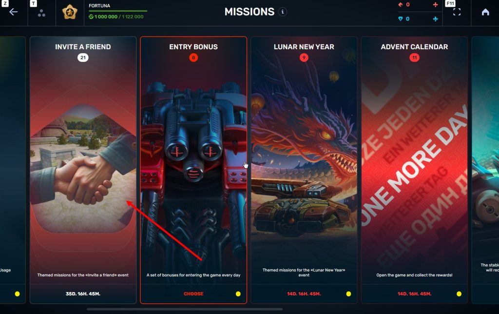
STEP 3 There, you need to open the special «Invite a friend» category of missions.
STEP 4 In that section, you need to generate a special invite promo code.
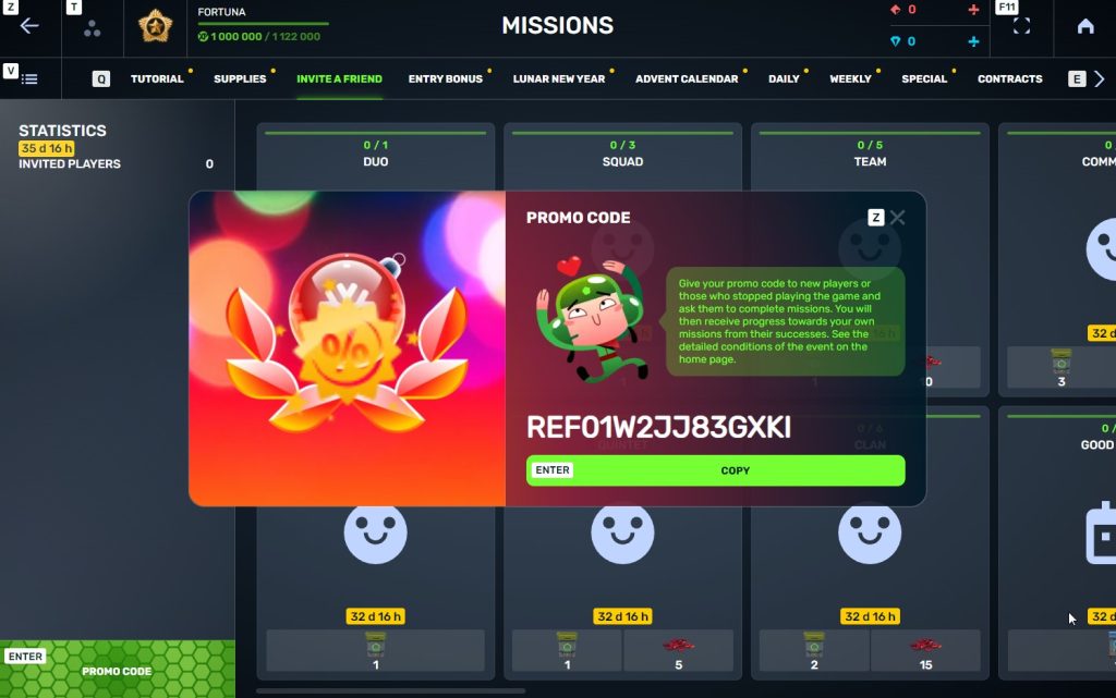
STEP 5 Share this Promocode with people you want to invite to the game and tell them how they can activate it (read below).
IMPORTANT: If you are a player who was invited to the game during this referral event, you cannot generate your own promo code to invite other players.
Who can become your referral
There are two types of players who can become your referrals:
- Players who created their account since January 30th 2 AM.
- Player who last entered the game before November 24th 2 AM UTC.
Pay attention to the fact that in order to activate an invite promo code, a player should have at least Private rank.
Important: A player who generated a promo code to send it to other players cannot activate their own promo code or a Promocode of any other player.
What do I get for inviting players?
- Once you generate your invite promo code, send it to your friends and acquaintances.
- In the special «Invite a friend» category of missions, you will get a set of special missions.
3. Once they activate your promo code, players who have been invited will also get a set of their own special missions in the «Missions from a friend» category. In your «Invite a friend» category you can track how your referrals complete their missions, and thus your missions get completed and you can claim rewards for the efforts of the players you have referred.
Missions for those who invite
There are two types of missions for inviting players. The first type gives you rewards for players who just activated your promo code. The second type gives you rewards once your invited players complete the required missions.
Bonuses for inviting players
Important: An invited player is counted towards mission progress only once they activate your promocode.
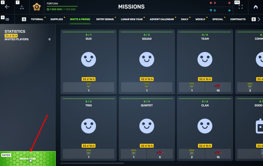
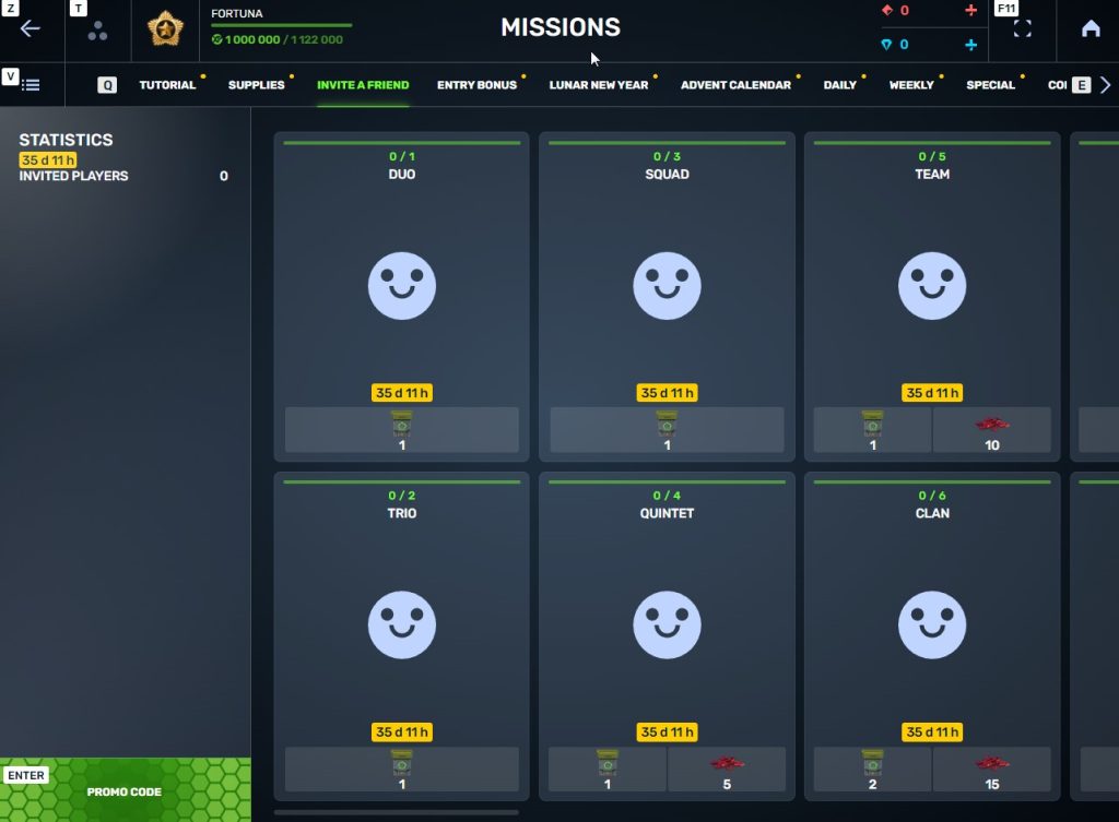
Duo
TASK
Invite 1 player to the game.
REWARD
×1
COMMON KEY
COMMON KEY
×100
EXPERIENCE POINTS
EXPERIENCE POINTS
Trio
TASK
Invite 2 players to the game.
REWARD
×1
COMMON KEY
COMMON KEY
×100
EXPERIENCE POINTS
EXPERIENCE POINTS
Squad
TASK
Invite 3 players to the game.
REWARD
×1
COMMON KEY
COMMON KEY
×100
EXPERIENCE POINTS
EXPERIENCE POINTS
Quintet
TASK
Invite 4 players to the game.
REWARD
×1
COMMON KEY
COMMON KEY
×100
EXPERIENCE POINTS
EXPERIENCE POINTS
×5
RUBY
RUBY
Team
TASK
Invite 5 players to the game.
REWARD
×1
COMMON KEY
COMMON KEY
×100
EXPERIENCE POINTS
EXPERIENCE POINTS
×10
RUBY
RUBY
Clan
TASK
Invite 6 players to the game.
REWARD
×2
COMMON KEY
COMMON KEY
×100
EXPERIENCE POINTS
EXPERIENCE POINTS
×15
RUBY
RUBY
Community
TASK
Invite 7 players to the game.
REWARD
×3
COMMON KEY
COMMON KEY
×100
EXPERIENCE POINTS
EXPERIENCE POINTS
×40
RUBY
RUBY
Bonuses for efforts of your referrals
Important: An invited player is counted towards mission progress only once they activate your promocode and complete the required referral missions.
Good Start
TASK
Invited players completed 10 referral event missions
REWARD
×1
RARE KEY
RARE KEY
×100
EXPERIENCE POINTS
EXPERIENCE POINTS
Makes Progress
TASK
Invited players completed 20 referral event missions
REWARD
×1
RARE KEY
RARE KEY
×100
EXPERIENCE POINTS
EXPERIENCE POINTS
Can Play Together
TASK
Invited players completed 30 referral event missions
REWARD
×1
RARE KEY
RARE KEY
×100
EXPERIENCE POINTS
EXPERIENCE POINTS
×5
RUBY
RUBY
They Trust You
TASK
Invited players completed 40 referral event missions
REWARD
×1
RARE KEY
RARE KEY
×100
EXPERIENCE POINTS
EXPERIENCE POINTS
×10
RUBY
RUBY
Social Butterfly
TASK
Invited players completed 50 referral event missions
REWARD
×1
RARE KEY
RARE KEY
×100
EXPERIENCE POINTS
EXPERIENCE POINTS
×15
RUBY
RUBY
Influencer
TASK
Invited players completed 60 referral event missions
REWARD
×2
RARE KEY
RARE KEY
×100
EXPERIENCE POINTS
EXPERIENCE POINTS
×20
RUBY
RUBY
Celebrity
TASK
Invited players completed 80 referral event missions
REWARD
×3
RARE KEY
RARE KEY
×100
EXPERIENCE POINTS
EXPERIENCE POINTS
×60
RUBY
RUBY
Full Pack
TASK
Invited players completed 1 referral event supermission
REWARD
×1
EPIC KEY
EPIC KEY
×100
EXPERIENCE POINTS
EXPERIENCE POINTS
Aspiring Expert
TASK
Invited players completed 2 referral event supermissions
REWARD
×1
EPIC KEY
EPIC KEY
×100
EXPERIENCE POINTS
EXPERIENCE POINTS
×5
RUBY
RUBY
Forward to Victory
TASK
Invited players completed 3 referral event supermissions
REWARD
×1
EPIC KEY
EPIC KEY
×100
EXPERIENCE POINTS
EXPERIENCE POINTS
×10
RUBY
RUBY
Good Mentor
TASK
Invited players completed 4 referral event supermissions
REWARD
×1
EPIC KEY
EPIC KEY
×100
EXPERIENCE POINTS
EXPERIENCE POINTS
×15
RUBY
RUBY
Thunderstorm of Matchmaking
TASK
Invited players completed 5 referral event supermissions
REWARD
×1
EPIC KEY
EPIC KEY
×100
EXPERIENCE POINTS
EXPERIENCE POINTS
×20
RUBY
RUBY
Preparing for eSports
TASK
Invited players completed 6 referral event supermissions
REWARD
×2
EPIC KEY
EPIC KEY
×100
EXPERIENCE POINTS
EXPERIENCE POINTS
×60
RUBY
RUBY
Professional Referrer
TASK
Invited players completed 7 referral event supermissions
REWARD
×3
EPIC KEY
EPIC KEY
×700
RUBY
RUBY
×1
LEGENDARY KEY
LEGENDARY KEY
How it works for referrals
Once you invite a friend and give them your promo code, your friend should do the following:
STEP 1 Create an account (or log into an existing one, if it meets the criteria)
STEP 2 Get the «Private» rank. It won’t take much time.
STEP 3 Enter the Shop
STEP 4 Go to the «Promocode» section
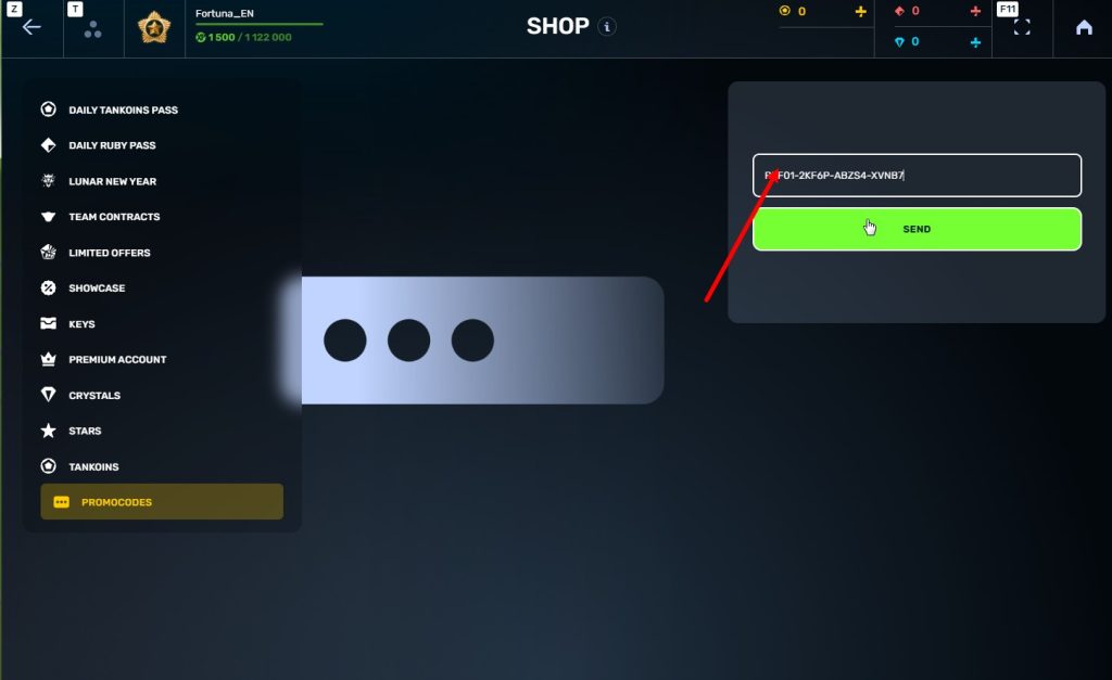
STEp 5 Activate the promo code
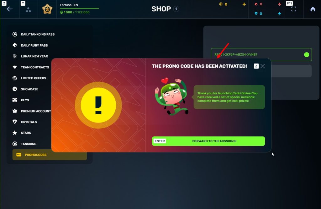
STEP 6 Press the «Forward to the missions!» button
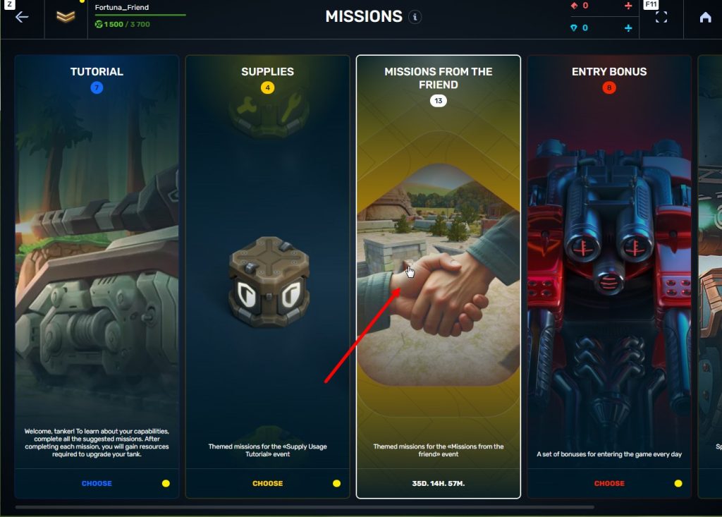
STEP 7 In the Missions menu, there will be a section called «Missions from the friend» with a set of special missions to complete
STEP 8 Complete the missions and claim the rewards
Important: During a referral event, a player can become a referral of only one player (activate only one referral promo code).
Bonuses for referrals for completing missions
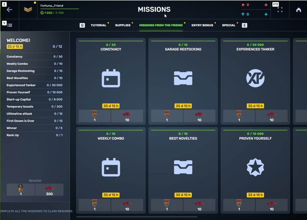
WELCOME!
TASK
Supermission. Complete all referral missions.
REWARD

×1
legendary key
×300
ruby
CONSTANCY
TASK
Complete 30 daily missions.
REWARD

×1
epic key
×100
EXPERIENCE POINTS
EXPERIENCE POINTS
×10
ruby
WEEKLY COMBO
TASK
Complete 15 weekly missions.
REWARD
×1
epic key
×100
EXPERIENCE POINTS
EXPERIENCE POINTS
×10
ruby
GARAGE RESTOCKING
TASK
Open 15 Common Containers
REWARD
×1
epic key
×100
EXPERIENCE POINTS
EXPERIENCE POINTS
×10
ruby
BEST NOVELTIES
TASK
Open 10 Epic Containers.
REWARD
×1
epic key
×100
EXPERIENCE POINTS
EXPERIENCE POINTS
×10
ruby
EXPERIENCED TANKER
TASK
Earn 30 000 experience points.
REWARD
×1
epic key
×100
EXPERIENCE POINTS
EXPERIENCE POINTS
×10
ruby
PROVEN YOURSELF
TASK
Earn 15 000 reputation points.
REWARD
×1
epic key
×100
EXPERIENCE POINTS
EXPERIENCE POINTS
×10
ruby
START-UP CAPITAL
TASK
Earn 10 000 crystals.
REWARD
×1
epic key
×100
EXPERIENCE POINTS
EXPERIENCE POINTS
×10
ruby
TEMPORARY BOOSTS
TASK
Activate supplies 300 times.
REWARD
×1
epic key
×100
EXPERIENCE POINTS
EXPERIENCE POINTS
×10
ruby
ULTIMATIVE ATTACK
TASK
Use overdrive 15 times.
REWARD
×1
epic key
×100
EXPERIENCE POINTS
EXPERIENCE POINTS
×10
ruby
FIRST DOZEN IS OVER
TASK
Finish 20 battles.
REWARD
×1
epic key
×100
EXPERIENCE POINTS
EXPERIENCE POINTS
×10
ruby
WINNER
TASK
Be in the winning team of 5 battles.
REWARD
×1
epic key
×100
EXPERIENCE POINTS
EXPERIENCE POINTS
×10
ruby
RANK UP
TASK
Get a new rank.
REWARD
×1
epic key
×100
EXPERIENCE POINTS
EXPERIENCE POINTS
×10
ruby
You can track the progress of completing missions by your referrals in the «Statistics» column of the «Invite a friend» category in missions.
Invite friends and get rewards!
Tanki Classic mass test

We are officially launching the “Tanki Classic” mass test!
During the test, you will be able to get onto separate “Tanki Classic” test servers, if you have purchased one of the early access special offers.
How to get there?
You can get onto “Tanki Classic” only through the announcement window in the main game lobby.
Attention! There are no other ways to get onto the game. Other sites you see on the Internet are scams and are made to steal your account details. You do not need to enter your password to log into the Tanki Classic test servers. If someone asks for your password to access Tanki Classic, it is definitely a scam. Be careful.
You will only have access if you are an early access participant.
How to get Early Access?
The special Early Access offers for “Tanki Classic” were only available for a limited time. With the start of the mass testing phase, we are bringing these special offers back on sale. This is your chance to become a part of the legendary “Tanki Classic” project ahead of everyone else!
Early Access offers are available from rank 8.
Personalized
×1000
(TO) Rubies

(TO) Bronze medal Tanki Classic
(TC) Nickname reservation
Nostalgia
×3000
(TO) Rubies

(TO) SILVER medal Tanki Classic
(TC) Nickname reservation
(TC) VETERAN PAINT

(TC) EARLY ACCESS

(TC) Voting option
Old School
×10000
(TO) Rubies

(TO) Gold medal Tanki Classic
(TC) Nickname reservation
(TC) VETERAN PAINT
(TC) EARLY ACCESS
(TC) Voting option
×200
(TC) CONTAINERS
What is there in the game?
This is a test version of the game. It is possible to encounter bugs, issues, unfinished features, and anomalies.
During the test, we will restart the game several times and even temporarily pause the testing process.
We will also wipe the test server database several times, which will reset all your progress.
For testing Tanki Classic, we use new server infrastructure. This may cause unstable server performance during the first weeks of testing. We will be configuring and fixing everything.
Is this early access already?
No. Early access will be announced separately, 2 weeks before the game is released. You will be able to get access to the game earlier than anybody else and progress your account earlier than others.
What is the “Development Plans” section on the Tanki Classic website?
Alongside the launch of Tanki Classic testing, we are adding a special “Development Plans” section to the project’s website. From now on, this section will be the primary, first-source of information on the development of the Tanki Classic project.
There, we will announce the key development areas of the project earlier than anywhere else.
Please note: the presented plans reflect our current goals and may be adjusted based on your feedback and voting results.
In the future, we will launch the promised polls for the game mechanics. You, the players, will define the future of “Tanki Classic!”
Feedback can be left on the forum topic of this news.

Recommended Posts
Archived
This topic is now archived and is closed to further replies.