Jump to content
EN
Play

Forum

New Paints: Reviewed


 Share

Message added by Venerable,

This review was one of the Best of the AWS in the year 2018!

Recommended Posts

Jz5WpUB.png

~ Main Image courtesy of @Viking4s

_________________________________________________________________________________________________________________


Top of the mornin' to ya laddies! Welcome to a fairly brief (by my standards mwhaha) review of the inclusion of 23 brand-new paints, 3 of which are additions to the growing range of animated paints. We're going to take a look at each individual paint, rate them in several different ways and then you will get to hear my own personal opinion on each one! (I'm sure you're all desperate to hear them!)


Let's get the ball rolling!


~ Introduction ~


Who doesn't like to decorate their tank in vivid colours? Paints in Tanki stand for a great deal: Some symbol power and authority. Some signal skill and great talent. Others indicate that the wearer is a true veteran of the game. However, many of the game's most beautiful paints are bought and worn to make a statement - a show of wealth in most cases.


S3BONQT.png


The paint you choose to wear does alter other tankers' first impressions of you.


Tanki add new paints fairly regularly to the game (though up until fairly recently the sources of these "new" paints was dubious), and for many years the general trend has been the addition of numerous exclusive paints during special events, either for purchase in the garage or in the shop. July 8th, 2016 saw the introduction of the first ever animated paint into the game - named Flow. Since that date, it has become customary for Tanki to include a special animated paint while a special event is taking place (Nightmare during Halloween, Spectrum on Black Friday, Holiday Lights for New Year etc). Animated paints are one of the biggest staus symbols in the game, with most tankers left looking longingly at the paints and wishing that they had the chance to own them.


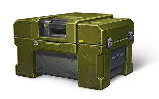
Of course, now they do. With the introduction of containers (which were originally added into the Shop during the Black Friday sales) into Mission Chain rewards and as rare drops instead of Gold Boxes, every tanker has the opportunity to potentially "win" any of these legendary animated paints, providing that they have possess a great deal of luck. It quickly became apparent that the majority of Tanki loved the concept of paints in Containers, so much that it evidently has attracted the Developer team's attention. They clearly saw that there was an opportunity to exploit money gains from containers even more.


On the 26th of January in a surprise announcement, it was made known that even more paints were going to be added as Container rewards only, not in the shop or the garage. 23 new paints in fact, including 3 new animated ones!


~ The Regular Paints ~


We're beginning with the "regular" paints (ie. the ones that aren't animated). There are 20 of these new paints, all only available as container rewards. If you should be lucky enough to recieve one of these paints, they will be heralded by a purple effect. So, if you're container hunting for one of these paints, keep a good look out for vivid flash of purple!


For each of these paints, I will reveal what was their inspiration (Namesake), how original their design is (Originality) and then give you my opinion on whether that particular paint is different from the rest (Will I Stand Out?).


Let us begin!


- Azure -


Paint_Azure.png

gYHadBw.png


Namesake: Azure is a bright blue colour, like a cloudless sky.


The first paint on our list today! Azure is a great name as well as being a beautiful colour in real life. Although the paint preview icon clearly doesn't do this paint justice, you will have to agree with me that the actual paint itself is quite attractive. Though Azure is largely made up of a soothing sky-blue colour, there are greens and yellows subtly meshed into the paint's main blue framework. As paints go, it is definitely not an eyesore and I think the design team have done a good job. The only thing that slightly unsettles me is how similar this paint is to the survival parkour reward paint, Sky.


Originality: I would give it a 7/10 here. Unfortunately, aside from the fact that there are two other light-blue paints in this list, Azure is verging on being a clone of the award paint, Sky.


Will I Stand Out?: Definitely. Apart from the obvious similarities to Sky (meaning you can pretend to be good at parkour like me), Azure really possesses an lovely blend of gentle colours that will render it a sure eyecatcher (for all the right reasons).


- Gucciflage -


Paint_Gucciflage.png


Tfq3acc.png


Namesake: Gucciflage (apparently) is another word for Multicam, which is a type of camouflage used by armed forces across the globe.


Next on the list, we have a paint with a name that surely makes many individuals (including myself) cringe heavily. It sounds like @Hazel-Rah is trying to be modern and is attempting to embrace today's trends, in a fashion not unsimilar to something that your parents would do. Anyway, it turns out that this is not the case. After lengthy research (of course), I found that this paint is actually modelled off a real-life army camouflage pattern, and that Gucciflage in-game is essentially the Russian variant.


The paint itself is actually one of the few paints that can potentially act as a camouflage, because of its design and colour. However, it definitely lacks the bright and heard-turning factor that most rare paints possess.


Originality: I'd give it a solid 8/10 here. I appreciate the fact that Tanki have actually used a real-life camouflage as a design. Its closest paint in regards to looks is Birdwatcher.


Will I Stand Out?: Ermm...No. This paint sadly (unless you're the kind of guy who wants to go unnoticed) is not bright or striking enough to give you any "Wow buyer!?!" messages from the battle chats, which is unfortunate considering its designers seem to have tried fairly hard with it.


- Hallucination -


Paint_Hallucination.png


Gi1aRpY.png


Namesake: A hallucination is an experience that involves the apparent perception of something not present ~ Google


Now we have another paint with a very alluring name. Hallucination unfortunately does not exactly live up to its promising name. As you can see from the pictures, we are presented with another paint that looks as if a bored child has attempted to relieve his boredom by randomly throwing brightly coloured paint around. This is essentially what it is - a random combination of seemingly every possible colour. However, not all is lost. It does look much better than its "parent" paints - Glitch and Disco. However, after the enticing name, the actual product is a bit of a let down in my opinion.


Originality: Hallucination deserves everything it gets. I'd readily give it anything as low as 2/10, because it really is very similar in design and concept to Glitch, and colour-wise Disco is awfully close to this paint.


Will I Stand Out?: Yes, you will. While it is essentially two paints combined, its random arrangement of bright colours still means that you will definitely catch people's attentions if you wear Hallucination. Although theymight not want to look too closely at you - as paints go it really is a bit of an eyesore.


- Hypercube -


Paint_Hypercube.png


02EkHBH.png


Namesake: A hypercube is a geometrical figure in four or more dimensions which is comparable to a cube in three dimensions.


Kudos to Tanki for some really interesting and cool-looking paint names in this update. Hypercube is a great name, and the paint's profile icon seems to promise a lot. And thankfully this time, it does deliver! An actual hypercube looks pretty much nothing like the paint, but that's not always a bad thing. I find the choice of colours for Hypercube pleasant and refreshingly dark, compared to the majority of this update's other paints. The pattern is interesting enough at close range, but as with most paints the detail is pretty undefinable at a distance.


Originality: I reckon this paint deserves a 9/10. Spark is probably the only paint I can think of that looks remotely similar.


Will I Stand Out?:  Yes, to some degree. Though it definitely is not an "Up there, in your face!" kind of paint, Hypercube possesses its own mysterious air with its perculiar pattern.


- Kungur Ice Cave -


Paint_Kungur_Ice_Cave.png


O7oiKnY.png


Namesake: Named after a 5,700m cave network located in Perm, Russia.


The name of this paint sounds vastly overcooked and awkward if you don't know the backstory to it. The actual Kungur Ice Caves are a series of natural cave formations where even during the height of summer they remain locked in a permanent winter. These caves are renowned for their ice formations, and once you know how this paint got its name, it all makes perfect sense. The intricate pattern of many meshed triangles works very nicely, especially when coupled with the icy whites and blues that this paint has. A really nice paint and one of the best in this update.


Originality: Solid 8/10 is well-deserved here. I love the fact that the Developers have been inspired by something fairly local and transformed a famous tourist attraction into a memorable and striking paint. It's closest match colour-wise would probably be Paisley Ice, another paint added in this update. However, since Potter uses the same pattern, it's never going to be a one-of-a-kind paint.


Will I Stand Out?: Of course! You definitely will not be short of jealous onlookers while wearing this! A simply beautiful paint for me, both in design and colour choice.


- Lollipop -


Paint_Lollipop.png


6re9WKe.png


Namesake: Brightly coloured pieces of confectionary.


Moving on, we come to another paint which, like Gucciflage, does not particularly feel like a rare or shop paint at all. To begin with, it looks nothing like what I envision a lollipop should appear like. The pattern of coloured straight lines really doesn't work all that well in my opinion. It reminds me too much of the paint Barber Shop, and I can't say I'm a fan. Even its owner (in the picture above) and my friend who was present were mocking the paint for its ugliness. I think it might have worked better with a different colour scheme, but the one chosen definitely does nothing to redeem this paint.


Originality: It is still going to earn a 7/10 here, simply because there are not many paints that look similar, with the exception of Barber Shop.


Will I Stand Out?: In my opinion, No. An uninspiring pattern and pretty poor colour selection really don't do anything for Lollipop. Besides, the name itself is not particularly interesting.


- Lotus -


Paint_Lotus.png


QWvLoS8.png


Namesake: A sacred flower in Asian art and religion.


Another intresting paint! Lotus is named after a type of flower that grows in shallow water and is held as a sacred object by both Hindus and Buddhists. The flower itself is a beautiful work of nature, with colours of brilliant white and pink. I think Tanki's representation of this flower does it full justice. The paintjob is not symmetrical, meaning that one side of your tank will be light blue while the other will be white, but I like this. As well as the white and pink found on the actual Lotus flower, the Designer team have added various shades of blue, possibly to symbolise the water that the flower grows in (I might be drifting off into a complete misinterpretation here).


Originality: 10/10 for originality. There are no paints that come close to this one in terms of design or colour. A truly great job!


Will I Stand Out?: Yes. An eye-catching and alluring colour selection and an interesting design means that one will never be bored at looking at you that sounded kinda wrong.


- Monet -


Paint_Monet.png


qfxm4UA.png


Namesake: The French artist Claude Monet.


We've had a Picasso paint and now we have a Monet paint. Claude Monet's famous paintings and his method called "Impressionism" have left their mark on the world, so will a paint named after him do the same in Tanki? Well, I'm not totally sure. The paint itself either looks as if it has been well-thought out and is an impression, exactly like something Monet would do; or it just looks like someone has thrown a load of different colours around. It is similar to Azure in its layout, though it uses darker colours where Azure uses light. Also, Azure is dominated by a sky-blue colour, whereas although this paint is still predominantly a reddish pink, it allows for the other colours to come through more.


Originality: 6/10. An interesting idea, but the paint itself is nothing special. Its owner remarked on how boring it looks, and I dare say I agree with him.


Will I Stand Out?: Yes, to some degree. Even though the paint itself is relatively unappealing, I think that because there are still comparatively few paints in this colour, you will still be stand out from the crowd if you wear Monet.


- Paisley Flame and Paisley Ice-


Paint_Paisley_Flame.pngPaint_Paisley_Ice.png


2JEOhwg.png


Namesake: Named after a teardrop-shaped motif of Persian origin, but its English name comes from a place called Paisley, where these designs were manufactured.


Two paints in one! Both of these paints are based around the same pattern, which is taken from an ancient Middle-Eastern design that was popularised in the 18th and 19th centuries when full-scale manufacturing of textiles began to take off. For both of these in-game paints the base pattern is the same - the same symbol repeated in various sizes over the entire paint. However, one paint is bright red while the other is a cold blue. Hence the difference names (duh).


Both paints are interesting at close range, but the further away you go the more Paisley Flame begins to look suspiciously like Sweater. Paisley Ice still looks fairly original from further away, mainly because light-blue paints are still few and far between.


Originality: 10/10 for inspiration. The design is also really neat and well-thought out. However, I wish that another background colour had been chosen for the Flame paint, or that the special pattern had been highlighted more.


Will I Stand Out?: Definitely. Both paints will help you stand out from your peers, though the Ice paint will probably do so to a greater extent. This is because, as mentioned earlier, there are paints such as Sweater that are similar to Paisley Flame.


- Peaks -


Paint_Peaks.png


DdtjYcf.png


Namesake: Debatable. Could either be another word for "spikes" or "thorns" or (as I originally assumed), a mountain range.


Once again, we find another paint that could easily be mistaken for a garage paint. Peaks has a fairly drab appearance, made up of dull greens, reds and blacks. The pattern is similar to Birdwatcher's pattern, though far more defined (which is obviously what you want). The colour scheme could be made better if brighter versions of the different colours were used, but the shades used are not quite right in my opinion. If the colours were reworked, I think this could be a great paint.


Originality: Even though I'm certainly not a fan of this paint, it still deserves an 8/10 because there are few paints that will appear similar.


Will I Stand Out?: No. Although the pattern is neat and full of interest, the whole paint just feels a little deflated by the colours that were chosen to accompany this pattern.


- Phantom -


Paint_Phantom.png


p8eU7zd.png


Namesake: The misty, translucent shade of ghosts.


Ever wanted to wear a paint that made you feel exactly like a ghost? Well, sorry to disappoint, but despite the name, Phantom definitely isn't the paint for you. There's so much promise in the name of this paint, yet the actual item itself does not particularly resemble what the box label promises. As you can clearly see by the picture above, you might not have expected a paint called Phantom to appear in the game in that fashion or with that design. The tiny black rhombuses on a grey background aren't actually all that bad, though of course in the light of the name the design is a let down. Even the owners of this paint called it a "meh paint".


Originality: 8/10. Aside from the colouring, which is nearly identical to that found on Vanadium and Liquid Metal, it is the design that sets it apart.


Will I Stand Out?: Yes, to a certain extent. From fairly close up your paint will be unique enough to "draw in the crowds". From further away though, your paint will begin to look less attractive and more and more like a variant of Metallic.


- Play-Doh -


Paint_Play_Doh.png


luUjnNs.png


Namesake: A child's modelling clay that can be obtained in various colours and molded into different shapes.


Play-doh was an fun way to pass time when I was younger. The only problem I had with it was mixing the colours, because once you mixed them you could never separate them again and eventually you'd just end up with a grey mess. This paint has been designed to represent Play-doh in that "mixing stage" where the colours form an interesting collage that can actually be quite attractive. The previous paint we looked at, Peaks, would have looked much better (in my opinion) with colours similar to this. The only issue I have with this paint is the clumsiness of the design - I'm not usually a fan of a chaotic-looking paint.


Originality: I'll readily give it a 9/10. The inspiration is original and there are few paints which look remotely similar.


Will I Stand Out?: Arise Play-doh lovers! Yes, Play-doh is a bright paint with a crazy design - perfect for raising other tankers' eyebrows!


- Pop Art -


Paint_Pop_Art.png


i4S4uBw.png


Namesake: An art movement that emerged during the 1950s.


The pop art movement was a sort of rebellion (if you like) against existing fine art, where the artists included images from advertising, comic books or popular cultural objects. In pop art, the materials used are often completely unrelated to the meaning or message of the work. Pop art in most cases (in my opinion) was and is a joke, and was the beginning of the end which has eventually spiraled into modern art, which is an utter farce. Pop art is apparently labled as "Abstract Impressionism".


Anyway, the paint in Tanki online will trigger a strong sense of déjà vu in owners of the paint Retina (me being one of them) or Harlequin. The pattern and the colours used are suspiciously similar on all three paints. People used to complain that Harelquin and Retina were too similar, and now we have a third paint to annoy them further!


Originality: I'm giving it a 4/10, simply because it is far too similar to two paints that were already mistaken for one another. The name and inspiration is good, but not the paint itself. I think, considering the huge scope for creating something related to Pop art, the Designer team could thought a bit harder and come up with something different.


Will I Stand Out?:  Yes, you will. Even though it "feels like a copy of Retina" (in the words of the player who let me photograph him), it is still a striking enough paint to do the job. Just don't be too surprised or offended if people ask you why you're so obsessed with Harlequin paint.


- Potter -


Paint_Potter.png


l42sxeB.png


Namesake: A potter is a person who makes ceramic ware (pottery).


Probably inspired by clay-formed pottery (which is a similar reddish-brown colour to the paint), this paint is one of the first brown paints that actually looks half decent. Does the pattern on this paint look vaguely familiar? That's because it is. Potter and Kungur Ice Cave paints utilise exactly the same design, though obviously they are coloured differently. Though I prefer the range of icy blues used on Kungur Ice Cave, the colouring on Potter is also rather attractive. The triangles of different shades of brown and red look really good, though from a distance it does look quite similar to Masters of Parkour Paint 2015.


Originality: 7/10. It does remind me of MoP 2015, and obviously the pattern is identical to that of Kungur Ice Cave, so this means Potter is not exactly the most original paint out there.


Will I Stand Out?: Yes, you will. Even though Potter uses reasonably dull shades of colour, the overall reddish-bronze tone is sure to attract attention, especially if people wrongly mistake it for MoP 2015!


- Pulsar -


Paint_Pulsar.png


TuIHJSD.png


Namesake: A pulsar is a highly magnetized, rotating neutron star or white dwarf, that emits a beam of electromagnetic radiation.


You know, I had no clue as to the meaning of the word "pulsar" before I this article. Now I feel very much enlightened in the sense that I can see why the Tanki paint is named as such. The paint is supposed to represent exactly what I've put as its namesake (I think the white is supposed to be the star, the dark blue is Space and the red section is the emitted radiation). A truly impressive name is not let down by the Designer team, who appear to have done an exceptionally good job on this paint. I think some tankers will call it ugly, but I for one think it is very beautiful.


Originality: 10/10 for sure! There are no paints that resemble this in any way, shape or form. The design is completely original.


Will I Stand Out?: Yes, you will. Pulsar is a one-of-a-kind paint, a triumph for the Designer team (who seem to have finally discovered that Google Images isn't the way forward). Envious eyes will always be on you if you wear Pulsar!


- Ripple -


Paint_Ripple.png

eu87uL6.png


Namesake: I think it's supposed to be inspired by the ripple effect you see in water, but to be honest it's a bit of a mystery.


This was the last paint I tracked down and photographed for this article! Because the Tanki Wiki had not been updated, I spent ages wandering aimlessly around parkour maps hoping to find someone wearing one of these new paints. So far, I've only found one person with Ripple - this paint.


The name is interesting because I don't think the paint looks anything like the name suggests. I would never have guessed it was named Ripple simply by looking at it and I originally thought it could be called Honeycomb, since the colour reminded me of honey and the pattern of hexagons reminded me of the comb in which bees store their honey.


Anyway, enough biology. If you try hard enough you can just about imagine the the pattern being a kind of ripple effect, but in all honesty I don't think the paint and the name go together. However, the paint is both interesting and unique. Clearly someone has put some effort into designing it.


Originality: 10/10 for originality. There are no paints which look anything like it, and although the name/paint combination is dubious, the paint's design more than makes up for it.


Will I Stand Out?: 100%! The lovely golden glow from Ripple is unrivaled among the other paints in this game. Wearers of Ripple will be like small golden beacons of light, spreading hope and freedom across the galaxy.


- Sillicate -


Paint_Sillicate.png


qxEJjbx.png


Namesake: Sillicate minerals make up 90% of the Earth's crust. They are minerals such as Quartz or Mica.


Interesting name, interesting paint. The name has a nice sound but since it can literally mean almost eany type of mineral under the sun there isn't really anything to compare this paint to. However, there are existing paints that we can check out and make a comparison.


First of all, I assumed it was the paint Domino before closer inspection (and I mean, much closer) revealed that this was neither the standard Holiday paint nor Domino itself. The colour scheme has already been used for one shop paint in Tanki already, so using it again makes little sense. Especially as the pattern is very close to that of Domino's as well.


Originality: 2/10. Looks like the Designer team simply have copy/pasted Domino paint before scaling the pattern down a bit and then tacking a new name on. It's a nice paint, don't get me wrong. We've just seen it before, that's all.


Will I Stand Out?: Yes, you will to a certain extent. However, many people might (like I did) wrongly assume that you are wearing the other shop paint Domino or even the free Holiday paint. Not exactly what you want to hear when you've spend goodness-only-knows how much money on containers to get a new paint.


- Sudoku -


Paint_Sudoku.png

k0LheGk.png


Namesake: Inspired by the squared grid of a very popular puzzle game.


Sudoku is a logic-based number-placement puzzle in which the objective is to fill a 9x9 squared grid with certain number digits. French newspaper originally featured this puzzle in some of their publishings during the 19th century, but the game was only popularised by a Japanese company in the 1980s, who gave it its current name.


The Tanki paint sports a lot of different colours, so much that it almost looks like a squared rainbow. Of course, regular Sudoku does not have coloured squares, it is simply printed in black and white. I personally think that Tanki's colour selection works, but I'm not sure that the name quite suits it.


Originality: 8/10. The pattern is certainly original. The colour selection is fine in itself, but paints with many varying colours do end up being slightly repetitive.


Will I Stand Out?: The answer in this case is Yes. The uniform pattern and colourful details are hard not to notice.


- Zigzag -


Paint_Zigzag.png


Yh2OVZZ.png


Namesake: A jagged line that moves between two parallel lines, changing direction at varying angles.


The last regular paint in this article! And we end on a bang! Zigzag has a striking pattern of crooked dark-blue lines which meander across the surface of the paint, passing through different background colours along the way, including whites, blues and flourescent yellows. It's the paint I wish Graffiti was, because it looks far more appealing. Graffiti is far too dull in my opinion and could really use an injection of bright colours.


Originality: A solid 9/10 is well-deserved. A fitting name, a great pattern and an interesting colour scheme. A wonderful effort overall!


Will I Stand Out?: Of course! Zigzag has all the requirements for a stand-out paint. Graffitti is the only paint that looks remotely similar to this, and even that looks virtually nothing like it.


~ The Animated Paints ~


And now we have reached the three special paints that were also introduced. These paints are all animated in their own particular way, for example Spectrum's colour changing ability or Holiday Lights' flashing fairy lights pattern. These three paints are only available as a "Legendary" container reward, meaning that they are not only extremely rare but also that they are heralded by a lovely rosy red effect if you are lucky enough to recieve one in a container.


Here, as with the regular paints above, we will look at the paint's inspiration (Namesake), how novel it is (Originality) but obviously because all animated paints stand out, me and three others are going to give a rating out of 10 for each of the three paints.


Let's take a look!


- Matrix -


Paint_Matrix.png


2KdZGeg.png


giphy.gif


Namesake: Based of the code (digital rain) in a famous film titled "The Matrix".


"The Matrix" is a sci-fi film, with the original being produced in 1999 and its two sequels released in 2003. All three movies open with a falling green digital rain, and this new paint recreats that in Tanki Online. The small moving green dots represent the Matrix code, moving across a black background. It's a great idea for a paint, an awesome name and a truly perfect representation of the Matrix code. After the disappointing Holiday Lights and the love-or-hate Nightmare, Matrix is a success with a design that rivals even Synesthesia and Flow.


Originality: A sure 10/10 here. Matrix has (as most animated paints have) an original design and it is a definite one-of-a-kind. With its interesting nature as well as the unique colour scheme, it's no wonder that Matrix is the most-sought after of the new paints.


Overall Rating ~ Feat. Forum Mods: We (me and the Forum nugs) generally agree that Matrix is a truly wonderful paint and is well-worth opening thousands of containers for it (though @Hate is a bit off the radar with his answer, I think he's a bit jealous of Matrix personally).


@Coldplay: 9/10

@Maf: 8/10

@Hate: 6/10

@Ninja: 10/10


- Mosaic -


Paint_Mosaic.png


cStJr3a.png


giphy.gif


Namesake: A mosaic is a piece of art or image made from the assemblage of small pieces of colored glass, stone, or other materials.


The second of this update's animated paints. Mosaic is inspired from a type of art that has been around for thousands of years, with mosaics dating back to the 4th century BC having been uncovered in Macedonia, made of pebbles. Mosaic art evolved over the next few centuries until by Roman times tiny 3 millimetre cubes were being used to form these images - a method which remained in use for the next thousand years.


The paint in Tanki Online is a bit uninspiring compared to the scope opened up by the name "Mosaic". It reminds me of a moving tablecloth, though that is my opinion. Also, the tiny moving shapes aren't squares; they're rhombuses. I think the best part about this paint is the way in which it is animated, because the way the shapes move is unique and quite fascinating.


Originality: Whatever I might think, it still achieves a 10/10 with ease. There are no paints that resemble Mosaic in any way, shape or form.


Overall Rating ~ Feat. Forum Mods: Though some of us thought more highly of it than others, generally we all conclude that Mosaic isn't as nice a paint as Matrix (even @Hate agreed this time).


@Coldplay: 6/10

@Maf: 7/10

@Hate: 7/10

@Ninja: 7/10


- Vertigo -


Paint_Vertigo.png


wGWJ4dN.png


giphy.gif


Namesake: An extreme form of dizziness.


And now (at long last), we have reached the final paint out of the 23 introduced in the update. We end with a paint named after a medical condition, which I think is a new thing (Love isn't exactly a medical condition). Vertigo is a when a person has a sense that his or her surroundings are spinning, causing an extreme feeling of dizziness. It is apparently caused by a lack of balance within the inner ear.


Anyways, what does the paint look like in the game? Not brilliant, if I'm completely honest. it is essentially just a plain white paint. Now, that might be fine if it wasn't for the fact that the paint White is not only very similar from anything other than close up, it's also one of the cheapest paints in the game. The pattern is actually very appealing and interesting, but it isn't well-defined at all and barely visible.


Originality: 5/10. The idea is well-formed, but the end product just isn't particularly original. It looks far too like  the standard White paint, which is not ideal if you've spent 100s of £s to be rewarded with a hyped White paint.


Overall Ratings ~ Feat. Forum Mods: "It looks boring" was one of the Mod's responses. And to tell you the truth, he's quite correct. Vertigo is simply not well-designed enough to be anything other than a detailed White paint - clearly not worth opening as many containers for as it is for Matrix.


@Coldplay: 4/10

@Maf: 3/10

@Hate: 7/10

@Ninja: 6/10


~ Special Bonus Paint: Synesthesia ~


preview.png


z4qnaJQ.png


You can see the how Synesthesia is animated by following this link.


Namesake: A condition in which one sense (for example, hearing) is simultaneously perceived as if by one or more additional senses such as sight. Therefore, synesthesia literally means "joined perception."


Just when you thought I couldn't make this article any longer, it turns out I actually can! We have covered all of the paints included in the last update, but now we look even further back to another special paint that appeared in the game, without announcement or any forewarning, during the New Year 2017-18 event. According to a special page, Synesthesia was actually introduced into the game (or rather, introduced as a container reward) on the 24th of December 2017, making it the 4th animated paint in the game and the first container-exclusive paint (a sort of herald perhaps for the 23 paints also covered in this article). Synesthesia, like all animated paints, is a "Legendary" container reward, meaning that it is an extremely rare occurance to actually "win" this paint.


UIOzBr4.png


You have to have an extreme amount of good luck to get this.


In reality, what actually is Synesthesia? As mentioned above, it is a real-life condition where a certain random response is activated in the affected person when a specific trigger appears. For example, if you are looking at a snow-covered hillside and suddenly taste apples or if you are convinced that the word "Plane" is mint-green, then you have synesthesia. 


After looking into this, the strange message that Synesthesia owners can reach (we'll come onto that in a minute) makes a lot more sense - "Do you know how a shot from a Railgun tastes like?" for example. I didn't know what synesthesia actually was, but now (after an elightening search on the internet) I know that the creators of the Synesthesia page actually weren't simply writing down whatever words came into their head first.


The paint in the game is truly beautiful. It reminds me of oil patterns swirling on water in a smooth and mesmerising manner. A wonderful blend of interesting colours, drifting and flowing gently on the wearer's tank. Definitely one of the best paints that the Tanki designer team have ever come up with. Incredibly unique.


- The Synesthesia Code -


Do you know how a shot from a Railgun tastes like? Did you listen to the «Flow» paint? How the flag captured in the last moments of battle smells? What Gold Box feels like to the touch? Only those who keep the gates of senses wide open deserve to transcend their discoveries. Synesthesia is a gift and a curse, alpha and omega, anomaly in the system. The rivers of eternity wash away meaning and delude reality. Tank is a sword, ego, power of will. It's Synesthesia.


~ The message which formed The Synesthesia Code


On the very same day that the paint was introduced, a mysterious weblink began to be seen circulating around the in-game chats and on this very Forum. A new topic was started here, where the intriguing link was discussed and mused over. Players attempted to find the page's password by unscrambling the bold letters that were inserted into the text at various intervals, mainly because everyone believed that they too would receive this wonderful new paint if they were quick and clever enough to solve the code. After several forum pages, a kindly individual posted a screenshot of Synesthesia's garage description, showing where the original "Synesthesia Code" link had come from.


Eventually, after several weeks of fruitless effort to work out the code, several determined and inspired tankers finally managed to crack it. To the disappointment and enragement of many people (once the answer was made public), completing the code did not provide them with a special paint. Instead, they found themselves on a secret page about Synesthesia. A rumour started on the topic let me (and many other tankers) to believe that you recieved 20 of each supply for entering your nickname on the Synesthesia page, but this has turned out to be false.


kU1kKFx.png


An interesting list of facts connected to Synesthesia which come to light when the code is solved.


The Head Developer, Semyon Strizhak, seemed to find the vast amount of time needed for the EN Community to crack the code rather amusing.


D9IwHSd.png


~ Final Thoughts ~


Well well! That er...appears to be the end of my article. Sorry for having to put you through so much torment - I really do need to shorten the length of my pieces - I'm giving you overdoses of detail all the time. Can't be good for you! :D


Designing and adding new paints into the game does start to get more of a challenge as the artists begin to have to "think outside the box" a little more, but the majority of these paints that I've reviewed here have been full of character and not simply "Google Images" designs.


Special thanks to @N-A-H, , , @Lost-Legacy, , and @Porsche for allowing me to take pictures of the special paints that they own.


Many thanks to @Hate, @Maf and @Ninja for assisting me.


__________________________________________________________________________________________


Nope I lied. It wasn't brief at all. Thanks for reading! Stay tuned for more articles in the future!


2Dc81NL.png

Edited by Savage
  • Like 32

Share this post


Link to post
Share on other sites

Accepted.


Great piece. Brilliant analysis on each paint (still didn't like the fact that you didn't take .png files though). The wording, expression, formatting and structure was flawless. My only critique is your editing of the images. If you edited those images a bit more appropriately, this would be pretty much flawless. Only a couple of grammar edits were made. Well done!

  • Like 6

Share this post


Link to post
Share on other sites

(still didn't like the fact that you didn't take .png files though).

Yeah, need to change that.


Thanks though!

Share this post


Link to post
Share on other sites

Instead, they found themselves on a secret page about Synesthesia that also left them with 20 of each supply (excluding Gold Boxes) if they entered their nickname into a box. 

Sorry Coldplay, but I made that up  :ph34r:, nobody with 5k of supplies will notice 20 additional supplies. So I cannot confirm or infirm this rumour I started. If any rewards are associated with this riddle it should be more than 20 supplies and even could involve GB supplies. I did received 3 GB supplies about the same time I entered the Synesthesia code, however I also did something good to the community the same week. Therefore I can't tell which reason triggered the 3 GB supplies.


This article should have been added to the Newspaper.


Hazel is a noob, @Ninja cracked it quickly. It's just the EN community more interested of finding the answer by themselves rather than being told. So well done to those who keep the answer for that long.

Edited by Viking4s
  • Like 3

Share this post


Link to post
Share on other sites

Sorry Coldplay, but I made that up  :ph34r:, nobody with 5k of supplies will notice 20 additional supplies.

Ah whoops.


I've been deceived!


Edit: Fixed my article to remove false information.

Edited by Savage
  • Like 2

Share this post


Link to post
Share on other sites

Ah whoops.

I've been deceived!

Edit: Fixed my article to remove false information.

I can't believe people thought that 20 supplies of each was for real. I'm really bad at making funny stuff and jokes business :/

I don't want to start another rumour, but I think the reward for finding the code was actually 3 GB supplies.  ;)  


Let's wait for the wiki to update (one day) the wiki about the whole affair. 

Edited by Viking4s

Share this post


Link to post
Share on other sites

Wonderful job, extremely well written and quite beautifully structured!


I would love to get some of the paints like Pulsar, Potter and Ice Cave

  • Like 1

Share this post


Link to post
Share on other sites

Very informing and well written. Would love to get almost any of these paints, but the last 10 containers I have opened had supplies.

I think I saw someone with Matrix the other day, looks very good.


Congrats on making to Legend rank, as well.

  • Like 1

Share this post


Link to post
Share on other sites

I personally love the new addition to the garage. All the paints are starting to get boring and these new paints look really nice. I have gotten Vertigo, Sudoku and Pulsar and love all 3!! I just have a question on one of my containers it turned orange as it would normally for an animated paint but I got Red Suit out of it.. -.-  :angry:  :(  :huh: Why is this?

Look in the wiki regarding the colour and the items: https://en.tankiwiki.com/Containers

Orange glow from the container indicate a Legendary paint or an Animated paint:

The draw give one of the item, and depending of the item you will have the associated glow. It's not the opposite.


If you want to learn more about the odds of each item in the containers have a look there Containers Mission Rewards - Results & Discussion

Share this post


Link to post
Share on other sites

 Share

×
×
  • Create New...