 Jump to content
Halloween 2025
1/8
Tanki Online V-LOG: Episode 536
2/8
Parkour Survival 2025: Extended Deadline for Challenge 7 and Early Conclusion of the Tournament
3/8
Invite a friend #4
4/8
Play on your main account on Nintendo Switch™!
5/8
Winter Major Rankings III 2025
6/8
Tanki Online V-LOG: Episode 535
7/8
Parkour Survival 2025
8/8


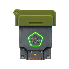
Halloween 2025
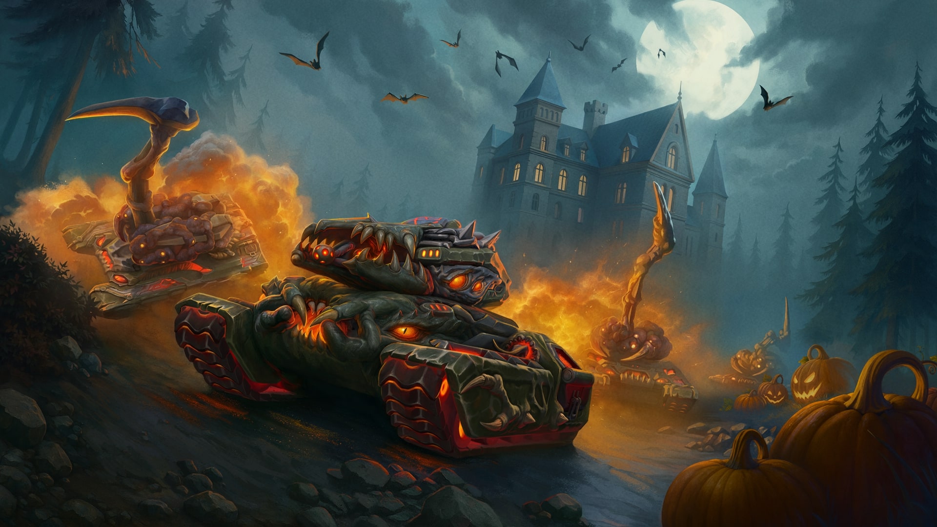
Halloween is already knocking at our doors! And starting tomorrow, the spooky fun begins in Tanki!
To make the holiday atmosphere even more mysterious and mystical, a host of activities await you in the game: cool Zombie and Legendary Gold Rush modes, a lucrative 30% discount, zombie bots, updated Epic Containers with Demonic skins for Shaft and Viking, Gift Calendar, new Elite Pass with a Legendary Key and Pumpkin Grenades as rewards, Pumpkin gold boxes, numerous festive missions with valuable prizes, and eerie holiday decorations.
Event dates: October 17th 2 AM — November 7th 2 AM UTC
Pumpkin Grenade

Pumpkin Grenade
This is a unique holiday grenade. It deals chaos damage to all enemy tanks within a certain blast radius, and applies the «Burning» status effect to them for 10 seconds.
In this event, you will be able to get the Pumpkin Grenade on your account!
Bots
For the duration of the holiday, all bots in matchmaking battles will be equipped with the «B0-NK» sledgehammer!
Now it won’t be difficult at all to tell them apart from real players!
Discounts
Take advantage of the great discounts from October 17th to October 20th.
All discounts start and end with the server restart at 2 AM UTC.
For 3 whole days, you will be able to obtain the following items with a 30% discount:
-30%
Shop (17.10 — 20.10)
Crystals

Stars
Early Access Items
Premium Pass
-30%
Garage (17.10 — 20.10)
Augments
Supplies
Paints
Drones
Modules
Grenades
-30%
Upgrades (17.10 — 20.10)
Special event modes
During the event, we’ve prepared two terrifying modes for you. The zombies are waiting!
Important: Boosted battle funds and experience points are only active within the festive weekend game modes.
Each mode starts and ends with the server restart at 2 AM UTC.
SPECIAL MODE
ZOMBIE
October 17th — October 20th
Mode
JGR
Turret
Claw
Hull
Viking
Bonus Boxes
Upgrades
Augments
Gold Boxes
Equipment Change
Overdrives
Supplies
Nuclear Energy
Smart Supplies
Drones
Protection Modules
Groups
Grenades
More Gold Boxes
The only survivor is a Juggernaut super tank with powerful weapon parameters to fend off the hoard of zombies equipped with a claw that can effortlessly break through any armor, even that of the toughest tank in the game. But beware of rockets carrying gold boxes, for they are weapons of mass destruction!
- Halloween 1
And in this mode, instead of regular gold boxes, devastating rockets will fall from the sky.
SPECIAL MODE
LEGENDARY GOLD RUSH
October 20th — November 3rd
Mode
DM
Turret
Any
Hull
Any
Bonus Boxes
Upgrades
Augments
Gold Boxes
Equipment Change
Overdrives
Supplies
Nuclear Energy
Smart Supplies
Drones
Protection Modules
Groups
Grenades
More Gold Boxes
Deathmatch. Everyone wants to catch as many gold boxes as possible, risking being left without any loot in a fight with other players.
- Halloween
- Sandbox Halloween
- Sandal Halloween
Special offers
What’s any holiday without some great deals at awesome prices?
October 17th — November 3rd:

October 17th — November 7th:
Daily Ruby Pass
×500
TANKOINS*

×4500
RUBIES**
500 Tankoins instantly.
** For 30 days, each day the player can access a pre-completed mission upon logging in, from which they can claim a reward of 150 Rubies.
** For 30 days, each day the player can access a pre-completed mission upon logging in, from which they can claim a reward of 150 Rubies.
PURCHASE

October 24th — November 7th
Pound of Flesh

×20
EPIC KEY

×4
PREMIUM PASS

×1
RARE KEY
October 31st — November 7th

Epic Containers
Treat yourself with the updated content of Epic Containers!
- SKIN Shaft Demonic
- SKIN Viking Demonic
- Shaft’s «Stellarator» augment
- Scorpion’s «Missile launcher «Tornado» augment
- Ricochet’s «Berserk» augment
- Viking’s «Excelsior» augment
- Viking’s «Driver» augment
- And everything you can get from Common Containers
Special Missions
We have prepared a plethora of exciting missions which will make the event more exciting!
Your progress in completing missions is only counted from the moment you first enter the “Missions” screen after the event begins.
Missions follow the Encore system, with the second set of missions appearing only after the first set is completed.
SPECIAL
Part 1. October 17th — October 24th
Part 2. October 24th — October 31st
Part 3. October 31st — November 7th
PRINCE OF DARKNESS. PART 1
TASK
Be in the winning team of 1 battle in any matchmaking battles.
IMPORTANT: The mission is only available for «Premium Pass» owners.
REWARD
×1
EPIC KEY
EPIC KEY
BLOODY MARK. PART 1
TASK
Finish 3 battles in any matchmaking battles.
IMPORTANT: The mission is only available for «Battle Pass» owners.
REWARD
×1
EPIC KEY
EPIC KEY
RITUAL. PART 1
TASK
Earn 500 reputation points in the festive «Zombie» mode.
REWARD
×1
EPIC KEY
EPIC KEY
PRINCE OF DARKNESS. PART 2
TASK
Be in the winning team of 1 battle in any matchmaking battles.
IMPORTANT: The mission is only available for «Premium Pass» owners.
REWARD
×1
EPIC KEY
EPIC KEY
BLOODY MARK. PART 2
TASK
Finish 3 battles in any matchmaking battles.
IMPORTANT: The mission is only available for «Battle Pass» owners.
REWARD
×1
EPIC KEY
EPIC KEY
RITUAL. PART 2
TASK
Earn 500 reputation points in the festive «Legendary gold rush» mode.
REWARD
×1
EPIC KEY
EPIC KEY
PRINCE OF DARKNESS. PART 3
TASK
Be in the winning team of 1 battle in any matchmaking battles.
IMPORTANT: The mission is only available for «Premium Pass» owners.
REWARD
×1
EPIC KEY
EPIC KEY
BLOODY MARK. PART 3
TASK
Finish 3 battles in any matchmaking battles.
IMPORTANT: The mission is only available for «Battle Pass» owners.
REWARD
×1
EPIC KEY
EPIC KEY
RITUAL. PART 3
TASK
Earn 500 reputation points in the festive «Legendary gold rush» mode.
REWARD
×1
EPIC KEY
EPIC KEY
SET 1
Set 1. October 17th — November 7th
SUPERMISSION: INITIATION! PART 1
TASK
Complete «Awakening. Part 1», «Bad Reputation. Part 1», «Purgatory. Part 1», «Desperation. Part 1», «Walking Dead. Part 1», «Final Wish. Part 1», «Cemetery Plot», «Charm», «Death Experience», «Bloody Diamonds» and «The Last Surprise» missions.
REWARD
×5
EPIC KEY
EPIC KEY
×1
RARE KEY
RARE KEY
×1000
EXPERIENCE POINTS
EXPERIENCE POINTS
AWAKENING. PART 1
TASK
Enter the game at least once.
REWARD
×1
COMMON KEY
COMMON KEY
×100
EXPERIENCE POINTS
EXPERIENCE POINTS
BAD REPUTATION. PART 1
TASK
Earn 5000 reputation points in any matchmaking battles.
REWARD
×1
COMMON KEY
COMMON KEY
×100
EXPERIENCE POINTS
EXPERIENCE POINTS
PURGATORY. PART 1
TASK
Earn 3000 reputation points in Quick Battle mode in any matchmaking battles.
REWARD
×1
COMMON KEY
COMMON KEY
×100
EXPERIENCE POINTS
EXPERIENCE POINTS
DESPERATION. PART 1
TASK
Finish 10 battles in any matchmaking battles.
REWARD
×1
COMMON KEY
COMMON KEY
×100
EXPERIENCE POINTS
EXPERIENCE POINTS
WALKING DEAD. PART 1
TASK
Be in the winning team of 2 battles in any matchmaking battles.
REWARD
×1
COMMON KEY
COMMON KEY
×100
EXPERIENCE POINTS
EXPERIENCE POINTS
FINAL WISH. PART 1
TASK
Make any purchase in the game’s Shop.
REWARD
×1
COMMON KEY
COMMON KEY
×100
EXPERIENCE POINTS
EXPERIENCE POINTS
CEMETERY PLOT
TASK
Earn 1000 reputation points in CP mode in matchmaking battles.
REWARD
×1
COMMON KEY
COMMON KEY
×100
EXPERIENCE POINTS
EXPERIENCE POINTS
CHARM
TASK
Use boosted armor 150 times in any matchmaking battles.
REWARD
×1
COMMON KEY
COMMON KEY
×100
EXPERIENCE POINTS
EXPERIENCE POINTS
DEATH EXPERIENCE
TASK
Earn 3000 experience points in any matchmaking battles.
REWARD
×1
COMMON KEY
COMMON KEY
×100
EXPERIENCE POINTS
EXPERIENCE POINTS
BLOODY DIAMONDS
TASK
Earn 4000 crystals in any matchmaking battles.
REWARD
×1
COMMON KEY
COMMON KEY
×100
EXPERIENCE POINTS
EXPERIENCE POINTS
THE LAST SURPRISE
TASK
Destroy 1 tank using grenades in any matchmaking battles.
REWARD
×1
COMMON KEY
COMMON KEY
×100
EXPERIENCE POINTS
EXPERIENCE POINTS
SET 2
Set 2. October 24th — November 7th
SUPERMISSION: INITIATION! PART 2
TASK
Complete «Awakening. Part 2», «Bad Reputation. Part 2», «Purgatory. Part 2», «Desperation. Part 2», «Walking Dead. Part 2», «Final Wish. Part 2», «Henchman», «Rabies», «Dream Seeker», «Sower» and «Sacrifice» missions.
REWARD
×5
EPIC KEY
EPIC KEY
×1
RARE KEY
RARE KEY
×1000
EXPERIENCE POINTS
EXPERIENCE POINTS
AWAKENING. PART 2
TASK
Enter the game at least once.
REWARD
×1
COMMON KEY
COMMON KEY
×100
EXPERIENCE POINTS
EXPERIENCE POINTS
BAD REPUTATION. PART 2
TASK
Earn 5000 reputation points in any matchmaking battles.
REWARD
×1
COMMON KEY
COMMON KEY
×100
EXPERIENCE POINTS
EXPERIENCE POINTS
PURGATORY. PART 2
TASK
Earn 3000 reputation points in Quick Battle mode in any matchmaking battles.
REWARD
×1
COMMON KEY
COMMON KEY
×100
EXPERIENCE POINTS
EXPERIENCE POINTS
DESPERATION. PART 2
TASK
Finish 10 battles in any matchmaking battles.
REWARD
×1
COMMON KEY
COMMON KEY
×100
EXPERIENCE POINTS
EXPERIENCE POINTS
WALKING DEAD. PART 2
TASK
Be in the winning team of 2 battles in any matchmaking battles.
REWARD
×1
COMMON KEY
COMMON KEY
×100
EXPERIENCE POINTS
EXPERIENCE POINTS
FINAL WISH. PART 2
TASK
Make any purchase in the game’s Shop.
REWARD
×1
COMMON KEY
COMMON KEY
×100
EXPERIENCE POINTS
EXPERIENCE POINTS
HENCHMAN
TASK
Earn 1000 reputation points in TJR mode in matchmaking battles.
REWARD
×1
COMMON KEY
COMMON KEY
×100
EXPERIENCE POINTS
EXPERIENCE POINTS
RABIES
TASK
Use boosted damage 150 times in any matchmaking battles.
REWARD
×1
COMMON KEY
COMMON KEY
×100
EXPERIENCE POINTS
EXPERIENCE POINTS
DREAM SEEKER
TASK
Earn 45 stars in any matchmaking battles.
REWARD
×1
COMMON KEY
COMMON KEY
×100
EXPERIENCE POINTS
EXPERIENCE POINTS
SOWER
TASK
Use any grenade 10 times in any matchmaking battles.
REWARD
×1
COMMON KEY
COMMON KEY
×100
EXPERIENCE POINTS
EXPERIENCE POINTS
SACRIFICE
TASK
Destroy 10 tanks using critical damage in any matchmaking battles.
REWARD
×1
COMMON KEY
COMMON KEY
×100
EXPERIENCE POINTS
EXPERIENCE POINTS
SET 3
Set 3. October 31st — November 7th
SUPERMISSION: INITIATION! PART 3
TASK
Complete «Awakening. Part 3», «Bad Reputation. Part 3», «Purgatory. Part 3», «Desperation. Part 3», «Walking Dead. Part 3», «Final Wish. Part 3», «Sign», «Fear of Death», «From Dusk till Dawn», «7 Days» and «Grave Robber» missions.
REWARD
×5
EPIC KEY
EPIC KEY
×1
RARE KEY
RARE KEY
×1000
EXPERIENCE POINTS
EXPERIENCE POINTS
AWAKENING. PART 3
TASK
Enter the game at least once.
REWARD
×1
COMMON KEY
COMMON KEY
×100
EXPERIENCE POINTS
EXPERIENCE POINTS
BAD REPUTATION. PART 3
TASK
Earn 5000 reputation points in any matchmaking battles.
REWARD
×1
COMMON KEY
COMMON KEY
×100
EXPERIENCE POINTS
EXPERIENCE POINTS
PURGATORY. PART 3
TASK
Earn 3000 reputation points in Quick Battle mode in any matchmaking battles.
REWARD
×1
COMMON KEY
COMMON KEY
×100
EXPERIENCE POINTS
EXPERIENCE POINTS
DESPERATION. PART 3
TASK
Finish 10 battles in any matchmaking battles.
REWARD
×1
COMMON KEY
COMMON KEY
×100
EXPERIENCE POINTS
EXPERIENCE POINTS
WALKING DEAD. PART 3
TASK
Be in the winning team of 2 battles in any matchmaking battles.
REWARD
×1
COMMON KEY
COMMON KEY
×100
EXPERIENCE POINTS
EXPERIENCE POINTS
FINAL WISH. PART 3
TASK
Make any purchase in the game’s Shop.
REWARD
×1
COMMON KEY
COMMON KEY
×100
EXPERIENCE POINTS
EXPERIENCE POINTS
SIGN
TASK
Earn 1000 reputation points in CTF mode in matchmaking battles.
REWARD
×1
COMMON KEY
COMMON KEY
×100
EXPERIENCE POINTS
EXPERIENCE POINTS
FEAR OF DEATH
TASK
Use speed boost 150 times in any matchmaking battles.
REWARD
×1
COMMON KEY
COMMON KEY
×100
EXPERIENCE POINTS
EXPERIENCE POINTS
FROM DUSK TILL DAWN
TASK
Complete 15 Daily missions.
REWARD
×1
COMMON KEY
COMMON KEY
×100
EXPERIENCE POINTS
EXPERIENCE POINTS
7 DAYS
TASK
Complete 3 Weekly missions.
REWARD
×1
COMMON KEY
COMMON KEY
×100
EXPERIENCE POINTS
EXPERIENCE POINTS
GRAVE ROBBER
TASK
Open 15 any Containers.
REWARD
×1
COMMON KEY
COMMON KEY
×100
EXPERIENCE POINTS
EXPERIENCE POINTS
Advent Calendar
We are launching the festive advent calendar for you!
Attention! The Advent Calendar and its missions become available only after purchasing the “Advent Calendar” special offer.
After purchasing the “Advent Calendar” special offer, you will get access to:
- 5 standard missions
- 1 Supermission with unique rewards!
All you need to do is log into the game during the event and claim your gifts.
Task: Complete all «One More Day» missions that appear after October 17th.
Completing 5 standard missions will unlock the final supermission.
Supermission
×1
RECRUIT
×200
RUBY
Missions
×12
EPIC KEY
×200
RUBY
Elite Pass
The most luxurious pass is here! It will consist of 20 levels.
Your goal is to earn stars to unlock new levels, and for each level you reach, you will receive additional prizes.
In order to complete the whole pass and reach the main prize, you will need to earn 1000 stars.

ELITE PAS
All stars earned during the event will be counted. Progress begins with the start of the event. Stars earned before the purchase of the «Elite Pass» will also be counted. The «Elite Pass» itself is required to claim the prizes. By purchasing it, you will be able to claim all the unlocked prizes to your Garage!
The Main Prizes are Legendary Key ×1 and «Pumpkin» grenades ×50!
The price of this «Elite Pass» is 2300 Rubies.
Festive Decorations
- Festive paint on cargo drones
- Festive paint
- Festive Gold Box drop zone skin
- Special loading screen
- Festive billboards
- Pumpkin Drones
- Pumpkin bombs (Bomb grenades have the skin of the Pumpkin grenade)
- Pumpkin Gold Boxes
- Festive Garage

Pumpkin Gold Boxes
Have a spooky Halloween!
Tanki Online V-LOG: Episode 536
In today’s episode, we will talk about everyone’s favorite atmospheric holiday, reveal the mechanics of new grenades, and share a major update for Nintendo.
Parkour Survival 2025: Extended Deadline for Challenge 7 and Early Conclusion of the Tournament
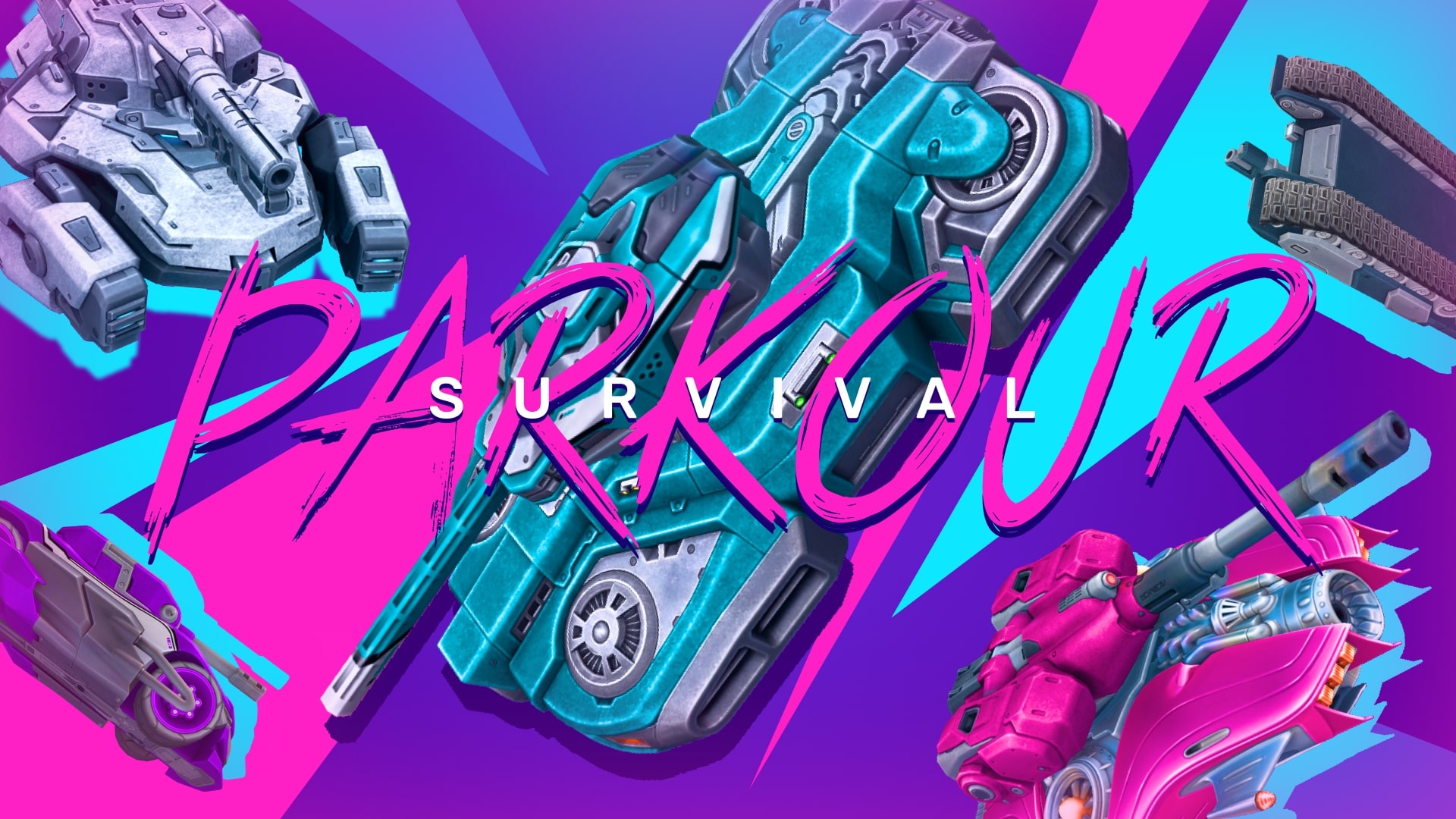
Tankers, We have an important update regarding the Parkour Survival tournament!
After reviewing the progress of the ongoing challenges, we’ve decided to make a small but meaningful adjustment to ensure the tournament concludes in the most exciting and rewarding way possible.
Challenge #7 will be extended for one additional week and will now serve as the final challenge of Parkour Survival 2025.
As a result, Challenge #8 will be canceled, and the teams that successfully complete Challenge #7 will be declared the official winners of the tournament.
Since its relaunch in mid-August, Parkour Survival has pushed players’ creativity, teamwork, and precision to new heights. We’ve been amazed by the skill and dedication shown by every participant, and we’re thrilled to see who will rise to the top and claim the legendary Blaze paint. Thank you to all who took part and made this event truly special — let’s finish strong, Tankers! 
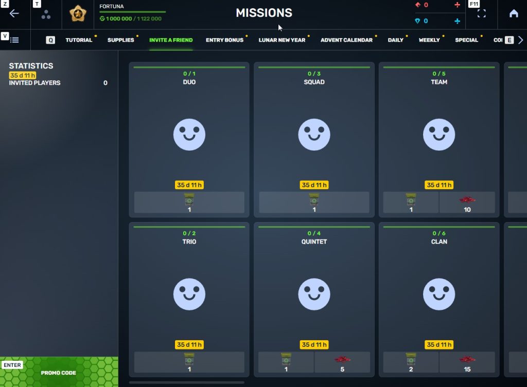
Invite a friend #4
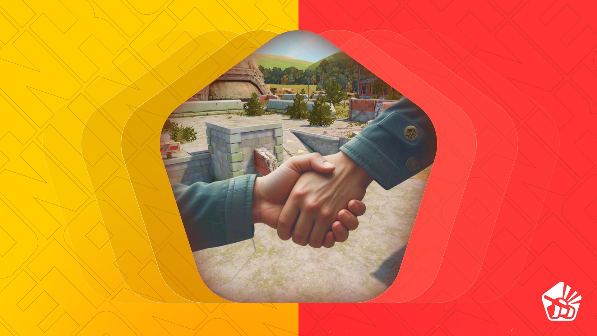
Invite friends to the game and get rewards!
We are launching a new referral event! During this event, you can get rewards for inviting new players or players who stopped playing the game. Also, as the friends you’ve invited complete special missions, you will receive additional bonuses!
Dates: From October 10th 2 AM to November 24th 2 AM UTC
Let’s get into the details:
How to invite
IMPORTANT: The option to invite new players is only available to accounts created before the start of the event, October 10th 2 AM.
Referrals are players who you invited to the game.
You need to follow these steps to make a new player your referral:
STEP 1 Your rank should be at least Master Sergeant.
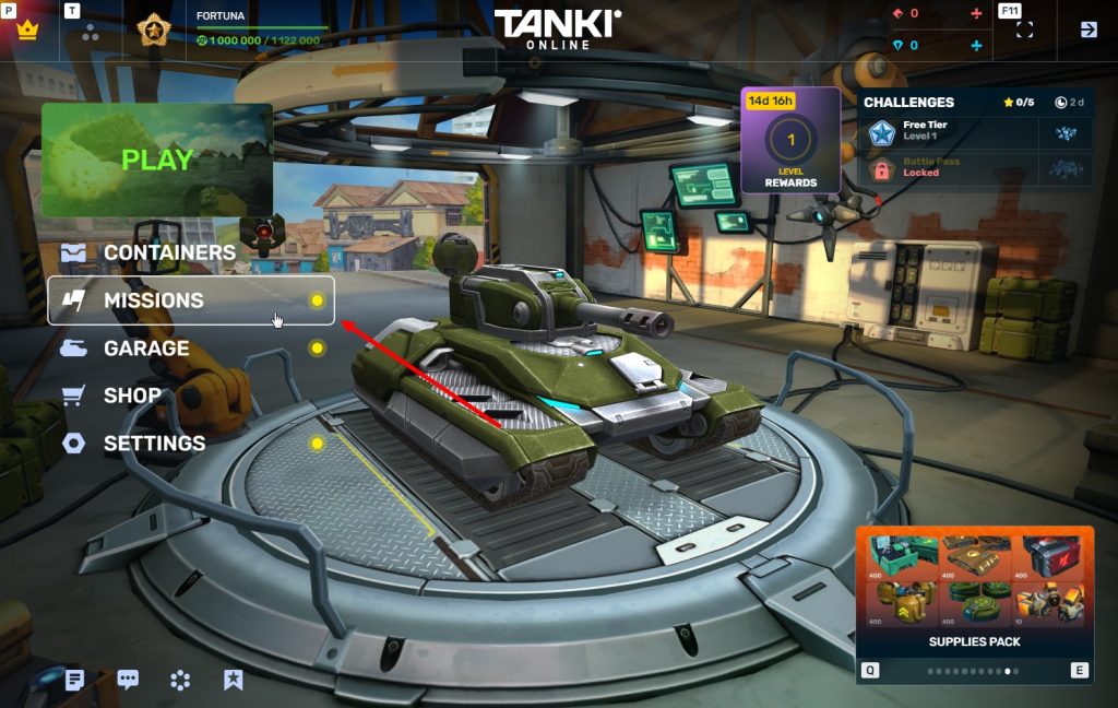
STEP 2 You need to enter the game and go to the Missions menu.
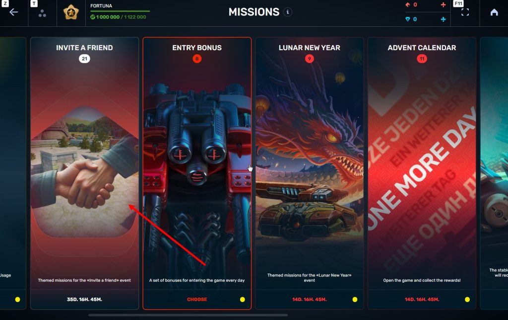
STEP 3 There, you need to open the special «Invite a friend» category of missions.
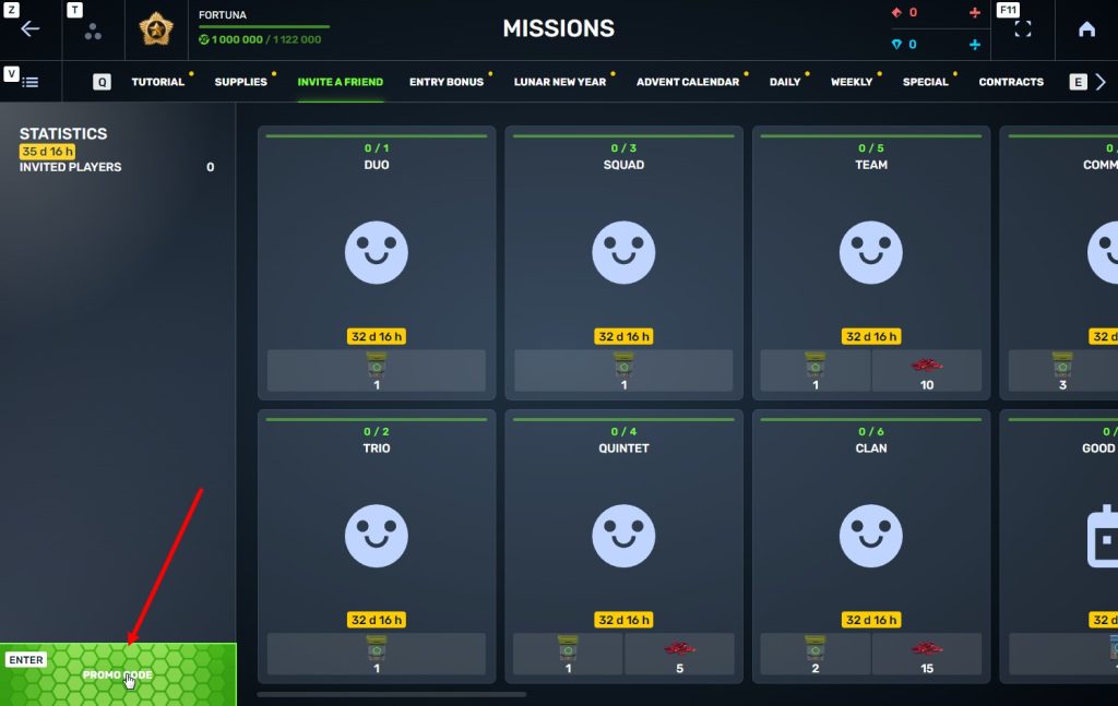
STEP 4 In that section, you need to generate a special invite promo code.
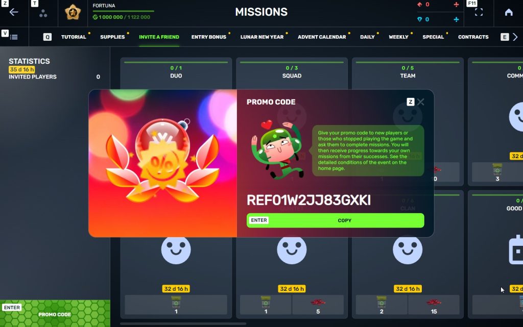
STEP 5 Share this Promocode with people you want to invite to the game and tell them how they can activate it (read below).
IMPORTANT: If you are a player who was invited to the game during this referral event, you cannot generate your own promo code to invite other players.
Who can become your referral
There are two types of players who can become your referrals:
- Players who created their account from October 10th 2 AM to November 24th 2 AM UTC.
- Player who last entered the game before August 25th 2 AM UTC.
Pay attention to the fact that in order to activate an invite promo code, a player should have at least Private rank.
Important: A player who generated a promo code to send it to other players cannot activate their own promo code or a Promocode of any other player.
What do I get for inviting players?
- Once you generate your invite promo code, send it to your friends and acquaintances.
- In the special «Invite a friend» category of missions, you will get a set of special missions.
3. Once they activate your promo code, players who have been invited will also get a set of their own special missions in the «Missions from a friend» category. In your «Invite a friend» category you can track how your referrals complete their missions, and thus your missions get completed and you can claim rewards for the efforts of the players you have referred.
Missions for those who invite
There are two types of missions for inviting players. The first type gives you rewards for players who just activated your promo code. The second type gives you rewards once your invited players complete the required missions.
Bonuses for inviting players
Important: An invited player is counted towards mission progress only once they activate your promocode.
Duo
TASK
Invite 1 player to the game.
REWARD
×1
COMMON KEY
COMMON KEY
×100
EXPERIENCE POINTS
EXPERIENCE POINTS
Trio
TASK
Invite 2 players to the game.
REWARD
×1
COMMON KEY
COMMON KEY
×100
EXPERIENCE POINTS
EXPERIENCE POINTS
Squad
TASK
Invite 3 players to the game.
REWARD
×1
COMMON KEY
COMMON KEY
×100
EXPERIENCE POINTS
EXPERIENCE POINTS
Quintet
TASK
Invite 4 players to the game.
REWARD
×1
COMMON KEY
COMMON KEY
×100
EXPERIENCE POINTS
EXPERIENCE POINTS
×5
RUBY
RUBY
Team
TASK
Invite 5 players to the game.
REWARD
×1
COMMON KEY
COMMON KEY
×100
EXPERIENCE POINTS
EXPERIENCE POINTS
×10
RUBY
RUBY
Clan
TASK
Invite 6 players to the game.
REWARD
×2
COMMON KEY
COMMON KEY
×100
EXPERIENCE POINTS
EXPERIENCE POINTS
×15
RUBY
RUBY
Community
TASK
Invite 7 players to the game.
REWARD
×3
COMMON KEY
COMMON KEY
×100
EXPERIENCE POINTS
EXPERIENCE POINTS
×40
RUBY
RUBY
Bonuses for efforts of your referrals
Important: An invited player is counted towards mission progress only once they activate your promocode and complete the required referral missions.
Good Start
TASK
Invited players completed 10 referral event missions
REWARD
×1
RARE KEY
RARE KEY
×100
EXPERIENCE POINTS
EXPERIENCE POINTS
Makes Progress
TASK
Invited players completed 20 referral event missions
REWARD
×1
RARE KEY
RARE KEY
×100
EXPERIENCE POINTS
EXPERIENCE POINTS
Can Play Together
TASK
Invited players completed 30 referral event missions
REWARD
×1
RARE KEY
RARE KEY
×100
EXPERIENCE POINTS
EXPERIENCE POINTS
×5
RUBY
RUBY
They Trust You
TASK
Invited players completed 40 referral event missions
REWARD
×1
RARE KEY
RARE KEY
×100
EXPERIENCE POINTS
EXPERIENCE POINTS
×10
RUBY
RUBY
Social Butterfly
TASK
Invited players completed 50 referral event missions
REWARD
×1
RARE KEY
RARE KEY
×100
EXPERIENCE POINTS
EXPERIENCE POINTS
×15
RUBY
RUBY
Influencer
TASK
Invited players completed 60 referral event missions
REWARD
×2
RARE KEY
RARE KEY
×100
EXPERIENCE POINTS
EXPERIENCE POINTS
×20
RUBY
RUBY
Celebrity
TASK
Invited players completed 80 referral event missions
REWARD
×3
RARE KEY
RARE KEY
×100
EXPERIENCE POINTS
EXPERIENCE POINTS
×60
RUBY
RUBY
Full Pack
TASK
Invited players completed 1 referral event supermission
REWARD
×1
EPIC KEY
EPIC KEY
×100
EXPERIENCE POINTS
EXPERIENCE POINTS
Aspiring Expert
TASK
Invited players completed 2 referral event supermissions
REWARD
×1
EPIC KEY
EPIC KEY
×100
EXPERIENCE POINTS
EXPERIENCE POINTS
×5
RUBY
RUBY
Forward to Victory
TASK
Invited players completed 3 referral event supermissions
REWARD
×1
EPIC KEY
EPIC KEY
×100
EXPERIENCE POINTS
EXPERIENCE POINTS
×10
RUBY
RUBY
Good Mentor
TASK
Invited players completed 4 referral event supermissions
REWARD
×1
EPIC KEY
EPIC KEY
×100
EXPERIENCE POINTS
EXPERIENCE POINTS
×15
RUBY
RUBY
Thunderstorm of Matchmaking
TASK
Invited players completed 5 referral event supermissions
REWARD
×1
EPIC KEY
EPIC KEY
×100
EXPERIENCE POINTS
EXPERIENCE POINTS
×20
RUBY
RUBY
Preparing for eSports
TASK
Invited players completed 6 referral event supermissions
REWARD
×2
EPIC KEY
EPIC KEY
×100
EXPERIENCE POINTS
EXPERIENCE POINTS
×60
RUBY
RUBY
Professional Referrer
TASK
Invited players completed 7 referral event supermissions
REWARD
×3
EPIC KEY
EPIC KEY
×700
RUBY
RUBY
×1
LEGENDARY KEY
LEGENDARY KEY
How it works for referrals
Once you invite a friend and give them your promo code, your friend should do the following:
STEP 1 Create an account (or log into an existing one, if it meets the criteria)
STEP 2 Get the «Private» rank. It won’t take much time.
STEP 3 Enter the Shop
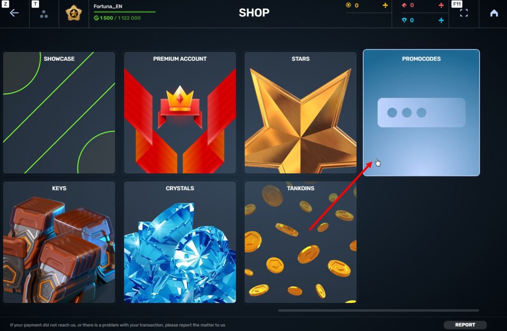
STEP 4 Go to the «Promocode» section
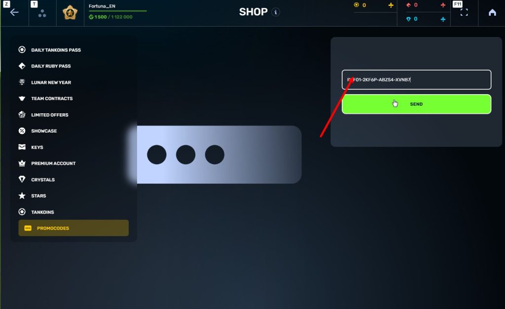
STEp 5 Activate the promo code
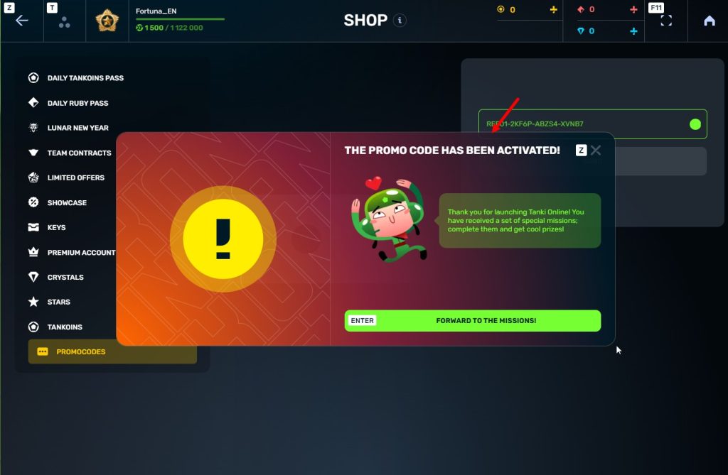
STEP 6 Press the «Forward to the missions!» button
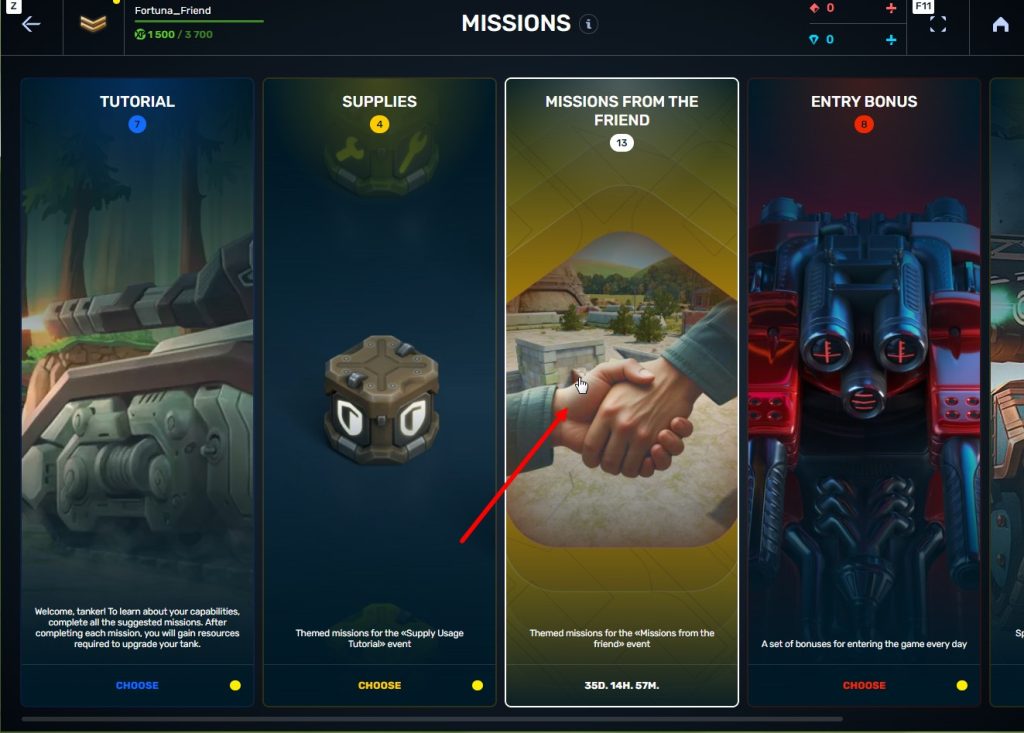
STEP 7 In the Missions menu, there will be a section called «Missions from the friend» with a set of special missions to complete
STEP 8 Complete the missions and claim the rewards
Important: During a referral event, a player can become a referral of only one player (activate only one referral promo code).
Bonuses for referrals for completing missions
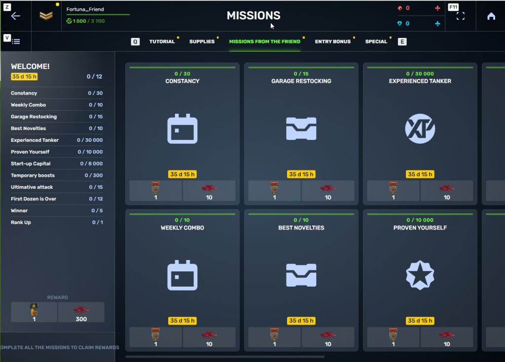
WELCOME!
TASK
Supermission. Complete all referral missions.
REWARD

×1
legendary key
×300
ruby
CONSTANCY
TASK
Complete 30 daily missions.
REWARD

×1
epic key
×100
EXPERIENCE POINTS
EXPERIENCE POINTS
×10
ruby
WEEKLY COMBO
TASK
Complete 15 weekly missions.
REWARD
×1
epic key
×100
EXPERIENCE POINTS
EXPERIENCE POINTS
×10
ruby
GARAGE RESTOCKING
TASK
Open 15 Common Containers
REWARD
×1
epic key
×100
EXPERIENCE POINTS
EXPERIENCE POINTS
×10
ruby
BEST NOVELTIES
TASK
Open 10 Epic Containers.
REWARD
×1
epic key
×100
EXPERIENCE POINTS
EXPERIENCE POINTS
×10
ruby
EXPERIENCED TANKER
TASK
Earn 30 000 experience points.
REWARD
×1
epic key
×100
EXPERIENCE POINTS
EXPERIENCE POINTS
×10
ruby
PROVEN YOURSELF
TASK
Earn 15 000 reputation points.
REWARD
×1
epic key
×100
EXPERIENCE POINTS
EXPERIENCE POINTS
×10
ruby
START-UP CAPITAL
TASK
Earn 10 000 crystals.
REWARD
×1
epic key
×100
EXPERIENCE POINTS
EXPERIENCE POINTS
×10
ruby
TEMPORARY BOOSTS
TASK
Activate supplies 300 times.
REWARD
×1
epic key
×100
EXPERIENCE POINTS
EXPERIENCE POINTS
×10
ruby
ULTIMATIVE ATTACK
TASK
Use overdrive 15 times.
REWARD
×1
epic key
×100
EXPERIENCE POINTS
EXPERIENCE POINTS
×10
ruby
FIRST DOZEN IS OVER
TASK
Finish 20 battles.
REWARD
×1
epic key
×100
EXPERIENCE POINTS
EXPERIENCE POINTS
×10
ruby
WINNER
TASK
Be in the winning team of 5 battles.
REWARD
×1
epic key
×100
EXPERIENCE POINTS
EXPERIENCE POINTS
×10
ruby
RANK UP
TASK
Get a new rank.
REWARD
×1
epic key
×100
EXPERIENCE POINTS
EXPERIENCE POINTS
×10
ruby
You can track the progress of completing missions by your referrals in the «Statistics» column of the «Invite a friend» category in missions.
Invite friends and get rewards!
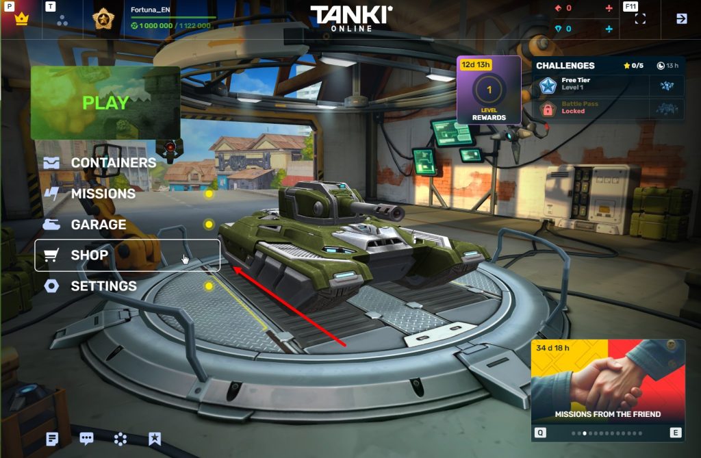
Play on your main account on Nintendo Switch™!

Great news for all tankers playing on Nintendo Switch™!
We are happy to announce that the latest game update introduces a long-awaited feature — the ability to log into your existing Tanki Online account!
The new version of the game with this feature will appear on your Nintendo Switch™ device on October 10th, during the day.
Recall that since the release in March 2025, players on Nintendo Switch™ could only play with new, separate accounts. Now, you can get full access to your main account that you previously played on from your PC or Android!
How to Log Into Your Account?
You need to open the game on Nintendo Switch™ and log out of the current account. It’s easy to do in just a few steps:
- Go to Settings in the game.
- Select the Account section.
- Press the “Sign out of this account” button.
- Set a password for your console account, so you can log in back to this account later.
After this, a login form will appear where you can authorize using the username and password of your account created on another platform.
Fight on your account on any device! Tell your fellow tankers about this and see you on the battlefield
Winter Major Rankings III 2025
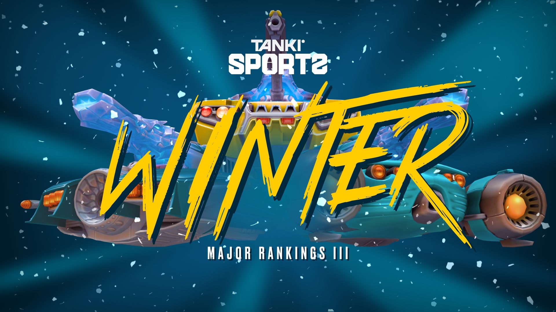
Winter Major Rankings II 2025 is finished so we are ready to announce the THIRD ranking tournament of the Winter season!
If you’re still unsure whether to participate in tournaments or not, then now is the time to decide! After all, as we said earlier, the eSport format is designed to simplify participation in eSports, which means that everyone has a chance to compete for impressive in-game rewards and even for real cash rewards.
Who knows, perhaps it will be you and your team that will achieve the highest results.
We also want to remind you that in order to simplify the search for players and teams, we have updated our eSports website and added a special section in which teams search for players, and players search for teams.
Tournament rules
- Ranks: First Sergeant — Legend
- The team consists of 7 players.
- In battle – 5 tankers from each team.
- Your garage doesn’t matter as battles are played in Sport mode.
- On the battlefield, in each team, hulls and turrets should not be repeated. For example, if you use Hornet and Ricochet, no one else from your team should be in the battle with Ricochet or Hornet.
- More detailed rules can be found on the tournament page on the eSports portal.
Prizes
- Unique «Acid» paint
- 96,000 Rubies
- 88,000,000 crystals
- 2,835 epic keys
- 1,071 days of «Premium Pass»
- TMR points
Tournament dates
- Tournament registration will last from 17:00 UTC on September 23rd till 17:00 UTC on October 6th.
- The first match will start on October 7th.
- The tournament will end before October 29th.
- The transfer is open and will last until 17:00 UTC on October 6th.
The tournament will be attended by 32 to 128 teams.
Almost immediately after the third rating tournament, we will announce a Major one. In the Major tournament, they will fight not only for in-game rewards, but also for real cash.
Go to the eSports portal, create your team, read the rules, register and get ready for the next rating tournament! And if you have any questions, visit our eSports Discord server, they will definitely help you.
See you on the battlefields and eSports broadcasts!
Tanki Online V-LOG: Episode 535
In today’s episode, we will be announcing Autumn Festival. We’ll also be declaring results of the War event and showing our plans on maps in Tanki Classic.
Parkour Survival 2025
After five long years… it’s finally back!
Tankers, brace yourselves — Parkour Survival 2025 is here, and this time, it’s bigger than ever! For the first time in history, this legendary contest is open to all communities worldwide. Whether you’re a seasoned parkour pro or a daring newcomer, if you’ve got the skills, this is your chance to shine.
What is Parkour Survival?
Parkour Survival is Tanki Online’s ultimate team-based parkour contest. Assemble a squad of up to 5 players and tackle a series of increasingly difficult challenges. Starting August 15th, each week a new parkour challenge will be revealed. If you complete it, your team will proceed to the next Challenge. But if you fail… you’re out. Only the strongest, most creative, and persistent teams will survive until the end.
How to Participate
No sign-up needed! Here’s how to join:
- Assemble a team of 5 participants
- Each participant should purchase the “Blaze” paint in the Garage; each participant should equip this paint while capturing the tricks.
- Visit the event’s website on August 15th, read the rules of the first challenge, and complete it (released on August 15).
- Upload a video of your team’s success to YouTube.
- Submit the link via the event website on the Challenge’s page, along with your team name and members.
- That’s it! Your team is officially in the running.
- Wait for the results of the first Challenge, and if your team passes it, complete the next Challenge.

Blaze
This paint belongs to the fearsome players of parkour community, who completed the impossible challenges of Parkour Survival and finished the contest as a single team.
During the tournament, this paint can be purchased in the Garage. After the tournament, only winners have this paint.
Blaze paint is available for purchase in the Garage, in the Special category (the last one, red), for 10 crystals. If you do not see the paint there, reload the game.
Blaze paint will be removed from all accounts after the end of the event and will only be added back to the teams that completed all the Challenges successfully. The winners will keep the paint until the next tournament, or until further decision of the Administration to remove the paint.
Challenges
There are 8 different Challenges in total. Each becomes available after the previous one ends.
Each Challenge starts and ends at 13:00 UTC.
| Challenge | Start Date | End Date |
| 1 | 15.08 | 29.08 |
| 2 | 29.08 | 05.09 |
| 3 | 05.09 | 12.09 |
| 4 | 12.09 | 19.09 |
| 5 | 19.09 | 26.09 |
| 6 | 26.09 | 3.10 |
| 7 | 3.10 | 10.10 |
| 8 | 10.10 | 17.10 |
Prizes
Earn rewards for every challenge completed: Keys, Rubies, and the exclusive “Blaze” paint!
Exclusive “Blaze” paint: Only the teams that manage to complete all 8 challenges will unlock this legendary badge of honor. The Blaze paint will stay in their accounts until the next tournament, or until further decision of the Administration to remove the paint.
Prizes for each member of a team:
Challenge 1

×1
COMMON KEY
×1
RARE KEY
Challenge 2
×4
COMMON KEY
×1
RARE KEY
Challenge 3
×7
COMMON KEY
×1
RARE KEY
Challenge 4
×9
COMMON KEY
×2
RARE KEY
Challenge 5
×12
COMMON KEY
×2
RARE KEY
Challenge 6
×15
COMMON KEY
×2
RARE KEY
Challenge 7
×17
COMMON KEY
×3
RARE KEY
Challenge 8
×30
COMMON KEY
×3
RARE KEY

×500
RUBIES
BLAZE
PAINT
Teams that pass a Challenge will receive the rewards within three business days after each challenge concludes.
Are you ready to survive? Gather your team, sharpen your skills, and prepare for the ultimate parkour showdown.
Parkour Survival 2025 begins soon — will your team be the last one standing?
Stay tuned for updates, and let the Challenges begin!

Recommended Posts