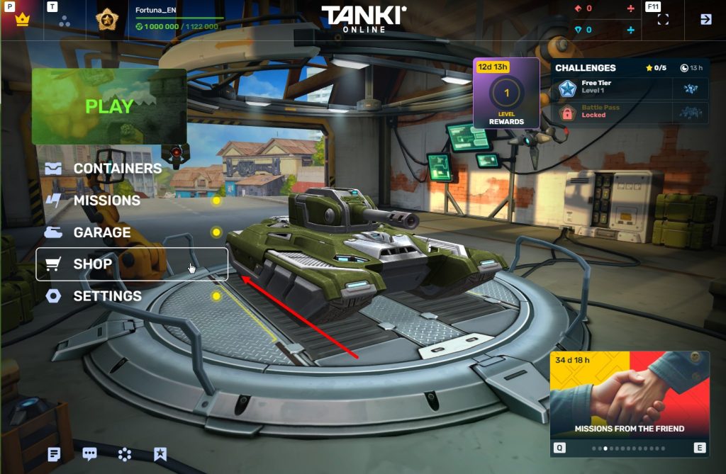
 Jump to content
Tanki Online turns 17!
1/9
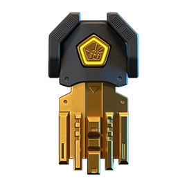
Tsunami XT HD
2/9
Tanki Online V-LOG: Episode 548
3/9
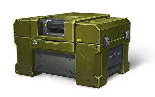
Armor Blocks 2026
4/9
Summer Major 2026
5/9
May Holidays 2026
6/9
Tanki Online V-LOG: Episode 547
7/9
Invite a friend #6
8/9
Tanki Classic mass test
9/9


Tanki Online turns 17!

Tanki Online is turning 17! We invite you to celebrate this holiday together, among loyal friends and like-minded tankers!
A festive program awaits you in the game: 4 special modes – “Gold Rush”, “Team Arms Race”, “Hazelball”, and “Railgun Grenadiers.” 50% discounts, the new Tsunami XT HD skin, and many other XT and DK series skins in Epic Containers, an Elite Pass with a Legendary Key and the new Duplet Firing Mode Augment for Tsunami as rewards, an Advent Calendar, a festive garage, a gold cake, and special gifts for everyone!
Event dates: May 29th — June 26th, 2 AM UTC.
Tsunami on Sale
As promised, the Tsunami turret is now freely available! Now anyone can purchase it for their account.
May 29th — June 22nd
Additionally, the turret will be added to containers.
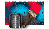
50% Discounts
All prices are cut in half! You can’t miss a sale like this! Stock up with big savings from May 29th to June 1st.
All discounts start and end with the server restart at 2 AM UTC.
For 3 whole days, you will be able to obtain the following items with a 50% discount:
-50%
Shop (29.05 — 1.06)
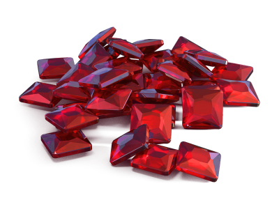
Crystals

Stars
Early Access items
Premium Pass

-50%
GARAGE (29.05 — 1.06)
Augments
Supplies
Paints
Drones
Modules
Grenades
-50%
UPGRADES (29.05 — 1.06)
Special Tankoin Offers
Only in honor of the Birthday, buy Tankoins at a great value!
Hurry to the in-game Shop and get double rewards for each first purchase of any special Tankoin offer!
The doubling applies once for each special Tankoin offer. For example, you buy the special offer for 300 Tankoins and get an additional 300 Tankoins as a bonus. If you buy the 300 Tankoin offer again, there will be no bonus, but if you buy the 750 Tankoin offer, you will again receive 750 bonus Tankoins.

Special Modes
4 exciting modes await you in the game!
Important: Boosted battle funds and experience points are only active within the festive weekend game modes.
Each mode starts and ends with the server restart at 2 AM UTC.
SPECIAL MODE
GOLD RUSH
May 29th — June 1st
Mode
DM
Turret
Any
Hull
Any
Bonus Boxes
Upgrades
Augments
Gold Boxes
Equipment Change
Overdrives
Supplies
Nuclear Energy
Smart Supplies
Drones
Protection Modules
Groups
Grenades
More Gold Boxes
Crush everyone in a Deathmatch and catch plenty of gold! A lot more of the elusive boxes will be dropping in this mode!
Maps:
- Forest (Remaster)
- Sandal (Remaster)
- Parma (Remaster)
- Highland (Remaster)
SPECIAL MODE
TEAM ARMS RACE
June 5th — June 8th
Mode
Team Arms Race
Turret
Changes Every 3 Kills
Hull
Viking
Bonus Boxes
Upgrades
Augments
Gold Boxes
Equipment Change
Overdrives
Supplies
Nuclear Energy
Smart Supplies
Drones
Protection Modules
Groups
Grenades
More Gold Boxes
Crush enemies with BO-NK in the updated team mode and catch a lot of gold boxes, because this weekend, we have increased their dropping frequency!
Maps:
- Deathtrack PRO
- Kolhoz PRO
- Subway PRO
SPECIAL MODE
RAILGUN GRENADIERS
June 12th — June 15th
Mode
CTF
Turret
Railgun
Hull
Hornet
Bonus Boxes
Upgrades
Augments
Gold Boxes
Equipment Change
Overdrives
Supplies
Nuclear Energy
Smart Supplies
Drones
Protection Modules
Groups
Grenades
More Gold Boxes
This is the game mode for Tanki virtuosos! In addition to well-aimed Grenade throws, you also need well-aimed Railgun shots. An accurate shot at a thrown Grenade and there will be no trace left of your enemy. Shoot, detonate, and win!
Maps:
- Sandbox (Remaster)
- Cross (Remaster)
SPECIAL MODE
HAZELBALL
June 19th — June 22nd
Mode
RGB
Turret
B0-NK
Hull
Any
Bonus Boxes
Upgrades
Augments
Gold Boxes
Equipment Change
Overdrives
Supplies
Nuclear Energy
Smart Supplies
Drones
Protection Modules
Groups
Grenades
More Gold Boxes
Let’s play a hot match in the Rugby mode with a ball in the shape of hazelnut and legendary BO-NK turrets?! Sounds fun, doesn’t it?…
Maps:
- Stadium MM
- Parma MM
- Magistral MM
Special Offers
Don’t miss out on these great special offers!
May 29th — June 26th
Daily Ruby Pass

×500
Tankoins*

×4500
Rubies**
* 500 Tankoins instantly.
** For 30 days, each day the player can access a pre-completed mission upon logging in, from which they can claim a reward of 150 Rubies.
Note: One-time purchase
** For 30 days, each day the player can access a pre-completed mission upon logging in, from which they can claim a reward of 150 Rubies.
Note: One-time purchase
PURCHASE

June 5th — June 26th
Sweet Present

×15
EPIC key

×3
RARE key
×1
Nuclear Energy
June 12th — June 26th

June 19th — June 26th
Reason for Happiness
×20
EPIC key
×1
RARE key

×4
Premium Pass
Epic Containers
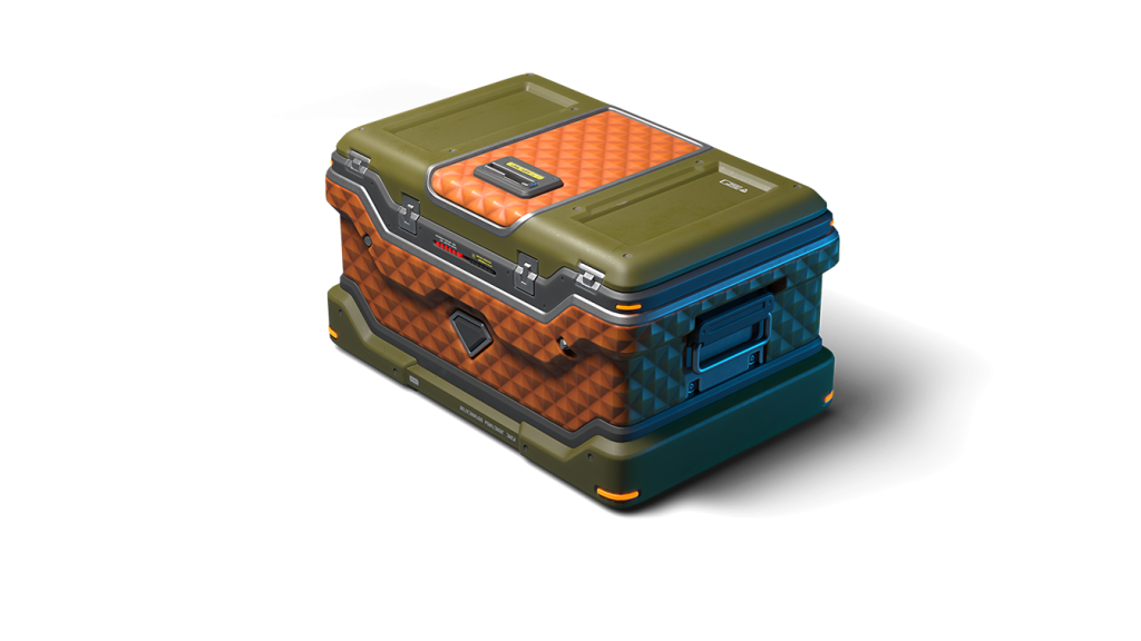
Treat yourself to refreshed Epic Containers! Their composition is truly festive – a whole sea of skins!
- NEW SKIN Tsunami XT (HD)
- SKIN Ares XT (HD)
- SKIN Hopper XT (HD)
- SKIN Crusader XT (HD)
- SKIN Paladin XT (HD)
- SKIN Tesla XT (HD)
- SKIN Scorpion XT (HD)
- SKIN Striker XT (HD)
- SKIN Viking XT (HD)
- SKIN Freeze XT (HD)
- SKIN Thunder XT (HD)
- SKIN Hornet XT (HD)
- SKIN Thunder DK
- SKIN Viking DK
- SKIN Hornet DK
- SKIN Ares DK
- SKIN Tesla DK
- SKIN Scorpion DK
- SKIN Freeze DK
- SKIN Striker DK
- SKIN Hopper DK
- Crisis Drone
- Armadillo Module
- And everything you can get from Common Containers
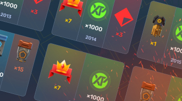
Special Missions
Challenge yourself in a series of missions and claim valuable rewards!
Your progress in completing missions is only counted from the moment you first enter the “Missions” screen after the event begins.
Missions follow the Encore system, with the second set of missions appearing only after the first set is completed.
SPECIAL
Part 1. May 29th — June 5th
Part 2. June 5th — June 12th
Part 3. June 12th — June 19th
Part 4. June 19th — June 26th
GOLD
TASK
Finish 2 battles in the festive mode.
REWARD
×3
EPIC KEY
EPIC KEY
CONTEST WITH CHANGING CLOTHES
TASK
Finish 2 battles in the festive mode.
REWARD
×3
EPIC KEY
EPIC KEY
FESTIVE FIREWORKS
TASK
Finish 2 battles in the festive mode.
REWARD
×3
EPIC KEY
EPIC KEY
HAZEL PASTE
TASK
Finish 2 battles in the festive mode.
REWARD
×3
EPIC KEY
EPIC KEY
SET 1
May 29th — June 26th
SUPERMISSION: WISHLIST! PART 1
TASK
Complete «Special Invitation. Part 1», «Guest of Honor. Part 1», «Indiscriminate. Part 1», «It’s About Participating! Part 1», «Right Choice. Part 1», «Cherished Wish. Part 1», «Volatile Mixture», «Regular Guest», «Tears of Joy» and «Gifts Time. Part 1» missions.
REWARD
×5
EPIC KEY
EPIC KEY
×1
RARE KEY
RARE KEY
×1000
EXPERIENCE POINTS
EXPERIENCE POINTS
SPECIAL INVITATION. PART 1
TASK
Enter the game at least once.
REWARD
×1
COMMON KEY
COMMON KEY
×100
EXPERIENCE POINTS
EXPERIENCE POINTS
GUEST OF HONOR. PART 1
TASK
Earn 5000 reputation points in matchmaking battles.
REWARD
×1
COMMON KEY
COMMON KEY
×100
EXPERIENCE POINTS
EXPERIENCE POINTS
INDISCRIMINATE. PART 1
TASK
Earn 3000 reputation points in Quick Battle mode in matchmaking battles.
REWARD
×1
COMMON KEY
COMMON KEY
×100
EXPERIENCE POINTS
EXPERIENCE POINTS
IT’S ABOUT PARTICIPATING! PART 1
TASK
Finish 10 battles in matchmaking battles.
REWARD
×1
COMMON KEY
COMMON KEY
×100
EXPERIENCE POINTS
EXPERIENCE POINTS
RIGHT CHOICE. PART 1
TASK
Be in the winning team of 2 battles in matchmaking battles.
REWARD
×1
COMMON KEY
COMMON KEY
×100
EXPERIENCE POINTS
EXPERIENCE POINTS
CHERISHED WISH. PART 1
TASK
Make any purchase in the game’s Shop.
REWARD
×1
COMMON KEY
COMMON KEY
×100
EXPERIENCE POINTS
EXPERIENCE POINTS
VOLATILE MIXTURE
TASK
Use boosted damage 150 times in matchmaking battles.
REWARD
×1
COMMON KEY
COMMON KEY
×100
EXPERIENCE POINTS
EXPERIENCE POINTS
REGULAR GUEST
TASK
Earn 3000 experience points in matchmaking battles.
REWARD
×1
COMMON KEY
COMMON KEY
×100
EXPERIENCE POINTS
EXPERIENCE POINTS
TEARS OF JOY
TASK
Earn 4000 crystals in matchmaking battles.
REWARD
×1
COMMON KEY
COMMON KEY
×100
EXPERIENCE POINTS
EXPERIENCE POINTS
GIFTS TIME. PART 1
TASK
Open 15 any Containers.
REWARD
×1
COMMON KEY
COMMON KEY
×100
EXPERIENCE POINTS
EXPERIENCE POINTS
SET 2
June 5th — June 26th
SUPERMISSION: WISHLIST! PART 2
TASK
Complete «Special Invitation. Part 2», «Guest of Honor. Part 2», «Indiscriminate. Part 2», «It’s About Participating! Part 2», «Right Choice. Part 2», «Cherished Wish. Part 2», «Aspirin», «Meteor Shower», «The King of the Party» and «Joke After Joke» missions.
REWARD
×5
EPIC KEY
EPIC KEY
×1
RARE KEY
RARE KEY
×1000
EXPERIENCE POINTS
EXPERIENCE POINTS
SPECIAL INVITATION. PART 2
TASK
Enter the game at least once.
REWARD
×1
COMMON KEY
COMMON KEY
×100
EXPERIENCE POINTS
EXPERIENCE POINTS
GUEST OF HONOR. PART 2
TASK
Earn 5000 reputation points in matchmaking battles.
REWARD
×1
COMMON KEY
COMMON KEY
×100
EXPERIENCE POINTS
EXPERIENCE POINTS
INDISCRIMINATE. PART 2
TASK
Earn 3000 reputation points in Quick Battle mode in matchmaking battles.
REWARD
×1
COMMON KEY
COMMON KEY
×100
EXPERIENCE POINTS
EXPERIENCE POINTS
IT’S ABOUT PARTICIPATING! PART 2
TASK
Finish 10 battles in matchmaking battles.
REWARD
×1
COMMON KEY
COMMON KEY
×100
EXPERIENCE POINTS
EXPERIENCE POINTS
RIGHT CHOICE. PART 2
TASK
Be in the winning team of 2 battles in matchmaking battles.
REWARD
×1
COMMON KEY
COMMON KEY
×100
EXPERIENCE POINTS
EXPERIENCE POINTS
CHERISHED WISH. PART 2
TASK
Make any purchase in the game’s Shop.
REWARD
×1
COMMON KEY
COMMON KEY
×100
EXPERIENCE POINTS
EXPERIENCE POINTS
ASPIRIN
TASK
Use repair kit 150 times in matchmaking battles.
REWARD
×1
COMMON KEY
COMMON KEY
×100
EXPERIENCE POINTS
EXPERIENCE POINTS
METEOR SHOWER
TASK
Earn 45 stars in matchmaking battles.
REWARD
×1
COMMON KEY
COMMON KEY
×100
EXPERIENCE POINTS
EXPERIENCE POINTS
THE KING OF THE PARTY
TASK
Destroy 30 tanks in matchmaking battles.
REWARD
×1
COMMON KEY
COMMON KEY
×100
EXPERIENCE POINTS
EXPERIENCE POINTS
JOKE AFTER JOKE
TASK
Deal 100000 damage in matchmaking battles.
REWARD
×1
COMMON KEY
COMMON KEY
×100
EXPERIENCE POINTS
EXPERIENCE POINTS
SET 3
June 12th — June 26th
SUPERMISSION: WISHLIST! PART 3
TASK
Complete «Special Invitation. Part 3», «Guest of Honor. Part 3», «Indiscriminate. Part 3», «It’s About Participating! Part 3», «Right Choice. Part 3», «Cherished Wish. Part 3», «Energy Drink», «Preemptive Play», «Dangerous Trick» and «7 Days» missions.
REWARD
×5
EPIC KEY
EPIC KEY
×1
RARE KEY
RARE KEY
×1000
EXPERIENCE POINTS
EXPERIENCE POINTS
SPECIAL INVITATION. PART 3
TASK
Enter the game at least once.
REWARD
×1
COMMON KEY
COMMON KEY
×100
EXPERIENCE POINTS
EXPERIENCE POINTS
GUEST OF HONOR. PART 3
TASK
Earn 5000 reputation points in matchmaking battles.
REWARD
×1
COMMON KEY
COMMON KEY
×100
EXPERIENCE POINTS
EXPERIENCE POINTS
INDISCRIMINATE. PART 3
TASK
Earn 3000 reputation points in Quick Battle mode in matchmaking battles.
REWARD
×1
COMMON KEY
COMMON KEY
×100
EXPERIENCE POINTS
EXPERIENCE POINTS
IT’S ABOUT PARTICIPATING! PART 3
TASK
Finish 10 battles in matchmaking battles.
REWARD
×1
COMMON KEY
COMMON KEY
×100
EXPERIENCE POINTS
EXPERIENCE POINTS
RIGHT CHOICE. PART 3
TASK
Be in the winning team of 2 battles in matchmaking battles.
REWARD
×1
COMMON KEY
COMMON KEY
×100
EXPERIENCE POINTS
EXPERIENCE POINTS
CHERISHED WISH. PART 3
TASK
Make any purchase in the game’s Shop.
REWARD
×1
COMMON KEY
COMMON KEY
×100
EXPERIENCE POINTS
EXPERIENCE POINTS
ENERGY DRINK
TASK
Use speed boost 150 times in matchmaking battles.
REWARD
×1
COMMON KEY
COMMON KEY
×100
EXPERIENCE POINTS
EXPERIENCE POINTS
PREEMPTIVE PLAY
TASK
Destroy 1 tank using grenades in matchmaking battles.
REWARD
×1
COMMON KEY
COMMON KEY
×100
EXPERIENCE POINTS
EXPERIENCE POINTS
DANGEROUS TRICK
TASK
Destroy 10 tanks using critical damage in matchmaking battles.
REWARD
×1
COMMON KEY
COMMON KEY
×100
EXPERIENCE POINTS
EXPERIENCE POINTS
7 DAYS
TASK
Complete 3 Weekly missions.
REWARD
×1
COMMON KEY
COMMON KEY
×100
EXPERIENCE POINTS
EXPERIENCE POINTS
SET 4
June 19th — June 26th
SUPERMISSION: WISHLIST! PART 4
TASK
Complete «Special Invitation. Part 4», «Guest of Honor. Part 4», «Indiscriminate. Part 4», «It’s About Participating! Part 4», «Right Choice. Part 4», «Cherished Wish. Part 4», «Surprise!», «Magician», «Juggler» and «Gifts Time. Part 2» missions.
REWARD
×5
EPIC KEY
EPIC KEY
×1
RARE KEY
RARE KEY
×1000
EXPERIENCE POINTS
EXPERIENCE POINTS
SPECIAL INVITATION. PART 4
TASK
Enter the game at least once.
REWARD
×1
COMMON KEY
COMMON KEY
×100
EXPERIENCE POINTS
EXPERIENCE POINTS
GUEST OF HONOR. PART 4
TASK
Earn 5000 reputation points in matchmaking battles.
REWARD
×1
COMMON KEY
COMMON KEY
×100
EXPERIENCE POINTS
EXPERIENCE POINTS
INDISCRIMINATE. PART 4
TASK
Earn 3000 reputation points in Quick Battle mode in matchmaking battles.
REWARD
×1
COMMON KEY
COMMON KEY
×100
EXPERIENCE POINTS
EXPERIENCE POINTS
IT’S ABOUT PARTICIPATING! PART 4
TASK
Finish 10 battles in matchmaking battles.
REWARD
×1
COMMON KEY
COMMON KEY
×100
EXPERIENCE POINTS
EXPERIENCE POINTS
RIGHT CHOICE. PART 4
TASK
Be in the winning team of 2 battles in matchmaking battles.
REWARD
×1
COMMON KEY
COMMON KEY
×100
EXPERIENCE POINTS
EXPERIENCE POINTS
CHERISHED WISH. PART 4
TASK
Make any purchase in the game’s Shop.
REWARD
×1
COMMON KEY
COMMON KEY
×100
EXPERIENCE POINTS
EXPERIENCE POINTS
SURPRISE!
TASK
Use mines 150 times in matchmaking battles.
REWARD
×1
COMMON KEY
COMMON KEY
×100
EXPERIENCE POINTS
EXPERIENCE POINTS
MAGICIAN
TASK
Use overdrive 10 times in matchmaking battles.
REWARD
×1
COMMON KEY
COMMON KEY
×100
EXPERIENCE POINTS
EXPERIENCE POINTS
JUGGLER
TASK
Use any grenade 10 times in matchmaking battles.
REWARD
×1
COMMON KEY
COMMON KEY
×100
EXPERIENCE POINTS
EXPERIENCE POINTS
GIFTS TIME. PART 2
TASK
Complete 15 Daily missions.
REWARD
×1
COMMON KEY
COMMON KEY
×100
EXPERIENCE POINTS
EXPERIENCE POINTS
Advent Calendar
We are launching the festive Advent Calendar for you!
Attention! The Advent Calendar and its missions become available only after purchasing the “Advent Calendar” special offer.
After purchasing the “Advent Calendar” special offer, you will get access to:
- 5 Standard Missions
- 1 Supermission with unique rewards!
All you need to do is log into the game during the event and claim your gifts.
Task: Complete all “One More Day” missions that appear after May 29th.
Completing 5 standard missions will unlock the final Supermission.
Supermission
×1
Recruit Paint
×200
Rubies
Mission
×12
EPIC Key
×200
Rubies
Special Gifts
We value every tanker, and in honor of our Birthday — gifts for you!
Special Gifts
From June 4th, 2 AM to June 26th, 2 AM UTC, log into the game and claim a special gift. Its value depends on how many years you’ve spent with us — the longer you’ve been with Tanki Online, the more generous the reward!
Don’t miss it — log into the game and claim your reward!
Important: Available from the rank of Master Sergeant.
Elite Pass
The most luxurious pass is here! It consists of 20 levels.
Your goal is to earn stars and unlock new levels, and for each level reached, you will receive additional prizes!
In order to complete the whole pass and reach the main prize, you will need to earn 1000 stars.

Elite Pass
Important: All stars earned during the event will be counted. Progress begins with the start of the event. Stars earned before the purchase of the «Elite Pass» will also be counted. The «Elite Pass» itself is required to claim the prizes. By purchasing it, you will be able to claim all the unlocked prizes to your Garage!
The Main Prizes are the “Duplet” Firing Mode Augment for Tsunami and a LEGENDARY KEY!
The price of this “Elite Pass” is 2300 Rubies.

“Duplet” Firing Mode Augment for Tsunami
Both barrels fire at the same time.
Removes the restriction of the simultaneous work of loading mechanisms of both cannons. Works with no problems in 98.46% of the cases before the average expected time of an enemy tank’s death.
Festive Decorations
- Festive paint on drones
- Festive paint
- Festive Gold Box drop zone skin
- Gold cake
- Festive loading screen
- Festive garage
- Hazelball
- Festive billboards
Happy Birthday!!!
Tsunami XT HD

We are adding a new HD-skin into the game!
A new detailed XT skin for Tsunami will appear in the game for the celebration of the 17th birthday of Tanki Online.
From May 29, Tsunami XT HD will be added to Epic Containers. Enter the game, open updated containers, and maybe you will be lucky enough to get this new skin to appear in your garage!

Tsunami XT HD
The XT series of skins is a collection of exclusive skins for various tanks, each with its own unique appearance.
The model of the turret is more detailed and large-scale, which gives it a powerful and spectacular look. Even the smallest details are taken into account!
The owners of these rare skins are always in the spotlight.
Join the celebration, good luck to everyone!
Tanki Online V-LOG: Episode 548
In today’s episode, we will be celebrating Tanki Online’s birthday. We’ll also be making Tsunami available to everyone and introducing Missile Lock Warning System.
Armor Blocks 2026

Tankers! Get ready for the new in-game event — “Armor Blocks”!
An unusual event, where winning depends not only on the power in battle, but also on the ability to calculate moves, assemble combinations, and use bonuses at the right moment, awaits you. During the event, you will need to destroy identical elements, collect points, unlock rewards, and fight for the top spots on the leaderboard. Among the rewards are keys of different types including Legendary, Grenades, Nuclear Energy, Paladin DK skin, and Tsunami Mk1 turret!
Event dates: From May 15th, 2 AM UTC till June 5th, 2 AM UTC.
How to participate
To participate in the “Armor Blocks” event, it is required to purchase the special “Participant Pass” special offer in the Shop.
Participant Pass

Event Pass

Unique participant paint
You will need to complete contracts in the game. For completing them, you will get energy, with which you will be able to make moves on the game field.
Game Field
On the event website, the game field with elements awaits you.

Game Field
The game field is a 7 by 7 net, filled with different colored elements.
The following elements are used in the event:
Armor

Shell

Speed Boost

Mine

Repair kit


Combinations
Swap places of adjacent elements and assemble combinations of three or more of the same elements horizontally or vertically.
After a successful combination, elements disappear, and new ones drop from above.
Points

Points
Each destroyed element gives 10 points. So the smallest successful combination will bring you 30 points.
The longer the combination, the more points you will get. Points unlock rewards for the individual progress and help get a high place on the leaderboard.
If there are no possible moves on the board, it will be automatically rebuilt.
To make one move, 1 unit of Energy is required.
Energy

Energy
Energy is the special currency of the event that can be received by completing contracts.
Using energy, you can make moves and move elements on the playing field.
Bonuses
If it is required to quickly change the situation on the field, use the following special bonuses.
Each bonus can be used up to 5 times per day.

Bomb
Explodes a 3×3 area around the selected cell, destroying the available elements.
Bomb is more effective in the middle of the field; its area of effect is smaller near the edges and corners of the field.
Price: 20 Rubies

Overdrive
Destroys all elements of one selected type on the game field.
Price: 30 Rubies

Linear strike
Destroys all elements in the selected line or column.
Price: 10 Rubies
Contracts

Contract
A Contract is a mission that requires earning reputation points in matchmaking battles.
Contracts can be purchased from May 15th, 2 AM UTC till June 5th, 2 AM UTC in the Shop for Crystals or Rubies.
After the purchase, open the «Contracts» section in the «Missions» menu and activate the contract.
There are 3 types of contracts in the event:
Bronze Contract

Condition: Earn 5000 reputation points in battles.
Reward: Energy х30.
Multiple-time purchase.
Reward: Energy х30.
Multiple-time purchase.
Price
49900 CRYSTALS
- Time to complete: Till 2 AM UTC, June 5th
- Time to collect the prize: Till 2 AM UTC, June 5th
- Alternative reward if not completed in time: 49900 Crystals
- Alternative reward if not collected in time: 49900 Crystals
- Early completion: Instead of earning points, you may purchase contract early completion. The price of early completion depends on your progress towards completing the contract.
- Early completion price: From 175 Rubies to 1 Ruby.
Silver Contract
Condition: Earn 5000 reputation points in battles.
Reward: Energy х50.
Multiple-time purchase.
Reward: Energy х50.
Multiple-time purchase.
Price
290 RUBIES
- Time to complete: Till 2 AM UTC, June 5th
- Time to collect the prize: Till 2 AM UTC, June 5th
- Alternative reward if not completed in time: 290 Rubies
- Alternative reward if not collected in time: 290 Rubies
- Early completion: Instead of earning points, you may purchase contract early completion. The price of early completion depends on your progress towards completing the contract.
- Early completion price: From 700 Rubies to 1 Ruby.
Gold Contract
Condition: Earn 3000 reputation points in battles.
Reward: Energy х150.
Multiple-time purchase.
Reward: Energy х150.
Multiple-time purchase.
Price
990 RUBIES
- Time to complete: Till 2 AM UTC, June 5th
- Time to collect the prize: Till 2 AM UTC, June 5th
- Alternative reward if not completed in time: 990 Rubies
- Alternative reward if not collected in time: 990 Rubies
- Early completion: Instead of earning points, you may purchase contract early completion. The price of early completion depends on your progress towards completing the contract.
- Early completion price: From 1000 Rubies to 1 Ruby.
IMPORTANT information:
- You can only have 1 contract activated at the same time.
- If you have already completed the contract requirement and earned 3000/5000 reputation points, the reward should be claimed immediately; otherwise, a new contract can’t be activated.
- At the end of the event, if you completed a contract but didn’t claim its reward, you can receive an alternative reward depending on the contract’s price.
- After 2 AM UTC on June 5th, all contacts will become unavailable and expired. They will be marked in red.
Before completing a contract, don’t forget to activate it.
Rewards
Individual progress
Earn points and unlock guaranteed rewards for completing event stages:

3000 POINTS
Medic Grenade ×10

6000 POINTS
COMMON Key ×15
9000 POINTS
Nuclear Energy ×8
12000 POINTS
COMMON Key ×15
15000 POINTS
Medic Grenade ×100
18000 POINTS
COMMON Key ×15

21000 POINTS
Tsar Grenade ×3
24000 POINTS
COMMON Key ×15
27000 POINTS
Nuclear Energy ×24
30000 POINTS
COMMON Key ×15
33000 POINTS
Tsar Grenade ×30
36000 POINTS
RARE Key ×15

39000 POINTS
Railgun Shotgun rounds

42000 POINTS
EPIC Key ×15

45000 POINTS
Paladin DK skin
48000 POINTS
EPIC Key ×15

51000 POINTS
Magnum Pulsar
54000 POINTS
EPIC Key ×15
57000 POINTS
LEGENDARY Key ×1
60000 POINTS reward:

Tsunami Мк1
Turret

CAMPER
TSUNAMI
Rewards for individual progress are given automatically when reaching the corresponding step.
Leaderboard
Best players of the event will get to the Leaderboard and receive extra rewards depending on the final positions.

Prize for getting into Top-1
Animated paint “Turbo”
Prize for getting into Top-10
LEGENDARY Key ×3
Prize for getting into Top-30
EPIC Key ×120
Prize for getting into Top-100
RARE Key ×30
Final positions are fixed after the event ends. After that the “Claim your prize” button will be available — click it to get the reward.
IMPORTANT: Don’t forget to click the “Claim your prize” button until June 12th, 2 AM UTC.
Calculate every move, assemble beneficial combinations, use bonuses wisely, and prove that you deserve to be at the top of the leaderboard.
See you in “Armor Blocks”!
Summer Major 2026

Summer Major 2026 is coming!
There are just a few days left until the start of the biggest eSports tournament this summer, so now is the right time to share all the details of the upcoming event!
What is eSports up to nowadays?
eSports nowadays consists of two seasons per year, and each of them includes a series of qualifying ranking tournaments and finishes with a Major event.
The 24 best teams (according to rating points) have taken part in three rating (qualifying) tournaments to get a place in the main tournament of the half-year – Major, and to compete for a solid cash prize.
I don’t play eSports, what can I do?
Don’t worry. All the qualifying tournaments of the year are over, and the teams participating in the final tournament have been determined, which means it’s time to become a viewer!Join livestreams on our Twitch channels, follow them, watch eSports matches, and keep track of results.
Twitch Drops
For watching eSports livestreams, we reward each tanker with Epic Keys on each broadcast. To have your watch time counted, you first must link your Twitch account in the game settings.
Read more about how the «Twitch Drops» system works in the special article.
Follow the news in the game so as not to miss our livestreams!
When will it start?
The «Challengers» Stage begins on May 13th and will last until May 24th.
The 16 lowest-rated teams out of the total 24 will take part in this stage. The best 8 have already received a place in the next stage.
Next, we will have the «Legends» Stage from June 1st until June 12th. The top 8 teams that have automatically advanced to this stage will join the 8 best teams from the Challengers Stage. These 16 teams will compete for a spot in the «Champions» Stage.
Will there be Tanki Fund?
Of course, what is eSports without the Tanki Fund? In addition to the Epic Keys you receive for each livestream, right during the «Legends» Stage, we will announce the «eSports Tanki Fund».
In the «Legends» Stage, you can choose your favorite team, purchase special offers in the Shop, and thus not only help your favorite team but also get a chance to win Rubies as well as receive guaranteed prizes from Tanki Fund levels.
When will The Grand Finals take place?
The last 14 matches will happen in the «Champions» stage, and the 8 best teams will fight for cash prizes from June 21st to June 28th.
The hottest matches and the fate of the cash prize lie in these final matches!
Anyone who has seen at least one Grand Finals livestream before knows that no one should miss it!Don’t miss the livestreams of eSports matches on our Twitch channels! Root for your favorite teams, watch interesting matches, and get yourself some cool rewards!
May Holidays 2026

Spring is in full swing! And the May holidays are just ahead, so let’s spend time with fun and interest!
In the game, a festive program awaits you: 4 special modes, 30% discounts, updated Epic Containers containing GT skins for Hornet and Isida, as well as lots of augments, new Elite Pass with a Legendary Key and a rare augment for Scorpion, and most importantly – festive decorations!
The event will take place from May 1st, 2 AM UTC, to May 29th, 2 AM UTC.
Updated Gold Box
In honor of the holidays, we are changing the look of the Gold Box.
For the entire duration of the event, instead of Gold Boxes, bright red stars will drop from the sky!
Make screenshots and share them in the comments on the forum and social media.
A true starfall – it will be beautiful!

Discounts
Take advantage of the beneficial discounts from May 1st to May 4th.
All discounts start and end with the server restart at 2 AM UTC.
For 3 whole days, you will be able to obtain the following items with a 30% discount:
-30%
SHOP (01.05 — 04.05)
Crystals
Stars
Early Access Items
Premium Pass
-30%
GARAGE (01.05 — 04.05)
Augments
Supplies
Paints
Modules
Drones
Grenades
-30%
Upgrades (01.05 — 04.05)
Special Modes
This time, four festive modes await you in the game!
Important: Boosted battle funds and experience points are only active within the festive weekend game modes.
Each mode starts and ends with the server restart at 2 AM UTC.
SPECIAL MODE
PYROMANIAC
May 1st — May 4th
Mode
CP
Turret
Firebird
Hull
Wasp
Bonus Boxes
Upgrades
Augments
Gold Boxes
Equipment Change
Overdrives
Supplies
Nuclear Energy
Smart Supplies
Drones
Protection Modules
Groups
Grenades
More Gold Boxes
Burn everyone and capture the points to win! While you move between points, capture gold boxes!
- Cross Remaster
- Highland Remaster
- Sandbox Remaster
SPECIAL MODE
SICKLE AND HAMMER
May 8th — May 11th
Mode
TDM
Map
Turret
Hammer
Hull
Wasp
Bonus Boxes
Upgrades
Augments
Gold Boxes
Equipment Change
Overdrives
Supplies
Nuclear Energy
Smart Supplies
Drones
Protection Modules
Groups
Grenades
More Gold Boxes
Destroy opponents with Hammer shells and catch dozens of gold boxes!
- Dusseldorf MM Day
- Dusseldorf MM Evening
- Dusseldorf MM Night
SPECIAL MODE
BUTCHERS
May 15th — May 18th
Mode
CP
Map
Turret
B0-NK
Hull
Any
Bonus Boxes
Upgrades
Augments
Gold Boxes
Equipment Change
Overdrives
Supplies
Nuclear Energy
Smart Supplies
Drones
Protection Modules
Groups
Grenades
More Gold Boxes
The main task is to destroy all the opponents, capture points, and keep controlling them to finish a battle as soon as possible.
- Boombox MM
- Iran MM
- Polygon MM
SPECIAL MODE
DRAGON’S GOLD
May 22nd — May 25th
Mode
JGR
Map
Turret
Any
Hull
Any
Bonus Boxes
Upgrades
Augments
Gold Boxes
Equipment Change
Overdrives
Supplies
Nuclear Energy
Smart Supplies
Drones
Protection Modules
Groups
Grenades
More Gold Boxes
«Dragon’s gold» — one of the players is equipped with the «Juggernaut» super tank
- Kungur MM
- Yorkshire MM
- Serpuhov MM
Special Offers
Don’t miss out on these great special offers!
May 1st — May 25th
May 1st — May 29th:
Daily Ruby Pass
×500
Tankoins*
×4500
Rubies**
* 500 Tankoins instantly.
** For 30 days, each day the player can access a pre-completed mission upon logging in, from which they can claim a reward of 150 Rubies.
Note: One-time purchase
** For 30 days, each day the player can access a pre-completed mission upon logging in, from which they can claim a reward of 150 Rubies.
Note: One-time purchase
PURCHASE

May 8th — May 29th:
May 15th — May 29th:

May 22nd — May 29th:
Epic Containers
Treat yourself with the updated content of Epic Containers!
- SKIN Isida GT
- SKIN Hornet GT
- Isida’s “Vampire Nanobots” Augment
- Isida’s “Sustainable Nanobots” Augment
- Isida’s “Excelsior” Augment
- Hornet’s “Grenadier” Augment
- Hornet’s “Excelsior” Augment
- And everything you can get from Common Containers
Special Missions
Challenge yourself in a series of missions and claim valuable rewards!
Your progress in completing missions is only counted from the moment you first enter the “Missions” screen after the event begins.
Missions follow the Encore system, with the second set of missions appearing only after the first set is completed.
SPECIAL
Part 1. May 1st — May 8th
Part 2. May 8th — May 15th
Part 3. May 15th — May 22nd
Part 3. May 22nd — May 29th
VICTORY’S FLAME
TASK
Finish 2 battles in the festive mode.
REWARD
×3
EPIC KEY
EPIC KEY
WASP AND HAMMER
TASK
Finish 2 battles in the festive mode.
REWARD
×3
EPIC KEY
EPIC KEY
WEAK LINK
TASK
Finish 2 battles in the festive mode.
REWARD
×3
EPIC KEY
EPIC KEY
PARTY’S GOLD
TASK
Finish 2 battles in the festive mode.
REWARD
×3
EPIC KEY
EPIC KEY
SET 1
Set 1. May 1st — May 29th
SUPERMISSION: PEACE, WORK, MAY! PART 1
TASK
Complete «Welcome! Part 1», «Veteran of Labor. Part 1», «No Second Thought. Part 1», «It’s Not About Winning… Part 1», «Best of the Best. Part 1», «Industrial Commerce. Part 1», «Repair Workshop. Part 1», «Preemptive Play», «Length of Service. Part 1» and «Unpacking» missions.
REWARD
×5
EPIC KEY
EPIC KEY
×1
RARE KEY
RARE KEY
×1000
EXPERIENCE POINTS
EXPERIENCE POINTS
WELCOME! PART 1
TASK
Enter the game at least once.
REWARD
×1
COMMON KEY
COMMON KEY
×100
EXPERIENCE POINTS
EXPERIENCE POINTS
VETERAN OF LABOR. PART 1
TASK
Earn 5000 reputation points in matchmaking battles.
REWARD
×1
COMMON KEY
COMMON KEY
×100
EXPERIENCE POINTS
EXPERIENCE POINTS
NO SECOND THOUGHT. PART 1
TASK
Earn 3000 reputation points in Quick Battle mode in matchmaking battles.
REWARD
×1
COMMON KEY
COMMON KEY
×100
EXPERIENCE POINTS
EXPERIENCE POINTS
IT’S NOT ABOUT WINNING… PART 1
TASK
Finish 10 battles in matchmaking battles.
REWARD
×1
COMMON KEY
COMMON KEY
×100
EXPERIENCE POINTS
EXPERIENCE POINTS
BEST OF THE BEST. PART 1
TASK
Be in the winning team of 2 battles in matchmaking battles.
REWARD
×1
COMMON KEY
COMMON KEY
×100
EXPERIENCE POINTS
EXPERIENCE POINTS
INDUSTRIAL COMMERCE. PART 1
TASK
Make any purchase in the game’s Shop.
REWARD
×1
COMMON KEY
COMMON KEY
×100
EXPERIENCE POINTS
EXPERIENCE POINTS
REPAIR WORKSHOP. PART 1
TASK
Use repair kit 150 times in matchmaking battles.
REWARD
×1
COMMON KEY
COMMON KEY
×100
EXPERIENCE POINTS
EXPERIENCE POINTS
PREEMPTIVE PLAY
TASK
Destroy 1 tank using grenades in matchmaking battles.
REWARD
×1
COMMON KEY
COMMON KEY
×100
EXPERIENCE POINTS
EXPERIENCE POINTS
LENGTH OF SERVICE. PART 1
TASK
Earn 3000 experience points in matchmaking battles.
REWARD
×1
COMMON KEY
COMMON KEY
×100
EXPERIENCE POINTS
EXPERIENCE POINTS
UNPACKING
TASK
Open 15 any Containers.
REWARD
×1
COMMON KEY
COMMON KEY
×100
EXPERIENCE POINTS
EXPERIENCE POINTS
SET 2
Set 2. May 8th — May 29th
SUPERMISSION: PEACE, WORK, MAY! PART 2
TASK
Complete «Welcome! Part 2», «Veteran of Labor. Part 2», «No Second Thought. Part 2», «It’s Not About Winning… Part 2», «Best of the Best. Part 2», «Industrial Commerce. Part 2», «Party Card», «Length of Service. Part 2», «With Full Strength» and «Daily Norm» missions.
REWARD
×5
EPIC KEY
EPIC KEY
×1
RARE KEY
RARE KEY
×1000
EXPERIENCE POINTS
EXPERIENCE POINTS
WELCOME! PART 2
TASK
Enter the game at least once.
REWARD
×1
COMMON KEY
COMMON KEY
×100
EXPERIENCE POINTS
EXPERIENCE POINTS
VETERAN OF LABOR. PART 2
TASK
Earn 5000 reputation points in matchmaking battles.
REWARD
×1
COMMON KEY
COMMON KEY
×100
EXPERIENCE POINTS
EXPERIENCE POINTS
NO SECOND THOUGHT. PART 2
TASK
Earn 3000 reputation points in Quick Battle mode in matchmaking battles.
REWARD
×1
COMMON KEY
COMMON KEY
×100
EXPERIENCE POINTS
EXPERIENCE POINTS
IT’S NOT ABOUT WINNING… PART 2
TASK
Finish 10 battles in matchmaking battles.
REWARD
×1
COMMON KEY
COMMON KEY
×100
EXPERIENCE POINTS
EXPERIENCE POINTS
BEST OF THE BEST. PART 2
TASK
Be in the winning team of 2 battles in matchmaking battles.
REWARD
×1
COMMON KEY
COMMON KEY
×100
EXPERIENCE POINTS
EXPERIENCE POINTS
INDUSTRIAL COMMERCE. PART 2
TASK
Make any purchase in the game’s Shop.
REWARD
×1
COMMON KEY
COMMON KEY
×100
EXPERIENCE POINTS
EXPERIENCE POINTS
PARTY CARD
TASK
Use boosted armor 150 times in matchmaking battles.
REWARD
×1
COMMON KEY
COMMON KEY
×100
EXPERIENCE POINTS
EXPERIENCE POINTS
LENGTH OF SERVICE. PART 2
TASK
Earn 3000 experience points in matchmaking battles.
REWARD
×1
COMMON KEY
COMMON KEY
×100
EXPERIENCE POINTS
EXPERIENCE POINTS
WITH FULL STRENGTH
TASK
Use overdrive 10 times in matchmaking battles.
REWARD
×1
COMMON KEY
COMMON KEY
×100
EXPERIENCE POINTS
EXPERIENCE POINTS
DAILY NORM
TASK
Complete 15 Daily missions.
REWARD
×1
COMMON KEY
COMMON KEY
×100
EXPERIENCE POINTS
EXPERIENCE POINTS
SET 3
Set 3. May 15th — May 29th
SUPERMISSION: PEACE, WORK, MAY! PART 3
TASK
Complete «Welcome! Part 3», «Veteran of Labor. Part 3», «No Second Thought. Part 3», «It’s Not About Winning… Part 3», «Best of the Best. Part 3», «Industrial Commerce. Part 3», «Armor Piercing», «Meteor Shower», «Execution» and «Plans for Week» missions.
REWARD
×5
EPIC KEY
EPIC KEY
×1
RARE KEY
RARE KEY
×1000
EXPERIENCE POINTS
EXPERIENCE POINTS
WELCOME! PART 3
TASK
Enter the game at least once.
REWARD
×1
COMMON KEY
COMMON KEY
×100
EXPERIENCE POINTS
EXPERIENCE POINTS
VETERAN OF LABOR. PART 3
TASK
Earn 5000 reputation points in matchmaking battles.
REWARD
×1
COMMON KEY
COMMON KEY
×100
EXPERIENCE POINTS
EXPERIENCE POINTS
NO SECOND THOUGHT. PART 3
TASK
Earn 3000 reputation points in Quick Battle mode in matchmaking battles.
REWARD
×1
COMMON KEY
COMMON KEY
×100
EXPERIENCE POINTS
EXPERIENCE POINTS
IT’S NOT ABOUT WINNING… PART 3
TASK
Finish 10 battles in matchmaking battles.
REWARD
×1
COMMON KEY
COMMON KEY
×100
EXPERIENCE POINTS
EXPERIENCE POINTS
BEST OF THE BEST. PART 3
TASK
Be in the winning team of 2 battles in matchmaking battles.
REWARD
×1
COMMON KEY
COMMON KEY
×100
EXPERIENCE POINTS
EXPERIENCE POINTS
INDUSTRIAL COMMERCE. PART 3
TASK
Make any purchase in the game’s Shop.
REWARD
×1
COMMON KEY
COMMON KEY
×100
EXPERIENCE POINTS
EXPERIENCE POINTS
ARMOR PIERCING
TASK
Use boosted damage 150 times in matchmaking battles.
REWARD
×1
COMMON KEY
COMMON KEY
×100
EXPERIENCE POINTS
EXPERIENCE POINTS
METEOR SHOWER
TASK
Earn 45 stars in matchmaking battles.
REWARD
×1
COMMON KEY
COMMON KEY
×100
EXPERIENCE POINTS
EXPERIENCE POINTS
EXECUTION
TASK
Destroy 30 tanks in matchmaking battles.
REWARD
×1
COMMON KEY
COMMON KEY
×100
EXPERIENCE POINTS
EXPERIENCE POINTS
PLANS FOR WEEK
TASK
Complete 3 Weekly missions.
REWARD
×1
COMMON KEY
COMMON KEY
×100
EXPERIENCE POINTS
EXPERIENCE POINTS
SET 4
Set 4. May 22nd — May 29th
SUPERMISSION: PEACE, WORK, MAY! PART 4
TASK
Complete «Welcome! Part 4», «Veteran of Labor. Part 4», «No Second Thought. Part 4», «It’s Not About Winning… Part 4», «Best of the Best. Part 4», «Industrial Commerce. Part 4», «Repair Workshop. Part 2», «Grandma’s Crystal Glass», «Scout’s Heroic Deed» and «Shot Put» missions.
REWARD
×5
EPIC KEY
EPIC KEY
×1
RARE KEY
RARE KEY
×1000
EXPERIENCE POINTS
EXPERIENCE POINTS
WELCOME! PART 4
TASK
Enter the game at least once.
REWARD
×1
COMMON KEY
COMMON KEY
×100
EXPERIENCE POINTS
EXPERIENCE POINTS
VETERAN OF LABOR. PART 4
TASK
Earn 5000 reputation points in matchmaking battles.
REWARD
×1
COMMON KEY
COMMON KEY
×100
EXPERIENCE POINTS
EXPERIENCE POINTS
NO SECOND THOUGHT. PART 4
TASK
Earn 3000 reputation points in Quick Battle mode in matchmaking battles.
REWARD
×1
COMMON KEY
COMMON KEY
×100
EXPERIENCE POINTS
EXPERIENCE POINTS
IT’S NOT ABOUT WINNING… PART 4
TASK
Finish 10 battles in matchmaking battles.
REWARD
×1
COMMON KEY
COMMON KEY
×100
EXPERIENCE POINTS
EXPERIENCE POINTS
BEST OF THE BEST. PART 4
TASK
Be in the winning team of 2 battles in matchmaking battles.
REWARD
×1
COMMON KEY
COMMON KEY
×100
EXPERIENCE POINTS
EXPERIENCE POINTS
INDUSTRIAL COMMERCE. PART 4
TASK
Make any purchase in the game’s Shop.
REWARD
×1
COMMON KEY
COMMON KEY
×100
EXPERIENCE POINTS
EXPERIENCE POINTS
REPAIR WORKSHOP. PART 2
TASK
Use repair kit 150 times in matchmaking battles.
REWARD
×1
COMMON KEY
COMMON KEY
×100
EXPERIENCE POINTS
EXPERIENCE POINTS
GRANDMA’S CRYSTAL GLASS
TASK
Earn 4000 crystals in matchmaking battles.
REWARD
×1
COMMON KEY
COMMON KEY
×100
EXPERIENCE POINTS
EXPERIENCE POINTS
SCOUT’S HEROIC DEED
TASK
Destroy 10 tanks using critical damage in matchmaking battles.
REWARD
×1
COMMON KEY
COMMON KEY
×100
EXPERIENCE POINTS
EXPERIENCE POINTS
SHOT PUT
TASK
Use any grenade 10 times in matchmaking battles.
REWARD
×1
COMMON KEY
COMMON KEY
×100
EXPERIENCE POINTS
EXPERIENCE POINTS
Advent Calendar
We are launching the festive advent calendar for you!
Attention! The Advent Calendar and its missions become available only after purchasing the “Advent Calendar” special offer.
After purchasing the “Advent Calendar” special offer, you will get access to:
- 5 Standard Missions
- 1 Supermission with unique rewards!
All you need to do is log into the game during the event and claim your gifts.
Task: Complete all “One More Day” missions that appear after May 1st.
Completing 5 standard missions will unlock the final Supermission.
Supermission
×1
Recruit Paint
×200
Rubies
Missions
×12
EPIC Key
×200
Rubies
Elite Pass
The most luxurious pass is here! It consists of 20 levels.
Your goal is to earn stars and unlock new levels, and for each level reached, you will receive additional prizes!
In order to complete the whole pass and reach the main prize, you will need to earn 1000 stars.
ELITE PASS
All stars earned during the event will be counted. Progress begins with the start of the event. Stars earned before the purchase of the «Elite Pass» will also be counted. The «Elite Pass» itself is required to claim the prizes. By purchasing it, you will be able to claim all the unlocked prizes to your Garage!
The Main Prizes are the “Vacuum Shell” augment for Scorpion and a LEGENDARY KEY!
The price of this “Elite Pass” is 2300 Rubies.
Festive Decorations
- Festive paint on drones
- Festive paint
- Festive Gold Box drop zone skin
- Festive loading screen
- Festive billboards
Happy holidays to everybody!
Tanki Online V-LOG: Episode 547
In today’s episode, we will be discussing Authorial PRO battles. We’ll also be sharing our plans for the entirety of May and reminding how the Moderation system works.
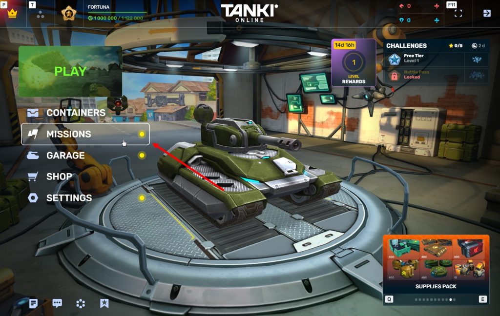
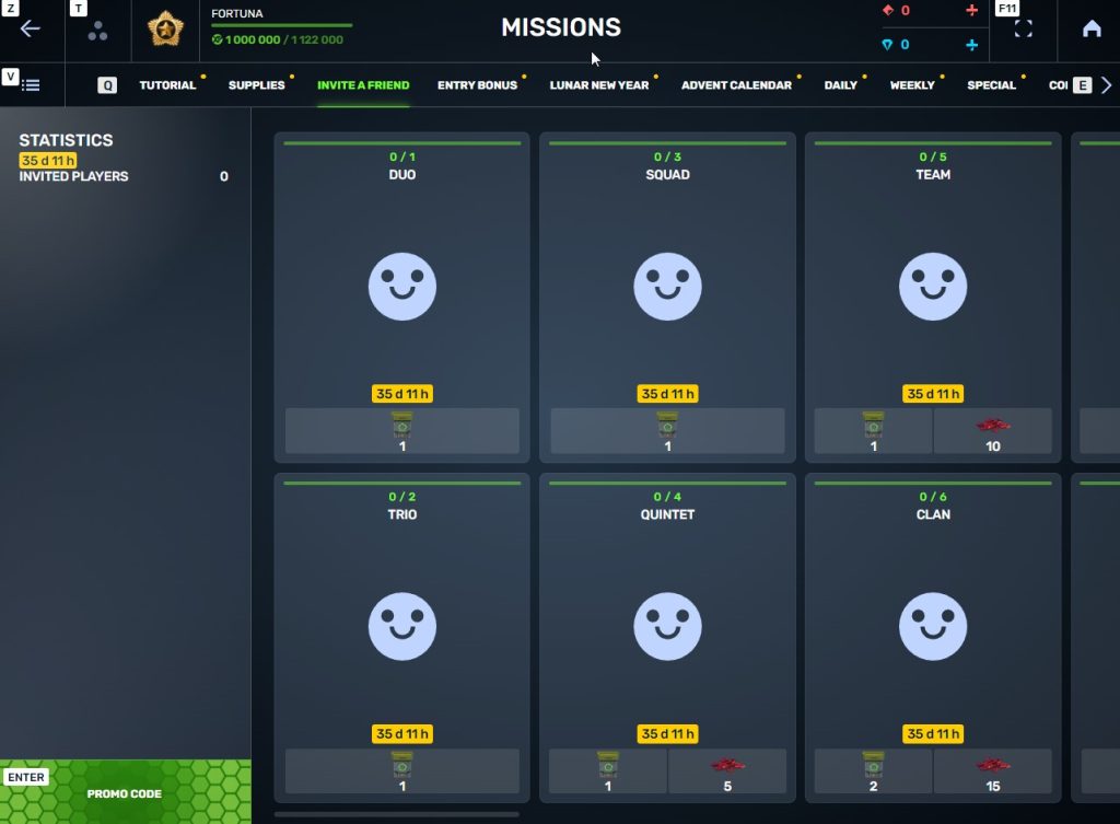
Invite a friend #6
Invite friends to the game and get rewards!
We are launching a new referral event! During this event, you can get rewards for inviting new players or players who stopped playing the game. Also, as the friends you’ve invited complete special missions, you will receive additional bonuses!
Dates: From April 24th 2 AM to June 3rd 2 AM UTC
Let’s get into the details:
How to invite
IMPORTANT: The option to invite new players is only available to accounts created before the start of the event, April 24th 2 AM.
Referrals are players who you invited to the game.
You need to follow these steps to make a new player your referral:
STEP 1 Your rank should be at least Master Sergeant.
STEP 2 You need to enter the game and go to the Missions menu.
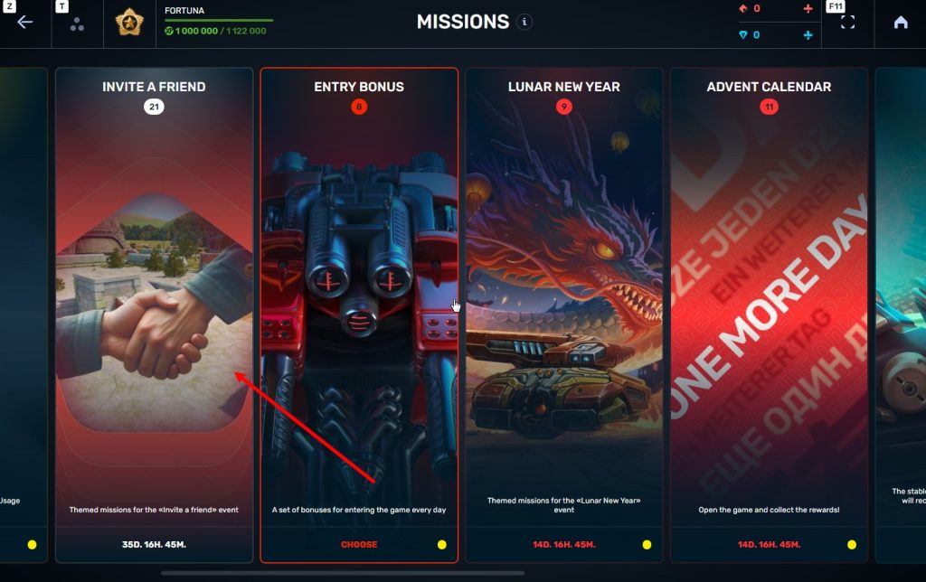
STEP 3 There, you need to open the special «Invite a friend» category of missions.
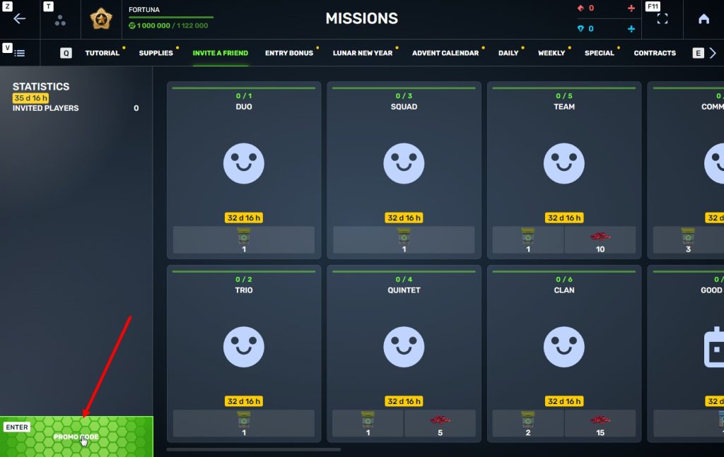
STEP 4 In that section, you need to generate a special invite promo code.
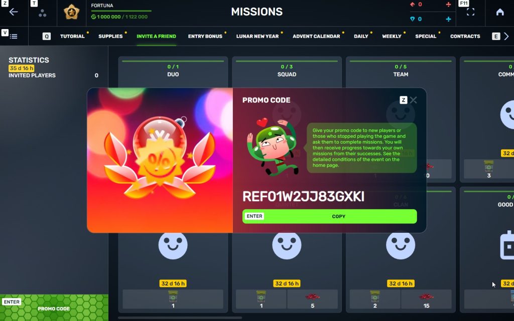
STEP 5 Share this Promocode with people you want to invite to the game and tell them how they can activate it (read below).
IMPORTANT: If you are a player who was invited to the game during this referral event, you cannot generate your own promo code to invite other players.
Who can become your referral
There are two types of players who can become your referrals:
- Players who created their account since April 24th 2 AM.
- Player who last entered the game before March 16th 2 AM UTC.
Pay attention to the fact that in order to activate an invite promo code, a player should have at least Private rank.
Important: A player who generated a promo code to send it to other players cannot activate their own promo code or a Promocode of any other player.
What do I get for inviting players?
- Once you generate your invite promo code, send it to your friends and acquaintances.
- In the special «Invite a friend» category of missions, you will get a set of special missions.
3. Once they activate your promo code, players who have been invited will also get a set of their own special missions in the «Missions from a friend» category. In your «Invite a friend» category you can track how your referrals complete their missions, and thus your missions get completed and you can claim rewards for the efforts of the players you have referred.
Missions for those who invite
There are two types of missions for inviting players. The first type gives you rewards for players who just activated your promo code. The second type gives you rewards once your invited players complete the required missions.
Bonuses for inviting players
Important: An invited player is counted towards mission progress only once they activate your promocode.
Duo
TASK
Invite 1 player to the game.
REWARD
×1
COMMON KEY
COMMON KEY
×100
EXPERIENCE POINTS
EXPERIENCE POINTS
Trio
TASK
Invite 2 players to the game.
REWARD
×1
COMMON KEY
COMMON KEY
×100
EXPERIENCE POINTS
EXPERIENCE POINTS
Squad
TASK
Invite 3 players to the game.
REWARD
×1
COMMON KEY
COMMON KEY
×100
EXPERIENCE POINTS
EXPERIENCE POINTS
Quintet
TASK
Invite 4 players to the game.
REWARD
×1
COMMON KEY
COMMON KEY
×100
EXPERIENCE POINTS
EXPERIENCE POINTS
×5
RUBY
RUBY
Team
TASK
Invite 5 players to the game.
REWARD
×1
COMMON KEY
COMMON KEY
×100
EXPERIENCE POINTS
EXPERIENCE POINTS
×10
RUBY
RUBY
Clan
TASK
Invite 6 players to the game.
REWARD
×2
COMMON KEY
COMMON KEY
×100
EXPERIENCE POINTS
EXPERIENCE POINTS
×15
RUBY
RUBY
Community
TASK
Invite 7 players to the game.
REWARD
×3
COMMON KEY
COMMON KEY
×100
EXPERIENCE POINTS
EXPERIENCE POINTS
×40
RUBY
RUBY
Bonuses for efforts of your referrals
Important: An invited player is counted towards mission progress only once they activate your promocode and complete the required referral missions.
Good Start
TASK
Invited players completed 10 referral event missions
REWARD
×1
RARE KEY
RARE KEY
×100
EXPERIENCE POINTS
EXPERIENCE POINTS
Makes Progress
TASK
Invited players completed 20 referral event missions
REWARD
×1
RARE KEY
RARE KEY
×100
EXPERIENCE POINTS
EXPERIENCE POINTS
Can Play Together
TASK
Invited players completed 30 referral event missions
REWARD
×1
RARE KEY
RARE KEY
×100
EXPERIENCE POINTS
EXPERIENCE POINTS
×5
RUBY
RUBY
They Trust You
TASK
Invited players completed 40 referral event missions
REWARD
×1
RARE KEY
RARE KEY
×100
EXPERIENCE POINTS
EXPERIENCE POINTS
×10
RUBY
RUBY
Social Butterfly
TASK
Invited players completed 50 referral event missions
REWARD
×1
RARE KEY
RARE KEY
×100
EXPERIENCE POINTS
EXPERIENCE POINTS
×15
RUBY
RUBY
Influencer
TASK
Invited players completed 60 referral event missions
REWARD
×2
RARE KEY
RARE KEY
×100
EXPERIENCE POINTS
EXPERIENCE POINTS
×20
RUBY
RUBY
Celebrity
TASK
Invited players completed 80 referral event missions
REWARD
×3
RARE KEY
RARE KEY
×100
EXPERIENCE POINTS
EXPERIENCE POINTS
×60
RUBY
RUBY
Full Pack
TASK
Invited players completed 1 referral event supermission
REWARD
×1
EPIC KEY
EPIC KEY
×100
EXPERIENCE POINTS
EXPERIENCE POINTS
Aspiring Expert
TASK
Invited players completed 2 referral event supermissions
REWARD
×1
EPIC KEY
EPIC KEY
×100
EXPERIENCE POINTS
EXPERIENCE POINTS
×5
RUBY
RUBY
Forward to Victory
TASK
Invited players completed 3 referral event supermissions
REWARD
×1
EPIC KEY
EPIC KEY
×100
EXPERIENCE POINTS
EXPERIENCE POINTS
×10
RUBY
RUBY
Good Mentor
TASK
Invited players completed 4 referral event supermissions
REWARD
×1
EPIC KEY
EPIC KEY
×100
EXPERIENCE POINTS
EXPERIENCE POINTS
×15
RUBY
RUBY
Thunderstorm of Matchmaking
TASK
Invited players completed 5 referral event supermissions
REWARD
×1
EPIC KEY
EPIC KEY
×100
EXPERIENCE POINTS
EXPERIENCE POINTS
×20
RUBY
RUBY
Preparing for eSports
TASK
Invited players completed 6 referral event supermissions
REWARD
×2
EPIC KEY
EPIC KEY
×100
EXPERIENCE POINTS
EXPERIENCE POINTS
×60
RUBY
RUBY
Professional Referrer
TASK
Invited players completed 7 referral event supermissions
REWARD
×3
EPIC KEY
EPIC KEY
×700
RUBY
RUBY

×1
LEGENDARY KEY
LEGENDARY KEY
How it works for referrals
Once you invite a friend and give them your promo code, your friend should do the following:
STEP 1 Create an account (or log into an existing one, if it meets the criteria)
STEP 2 Get the «Private» rank. It won’t take much time.
STEP 3 Enter the Shop
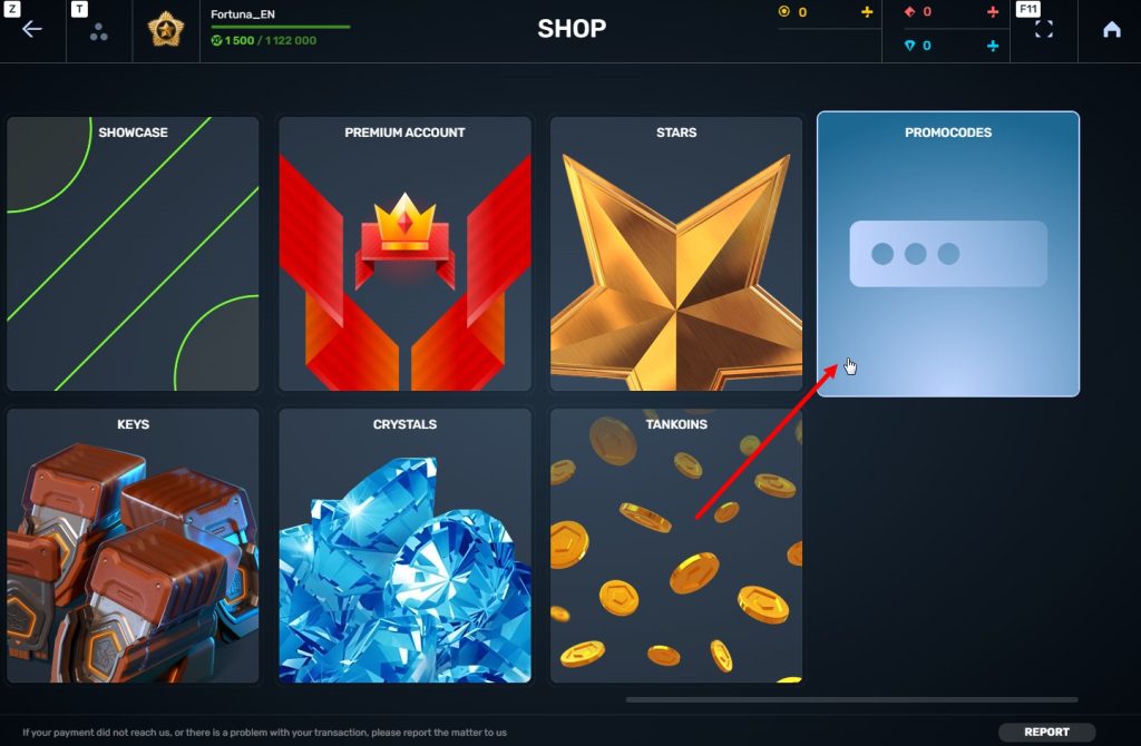
STEP 4 Go to the «Promocode» section
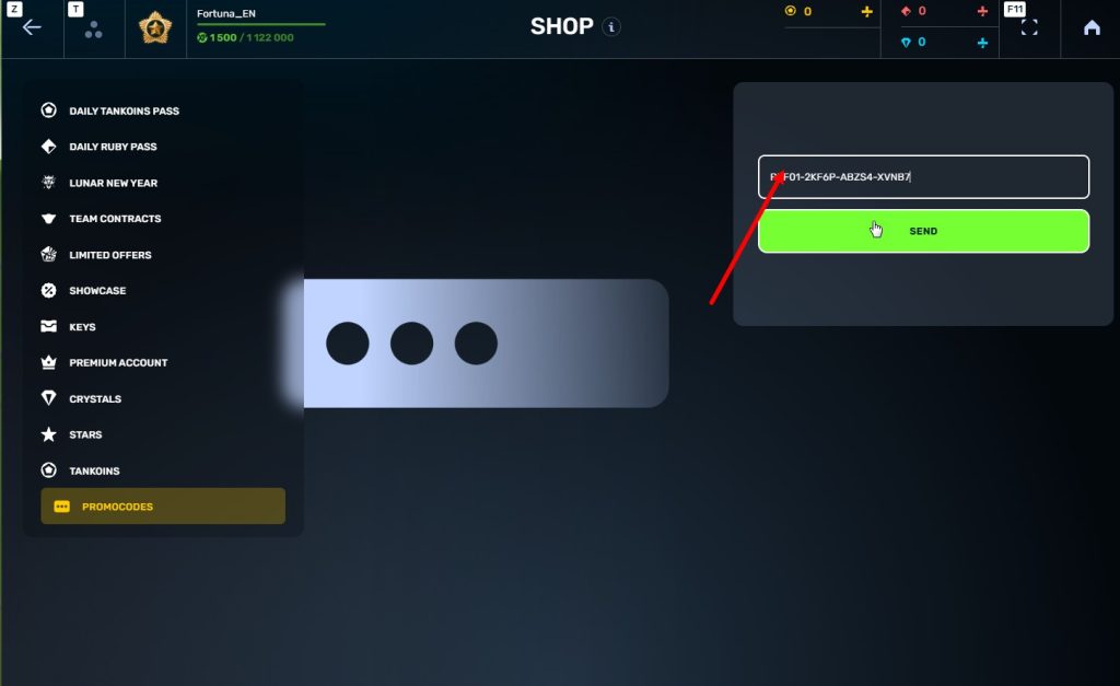
STEp 5 Activate the promo code
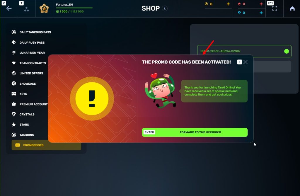
STEP 6 Press the «Forward to the missions!» button
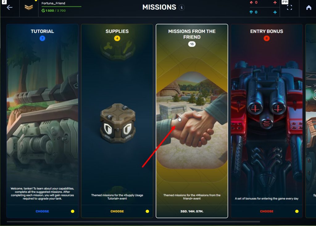
STEP 7 In the Missions menu, there will be a section called «Missions from the friend» with a set of special missions to complete
STEP 8 Complete the missions and claim the rewards
Important: During a referral event, a player can become a referral of only one player (activate only one referral promo code).
Bonuses for referrals for completing missions
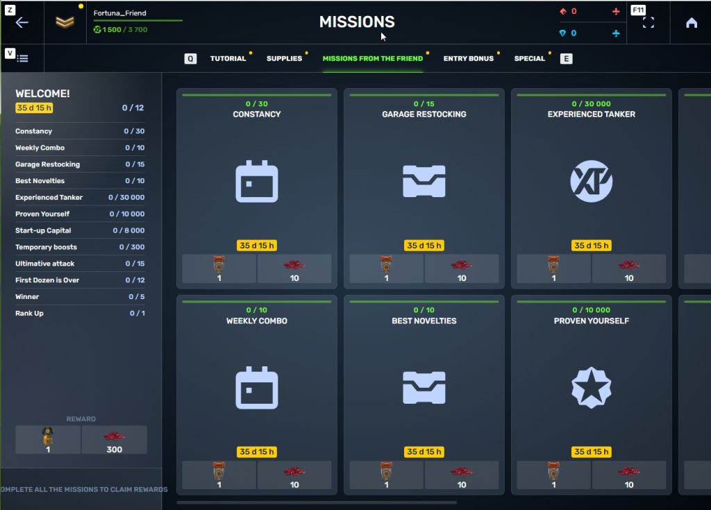
WELCOME!
TASK
Supermission. Complete all referral missions.
REWARD

×1
legendary key
×300
ruby
CONSTANCY
TASK
Complete 30 daily missions.
REWARD
×1
epic key
×100
EXPERIENCE POINTS
EXPERIENCE POINTS
×10
ruby
WEEKLY COMBO
TASK
Complete 15 weekly missions.
REWARD
×1
epic key
×100
EXPERIENCE POINTS
EXPERIENCE POINTS
×10
ruby
GARAGE RESTOCKING
TASK
Open 15 Common Containers
REWARD
×1
epic key
×100
EXPERIENCE POINTS
EXPERIENCE POINTS
×10
ruby
BEST NOVELTIES
TASK
Open 10 Epic Containers.
REWARD
×1
epic key
×100
EXPERIENCE POINTS
EXPERIENCE POINTS
×10
ruby
EXPERIENCED TANKER
TASK
Earn 30 000 experience points.
REWARD
×1
epic key
×100
EXPERIENCE POINTS
EXPERIENCE POINTS
×10
ruby
PROVEN YOURSELF
TASK
Earn 15 000 reputation points.
REWARD
×1
epic key
×100
EXPERIENCE POINTS
EXPERIENCE POINTS
×10
ruby
START-UP CAPITAL
TASK
Earn 10 000 crystals.
REWARD
×1
epic key
×100
EXPERIENCE POINTS
EXPERIENCE POINTS
×10
ruby
TEMPORARY BOOSTS
TASK
Activate supplies 300 times.
REWARD
×1
epic key
×100
EXPERIENCE POINTS
EXPERIENCE POINTS
×10
ruby
ULTIMATIVE ATTACK
TASK
Use overdrive 15 times.
REWARD
×1
epic key
×100
EXPERIENCE POINTS
EXPERIENCE POINTS
×10
ruby
FIRST DOZEN IS OVER
TASK
Finish 20 battles.
REWARD
×1
epic key
×100
EXPERIENCE POINTS
EXPERIENCE POINTS
×10
ruby
WINNER
TASK
Be in the winning team of 5 battles.
REWARD
×1
epic key
×100
EXPERIENCE POINTS
EXPERIENCE POINTS
×10
ruby
RANK UP
TASK
Get a new rank.
REWARD
×1
epic key
×100
EXPERIENCE POINTS
EXPERIENCE POINTS
×10
ruby
You can track the progress of completing missions by your referrals in the «Statistics» column of the «Invite a friend» category in missions.
Invite friends and get rewards!
Tanki Classic mass test

We are officially launching the “Tanki Classic” mass test!
During the test, you will be able to get onto separate “Tanki Classic” test servers, if you have purchased one of the early access special offers.
How to get there?
You can get onto “Tanki Classic” only through the announcement window in the main game lobby.
Attention! There are no other ways to get onto the game. Other sites you see on the Internet are scams and are made to steal your account details. You do not need to enter your password to log into the Tanki Classic test servers. If someone asks for your password to access Tanki Classic, it is definitely a scam. Be careful.
You will only have access if you are an early access participant.
How to get Early Access?
The special Early Access offers for “Tanki Classic” were only available for a limited time. With the start of the mass testing phase, we are bringing these special offers back on sale. This is your chance to become a part of the legendary “Tanki Classic” project ahead of everyone else!
Early Access offers are available from rank 8.
Personalized
×1000
(TO) Rubies

(TO) Bronze medal Tanki Classic
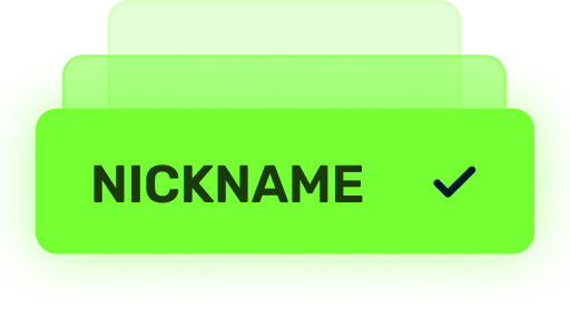
(TC) Nickname reservation
Nostalgia
×3000
(TO) Rubies

(TO) SILVER medal Tanki Classic
(TC) Nickname reservation
(TC) VETERAN PAINT
(TC) EARLY ACCESS

(TC) Voting option
Old School
×10000
(TO) Rubies

(TO) Gold medal Tanki Classic
(TC) Nickname reservation
(TC) VETERAN PAINT
(TC) EARLY ACCESS
(TC) Voting option
×200
(TC) CONTAINERS
What is there in the game?
This is a test version of the game. It is possible to encounter bugs, issues, unfinished features, and anomalies.
During the test, we will restart the game several times and even temporarily pause the testing process.
We will also wipe the test server database several times, which will reset all your progress.
For testing Tanki Classic, we use new server infrastructure. This may cause unstable server performance during the first weeks of testing. We will be configuring and fixing everything.
Is this early access already?
No. Early access will be announced separately, 2 weeks before the game is released. You will be able to get access to the game earlier than anybody else and progress your account earlier than others.
What is the “Development Plans” section on the Tanki Classic website?
Alongside the launch of Tanki Classic testing, we are adding a special “Development Plans” section to the project’s website. From now on, this section will be the primary, first-source of information on the development of the Tanki Classic project.
There, we will announce the key development areas of the project earlier than anywhere else.
Please note: the presented plans reflect our current goals and may be adjusted based on your feedback and voting results.
In the future, we will launch the promised polls for the game mechanics. You, the players, will define the future of “Tanki Classic!”
Feedback can be left on the forum topic of this news.
Recommended Posts