 Jump to content
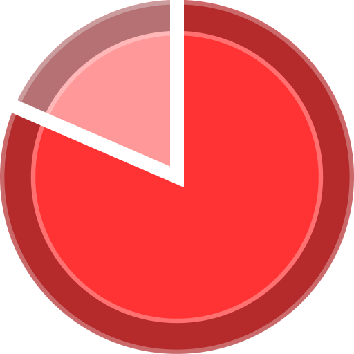
«Tanki and The Snow Trap» mini-game 2025
1/7
Magnum IC
2/7
Tanki Online V-LOG: Episode 540
3/7
Tanki Classic mass test
4/7
Helpers of the Year 2025
5/7
Festive season Wishes
6/7
Festive season in Tanki Online!
7/7


«Tanki and The Snow Trap» mini-game 2025
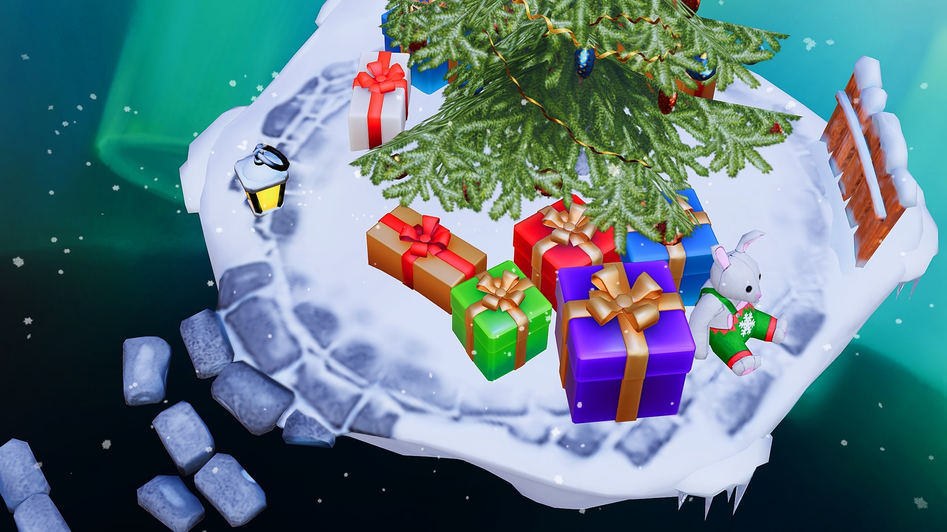
In honor of the New Year, we’re launching the “Tanki and The Snow Trap” mini-game.
Get ready to join us on the journey to conquer the unexplored winter territories! Put on warm clothes, get into a cozy mood, and go travelling for valuable prizes!
From December 26th 2 AM UTC until January 22nd 2 AM UTC, we will launch the “Tanki and The Snow Trap” mini-game on a special site. You will conquer drifting ice floes and receive special prizes!
To get your tank to move between those ice floes, your tank will need fuel — Gingerbread.
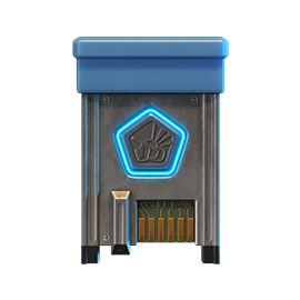
Gingerbreads
Gingerbreads
These are the special event currency. You can track the number of your units of Gingerbread reserves on the mini-game interface.
Here are the ways that you can get Gingerbread:
- Completing special event missions — 12 units of Gingerbread
- From special Gold Boxes — 1 unit of Gingerbread
- Completion of Contracts
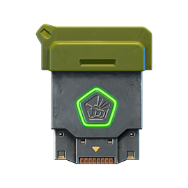
Contracts

Contract
A Contract is a mission that requires earning reputation points in Matchmaking battles.
Contracts can be purchased from December 26th, 2 AM UTC until January 21st, 2 AM UTC in the Shop for Crystals or Rubies.
After the purchase, open the “Contracts” section in the “Missions” menu and activate the contract.
There are 3 types of contracts in the event:
Bronze Contract

Condition: Earn 5000 reputation points in battles
Reward: Gingerbread х2; Bronze Contract х1
One-time purchase
Reward: Gingerbread х2; Bronze Contract х1
One-time purchase
Checkpoint #1 REWARD
- Time to complete: until January 21st, 2 AM UTC
- Time to collect the prize: until January 21st, 2 AM UTC
- Alternative reward if not completed in time: Crystals х1000
- Alternative reward if the reward is not collected in time: Crystals х1000
- Early completion price: Rubies 300-1
Silver Contract
- Time to complete: until January 21st, 2 AM UTC
- Time to collect the prize: until January 21st, 2 AM UTC
- Alternative reward if not completed in time: Crystals х49900
- Alternative reward if the reward is not collected in time: Crystals х49900
- Early completion price: Rubies 300-1
Golden Contract
- Time to complete: until January 21st, 2 AM UTC
- Time to collect the prize: until January 21st, 2 AM UTC
- Alternative reward if not completed in time: Rubies х290
- Alternative reward if the reward is not collected in time: Rubies х290
- Early completion price: Rubies 1500-1
IMPORTANT information:
- You can only have 1 contract activated at one time.
- If you have already completed the contract requirement and earned 5000 reputation points, the reward should be claimed immediately, otherwise a new contract cannot be activated.
- At the end of the event, if you completed a contract, but didn’t claim its reward, you can receive an alternative reward depending on the contract’s price.
- After January 21st, all contracts will become unavailable and expire. They will be marked with a red color.
Before completing a contract, DON’T FORGET to activate it.
How to Start
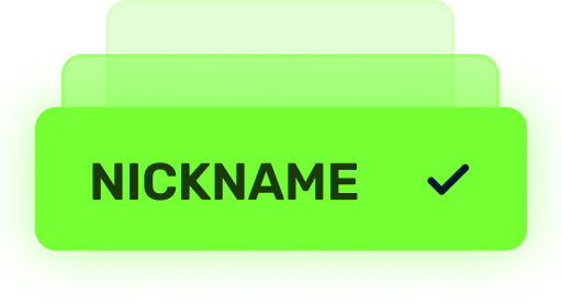
Log in
To start your journey, you need to log in to the mini-game website, using the nickname and the password of your in-game account.
By the way, the mini-game site will now be available on mobile devices!
If you use Facebook or Google to log in to your account, you will need to contact our customer service to get a password for your account to enter the website.
Ice Floes
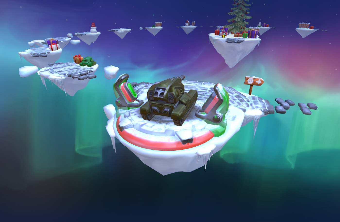
Ice Floes
The mini-game map consists of ice floes, and on each of them, a surprise awaits you.
But as you know, there are good and bad surprises:
- Let’s start with the good ones, where you will get: Common Keys, Rare Keys, Epic Keys, an augment for Magnum, ICE skins, and special Grenades. When you conquer an ice floe, a reward is sent to a special storage at the Checkpoint, and is not immediately credited to your in-game account.
- For each move, you need to spend 10 units of Gingerbread. You can move one or two floes forward.
- There will be special “snow traps” on your way. By entering them, you have a 50% chance to either move two steps back or stay in the same place.
Don’t worry, even if luck is not on your side and you get pushed back, you can receive a reward for each ice floe that you pass twice on your way forward.
Checkpoints
A player starts their journey from the 1st Checkpoint. The mini-game ends when you reach the 7th Checkpoint.
After completing a whole lap, the player reaches a checkpoint. There is a special vault on it to store all the prizes that the player received from the ice floes on that lap. When visiting a checkpoint, the player can transfer the prizes from the vault to their in-game account.
Moreover, whenever you reach a checkpoint, you will receive even more unique rewards in your vault.
Prizes
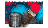
Checkpoint 1

PAINT
Viscum
Bronze Contract
Checkpoint 2
×100
Snowball grenade ×100
Checkpoint 3

×10
Tsar grenade ×10
Checkpoint 4

GAUSS
IC
Checkpoint 5
hammer
IC
Checkpoint 6

magnum
Carronade
Checkpoint 7

magnum
IC

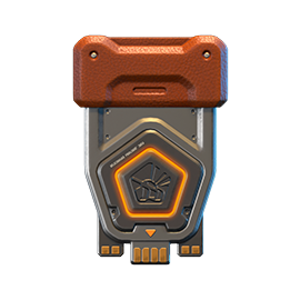
magnum Carronade
Increases the turret’s rate of fire at the cost of reduced damage per shot.
Shells used by this version of Magnum feature a smaller explosive charge, saving a significant amount of weight. This results in a higher rate of fire, smoother recoil, faster aiming, and a much higher density of fire. The “Carronade” performs noticeably better at close range compared to the standard Magnum.
On the other hand, firing the “Carronade” at maximum range is more demanding and requires greater skill from the shooter.
Special missions with Gingerbreads
Want to get a lot of gingerbreads? Then these missions are for you!
LIGHT FROST
TASK
Destroy 100 tanks using light hulls (Wasp, Hornet, Hopper) in any matchmaking battles.
REWARD
×1
EPIC KEY
EPIC KEY

×12
Gingerbread
FREEZING RAIN
TASK
Destroy 100 tanks using medium hulls (Hunter, Viking, Crusader, Paladin, Dictator) in any matchmaking battles.
REWARD
×1
EPIC KEY
EPIC KEY
×12
Gingerbread
SNOWSTORM
TASK
Destroy 100 tanks using heavy hulls (Ares, Titan, Mammoth) in any matchmaking battles.
REWARD
×1
EPIC KEY
EPIC KEY
×12
Gingerbread
NORTH WIND
TASK
Destroy 100 tanks using melee-range turrets (Firebird, Freeze, Isida, Tesla, Hammer) in any matchmaking battles.
REWARD
×1
EPIC KEY
EPIC KEY
×12
Gingerbread
RIGOR
TASK
Destroy 100 tanks using medium-range turrets (Smoky, Striker, Vulcan, Thunder, Twins, Ricochet) in any matchmaking battles.
REWARD
×1
EPIC KEY
EPIC KEY
×12
Gingerbread
ICE SHARDS
TASK
Destroy 100 tanks using long-range turrets (Shaft, Gauss, Magnum, Railgun, Scorpion) in any matchmaking battles.
REWARD
×1
EPIC KEY
EPIC KEY
×12
Gingerbread
Good luck in conquering new heights!
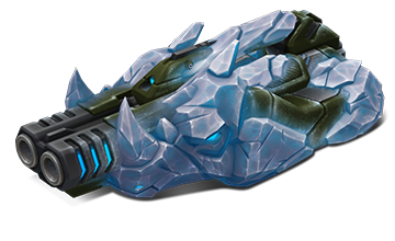
Magnum IC

The frosty lineup of skins keeps growing!
The IC skin series is welcoming Magnum! This skin embodies icy power and cold-blooded precision: its shapes are forged from ice crystals, sharp edges resemble frozen armor, and the cold blue glow highlights its deadly nature. Magnum IC looks like it was created in the heart of eternal permafrost, and every shot it fires carries a piercing chill.

Magnum IC
An IC series turret embodies the harsh power of ice. Covered in a thick layer of Antarctic ice, it resembles a dangerous crystalline beast, its form seemingly carved from permafrost. Every shot resonates with merciless cold, leaving an icy trail in its wake and turning the battlefield into a frozen wasteland.
This turret is made for those ready to face the frost head-on and answer their enemies with cold fury.
How to get it
You can obtain the Magnum IC skin at the 7th and final checkpoint of the «Tanki and The Snow Trap» mini-game 2025.
This skin will be a true highlight of your collection and another bonus to your New Year’s mood.
Good luck in battles!
Tanki Online V-LOG: Episode 540
In today’s episode, we will be announcing the new mini-game. We’ll also be giving updated on Classic and wishing you Merry Christmas and Happy New Year!
Tanki Classic mass test

We are officially launching the “Tanki Classic” mass test!
During the test, you will be able to get onto separate “Tanki Classic” test servers, if you have purchased one of the early access special offers.
How to get there?
You can get onto “Tanki Classic” only through the announcement window in the main game lobby.
Attention! There are no other ways to get onto the game. Other sites you see on the Internet are scams and are made to steal your account details. You do not need to enter your password to log into the Tanki Classic test servers. If someone asks for your password to access Tanki Classic, it is definitely a scam. Be careful.
You will only have access if you are an early access participant.
How to get Early Access?
The special Early Access offers for “Tanki Classic” were only available for a limited time. With the start of the mass testing phase, we are bringing these special offers back on sale. This is your chance to become a part of the legendary “Tanki Classic” project ahead of everyone else!
Early Access offers are available from rank 8.
Personalized
×1000
(TO) Rubies

(TO) Bronze medal Tanki Classic
(TC) Nickname reservation
Nostalgia
×3000
(TO) Rubies

(TO) SILVER medal Tanki Classic
(TC) Nickname reservation
(TC) VETERAN PAINT
(TC) EARLY ACCESS

(TC) Voting option
Old School
×10000
(TO) Rubies

(TO) Gold medal Tanki Classic
(TC) Nickname reservation
(TC) VETERAN PAINT
(TC) EARLY ACCESS
(TC) Voting option
×200
(TC) CONTAINERS
What is there in the game?
This is a test version of the game. It is possible to encounter bugs, issues, unfinished features, and anomalies.
During the test, we will restart the game several times and even temporarily pause the testing process.
We will also wipe the test server database several times, which will reset all your progress.
For testing Tanki Classic, we use new server infrastructure. This may cause unstable server performance during the first weeks of testing. We will be configuring and fixing everything.
Is this early access already?
No. Early access will be announced separately, 2 weeks before the game is released. You will be able to get access to the game earlier than anybody else and progress your account earlier than others.
What is the “Development Plans” section on the Tanki Classic website?
Alongside the launch of Tanki Classic testing, we are adding a special “Development Plans” section to the project’s website. From now on, this section will be the primary, first-source of information on the development of the Tanki Classic project.
There, we will announce the key development areas of the project earlier than anywhere else.
Please note: the presented plans reflect our current goals and may be adjusted based on your feedback and voting results.
In the future, we will launch the promised polls for the game mechanics. You, the players, will define the future of “Tanki Classic!”
Feedback can be left on the forum topic of this news.
Helpers of the Year 2025

It’s time to sum things up and thank the most dedicated helpers of Tanki Online for their selfless work. Those who have been working hard for the entire year for the good of the project. They are our pride, the Best Helpers of 2025.
These tankers made the greatest contribution to the development of the game in 2025: moderating the game resources, keeping information up to date across all platforms, testing updates, reviewing reports, and catching cheaters.
- Marcus
- Spy
- Mosad
- Stealth
- Jack
- rommeltanki
- Yele
- Vlad
- Elegante
- Dynasty
- natrolite
- Lennard
- NikmanGT
- fjrenke
- Sabry
- Ghost
- Mr_STIFFLER
- fjrenke
- Super_Nickson
- Seraphina
- Future
- Hans
- Bartson74
- Dumbledore6969
- chinufire
- Mr.Skiil
- Edu_Gamer
- Helax
- Positive
- Scientist
- Squirrellover
- Nocturn
- Peruere
- zam
- Heatw4ve
- wolfson
- BHOOT_KING
- Marekos1111
- Who_Is_NexT
- Legendarni
- k4n
- Walking.Dead
- Mr.Fox
- Spicy_Crabs
- Tornike
- 7ofHearts
Festive season Wishes

Dear Tankers! The most wonderful time of the year is just around the corner!
The air is filled with holiday magic, homes are glowing with festive lights, and the season brings that special feeling of warmth and joy. The Tanki Online team would like to warmly congratulate you on the upcoming holidays — Christmas and the New Year!
This year has been bright and full of action: exciting events, major updates, intense battles, and countless memorable moments. You became an essential part of everything that happened, and we kept working hard to make the game even better for you.
A new year means new goals, new victories, and new opportunities. Together, we’re ready to reach new heights!
May 2026 bring you inspiration, joyful discoveries, cozy moments with loved ones, and lots of reasons to smile. We wish you health, happiness, good luck, and success both in the game and in real life!
Merry Christmas and Happy New Year! 🎄✨
Festive season in Tanki Online!

Festive season is coming! The time of wonders is now! From December 19th, the New Year spirit will be at its maximum in Tanki Online!
Enjoy 50% discounts, special “Snowballs”, “Legendary Gold Rush”, “Snowman’s Gold”, and “Frostbite” game modes, updated Epic Containers packed with Excelsior augments, shot effects and the new “Detonator” augment for Railgun, new Elite Pass featuring a Legendary Key and “Snowball” grenades as rewards, snowman bots, festive decorations, an advent calendar, exciting special offers, and tons of missions, all waiting for you in the game!
The event will last from December 19th, 2 AM UTC till January 16th, 2 AM UTC.
Bots
For the duration of the celebration, all bots in Matchmaking battles will turn into snowmen!
Now they can be easily distinguished from real players!
Epic Containers
The contents of Epic Containers have been updated and are ready to surprise you!
In honor of the celebration, they are filled with lots of augments and shot effects!
Contents:
- NEW “Detonator” augment for Railgun
- “Excelsior” augment for Firebird
- “Excelsior” augment for Freeze
- “Excelsior” augment for Isida
- “Excelsior” augment for Tesla
- “Excelsior” augment for Hammer
- “Excelsior” augment for Twins
- “Excelsior” augment for Ricochet
- “Excelsior” augment for Vulcan
- “Excelsior” augment for Smoky
- “Excelsior” augment for Striker
- “Excelsior” augment for Thunder
- “Excelsior” augment for Scorpion
- “Excelsior” augment for Magnum
- “Excelsior” augment for Railgun
- “Excelsior” augment for Gauss
- “Excelsior” augment for Shaft
- “Excelsior” augment for Wasp
- “Excelsior” augment for Hopper
- “Excelsior” augment for Hornet
- “Excelsior” augment for Viking
- “Excelsior” augment for Crusader
- “Excelsior” augment for Hunter
- “Excelsior” augment for Paladin
- “Excelsior” augment for Dictator
- “Excelsior” augment for Titan
- “Excelsior” augment for Ares
- “Excelsior” augment for Mammoth
- “Blaster” shot effect for Twins
- “Blaster” shot effect for Ricochet
- “Magic” shot effect for Railgun
- And everything that can be obtained from Common Containers

RAILGUN Detonator
Significantly increases the damage and explostion radius of a Grenade in case of a combo shot. For the combo shot, you must hit your own Grenade with a Railgun shot.
A successful combo detonation of a Grenade requires many conditions to align. The enemy must be at the right distance, the Grenade must be ready, and the turret must be charged. This rarely happens. It’s even rarer to successfully hit the Grenade to trigger the detonation. With this Augment, your efforts will be rewarded many times over.
All you need is one successful hit. Just one successful hit and the enemy’s will shall be shattered.
50% Discounts
Don’t miss the opportunity to make good use of the unbelievable discounts!
From December 19th until December 22nd, 50% discounts await you!
All discounts start and end at 2 AM UTC.
For three whole days, you will be able to obtain the following items with a 50% discount:
-50%
SHOP (19.12 — 22.12)
Crystals

Stars
Early Access items
Premium Pass
-50%
GARAGE (19.12 — 22.12)
Augments
Supplies
Paints
Drones
Modules
Grenades
-50%
UPGRADES (19.12 — 22.12)
Special Event Modes
Four exciting game modes will be waiting for you in the game!
Important: Boosted battle funds and experience are only active within the festive weekend game modes.
Each mode starts and ends with the server restart at 2 AM UTC.
SPECIAL MODE
SNOWMAN’S GOLD
December 19th — December 22nd
Mode
DM
Turret
Snowman
Hull
Any
Bonus Boxes
Upgrades
Augments
Gold Boxes
Equipment Change
Overdrives
Supplies
Nuclear Energy
Smart Supplies
Drones
Protection Modules
Groups
Grenades
More Gold Boxes
Each tanker is automatically equipped with the special «Snowman» turret. Yes, it shoots snowballs! Join battles in the Deathmatch mode and show your skills!
- New Year 2025 Remastered
In this mode all players are equipped with the special “Salyut” grenades.
SPECIAL MODE
LEGENDARY GOLD RUSH
December 26th — December 29th
Mode
DM
Turret
Any
Hull
Any
Bonus Boxes
Upgrades
Augments
Gold Boxes
Equipment Change
Overdrives
Supplies
Nuclear Energy
Smart Supplies
Drones
Protection Modules
Groups
Grenades
More Gold Boxes
Deathmatch. Everyone wants to catch as many gold boxes as possible, risking being left without any loot in a fight with other players.
- New Year 2025 Remastered
- Forest MM Winter NY Remastered
- Sandbox MM Winter NY Remastered
In this mode all players are equipped with the special “Salyut” grenades.
SPECIAL MODE
SNOWBALLS
January 2nd — January 5th
Mode
TDM
Map
Turret
Snowman
Hull
Any
Bonus Boxes
Upgrades
Augments
Gold Boxes
Equipment Change
Overdrives
Supplies
Nuclear Energy
Smart Supplies
Drones
Protection Modules
Groups
Grenades
More Gold Boxes
There can be no winter festivities without a snowball fight! The special festive «Snowballs» mode returns on the new special Christmas Remastered map!
- Cross MM Winter Remastered
- Forest MM Winter Remastered
- Sandbox MM Winter Remastered
In this mode all players are equipped with the special “Salyut” grenades.
SPECIAL MODE
FROSTBITE
January 9th — January 12th
Mode
CP
Map
Turret
Freeze
Hull
Hornet
Bonus Boxes
Upgrades
Augments
Gold Boxes
Equipment Change
Overdrives
Supplies
Nuclear Energy
Smart Supplies
Drones
Protection Modules
Groups
Grenades
More Gold Boxes
Dive into an icy warfare! To win, you need to freeze out all opponents and capture points on the map. Be prepared for harsh conditions and a frigid battle!
- Polygon PRO
Special Missions
We have prepared a plethora of exciting missions which will make the event more exciting!
Your progress in completing missions is only counted from the moment you first enter the “Missions” screen after the event begins.
Missions follow the Encore system, with the second set of missions appearing only after the first set is completed.
SPECIAL
Part 1. December 19th — December 26th
Part 2. December 26th — January 2nd
Part 3. January 2nd — January 9th
Part 4. January 9th — January 16th
SNOWBALLS
TASK
Finish 2 battles in the festive mode.
REWARD
×3
EPIC KEY
EPIC KEY
GOOOLD!
TASK
Finish 2 battles in the festive mode.
REWARD
×3
EPIC KEY
EPIC KEY
SASQUATCH
TASK
Finish 2 battles in the festive mode.
REWARD
×3
EPIC KEY
EPIC KEY
COLD-HEARTED
TASK
Finish 2 battles in the festive mode.
REWARD
×3
EPIC KEY
EPIC KEY
SET 1
Set 1. December 19th — January 16th
SUPERMISSION: SNOWBALL. PART 1
TASK
Complete «Welcome! Part 1», «Respect! Part 1», «Choice Without a Choice. Part 1», «Well-Deserved Rest. Part 1», «Team Competition. Part 1», «Wish Fulfillment. Part 1», «The Ice Battle», «Santa’s Wrath», «For Everybody », «Polar Star» and «Unboxing! Part 1» missions.
REWARD
×5
EPIC KEY
EPIC KEY
×1
RARE KEY
RARE KEY
×1000
EXPERIENCE POINTS
EXPERIENCE POINTS
WELCOME! PART 1
TASK
Enter the game at least once.
REWARD
×1
COMMON KEY
COMMON KEY
×100
EXPERIENCE POINTS
EXPERIENCE POINTS
RESPECT! PART 1
TASK
Earn 5000 reputation points in any matchmaking battles.
REWARD
×1
COMMON KEY
COMMON KEY
×100
EXPERIENCE POINTS
EXPERIENCE POINTS
CHOICE WITHOUT A CHOICE. PART 1
TASK
Earn 3000 reputation points in Quick Battle mode in any matchmaking battles.
REWARD
×1
COMMON KEY
COMMON KEY
×100
EXPERIENCE POINTS
EXPERIENCE POINTS
WELL-DESERVED REST. PART 1
TASK
Finish 10 battles in any matchmaking battles.
REWARD
×1
COMMON KEY
COMMON KEY
×100
EXPERIENCE POINTS
EXPERIENCE POINTS
TEAM COMPETITION. PART 1
TASK
Be in the winning team of 2 battles in any matchmaking battles.
REWARD
×1
COMMON KEY
COMMON KEY
×100
EXPERIENCE POINTS
EXPERIENCE POINTS
WISH FULFILLMENT. PART 1
TASK
Make any purchase in the game’s Shop.
REWARD
×1
COMMON KEY
COMMON KEY
×100
EXPERIENCE POINTS
EXPERIENCE POINTS
THE ICE BATTLE
TASK
Earn 1000 reputation points in TDM mode in matchmaking battles.
REWARD
×1
COMMON KEY
COMMON KEY
×100
EXPERIENCE POINTS
EXPERIENCE POINTS
SANTA’S WRATH
TASK
Use boosted damage 150 times in any matchmaking battles.
REWARD
×1
COMMON KEY
COMMON KEY
×100
EXPERIENCE POINTS
EXPERIENCE POINTS
FOR EVERYBODY
TASK
Deal 100000 damage in any matchmaking battles.
REWARD
×1
COMMON KEY
COMMON KEY
×100
EXPERIENCE POINTS
EXPERIENCE POINTS
POLAR STAR
TASK
Earn 45 stars in any matchmaking battles.
REWARD
×1
COMMON KEY
COMMON KEY
×100
EXPERIENCE POINTS
EXPERIENCE POINTS
UNBOXING! PART 1
TASK
Open 15 any Containers.
REWARD
×1
COMMON KEY
COMMON KEY
×100
EXPERIENCE POINTS
EXPERIENCE POINTS
SET 2
Set 2. December 26th — January 16th
SUPERMISSION: SNOWBALL. PART 2
TASK
Complete «Welcome! Part 2», «Respect! Part 2», «Choice Without a Choice. Part 2», «Well-Deserved Rest. Part 2», «Team Competition. Part 2», «Wish Fulfillment. Part 2», «Snow Fortress», «Slippery Slope», «Santa’s Treasure», «Firecracker» and «Unboxing! Part 2» missions.
REWARD
×5
EPIC KEY
EPIC KEY
×1
RARE KEY
RARE KEY
×1000
EXPERIENCE POINTS
EXPERIENCE POINTS
WELCOME! PART 2
TASK
Enter the game at least once.
REWARD
×1
COMMON KEY
COMMON KEY
×100
EXPERIENCE POINTS
EXPERIENCE POINTS
RESPECT! PART 2
TASK
Earn 5000 reputation points in any matchmaking battles.
REWARD
×1
COMMON KEY
COMMON KEY
×100
EXPERIENCE POINTS
EXPERIENCE POINTS
CHOICE WITHOUT A CHOICE. PART 2
TASK
Earn 3000 reputation points in Quick Battle mode in any matchmaking battles.
REWARD
×1
COMMON KEY
COMMON KEY
×100
EXPERIENCE POINTS
EXPERIENCE POINTS
WELL-DESERVED REST. PART 2
TASK
Finish 10 battles in any matchmaking battles.
REWARD
×1
COMMON KEY
COMMON KEY
×100
EXPERIENCE POINTS
EXPERIENCE POINTS
TEAM COMPETITION. PART 2
TASK
Be in the winning team of 2 battles in any matchmaking battles.
REWARD
×1
COMMON KEY
COMMON KEY
×100
EXPERIENCE POINTS
EXPERIENCE POINTS
WISH FULFILLMENT. PART 2
TASK
Make any purchase in the game’s Shop.
REWARD
×1
COMMON KEY
COMMON KEY
×100
EXPERIENCE POINTS
EXPERIENCE POINTS
SNOW FORTRESS
TASK
Earn 1000 reputation points in SGE mode in matchmaking battles.
REWARD
×1
COMMON KEY
COMMON KEY
×100
EXPERIENCE POINTS
EXPERIENCE POINTS
SLIPPERY SLOPE
TASK
Use speed boost 150 times in any matchmaking battles.
REWARD
×1
COMMON KEY
COMMON KEY
×100
EXPERIENCE POINTS
EXPERIENCE POINTS
SANTA’S TREASURE
TASK
Earn 4000 crystals in any matchmaking battles.
REWARD
×1
COMMON KEY
COMMON KEY
×100
EXPERIENCE POINTS
EXPERIENCE POINTS
FIRECRACKER
TASK
Use any grenade 10 times in any matchmaking battles.
REWARD
×1
COMMON KEY
COMMON KEY
×100
EXPERIENCE POINTS
EXPERIENCE POINTS
UNBOXING! PART 2
TASK
Open 15 any Containers.
REWARD
×1
COMMON KEY
COMMON KEY
×100
EXPERIENCE POINTS
EXPERIENCE POINTS
SET 3
Set 3. January 2nd — January 16th
SUPERMISSION: SNOWBALL. PART 3
TASK
Complete «Welcome! Part 3», «Respect! Part 3», «Choice Without a Choice. Part 3», «Well-Deserved Rest. Part 3», «Team Competition. Part 3», «Wish Fulfillment. Part 3», «Who Stole Christmas?», «Ice Shield», «From Year to Year», «Elves’ Revenge» and «Unboxing! Part 3» missions.
REWARD
×5
EPIC KEY
EPIC KEY
×1
RARE KEY
RARE KEY
×1000
EXPERIENCE POINTS
EXPERIENCE POINTS
WELCOME! PART 3
TASK
Enter the game at least once.
REWARD
×1
COMMON KEY
COMMON KEY
×100
EXPERIENCE POINTS
EXPERIENCE POINTS
RESPECT! PART 3
TASK
Earn 5000 reputation points in any matchmaking battles.
REWARD
×1
COMMON KEY
COMMON KEY
×100
EXPERIENCE POINTS
EXPERIENCE POINTS
CHOICE WITHOUT A CHOICE. PART 3
TASK
Earn 3000 reputation points in Quick Battle mode in any matchmaking battles.
REWARD
×1
COMMON KEY
COMMON KEY
×100
EXPERIENCE POINTS
EXPERIENCE POINTS
WELL-DESERVED REST. PART 3
TASK
Finish 10 battles in any matchmaking battles.
REWARD
×1
COMMON KEY
COMMON KEY
×100
EXPERIENCE POINTS
EXPERIENCE POINTS
TEAM COMPETITION. PART 3
TASK
Be in the winning team of 2 battles in any matchmaking battles.
REWARD
×1
COMMON KEY
COMMON KEY
×100
EXPERIENCE POINTS
EXPERIENCE POINTS
WISH FULFILLMENT. PART 3
TASK
Make any purchase in the game’s Shop.
REWARD
×1
COMMON KEY
COMMON KEY
×100
EXPERIENCE POINTS
EXPERIENCE POINTS
WHO STOLE CHRISTMAS?
TASK
Earn 1000 reputation points in CTF mode in matchmaking battles.
REWARD
×1
COMMON KEY
COMMON KEY
×100
EXPERIENCE POINTS
EXPERIENCE POINTS
ICE SHIELD
TASK
Use boosted armor 150 times in any matchmaking battles.
REWARD
×1
COMMON KEY
COMMON KEY
×100
EXPERIENCE POINTS
EXPERIENCE POINTS
FROM YEAR TO YEAR
TASK
Earn 3000 experience points in any matchmaking battles.
REWARD
×1
COMMON KEY
COMMON KEY
×100
EXPERIENCE POINTS
EXPERIENCE POINTS
ELVES’ REVENGE
TASK
Destroy 30 tanks in any matchmaking battles.
REWARD
×1
COMMON KEY
COMMON KEY
×100
EXPERIENCE POINTS
EXPERIENCE POINTS
UNBOXING! PART 3
TASK
Open 15 any Containers.
REWARD
×1
COMMON KEY
COMMON KEY
×100
EXPERIENCE POINTS
EXPERIENCE POINTS
SET 4
Set 4. January 9th — January 16th
SUPERMISSION: SNOWBALL. PART 4
TASK
Complete «Welcome! Part 4», «Respect! Part 4», «Choice Without a Choice. Part 4», «Well-Deserved Rest. Part 4», «Team Competition. Part 4», «Wish Fulfillment. Part 4», «King of the Hill», «Cold Therapy», «Surprise!», «New Year Hassle» and «Unboxing! Part 4» missions.
REWARD
×5
EPIC KEY
EPIC KEY
×1
RARE KEY
RARE KEY
×1000
EXPERIENCE POINTS
EXPERIENCE POINTS
WELCOME! PART 4
TASK
Enter the game at least once.
REWARD
×1
COMMON KEY
COMMON KEY
×100
EXPERIENCE POINTS
EXPERIENCE POINTS
RESPECT! PART 4
TASK
Earn 5000 reputation points in any matchmaking battles.
REWARD
×1
COMMON KEY
COMMON KEY
×100
EXPERIENCE POINTS
EXPERIENCE POINTS
CHOICE WITHOUT A CHOICE. PART 4
TASK
Earn 3000 reputation points in Quick Battle mode in any matchmaking battles.
REWARD
×1
COMMON KEY
COMMON KEY
×100
EXPERIENCE POINTS
EXPERIENCE POINTS
WELL-DESERVED REST. PART 4
TASK
Finish 10 battles in any matchmaking battles.
REWARD
×1
COMMON KEY
COMMON KEY
×100
EXPERIENCE POINTS
EXPERIENCE POINTS
TEAM COMPETITION. PART 4
TASK
Be in the winning team of 2 battles in any matchmaking battles.
REWARD
×1
COMMON KEY
COMMON KEY
×100
EXPERIENCE POINTS
EXPERIENCE POINTS
WISH FULFILLMENT. PART 4
TASK
Make any purchase in the game’s Shop.
REWARD
×1
COMMON KEY
COMMON KEY
×100
EXPERIENCE POINTS
EXPERIENCE POINTS
KING OF THE HILL
TASK
Earn 1000 reputation points in CP mode in matchmaking battles.
REWARD
×1
COMMON KEY
COMMON KEY
×100
EXPERIENCE POINTS
EXPERIENCE POINTS
COLD THERAPY
TASK
Use repair kit 150 times in any matchmaking battles.
REWARD
×1
COMMON KEY
COMMON KEY
×100
EXPERIENCE POINTS
EXPERIENCE POINTS
SURPRISE!
TASK
Destroy 1 tank using grenades in any matchmaking battles.
REWARD
×1
COMMON KEY
COMMON KEY
×100
EXPERIENCE POINTS
EXPERIENCE POINTS
NEW YEAR HASSLE
TASK
Complete 15 Daily missions.
REWARD
×1
COMMON KEY
COMMON KEY
×100
EXPERIENCE POINTS
EXPERIENCE POINTS
UNBOXING! PART 4
TASK
Complete 3 Weekly missions.
REWARD
×1
COMMON KEY
COMMON KEY
×100
EXPERIENCE POINTS
EXPERIENCE POINTS
Special Offers
What’s any holiday without some great deals at awesome prices?
December 19th — January 12th

December 19th — January 16th
Daily Ruby Pass
×500
TANKOINS*
×4500
RUBIES**
* 500 Tankoins instantly.
** For 30 days, each day the player can access a pre-completed mission upon logging in, from which they can claim a reward of 150 Rubies.
Note: One-time purchase
** For 30 days, each day the player can access a pre-completed mission upon logging in, from which they can claim a reward of 150 Rubies.
Note: One-time purchase
PURCHASE
Festive Season Pack
×20
EPIC KEY

×4
PREMIUM PASS
×1
RARE KEY

December 26th — January 16th
Magic Wonder!
×20
EPIC KEY
×7
PREMIUM PASS
×1
NUCLEAR ENERGY
January 2nd — January 16th

January 9th — January 16th
Gifts from Elves
×15
EPIC KEY
×7
PREMIUM PASS
×1
RARE KEY
Advent Calendar
We are launching the festive advent calendar for you!
Attention! The Advent Calendar and its missions become available only after purchasing the “Advent Calendar” special offer.
After purchasing the “Advent Calendar” special offer, you will get access to:
- 5 standard missions
- 1 Supermission with unique rewards!
All you need to do is log into the game during the event and claim your gifts.
Task: Complete all “One More Day” missions that appear after December 19th.
Completing 5 standard missions will unlock the final Supermission.
Supermission
×1
Recruit PAINT
×200
RUBY
One More Day
×12
EPIC KEY
×400
RUBY
Elite Pass
The most luxurious pass is here! It will consist of 20 levels.
Your goal is to earn stars to unlock new levels, and for each level you reach, you will receive additional prizes.
In order to complete the whole pass and reach the main prize, you will need to earn 1000 stars.

Elite Pass
All stars earned during the event will be counted. Progress begins with the start of the event. Stars earned before the purchase of the “Elite Pass” will also be counted. The “Elite Pass” itself is required to claim the prizes. By purchasing it, you will be able to claim all the unlocked prizes to your Garage!
The Main Prizes are ×100 Snowball grenades and a LEGENDARY KEY!
The price of this Elite Pass is 2300 Rubies.
Festive decorations
- Festive paint on cargo drones
- Festive paint
- Festive Gold Box drop zone skin
- Special loading screen
- Festive billboards
- Festive bots in MM
- Cookies instead of mines
- New Year Garage
- “HO-HO-HO” audio for Gold Boxes
- Festive skin for the Gold Box

Have a good Festive mood everyone!

Recommended Posts