 Jump to content


Raphael2

-
Posts
8 235 -
Joined
-
Last visited
-
Days Won
17
Everything posted by Raphael2
-
Good idea ! gold box 2000 ^_^
-
nice
-
Are you talking about 'A propos' part ? is the comment part in english ?
-
Hello my friends, everything is here ! As usual, I would be happy to get feedback !
-
Awesome custom paints ! Good job ^_^
-
My new gameplay, Mammoth-Thunder. Enjoy ! http://youtu.be/HlpWR_8xTNU
-
Some old gameplay. Thunder+Drugs = PWN http://youtu.be/HlpWR_8xTNU
-
New video : Thunder - Mammoth gameplay - Noise CTF http://youtu.be/HlpWR_8xTNU
-
Mammoth m1 isn't available at that rank ?
-
Updated. More to come :D
-
-
^As I said, I wrote this in the beginning of August and I was preparing for my holidays - this article could have been better and completed for sure. I didn't proofread it now neither when I wrote it. I wrote the intro when I pasted my article (in the Alps where I had bad internet and no time) Sorry :) I promise to do better next time ;)
-
I would like to present you an article I wrote for Newspaper Issue 15, but unfortunately I lost my powers, so I invite you to check it out here. Thanks !
-
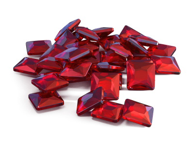
Yes, 305, which is 3050 with the new currency ;)
-
I never said I presented all GBs, only those which I like (I don't like Alloween's GB)and it was worth 305 crystals ;)
-
Yes, G did an incredible work. It obviously took him entire weeks 0_0
-
Guess..
-
I'm sorry, I just have it in my boxviewer. Yes it did take a lot of time, I spent several evenings writing on paper all that. + 4~5 hours writing on computer and doing pics. When I got banned I already wrote everything on paper. I was suite frenzied when I went to my computer. and Thanks !! Mister_G, no problem :) and thanks everyone :)
-
Review [Issue 15] [History] In The Beginning, Tanki... - Part 3
Raphael2 replied to hogree in Newspaper Archive
That New Year celebration should have been awesome.. Really good article ! -
Other [Issue 15] If The English Community Was A City...
Raphael2 replied to hogree in Newspaper Archive
hahaha very good article ! Thanks for the laugh ! -
#Note1: I got banned and lost my reporter powers, and as I am on vacation since the beginning of August, I have almost no internet access and I have no idea if I am fired or not. I guess I am, but anyway, all that doesn't matter you. I decided to post my article here as I don't want to publish it later, it was written for Issue 15, so I publish it during Issue 15 :) #Note2: I wrote this during my last days at home. I was tired, and I didn't proofread this. I'm sorry for all mistakes. #Note3: Please give feedback on this articles !
-
Review : Update 1.100's birthday
Raphael2 replied to Raphael2 in Review : Update 1.100's birthday Archive
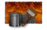
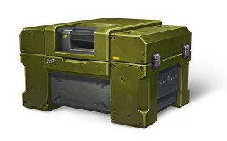
Dear friends, I am happy to present you a review of the 1.100 update. It was launched the 6 september 2012, so it is its birthday soon ! Enjoy reading :) I like both versions.. Even if I prefer the old one. I like the line at the vertical carbon line at the back of the old smoky, but I also like the grey parts of the actual Smoky. The old graphics firebird's flame was really awesome and colorful. Now, the flame is almost the same with every modifications of Firebird, the actual firebird looks very clean, professional, like a blowtorch. The old Firebird had very nice colors, the blue parts are very succeeded, but its successor maintains the level high. The new version is overall way better, even if I like a lot the green parts of the old graphics version. But apart from that, the old version is uglier and worse than the actual version. No doubt, the new version is way better ! Very beautiful designs, for a skills needed weapon, the only thing which I miss is the red point, it got moved to the actual version but it should be bigger and more luminous. The tight barrel looks better too. No doubt for me again here, I prefer the old one. The green impulse emitter looks awesome, as well for the two carbon lines and the aeration plates at the back. I'm sorry for the new isida lovers, but I don't like it at all. I love both versions.. Really, both are wonderful, the only thing we need now is the old Thunder explosion ! Before 1.100, it was a mighty powerful explosion, but now, it is just disappointing.. Veterans will remember that after 1.100, Thunder's explosions were too small, right after the update, while playing, I tought I was hit by a smoky, and I was amazed by its huge damage. Then, I noticed it was a Thunder, and I could hardly see the difference between Thunder's explosions and Smoky's explosions.. But devs fixed that one month later, during 1.104 update ! Even if they are very similar, I prefer the old one. Why ? Look at its pretty blue lines, on the sides and at the back of the weapon.. They dissapeared now ! Thats a shame, because it is the only good looking thing on Freeze ! Some Veterans may remember that the turbine at the back got removed after 1.100, but it got added again after 1.104 update, it is better like that. The two versions have good and bad sides.. Actual Ricochet has a more intense plasma color, but it has way too much metal parts, the old Ricochet was perfect on that side.. Again, Veterans will remember that after 1.100, the radar screen was missing. thanks again, they added it during 1.104. I was feeling like something was missing ! Old Shaft is really an awesome looking weapon, the orange and red parts looks mighty and add a mystical side to the weapon, and the metallic parts are awesome, while on the other hand, the actual version is bland. No colors, only simple metal parts, really disappointing. Oh, there is the middle of the barrel, which could look aggressive, but overall, Shaft is only a shadow of its past look. Also, for the third and last time, old players may remember the turbines and the "wings" at the back, which has been added again during 1.104 update. In both versions, this is the perfect hull for minecraft lovers, and I like the lightness of this hull, but I definitely prefer the old version. Its large vents, the scratch contrast with the boring plane looking new version. And I don't like its headlights too.. But I still like wasp, good job on this one. No doubt for me, even tough I like the metal plates at the back in the old version, the new one is better ! The headlights are nicely placed, and looks like bug's eyes, the exhaust pipe looks nice, and the wheel's armor is pleasant. Finally, we found a fail ! Titan's design is a failure. The headlights looks crap, there is too much metal plates and the is a door ! Why did they put a door in a game without humans ?! Really, I can't see what is pretty in this tank. I preferred its old vents, which was nicely placed and designed. Old and actual Dictator are nice, but I prefer by far the actual one. The metal plates, the headlights are awfully well placed. Dictator had a really good new version in my opinion. The old fastest tank, which was also arguably the most beautiful tank, kept his place. The shape was almost perfect, it became perfect. The actual version has beautiful headlights, black carbon parts, exhaust pipes, wheel's armor, and metal lines. Really, devs made an awesome job on this hull, and it is kinda my preferred. Viking, the old most popular hull, became better with this update. With the old graphics, it hasn't got enough gray metal parts. Now, it has too much of it ! The headlights could be bigger, but apart from that I can't add a lot of more criticism.. I may have been a bit harsh but I love Viking's designs ! It is my second preferred hull. I love the exhaust pipes position too.. Again, well done to the devs ! Mammoth looks fine in both versions. I miss the old vents, but instead we got two wonderful pairs of headlights.. I don't have a lot to add on Mammoth. I prefer the old supplies by far, it had more colors and looked more realistic. Now the boxes are quite monotonous and boring. Even for newcomers, I think tha we can say without doubt that old boxes were better. The battlefield was flooded by colorful and bright blue boxes.. About the gold box, it is exactly the same situation as for the crystals boxes, but the difference is even more marked and obvious. The old gold box was a sunshine falling, while all we have now is a random wood looking box. But between the actual and pre-123 update gold box, I prefer the actual one, as the crystal is bigger and brighter.. Those are some of the old special event boxes, which I like and decided to share with you. It has no equivalent with the new graphics, so just admire it ! :D Remember, this is my personal opinion. Share what YOU think in the comments !- 117 replies
-
- 34
-

-
Nice :)
-
Nice guide, most of us know that but it was an enjoyable read.
-
Wow, Nice design Lham ! :) This issue lack of articles.. But it is still pretty good :)