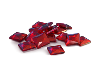
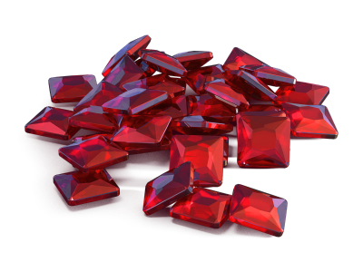
not all that bad but still better than before, you really wana avoid making those black strokes all over your work, makes it way too detailed, as in the using topaz clean at its maximum ughh, you wana pay attention towards what tone you pick to color, you wana use dark tones for the ares where much light wont fall, brighter tones where the light hits directly, and median tones where its equally balanced, a good example of this would be:
see how dark tones and light tones of the same colors are used,
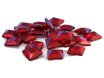
as well heres one of my psd of one of my TAT work, im sure youll get to know a thing or two ive included color tones which ive used in the image
 Jump to content