@Quo
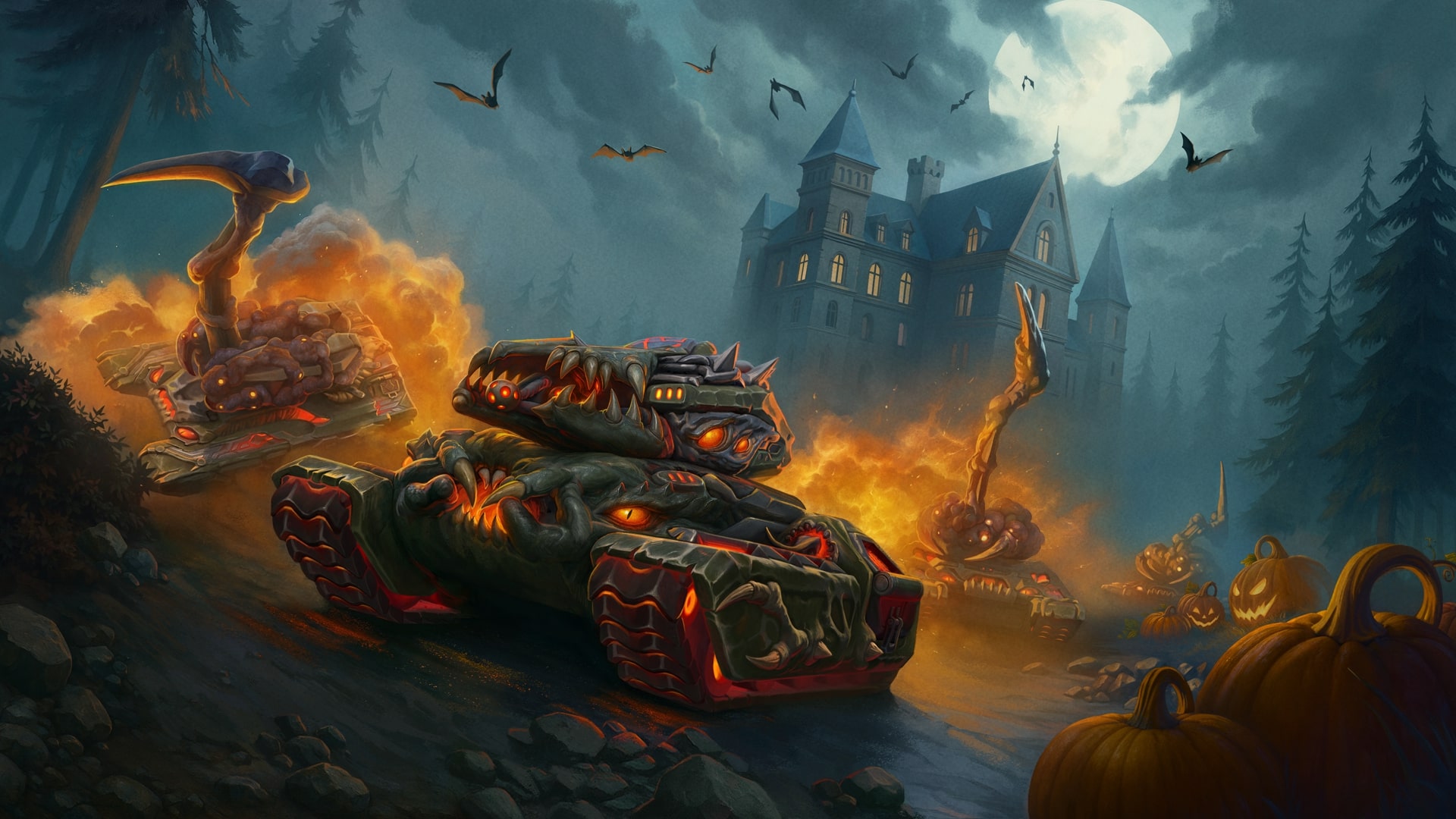
The work is indeed good, but with all due respect to the author, I dare to criticize it. If you quickly skim through the art without paying much attention, you won't notice anything bad or jarring.
However, as a person with a creative mindset and knowledge in various directions, I am bothered, first of all, by the red color. At first glance, it may seem like the shadow of the cannon itself, then it might appear as an illusion of the tank's fast movement. But in the end, you realize that the red color is just a plain background unsupported by anything, which is somewhat disappointing, although the tank itself is executed quite well. Once again, without intending to offend anyone, the work is good in a certain sense, but those same walls, they are empty. After reviewing the art for the first 15 seconds, I already came up with more than 4 ideas on how to fill them and creatively overcome the void in the space.
With all due respect...
 Jump to content