 Jump to content
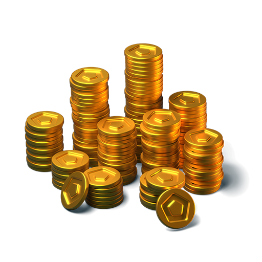
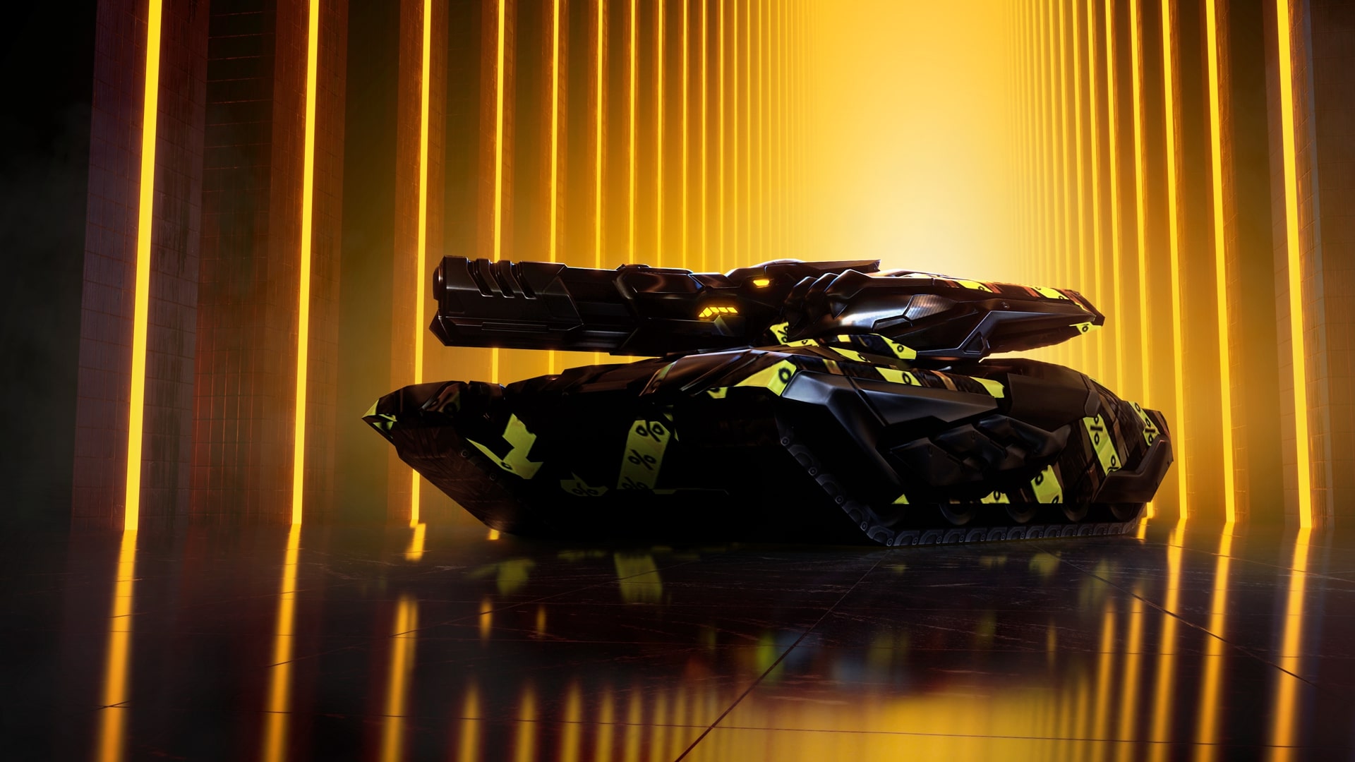
Festive season in Tanki Online!
1/10
Tanki Online V-LOG: Episode 539
2/10
Tanki Online is now on iOS!
3/10
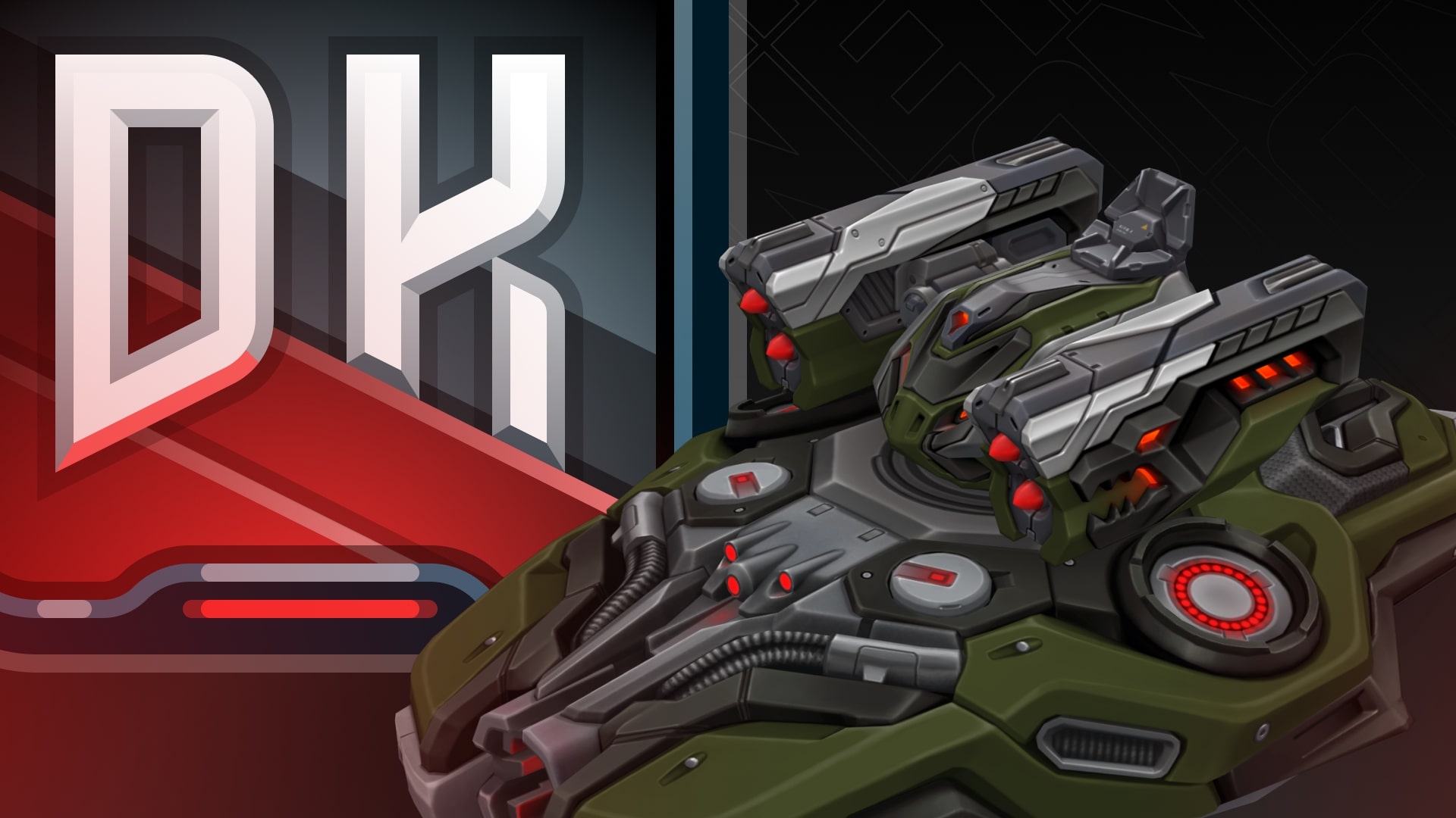
New DK skins for Crusader and Striker
4/10
Black Friday 2025
5/10
Tanki Online V-LOG: Episode 538
6/10
Hunter Steampunk
7/10
Winter eSports TankiFund 2025
8/10
Magnum HD Skin
9/10
Winter Major 2025
10/10


Festive season in Tanki Online!

Festive season is coming! The time of wonders is now! From December 19th, the New Year spirit will be at its maximum in Tanki Online!
Enjoy 50% discounts, special “Snowballs”, “Legendary Gold Rush”, “Snowman’s Gold”, and “Frostbite” game modes, updated Epic Containers packed with Excelsior augments, shot effects and the new “Detonator” augment for Railgun, new Elite Pass featuring a Legendary Key and “Snowball” grenades as rewards, snowman bots, festive decorations, an advent calendar, exciting special offers, and tons of missions, all waiting for you in the game!
The event will last from December 19th, 2 AM UTC till January 16th, 2 AM UTC.
Bots
For the duration of the celebration, all bots in Matchmaking battles will turn into snowmen!
Now they can be easily distinguished from real players!
Epic Containers
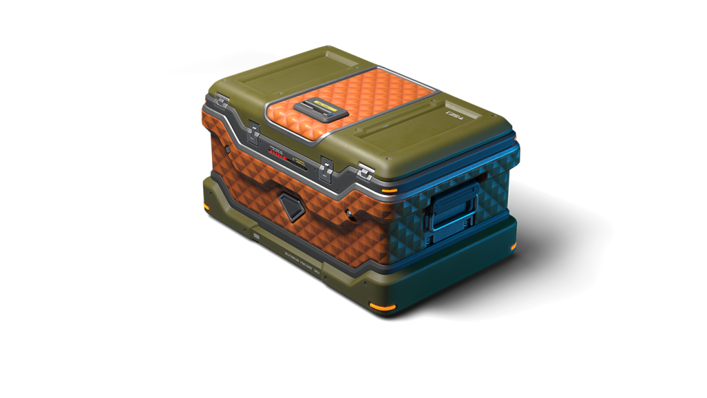
The contents of Epic Containers have been updated and are ready to surprise you!
In honor of the celebration, they are filled with lots of augments and shot effects!
Contents:
- NEW “Detonator” augment for Railgun
- “Excelsior” augment for Firebird
- “Excelsior” augment for Freeze
- “Excelsior” augment for Isida
- “Excelsior” augment for Tesla
- “Excelsior” augment for Hammer
- “Excelsior” augment for Twins
- “Excelsior” augment for Ricochet
- “Excelsior” augment for Vulcan
- “Excelsior” augment for Smoky
- “Excelsior” augment for Striker
- “Excelsior” augment for Thunder
- “Excelsior” augment for Scorpion
- “Excelsior” augment for Magnum
- “Excelsior” augment for Railgun
- “Excelsior” augment for Gauss
- “Excelsior” augment for Shaft
- “Excelsior” augment for Wasp
- “Excelsior” augment for Hopper
- “Excelsior” augment for Hornet
- “Excelsior” augment for Viking
- “Excelsior” augment for Crusader
- “Excelsior” augment for Hunter
- “Excelsior” augment for Paladin
- “Excelsior” augment for Dictator
- “Excelsior” augment for Titan
- “Excelsior” augment for Ares
- “Excelsior” augment for Mammoth
- “Blaster” shot effect for Twins
- “Blaster” shot effect for Ricochet
- “Magic” shot effect for Railgun
- And everything that can be obtained from Common Containers

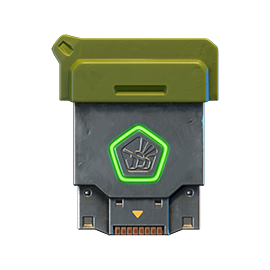
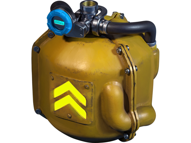
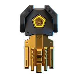
RAILGUN Detonator
Significantly increases the damage and explostion radius of a Grenade in case of a combo shot. For the combo shot, you must hit your own Grenade with a Railgun shot.
A successful combo detonation of a Grenade requires many conditions to align. The enemy must be at the right distance, the Grenade must be ready, and the turret must be charged. This rarely happens. It’s even rarer to successfully hit the Grenade to trigger the detonation. With this Augment, your efforts will be rewarded many times over.
All you need is one successful hit. Just one successful hit and the enemy’s will shall be shattered.
50% Discounts
Don’t miss the opportunity to make good use of the unbelievable discounts!
From December 19th until December 22nd, 50% discounts await you!
All discounts start and end at 2 AM UTC.
For three whole days, you will be able to obtain the following items with a 50% discount:
-50%
SHOP (19.12 — 22.12)
Crystals

Stars
Early Access items
Premium Pass
-50%
GARAGE (19.12 — 22.12)
Augments
Supplies
Paints
Drones
Modules
Grenades
-50%
UPGRADES (19.12 — 22.12)
Special Event Modes
Four exciting game modes will be waiting for you in the game!
Important: Boosted battle funds and experience are only active within the festive weekend game modes.
Each mode starts and ends with the server restart at 2 AM UTC.
SPECIAL MODE
SNOWMAN’S GOLD
December 19th — December 22nd
Mode
DM
Turret
Snowman
Hull
Any
Bonus Boxes
Upgrades
Augments
Gold Boxes
Equipment Change
Overdrives
Supplies
Nuclear Energy
Smart Supplies
Drones
Protection Modules
Groups
Grenades
More Gold Boxes
Each tanker is automatically equipped with the special «Snowman» turret. Yes, it shoots snowballs! Join battles in the Deathmatch mode and show your skills!
- New Year 2025 Remastered
In this mode all players are equipped with the special “Salyut” grenades.
SPECIAL MODE
LEGENDARY GOLD RUSH
December 26th — December 29th
Mode
DM
Turret
Any
Hull
Any
Bonus Boxes
Upgrades
Augments
Gold Boxes
Equipment Change
Overdrives
Supplies
Nuclear Energy
Smart Supplies
Drones
Protection Modules
Groups
Grenades
More Gold Boxes
Deathmatch. Everyone wants to catch as many gold boxes as possible, risking being left without any loot in a fight with other players.
- New Year 2025 Remastered
- Forest MM Winter NY Remastered
- Sandbox MM Winter NY Remastered
In this mode all players are equipped with the special “Salyut” grenades.
SPECIAL MODE
SNOWBALLS
January 2nd — January 5th
Mode
TDM
Map
Turret
Snowman
Hull
Any
Bonus Boxes
Upgrades
Augments
Gold Boxes
Equipment Change
Overdrives
Supplies
Nuclear Energy
Smart Supplies
Drones
Protection Modules
Groups
Grenades
More Gold Boxes
There can be no winter festivities without a snowball fight! The special festive «Snowballs» mode returns on the new special Christmas Remastered map!
- Cross MM Winter Remastered
- Forest MM Winter Remastered
- Sandbox MM Winter Remastered
In this mode all players are equipped with the special “Salyut” grenades.
SPECIAL MODE
FROSTBITE
January 9th — January 12th
Mode
CP
Map
Turret
Freeze
Hull
Hornet
Bonus Boxes
Upgrades
Augments
Gold Boxes
Equipment Change
Overdrives
Supplies
Nuclear Energy
Smart Supplies
Drones
Protection Modules
Groups
Grenades
More Gold Boxes
Dive into an icy warfare! To win, you need to freeze out all opponents and capture points on the map. Be prepared for harsh conditions and a frigid battle!
- Polygon PRO
Special Missions
We have prepared a plethora of exciting missions which will make the event more exciting!
Your progress in completing missions is only counted from the moment you first enter the “Missions” screen after the event begins.
Missions follow the Encore system, with the second set of missions appearing only after the first set is completed.
SPECIAL
Part 1. December 19th — December 26th
Part 2. December 26th — January 2nd
Part 3. January 2nd — January 9th
Part 4. January 9th — January 16th
SNOWBALLS
TASK
Finish 2 battles in the festive mode.
REWARD

×3
EPIC KEY
EPIC KEY
GOOOLD!
TASK
Finish 2 battles in the festive mode.
REWARD
×3
EPIC KEY
EPIC KEY
SASQUATCH
TASK
Finish 2 battles in the festive mode.
REWARD
×3
EPIC KEY
EPIC KEY
COLD-HEARTED
TASK
Finish 2 battles in the festive mode.
REWARD
×3
EPIC KEY
EPIC KEY
SET 1
Set 1. December 19th — January 16th
SUPERMISSION: SNOWBALL. PART 1
TASK
Complete «Welcome! Part 1», «Respect! Part 1», «Choice Without a Choice. Part 1», «Well-Deserved Rest. Part 1», «Team Competition. Part 1», «Wish Fulfillment. Part 1», «The Ice Battle», «Santa’s Wrath», «For Everybody », «Polar Star» and «Unboxing! Part 1» missions.
REWARD
×5
EPIC KEY
EPIC KEY

×1
RARE KEY
RARE KEY
×1000
EXPERIENCE POINTS
EXPERIENCE POINTS
WELCOME! PART 1
TASK
Enter the game at least once.
REWARD
×1
COMMON KEY
COMMON KEY
×100
EXPERIENCE POINTS
EXPERIENCE POINTS
RESPECT! PART 1
TASK
Earn 5000 reputation points in any matchmaking battles.
REWARD
×1
COMMON KEY
COMMON KEY
×100
EXPERIENCE POINTS
EXPERIENCE POINTS
CHOICE WITHOUT A CHOICE. PART 1
TASK
Earn 3000 reputation points in Quick Battle mode in any matchmaking battles.
REWARD
×1
COMMON KEY
COMMON KEY
×100
EXPERIENCE POINTS
EXPERIENCE POINTS
WELL-DESERVED REST. PART 1
TASK
Finish 10 battles in any matchmaking battles.
REWARD
×1
COMMON KEY
COMMON KEY
×100
EXPERIENCE POINTS
EXPERIENCE POINTS
TEAM COMPETITION. PART 1
TASK
Be in the winning team of 2 battles in any matchmaking battles.
REWARD
×1
COMMON KEY
COMMON KEY
×100
EXPERIENCE POINTS
EXPERIENCE POINTS
WISH FULFILLMENT. PART 1
TASK
Make any purchase in the game’s Shop.
REWARD
×1
COMMON KEY
COMMON KEY
×100
EXPERIENCE POINTS
EXPERIENCE POINTS
THE ICE BATTLE
TASK
Earn 1000 reputation points in TDM mode in matchmaking battles.
REWARD
×1
COMMON KEY
COMMON KEY
×100
EXPERIENCE POINTS
EXPERIENCE POINTS
SANTA’S WRATH
TASK
Use boosted damage 150 times in any matchmaking battles.
REWARD
×1
COMMON KEY
COMMON KEY
×100
EXPERIENCE POINTS
EXPERIENCE POINTS
FOR EVERYBODY
TASK
Deal 100000 damage in any matchmaking battles.
REWARD
×1
COMMON KEY
COMMON KEY
×100
EXPERIENCE POINTS
EXPERIENCE POINTS
POLAR STAR
TASK
Earn 45 stars in any matchmaking battles.
REWARD
×1
COMMON KEY
COMMON KEY
×100
EXPERIENCE POINTS
EXPERIENCE POINTS
UNBOXING! PART 1
TASK
Open 15 any Containers.
REWARD
×1
COMMON KEY
COMMON KEY
×100
EXPERIENCE POINTS
EXPERIENCE POINTS
SET 2
Set 2. December 26th — January 16th
SUPERMISSION: SNOWBALL. PART 2
TASK
Complete «Welcome! Part 2», «Respect! Part 2», «Choice Without a Choice. Part 2», «Well-Deserved Rest. Part 2», «Team Competition. Part 2», «Wish Fulfillment. Part 2», «Snow Fortress», «Slippery Slope», «Santa’s Treasure», «Firecracker» and «Unboxing! Part 2» missions.
REWARD
×5
EPIC KEY
EPIC KEY
×1
RARE KEY
RARE KEY
×1000
EXPERIENCE POINTS
EXPERIENCE POINTS
WELCOME! PART 2
TASK
Enter the game at least once.
REWARD
×1
COMMON KEY
COMMON KEY
×100
EXPERIENCE POINTS
EXPERIENCE POINTS
RESPECT! PART 2
TASK
Earn 5000 reputation points in any matchmaking battles.
REWARD
×1
COMMON KEY
COMMON KEY
×100
EXPERIENCE POINTS
EXPERIENCE POINTS
CHOICE WITHOUT A CHOICE. PART 2
TASK
Earn 3000 reputation points in Quick Battle mode in any matchmaking battles.
REWARD
×1
COMMON KEY
COMMON KEY
×100
EXPERIENCE POINTS
EXPERIENCE POINTS
WELL-DESERVED REST. PART 2
TASK
Finish 10 battles in any matchmaking battles.
REWARD
×1
COMMON KEY
COMMON KEY
×100
EXPERIENCE POINTS
EXPERIENCE POINTS
TEAM COMPETITION. PART 2
TASK
Be in the winning team of 2 battles in any matchmaking battles.
REWARD
×1
COMMON KEY
COMMON KEY
×100
EXPERIENCE POINTS
EXPERIENCE POINTS
WISH FULFILLMENT. PART 2
TASK
Make any purchase in the game’s Shop.
REWARD
×1
COMMON KEY
COMMON KEY
×100
EXPERIENCE POINTS
EXPERIENCE POINTS
SNOW FORTRESS
TASK
Earn 1000 reputation points in SGE mode in matchmaking battles.
REWARD
×1
COMMON KEY
COMMON KEY
×100
EXPERIENCE POINTS
EXPERIENCE POINTS
SLIPPERY SLOPE
TASK
Use speed boost 150 times in any matchmaking battles.
REWARD
×1
COMMON KEY
COMMON KEY
×100
EXPERIENCE POINTS
EXPERIENCE POINTS
SANTA’S TREASURE
TASK
Earn 4000 crystals in any matchmaking battles.
REWARD
×1
COMMON KEY
COMMON KEY
×100
EXPERIENCE POINTS
EXPERIENCE POINTS
FIRECRACKER
TASK
Use any grenade 10 times in any matchmaking battles.
REWARD
×1
COMMON KEY
COMMON KEY
×100
EXPERIENCE POINTS
EXPERIENCE POINTS
UNBOXING! PART 2
TASK
Open 15 any Containers.
REWARD
×1
COMMON KEY
COMMON KEY
×100
EXPERIENCE POINTS
EXPERIENCE POINTS
SET 3
Set 3. January 2nd — January 16th
SUPERMISSION: SNOWBALL. PART 3
TASK
Complete «Welcome! Part 3», «Respect! Part 3», «Choice Without a Choice. Part 3», «Well-Deserved Rest. Part 3», «Team Competition. Part 3», «Wish Fulfillment. Part 3», «Who Stole Christmas?», «Ice Shield», «From Year to Year», «Elves’ Revenge» and «Unboxing! Part 3» missions.
REWARD
×5
EPIC KEY
EPIC KEY
×1
RARE KEY
RARE KEY
×1000
EXPERIENCE POINTS
EXPERIENCE POINTS
WELCOME! PART 3
TASK
Enter the game at least once.
REWARD
×1
COMMON KEY
COMMON KEY
×100
EXPERIENCE POINTS
EXPERIENCE POINTS
RESPECT! PART 3
TASK
Earn 5000 reputation points in any matchmaking battles.
REWARD
×1
COMMON KEY
COMMON KEY
×100
EXPERIENCE POINTS
EXPERIENCE POINTS
CHOICE WITHOUT A CHOICE. PART 3
TASK
Earn 3000 reputation points in Quick Battle mode in any matchmaking battles.
REWARD
×1
COMMON KEY
COMMON KEY
×100
EXPERIENCE POINTS
EXPERIENCE POINTS
WELL-DESERVED REST. PART 3
TASK
Finish 10 battles in any matchmaking battles.
REWARD
×1
COMMON KEY
COMMON KEY
×100
EXPERIENCE POINTS
EXPERIENCE POINTS
TEAM COMPETITION. PART 3
TASK
Be in the winning team of 2 battles in any matchmaking battles.
REWARD
×1
COMMON KEY
COMMON KEY
×100
EXPERIENCE POINTS
EXPERIENCE POINTS
WISH FULFILLMENT. PART 3
TASK
Make any purchase in the game’s Shop.
REWARD
×1
COMMON KEY
COMMON KEY
×100
EXPERIENCE POINTS
EXPERIENCE POINTS
WHO STOLE CHRISTMAS?
TASK
Earn 1000 reputation points in CTF mode in matchmaking battles.
REWARD
×1
COMMON KEY
COMMON KEY
×100
EXPERIENCE POINTS
EXPERIENCE POINTS
ICE SHIELD
TASK
Use boosted armor 150 times in any matchmaking battles.
REWARD
×1
COMMON KEY
COMMON KEY
×100
EXPERIENCE POINTS
EXPERIENCE POINTS
FROM YEAR TO YEAR
TASK
Earn 3000 experience points in any matchmaking battles.
REWARD
×1
COMMON KEY
COMMON KEY
×100
EXPERIENCE POINTS
EXPERIENCE POINTS
ELVES’ REVENGE
TASK
Destroy 30 tanks in any matchmaking battles.
REWARD
×1
COMMON KEY
COMMON KEY
×100
EXPERIENCE POINTS
EXPERIENCE POINTS
UNBOXING! PART 3
TASK
Open 15 any Containers.
REWARD
×1
COMMON KEY
COMMON KEY
×100
EXPERIENCE POINTS
EXPERIENCE POINTS
SET 4
Set 4. January 9th — January 16th
SUPERMISSION: SNOWBALL. PART 4
TASK
Complete «Welcome! Part 4», «Respect! Part 4», «Choice Without a Choice. Part 4», «Well-Deserved Rest. Part 4», «Team Competition. Part 4», «Wish Fulfillment. Part 4», «King of the Hill», «Cold Therapy», «Surprise!», «New Year Hassle» and «Unboxing! Part 4» missions.
REWARD
×5
EPIC KEY
EPIC KEY
×1
RARE KEY
RARE KEY
×1000
EXPERIENCE POINTS
EXPERIENCE POINTS
WELCOME! PART 4
TASK
Enter the game at least once.
REWARD
×1
COMMON KEY
COMMON KEY
×100
EXPERIENCE POINTS
EXPERIENCE POINTS
RESPECT! PART 4
TASK
Earn 5000 reputation points in any matchmaking battles.
REWARD
×1
COMMON KEY
COMMON KEY
×100
EXPERIENCE POINTS
EXPERIENCE POINTS
CHOICE WITHOUT A CHOICE. PART 4
TASK
Earn 3000 reputation points in Quick Battle mode in any matchmaking battles.
REWARD
×1
COMMON KEY
COMMON KEY
×100
EXPERIENCE POINTS
EXPERIENCE POINTS
WELL-DESERVED REST. PART 4
TASK
Finish 10 battles in any matchmaking battles.
REWARD
×1
COMMON KEY
COMMON KEY
×100
EXPERIENCE POINTS
EXPERIENCE POINTS
TEAM COMPETITION. PART 4
TASK
Be in the winning team of 2 battles in any matchmaking battles.
REWARD
×1
COMMON KEY
COMMON KEY
×100
EXPERIENCE POINTS
EXPERIENCE POINTS
WISH FULFILLMENT. PART 4
TASK
Make any purchase in the game’s Shop.
REWARD
×1
COMMON KEY
COMMON KEY
×100
EXPERIENCE POINTS
EXPERIENCE POINTS
KING OF THE HILL
TASK
Earn 1000 reputation points in CP mode in matchmaking battles.
REWARD
×1
COMMON KEY
COMMON KEY
×100
EXPERIENCE POINTS
EXPERIENCE POINTS
COLD THERAPY
TASK
Use repair kit 150 times in any matchmaking battles.
REWARD
×1
COMMON KEY
COMMON KEY
×100
EXPERIENCE POINTS
EXPERIENCE POINTS
SURPRISE!
TASK
Destroy 1 tank using grenades in any matchmaking battles.
REWARD
×1
COMMON KEY
COMMON KEY
×100
EXPERIENCE POINTS
EXPERIENCE POINTS
NEW YEAR HASSLE
TASK
Complete 15 Daily missions.
REWARD
×1
COMMON KEY
COMMON KEY
×100
EXPERIENCE POINTS
EXPERIENCE POINTS
UNBOXING! PART 4
TASK
Complete 3 Weekly missions.
REWARD
×1
COMMON KEY
COMMON KEY
×100
EXPERIENCE POINTS
EXPERIENCE POINTS
Special Offers
What’s any holiday without some great deals at awesome prices?
December 19th — January 12th
December 19th — January 16th
Daily Ruby Pass
×500
TANKOINS*
×4500
RUBIES**
* 500 Tankoins instantly.
** For 30 days, each day the player can access a pre-completed mission upon logging in, from which they can claim a reward of 150 Rubies.
Note: One-time purchase
** For 30 days, each day the player can access a pre-completed mission upon logging in, from which they can claim a reward of 150 Rubies.
Note: One-time purchase
PURCHASE
Festive Season Pack
×20
EPIC KEY
×4
PREMIUM PASS
×1
RARE KEY

December 26th — January 16th
Magic Wonder!
×20
EPIC KEY
×7
PREMIUM PASS
×1
NUCLEAR ENERGY
January 2nd — January 16th

January 9th — January 16th
Gifts from Elves
×15
EPIC KEY
×7
PREMIUM PASS
×1
RARE KEY
Advent Calendar
We are launching the festive advent calendar for you!
Attention! The Advent Calendar and its missions become available only after purchasing the “Advent Calendar” special offer.
After purchasing the “Advent Calendar” special offer, you will get access to:
- 5 standard missions
- 1 Supermission with unique rewards!
All you need to do is log into the game during the event and claim your gifts.
Task: Complete all “One More Day” missions that appear after December 19th.
Completing 5 standard missions will unlock the final Supermission.
Supermission
×1
Recruit PAINT
×200
RUBY
One More Day
×12
EPIC KEY
×400
RUBY
Elite Pass
The most luxurious pass is here! It will consist of 20 levels.
Your goal is to earn stars to unlock new levels, and for each level you reach, you will receive additional prizes.
In order to complete the whole pass and reach the main prize, you will need to earn 1000 stars.

Elite Pass
All stars earned during the event will be counted. Progress begins with the start of the event. Stars earned before the purchase of the “Elite Pass” will also be counted. The “Elite Pass” itself is required to claim the prizes. By purchasing it, you will be able to claim all the unlocked prizes to your Garage!
The Main Prizes are ×100 Snowball grenades and a LEGENDARY KEY!
The price of this Elite Pass is 2300 Rubies.
Festive decorations
- Festive paint on cargo drones
- Festive paint
- Festive Gold Box drop zone skin
- Special loading screen
- Festive billboards
- Festive bots in MM
- Cookies instead of mines
- New Year Garage
- “HO-HO-HO” audio for Gold Boxes
- Festive skin for the Gold Box

Have a good Festive mood everyone!
Tanki Online V-LOG: Episode 539
In today’s episode, we will be launching Festive Season. We’ll also be reviewing eSports matches and announcing the Tanki Classic mass test.
Tanki Online is now on iOS!
Tank battles are now available right on your iPhone and iPad!
Now you can enjoy your favorite game anywhere, anytime. Launch fast-paced battles on your iPhone or use the large screen of your iPad for full immersion in the action.
What awaits you in the iOS version
- Full-fledged gameplay: The mobile version offers all the same features as the PC version.
- Cross-platform play: Log into your existing account and fight together with your friends, whether they play on PC, Android, or now on iOS!
- Optimized interface: Convenient and intuitive controls created specifically for touchscreens.
- Stable performance: High-quality graphics and smooth FPS for a comfortable gaming experience.
How to start playing
- Make sure your device meets the minimal requirement (at least iPhone 13, iOS 16)
- Download the official Tanki Online app from the App Store.
- Log into your account or create a new one if you are just starting your journey.
- Choose your tank and join a battle!
Don’t miss the chance to be in the center of the action anywhere, anytime — Tanki Online is always at your fingertips! Download the game and show everyone who the real master of the battlefield is!
New DK skins for Crusader and Striker
We present you the new skins from the Dark skin series for Crusader and Striker!
They can be received as rewards from the Elite Pass and the “Black Friday” Advent Calendar!
Crusader DK
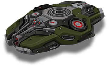
Crusader DK
Modernity. Elegance. Fearlessness.
A new look at the engineering art of tanks, combining futuristic aesthetics with combat readiness. This design turns your hull into a true masterpiece of innovation and strength.
Striker DK
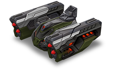
Striker DK
Power combined with an elegant design. This turret doesn’t just look intimidating, it is designed for domination and precise strikes. A symbol of control on every battlefield.
How to get them
Crusader DK
Purchase the “Event Pass” special offer and complete daily missions!
Starting from December 1st, new gifts for missions will appear every day in the “Advent Calendar” missions category. Enter the game daily to not miss a thing! If you stick through it all, by December 25th, you will get all the amazing rewards, among which is the new skin – Crusader DK.
Striker DK
Purchase the Elite Pass, earn Stars. For each level completed, you will receive rewards.
Elite Pass
All stars earned during the event will be counted. Progress begins with the start of the event. Stars earned before the purchase of the “Elite Pass” will also be counted. The “Elite Pass” itself is required to claim the prizes. By purchasing it, you will be able to claim all the unlocked prizes to your Garage!
The main prizes are the new Dark skin for Striker and a Legendary Key!
The price of this Elite Pass is 2300 Rubies.
Good luck in the game!
Black Friday 2025
Great savings for everyone! Black Friday begins tomorrow in Tanki Online!
Starting Friday, November 28, a 50% discount, special game modes – Gold Rush, Arms Race, and Butchers – updated Epic Containers with tons of skins, a new Elite Pass with a Legendary Key, and the new Dark skins for Crusader and Striker will be waiting for you in the game. Plus, don’t miss the unique Advent Calendar offer with amazing rewards: 8000 Rubies, Augments, Rare, Epic, and Legendary Keys, the exclusive Black Ruby paint, and a new Dark series skin for Crusader!
Event dates: November 28th, 2 AM UTC — December 19th, 2 AM UTC
Advent Calendar
From November 28th, 2 AM UTC till December 1st, 2 AM UTC, a unique special offer that unlocks the access to the “Advent Calendar” with cool rewards will be available.
Attention! Advent Calendar and missions are only unlocked after purchasing the “Advent Calendar“ special offer.
This is your ticket to generous daily gifts from our team!
Starting from December 1st, new gifts for missions will appear every day in the “Advent Calendar” missions category. You will only need to enter the game daily to not miss anything. If you stick to this, by December 25th, you will get Epic, Rare and LEGENDARY Keys, a unique animated paint, some Augments, the new DK skin for Crusader, and 8000 Rubies!
IMPORTANT: if you don’t claim a reward for a current mission, you won’t get a new mission the next day.
DAY 1
×5 RARE KEY

DAY 2
×15 EPIC KEY
DAY 3
×1000 RUBY
DAY 4
×5 RARE KEY
DAY 5
×15 EPIC KEY
DAY 6
×1000 RUBY
DAY 7
THUNDER CAMPER
DAY 8
BLACK RUBY PAINT
DAY 9
×1000 RUBY
DAY 10
×5 RARE KEY
DAY 11
×15 EPIC KEY
DAY 12
×1000 RUBY

DAY 13
×1 LEGENDARY KEY
DAY 14
SCORPION EXCELSIOR
DAY 15
×1000 RUBY
DAY 16
×5 RARE KEY
DAY 17
×15 EPIC KEY
DAY 18
×1000 RUBY
DAY 19
×5 RARE KEY
DAY 20
×15 EPIC KEY
DAY 21
×1000 RUBY

DAY 22
CRUSADER DK
DAY 23
×1 LEGENDARY KEY
DAY 24
×1000 RUBY
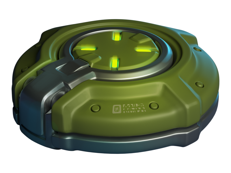
SCORPION EXCELSIOR
Enhances key turret parameters without introducing new functions.
This premium augment is the result of a breakthrough research program integrating diamond crystals into the turret’s design. Diamond-coated barrel lining increases operational pressure during fire. Diamond bearings enhance turret’s rotation efficiency. Diamond semiconductors boost the targeting system’s computational performance. The only downside? Its stunning craftsmanship remains hidden from view inside the turret.

THUNDER CAMPER
Increases turret damage when the tank has minimal damage.
A spare battery for the enhanced damage modulator, connected in parallel to the primary power source via an AI-controlled management system. This system safely boosts turret damage beyond the modulator’s standard capabilities, but only if the tank’s structural integrity remains intact. If the AI detects that the hull has been compromised, the spare battery will immediately shut down — all to prevent warranty claims, of course.
Epic Containers
The contents of Epic Containers have been updated and are ready to surprise you!
In celebration of Black Friday, they are filled with a variety of skins!
Contents:
- SKIN Freeze XT HD
- SKIN Tesla XT HD
- SKIN Striker XT HD
- SKIN Thunder XT HD
- SKIN Scorpion XT HD
- SKIN Striker UT
- SKIN Vulcan UT
- SKIN Thunder UT
- SKIN Railgun UT
- SKIN Gauss UT
- SKIN Hornet UT
- SKIN Viking UT
- SKIN Hunter UT
- SKIN Mammoth UT
- SKIN Firebird DC
- SKIN Hammer DC
- SKIN Vulcan DC
- SKIN Shaft DC
- SKIN Wasp DC
- SKIN Viking DC
- SKIN Hunter DC
- SKIN Twins SP
- SKIN Magnum SP
- SKIN Titan SP
- SKIN Mammoth SP
- SKIN Dictator SP
- SKIN Hammer SP
- SKIN Twins RF
- SKIN Ricochet RF
- SKIN Paladin RF
- SKIN Crusader RF
- SKIN Tesla RF
- SKIN Hopper RF
- SKIN Ares RF
- SKIN Freeze DK
- SKIN Tesla DK
- SKIN Thunder DK
- SKIN Scorpion DK
- SKIN Hornet DK
- SKIN Viking DK
- SKIN Ares DK
- And everything that can be obtained from Common Containers.
50% Discounts
Don’t miss the opportunity to make good use of the unbelievable discounts!
From November 28th until December 1st, 50% discounts await you, even on Epic Keys! This type of event happens very rarely!
All discounts start and end at 2 AM UTC.
For three whole days, you will be able to obtain the following items with a 50% discount
-50%
SHOP (28.11 — 1.12)
Crystals
Stars
Early Access items
Epic keys

Premium Pass
-50%
GARAGE (28.11 — 1.12)
Augments
Supplies
Paints
Drones
Modules
Grenades
-50%
UPGRADES (28.11 — 1.12)
Special Event modes
Three exciting game modes will be waiting for you in the game!
Important: Boosted battle funds and experience are only active within the festive weekend game modes.
Each mode starts and ends with the server restart at 2 AM UTC.
SPECIAL MODE
GOLD RUSH
November 28th — December 1st
Mode
DM
Turret
Any
Hull
Any
Bonus Boxes
Upgrades
Augments
Gold Boxes
Equipment Change
Overdrives
Supplies
Nuclear Energy
Smart Supplies
Drones
Protection Modules
Groups
Grenades
More Gold Boxes
Crush everyone in a Deathmatch and catch plenty of gold! A lot more of the elusive boxes will be dropping in this mode!
- Forest Remastered
- Sandbox Remastered
- Sandal Remastered
- Highland Remastered
- Cross Remastered
SPECIAL MODE
ARMS RACE
December 5th — December 8th
Mode
Arms Race
Turret
Changes Every 3 Kills
Hull
Viking
Bonus Boxes
Upgrades
Augments
Gold Boxes
Equipment Change
Overdrives
Supplies
Nuclear Energy
Smart Supplies
Drones
Protection Modules
Groups
Grenades
More Gold Boxes
Where else can you show everyone who is the boss while destroying enemy tanks using every turret available in the game and knocking out the last victim with the destructive B0-NK?
- Deathtrack PRO
- Skyscrapers PRO
- Siege PRO
SPECIAL MODE
BUTCHERS
December 12th — December 15th
Mode
CP
Turret
B0-NK
Hull
Any
Bonus Boxes
Upgrades
Augments
Gold Boxes
Equipment Change
Overdrives
Supplies
Nuclear Energy
Smart Supplies
Drones
Protection Modules
Groups
Grenades
More Gold Boxes
The main task is to destroy all the opponents, capture points, and keep controlling them to finish a battle as soon as possible.
- Sandbox PRO
- Island PRO
- Duality PRO
Special Missions
We have prepared a plethora of exciting missions which will make the event more exciting!
Your progress in completing missions is only counted from the moment you first enter the “Missions” screen after the event begins.
Missions follow the Encore system, with the second set of missions appearing only after the first set is completed.
SPECIAL
Part 1. November 28th — December 5th
Part 2. December 5th — December 12th
Part 3. December 12th — December 19th
FULLY BLACK. PART 1
TASK
Be in the winning team of 1 battle in any matchmaking battles.
IMPORTANT: The mission is only available for «Premium Pass» owners.
REWARD
×1
EPIC KEY
EPIC KEY
BLACK MARK. PART 1
TASK
Finish 3 battles in any matchmaking battles.
IMPORTANT: The mission is only available for «Battle Pass» owners.
REWARD
×1
EPIC KEY
EPIC KEY
BLINDMAN’S BLUFF. PART 1
TASK
Earn 500 reputation points in the festive «Gold rush» mode.
REWARD
×1
EPIC KEY
EPIC KEY
FULLY BLACK. PART 2
TASK
Be in the winning team of 1 battle in any matchmaking battles.
IMPORTANT: The mission is only available for «Premium Pass» owners.
REWARD
×1
EPIC KEY
EPIC KEY
BLACK MARK. PART 2
TASK
Finish 3 battles in any matchmaking battles.
IMPORTANT: The mission is only available for «Battle Pass» owners.
REWARD
×1
EPIC KEY
EPIC KEY
BLINDMAN’S BLUFF. PART 2
TASK
Earn 500 reputation points in the festive «Arms race» mode.
REWARD
×1
EPIC KEY
EPIC KEY
FULLY BLACK. PART 3
TASK
Be in the winning team of 1 battle in any matchmaking battles.
IMPORTANT: The mission is only available for «Premium Pass» owners.
REWARD
×1
EPIC KEY
EPIC KEY
BLACK MARK. PART 3
TASK
Finish 3 battles in any matchmaking battles.
IMPORTANT: The mission is only available for «Battle Pass» owners.
REWARD
×1
EPIC KEY
EPIC KEY
BLINDMAN’S BLUFF. PART 3
TASK
Earn 500 reputation points in the festive «Butchers» mode.
REWARD
×1
EPIC KEY
EPIC KEY
SET 1
Set 1. November 28th — December 19th
SUPERMISSION: MARATHON! PART 1
TASK
Complete «Back Door. Part 1», «Dark Side. Part 1», «Choice Without a Choice. Part 1», «Bliss. Part 1», «Right Choice. Part 1», «Mystery Shopper. Part 1», «Sport Department», «Element of Surprise », «Dark Past», «Restitution» and «Black Box» missions.
REWARD
×5
EPIC KEY
EPIC KEY
×1
RARE KEY
RARE KEY
×1000
EXPERIENCE POINTS
EXPERIENCE POINTS
BACK DOOR. PART 1
TASK
Enter the game at least once.
REWARD
×1
COMMON KEY
COMMON KEY
×100
EXPERIENCE POINTS
EXPERIENCE POINTS
DARK SIDE. PART 1
TASK
Earn 5000 reputation points in any matchmaking battles.
REWARD
×1
COMMON KEY
COMMON KEY
×100
EXPERIENCE POINTS
EXPERIENCE POINTS
CHOICE WITHOUT A CHOICE. PART 1
TASK
Earn 3000 reputation points in Quick Battle mode in any matchmaking battles.
REWARD
×1
COMMON KEY
COMMON KEY
×100
EXPERIENCE POINTS
EXPERIENCE POINTS
BLISS. PART 1
TASK
Finish 10 battles in any matchmaking battles.
REWARD
×1
COMMON KEY
COMMON KEY
×100
EXPERIENCE POINTS
EXPERIENCE POINTS
RIGHT CHOICE. PART 1
TASK
Be in the winning team of 2 battles in any matchmaking battles.
REWARD
×1
COMMON KEY
COMMON KEY
×100
EXPERIENCE POINTS
EXPERIENCE POINTS
MYSTERY SHOPPER. PART 1
TASK
Make any purchase in the game’s Shop.
REWARD
×1
COMMON KEY
COMMON KEY
×100
EXPERIENCE POINTS
EXPERIENCE POINTS
SPORT DEPARTMENT
TASK
Earn 1000 reputation points in RGB mode in matchmaking battles.
REWARD
×1
COMMON KEY
COMMON KEY
×100
EXPERIENCE POINTS
EXPERIENCE POINTS
ELEMENT OF SURPRISE
TASK
Use mines 150 times in any matchmaking battles.
REWARD
×1
COMMON KEY
COMMON KEY
×100
EXPERIENCE POINTS
EXPERIENCE POINTS
DARK PAST
TASK
Earn 3000 experience points in any matchmaking battles.
REWARD
×1
COMMON KEY
COMMON KEY
×100
EXPERIENCE POINTS
EXPERIENCE POINTS
RESTITUTION
TASK
Destroy 30 tanks in any matchmaking battles.
REWARD
×1
COMMON KEY
COMMON KEY
×100
EXPERIENCE POINTS
EXPERIENCE POINTS
BLACK BOX
TASK
Open 15 any Containers.
REWARD
×1
COMMON KEY
COMMON KEY
×100
EXPERIENCE POINTS
EXPERIENCE POINTS
SET 2
Set 2. December 5th — December 19th
SUPERMISSION: MARATHON! PART 2
TASK
Complete «Back Door. Part 2», «Dark Side. Part 2», «Choice Without a Choice. Part 2», «Bliss. Part 2», «Right Choice. Part 2», «Mystery Shopper. Part 2», «Meeting Point», «Striking Ability», «Reserve Fund», «Last Drop» and «Breakaway» missions.
REWARD
×5
EPIC KEY
EPIC KEY
×1
RARE KEY
RARE KEY
×1000
EXPERIENCE POINTS
EXPERIENCE POINTS
BACK DOOR. PART 2
TASK
Enter the game at least once.
REWARD
×1
COMMON KEY
COMMON KEY
×100
EXPERIENCE POINTS
EXPERIENCE POINTS
DARK SIDE. PART 2
TASK
Earn 5000 reputation points in any matchmaking battles.
REWARD
×1
COMMON KEY
COMMON KEY
×100
EXPERIENCE POINTS
EXPERIENCE POINTS
CHOICE WITHOUT A CHOICE. PART 2
TASK
Earn 3000 reputation points in Quick Battle mode in any matchmaking battles.
REWARD
×1
COMMON KEY
COMMON KEY
×100
EXPERIENCE POINTS
EXPERIENCE POINTS
BLISS. PART 2
TASK
Finish 10 battles in any matchmaking battles.
REWARD
×1
COMMON KEY
COMMON KEY
×100
EXPERIENCE POINTS
EXPERIENCE POINTS
RIGHT CHOICE. PART 2
TASK
Be in the winning team of 2 battles in any matchmaking battles.
REWARD
×1
COMMON KEY
COMMON KEY
×100
EXPERIENCE POINTS
EXPERIENCE POINTS
MYSTERY SHOPPER. PART 2
TASK
Make any purchase in the game’s Shop.
REWARD
×1
COMMON KEY
COMMON KEY
×100
EXPERIENCE POINTS
EXPERIENCE POINTS
MEETING POINT
TASK
Earn 1000 reputation points in CP mode in matchmaking battles.
REWARD
×1
COMMON KEY
COMMON KEY
×100
EXPERIENCE POINTS
EXPERIENCE POINTS
STRIKING ABILITY
TASK
Use boosted damage 150 times in any matchmaking battles.
REWARD
×1
COMMON KEY
COMMON KEY
×100
EXPERIENCE POINTS
EXPERIENCE POINTS
RESERVE FUND
TASK
Earn 4000 crystals in any matchmaking battles.
REWARD
×1
COMMON KEY
COMMON KEY
×100
EXPERIENCE POINTS
EXPERIENCE POINTS
LAST DROP
TASK
Destroy 10 tanks using critical damage in any matchmaking battles.
REWARD
×1
COMMON KEY
COMMON KEY
×100
EXPERIENCE POINTS
EXPERIENCE POINTS
BREAKAWAY
TASK
Use overdrive 10 times in any matchmaking battles.
REWARD
×1
COMMON KEY
COMMON KEY
×100
EXPERIENCE POINTS
EXPERIENCE POINTS
SET 3
Set 3. December 12th — December 19th
SUPERMISSION: MARATHON! PART 3
TASK
Complete «Back Door. Part 3», «Dark Side. Part 3», «Choice Without a Choice. Part 3», «Bliss. Part 3», «Right Choice. Part 3», «Mystery Shopper. Part 3», «War of Shadows», «Restoration», «Star Guest», «Haphazardly» and «Rigorous Calculation» missions.
REWARD
×5
EPIC KEY
EPIC KEY
×1
RARE KEY
RARE KEY
×1000
EXPERIENCE POINTS
EXPERIENCE POINTS
BACK DOOR. PART 3
TASK
Enter the game at least once.
REWARD
×1
COMMON KEY
COMMON KEY
×100
EXPERIENCE POINTS
EXPERIENCE POINTS
DARK SIDE. PART 3
TASK
Earn 5000 reputation points in any matchmaking battles.
REWARD
×1
COMMON KEY
COMMON KEY
×100
EXPERIENCE POINTS
EXPERIENCE POINTS
CHOICE WITHOUT A CHOICE. PART 3
TASK
Earn 3000 reputation points in Quick Battle mode in any matchmaking battles.
REWARD
×1
COMMON KEY
COMMON KEY
×100
EXPERIENCE POINTS
EXPERIENCE POINTS
BLISS. PART 3
TASK
Finish 10 battles in any matchmaking battles.
REWARD
×1
COMMON KEY
COMMON KEY
×100
EXPERIENCE POINTS
EXPERIENCE POINTS
RIGHT CHOICE. PART 3
TASK
Be in the winning team of 2 battles in any matchmaking battles.
REWARD
×1
COMMON KEY
COMMON KEY
×100
EXPERIENCE POINTS
EXPERIENCE POINTS
MYSTERY SHOPPER. PART 3
TASK
Make any purchase in the game’s Shop.
REWARD
×1
COMMON KEY
COMMON KEY
×100
EXPERIENCE POINTS
EXPERIENCE POINTS
WAR OF SHADOWS
TASK
Earn 1000 reputation points in TDM mode in matchmaking battles.
REWARD
×1
COMMON KEY
COMMON KEY
×100
EXPERIENCE POINTS
EXPERIENCE POINTS
RESTORATION
TASK
Use repair kit 150 times in any matchmaking battles.
REWARD
×1
COMMON KEY
COMMON KEY
×100
EXPERIENCE POINTS
EXPERIENCE POINTS
STAR GUEST
TASK
Earn 45 stars in any matchmaking battles.
REWARD
×1
COMMON KEY
COMMON KEY
×100
EXPERIENCE POINTS
EXPERIENCE POINTS
HAPHAZARDLY
TASK
Use any grenade 10 times in any matchmaking battles.
REWARD
×1
COMMON KEY
COMMON KEY
×100
EXPERIENCE POINTS
EXPERIENCE POINTS
RIGOROUS CALCULATION
TASK
Destroy 1 tank using grenades in any matchmaking battles.
REWARD
×1
COMMON KEY
COMMON KEY
×100
EXPERIENCE POINTS
EXPERIENCE POINTS
Special Offers
What’s any holiday without some great deals at awesome prices?
November 28th — December 19th:
Daily Ruby Pass
×500
Tankoins*
×4500
RUBIES**
* 500 Tankoins instantly.
** For 30 days, each day the player can access a pre-completed mission upon logging in, from which they can claim a reward of 150 Rubies.
Note: One-time purchase
** For 30 days, each day the player can access a pre-completed mission upon logging in, from which they can claim a reward of 150 Rubies.
Note: One-time purchase
PURCHASE
December 5th — December 19th
December 12th — December 19th
Unique Offer
×15
EPIC Key
×4
PREMIUM PASS
×1
Nuclear Energy
Elite Pass
The most luxurious pass is here! It will consist of 20 levels.
Your goal is to earn stars to unlock new levels, and for each level you reach, you will receive additional prizes.
In order to complete the whole pass and reach the main prize, you will need to earn 1000 stars.
ELITE PASS
All stars earned during the event will be counted. Progress begins with the start of the event. Stars earned before the purchase of the “Elite Pass” will also be counted. The “Elite Pass” itself is required to claim the prizes. By purchasing it, you will be able to claim all the unlocked prizes to your Garage!
The Main Prizes are the new DK skin for Striker and a LEGENDARY KEY!
The price of this Elite Pass is 2300 Rubies.
SKIN
STRIKER DK
Festive Decorations
- Festive Gold Box drop zones
- Festive loading screen
- Updated billboards
Join us quickly, you can’t miss an event like this!
Tanki Online V-LOG: Episode 538
In today’s episode we will be launching a new contest, sharing Winter Major news, and looking forward to Black Friday!
Hunter Steampunk
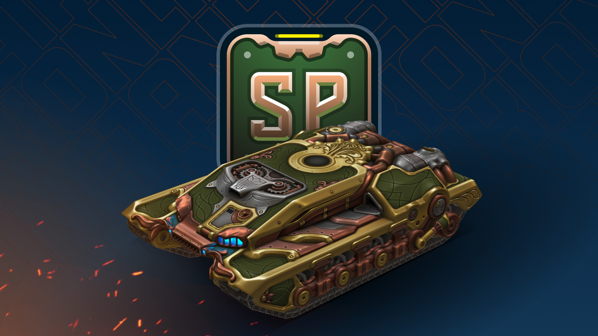
The Steampunk collection continues to expand!
Hunter has now joined the series.
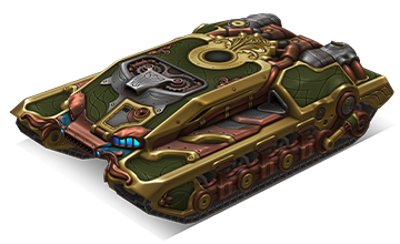
Hunter Steampunk
This skin combines the signature mechanical charm of steampunk: massive armor plates, copper details, and glowing elements that create an atmosphere of industrial power.
How to get:
The Hunter SP skin is available as one of the prizes in the Winter eSports Tanki Fund event. All participants will be able to receive it if the fund reaches level 12.
This skin will be a true highlight for any collection and another step towards a complete steampunk lineup.
Good luck in the game!
Winter eSports TankiFund 2025
The Winter Major 2025 tournament is in full swing, so alongside it, we commence the specially themed TankiFund event!
12 levels of general rewards and as many as 30 special levels for TankiFund Boosters await you! Among the prizes are the new Hunter SP skin, Keys, Grenades, and “Excelsior” augments for Mammoth and Railgun. And most importantly — millions of Rubies that we will be given away at the end of the event.
We have already found out which 16 teams will proceed to the next stage, where they will be fighting for the 8 places in the final stage where the fate of the real cash prize, unique paints, and modules offering 20–30% protection from all turrets will be determined!
Event dates: from November 21st, 2 AM UTC, till December 23rd, 2 AM UTC.
What is «eSports Tanki Fund»?
The Winter eSports TankiFund is a prize pool of Rubies that increases when players purchase any of the 3 main special offers.
At the end of the Winter eSports TankiFund event, the fund will be divided equally among the winners of the giveaway.
There are several ways to receive prizes in this event:
Ruby giveaway
Among all players who have purchased at least one of the 3 main special offers, a number of winners will be randomly selected to receive equal shares of the accumulated TankiFund.
General bonuses
All players who have purchased at least one of the 3 main special offers will receive additional bonuses, depending on the size of the fund.
Booster rewards
A special reward line is available for those who purchase the «Booster» special offer (only available to event participants).
The Winter eSports TankiFund will be growing from November 21st, 2 AM UTC, till December 23rd, 2 AM UTC.
How to take part?
During the event, 3 main special offers will be available in the Shop. By purchasing any of them, you automatically become a participant of the TankiFund.
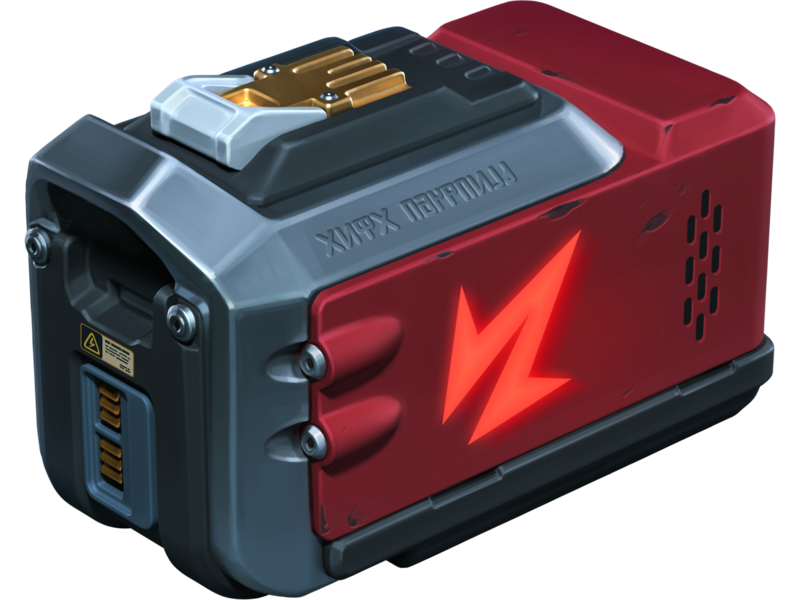
Doping
×3
NUCLEAR ENERGY
×400
REPAIR KIT
×400
BOOSTED DAMAGE
×400
BOOSTED ARMOR
×400
SPEED BOOST
×400
MINE
Buying this special offer grants you +1 slot in the Winter eSports TankiFund draw.
Note: One-time purchase.
Adds 1000 Rubies to the fund.
Note: One-time purchase.
Adds 1000 Rubies to the fund.
Price
1390 RUBIES
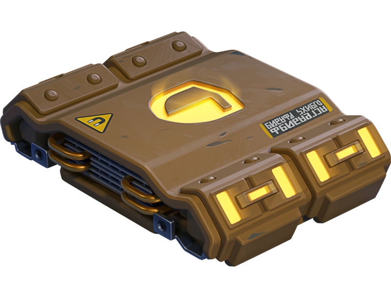
Fan’s Bundle
×20
EPIC KEY

×13000
CRYSTALS
×1
FAN PAINT
×1
FAN PAINT
×1
FAN PAINT
×1
FAN PAINT
×1
FAN PAINT
×1
FAN PAINT
×1
FAN PAINT
×1
FAN PAINT
Buying this special offer grants you +1 slot in the Winter eSports TankiFund draw (+1 extra slot for each repeated purchase).
Note: Multiple purchases allowed.
Adds 1500 Rubies to the fund.
Note: Multiple purchases allowed.
Adds 1500 Rubies to the fund.
Price
2990 RUBIES
Spectacular Appearance
×250
EPIC KEY
Black
FIREBIRD
Dark Moon
Freeze
Eclipse
hammer

Dark Moon
TWINS
Darkness
RAILGUN
Eclipse
MAGNUM
Eclipse
SHAFT
Buying this special offer grants you +1 slot in the Winter eSports TankiFund draw.
Note: One-time purchase.
Adds 10000 Rubies to the fund.
Note: One-time purchase.
Adds 10000 Rubies to the fund.
Price
19990 RUBIES
The more bundles you purchase, the higher your chances of receiving a share of the Winter eSports TankiFund!
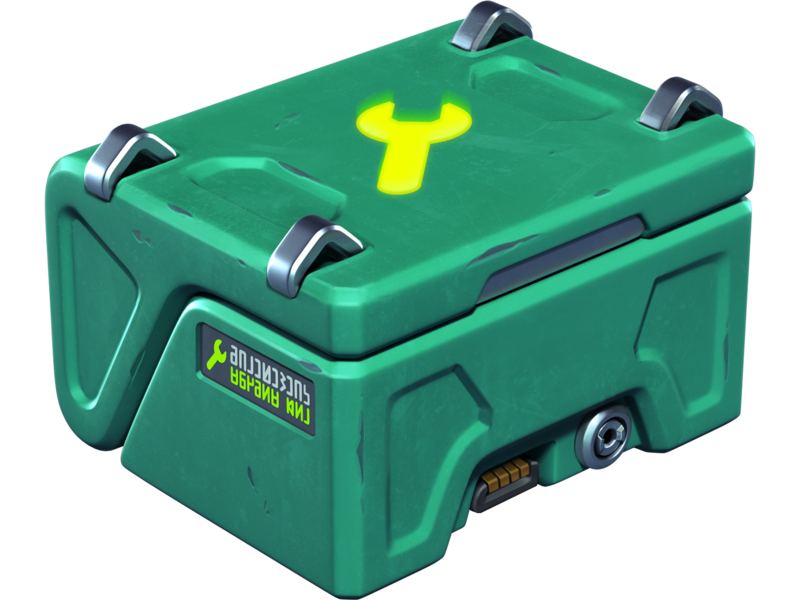
Booster
Important! Booster offer appears in the Shop on the next day after your qualifying purchase.
In the Winter eSports TankiFund, you can level up your personal progress by purchasing the “Booster” special offer.

Booster
Booster is a special offer that allows you to receive rewards from the personal progress bar. One Booster purchase grants one unit of energy, which increases your personal progress level by 1.
Each Booster you buy unlocks a new reward level for you. In total, there are 30 levels with valuable prizes.
Booster
×1
LEVEL
Note: Multiple purchases allowed, up to 30 times
Adds 1400 Rubies to the fund.
Adds 1400 Rubies to the fund.
Price
1400 TANKOINS
Booster purchases do not increase your chances in the Ruby draw.
Booster becomes available only after you purchase at least one of the event’s main special offers.
We will add part of the revenue from “Booster” purchases to the prize pool of the “Winter Major 2025” eSports tournament.
It does not matter which Booster variant you buy from the Shop – No.5 or No.9. The number in the name of the special offer is not related to the level it unlocks. Your progress bar will fill gradually, starting from level 1.
Prizes for the Winter eSports TankiFund
All prizes — Rubies and additional bonuses will be credited after the end of the tournament and after the winners of the draw are determined.
With every 8000 Rubies added to the fund, the number of giveaway winners increases by 1. All winners of the draw will receive equal shares of the Winter eSports TankiFund, and some of you may instantly become truly rich!
Winners of the draw are players randomly chosen from among those who have purchased the event’s special offers. The selection of participants will take place on December 23rd at 12 PM UTC. The number of winners depends on the total number of special offers purchased.
You will be able to track the growth of the fund and the number of giveaway participants on the special event website. The fund will start to grow only after the first purchase is made. For now, there are 0 Rubies in it.
Prizes
Every player who buys at least one of the special offers receives additional bonuses depending on the size of the fund. Every time the amount increases by 1 million Rubies, the Winter eSports TankiFund moves to a new level.

LEVEL 1
«Snowball» GRENADE ×100

LEVEL 2
COMMON KEY ×15
LEVEL 3
Mammoth
Excelsior
Excelsior
LEVEL 4
RARE KEY ×15
LEVEL 5
Railgun Excelsior
LEVEL 6
EPIC KEY ×15
LEVEL 7
«Crisis» drone
LEVEL 8
EPIC KEY ×15

LEVEL 9
«Tsar» GRENADE ×30
LEVEL 10
«Armadillo» module
LEVEL 11
LEGENDARY Key ×1

LEVEL 12
HUNTER SP
Rewards for purchasing the “Booster” offer
LEVEL 1
EPIC KEY ×30
LEVEL 2
NUCLEAR ENERGY ×15
LEVEL 3
EPIC KEY ×30
LEVEL 4
«Snowball» GRENADE ×100
LEVEL 5
EPIC KEY ×30
LEVEL 6
«Tsar» GRENADE ×10
LEVEL 7
EPIC KEY ×30
LEVEL 8
NUCLEAR ENERGY ×15
LEVEL 9
EPIC KEY ×30

LEVEL 10
«Snowball» GRENADE ×100
LEVEL 11
EPIC KEY ×30
LEVEL 12
«Tsar» GRENADE ×10
LEVEL 13
EPIC KEY ×30
LEVEL 14
NUCLEAR ENERGY ×15
LEVEL 15
EPIC KEY ×30
LEVEL 16
«Snowball» GRENADE ×100
LEVEL 17
EPIC KEY ×30
LEVEL 18
«Tsar» GRENADE ×10
LEVEL 19
EPIC KEY ×30
LEVEL 20
LEGENDARY key ×1
LEVEL 21
EPIC KEY ×30
LEVEL 22
NUCLEAR ENERGY ×15
LEVEL 23
EPIC KEY ×30
LEVEL 24
«Snowball» GRENADE ×100
LEVEL 25
EPIC KEY ×30
LEVEL 26
«Tsar» GRENADE ×10
LEVEL 27
EPIC KEY ×30
LEVEL 28
NUCLEAR ENERGY ×15
LEVEL 29
EPIC KEY ×30
LEVEL 30
LEGENDARY key ×1
Match livestreams
To fully feel the atmosphere of this intense eSports event, watch the eSports livestreams on our Twitch channels.
Remember that for 30 minutes of watch time, you can receive a special Twitch Drop containing 1 EPIC Key — and another one for 60 minutes of watch time.
Livestreams start at 5 PM and 6 PM UTC. You can follow the match schedule on the TankiSport website.
The event is held in accordance with the Regulations and General Rules for Promotions and Contests.
Magnum HD Skin
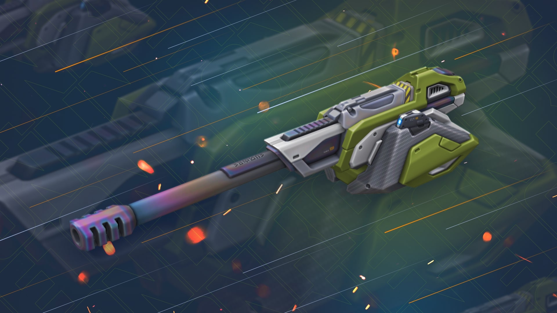
We continue to add new HD skins into the game!
This Friday, a new detailed skin for Magnum will appear in the game.
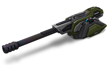
Magnum HD
The HD skins series is a collection of exclusive visuals for different tanks, each of which has a unique look.
The HD version of Magnum features not only improved detail, but also a unique animation that even the most elaborate versions like Steampunk don’t have.
Now, when firing, the breech block moves back, and a shell casing is ejected from the port.
From November 21st, the turret visuals will update to the HD version automatically and for free for all of its owners.
Enter the game and share your impressions!
Winter Major 2025
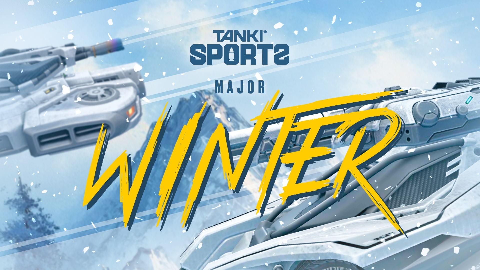
Winter Major 2025 is coming!
There are just a few days left until the start of the biggest eSports tournament this winter, so now is the right time to share all the details of the upcoming event!
What is eSports up to nowadays?
eSports nowadays consists of two seasons per year, and each of them includes a series of qualifying ranking tournaments and finishes with a Major event.
The 24 best teams (according to rating points) have taken part in three rating (qualifying) tournaments to get a place in the main tournament of the half-year – Major, and to compete for a solid cash prize.
I don’t play eSports, what can I do?
Don’t worry. All the qualifying tournaments of the year are over, and the teams participating in the final tournament have been determined, which means it’s time to become a viewer!
Join livestreams on our Twitch channels, follow them, watch eSports matches, and keep track of results.
Twitch Drops
For watching eSports livestreams, we reward each tanker with Epic Keys on each broadcast. To have your watch time counted, you first must link your Twitch account in the game settings.
Read more about how the «Twitch Drops» system works in the special article.
Follow the news in the game so as not to miss our livestreams!
When will it start?
The «Challengers» Stage begins on November 6th and will last until November 17th.
The 16 lowest-rated teams out of the total 24 will take part in this stage. The best 8 have already received a place in the next stage.
Next, we will have the «Legends» Stage from November 25th until December 6th. The top 8 teams that have automatically advanced to this stage will join the 8 best teams from the Challengers Stage. These 16 teams will compete for a spot in the «Champions» Stage.
Will there be Tanki Fund?
Of course, what is eSports without the Tanki Fund? In addition to the Epic Keys you receive for each livestream, right before the start of the «Legends» Stage, we will announce the «eSports Tanki Fund».
In the «Legends» Stage, you can choose your favorite team, purchase special offers in the Shop, and thus not only help your favorite team but also get a chance to win Rubies as well as receive guaranteed prizes from Tanki Fund levels.
When will The Grand Finals take place?
The last 14 matches will happen in the «Champions» stage, and the 8 best teams will fight for cash prizes from December 15th to December 22nd.
The hottest matches and the fate of the cash prize lie in these final matches!
Anyone who has seen at least one Grand Finals livestream before knows that no one should miss it!
Don’t miss the livestreams of eSports matches on our Twitch channels! Root for your favorite teams, watch interesting matches, and get yourself some cool rewards!
Recommended Posts