 Jump to content
Winter eSports TankiFund 2025
1/9
Magnum HD Skin
2/9
The Freezer Games 2025
3/9
Day of the Dead 2025
4/9
Tanki Online V-LOG: Episode 537
5/9
Winter Major 2025
6/9
“Trick-or-Treat” mini-game 2025
7/9
Isida Demonic
8/9
Invite a friend #4
9/9


Winter eSports TankiFund 2025
The Winter Major 2025 tournament is in full swing, so alongside it, we commence the specially themed TankiFund event!
12 levels of general rewards and as many as 30 special levels for TankiFund Boosters await you! Among the prizes are the new Hunter SP skin, Keys, Grenades, and “Excelsior” augments for Mammoth and Railgun. And most importantly — millions of Rubies that we will be given away at the end of the event.
We have already found out which 16 teams will proceed to the next stage, where they will be fighting for the 8 places in the final stage where the fate of the real cash prize, unique paints, and modules offering 20–30% protection from all turrets will be determined!
Event dates: from November 21st, 2 AM UTC, till December 23rd, 2 AM UTC.
What is «eSports Tanki Fund»?
The Winter eSports TankiFund is a prize pool of Rubies that increases when players purchase any of the 3 main special offers.
At the end of the Winter eSports TankiFund event, the fund will be divided equally among the winners of the giveaway.
There are several ways to receive prizes in this event:
Ruby giveaway
Among all players who have purchased at least one of the 3 main special offers, a number of winners will be randomly selected to receive equal shares of the accumulated TankiFund.
General bonuses
All players who have purchased at least one of the 3 main special offers will receive additional bonuses, depending on the size of the fund.
Booster rewards
A special reward line is available for those who purchase the «Booster» special offer (only available to event participants).
The Winter eSports TankiFund will be growing from November 21st, 2 AM UTC, till December 23rd, 2 AM UTC.
How to take part?
During the event, 3 main special offers will be available in the Shop. By purchasing any of them, you automatically become a participant of the TankiFund.
Doping
×3
NUCLEAR ENERGY
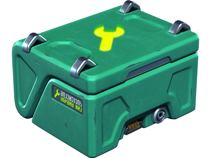
×400
REPAIR KIT
×400
BOOSTED DAMAGE
×400
BOOSTED ARMOR
×400
SPEED BOOST
×400
MINE
Buying this special offer grants you +1 slot in the Winter eSports TankiFund draw.
Note: One-time purchase.
Adds 1000 Rubies to the fund.
Note: One-time purchase.
Adds 1000 Rubies to the fund.
Price
1390 RUBIES
Fan’s Bundle

×20
EPIC KEY

×13000
CRYSTALS
×1
FAN PAINT
×1
FAN PAINT
×1
FAN PAINT
×1
FAN PAINT
×1
FAN PAINT
×1
FAN PAINT
×1
FAN PAINT
×1
FAN PAINT
Buying this special offer grants you +1 slot in the Winter eSports TankiFund draw (+1 extra slot for each repeated purchase).
Note: Multiple purchases allowed.
Adds 1500 Rubies to the fund.
Note: Multiple purchases allowed.
Adds 1500 Rubies to the fund.
Price
2990 RUBIES
Spectacular Appearance
×250
EPIC KEY
Black
FIREBIRD

Dark Moon
Freeze

Eclipse
hammer

Dark Moon
TWINS
Darkness
RAILGUN
Eclipse
MAGNUM
Eclipse
SHAFT
Buying this special offer grants you +1 slot in the Winter eSports TankiFund draw.
Note: One-time purchase.
Adds 10000 Rubies to the fund.
Note: One-time purchase.
Adds 10000 Rubies to the fund.
Price
19990 RUBIES
The more bundles you purchase, the higher your chances of receiving a share of the Winter eSports TankiFund!
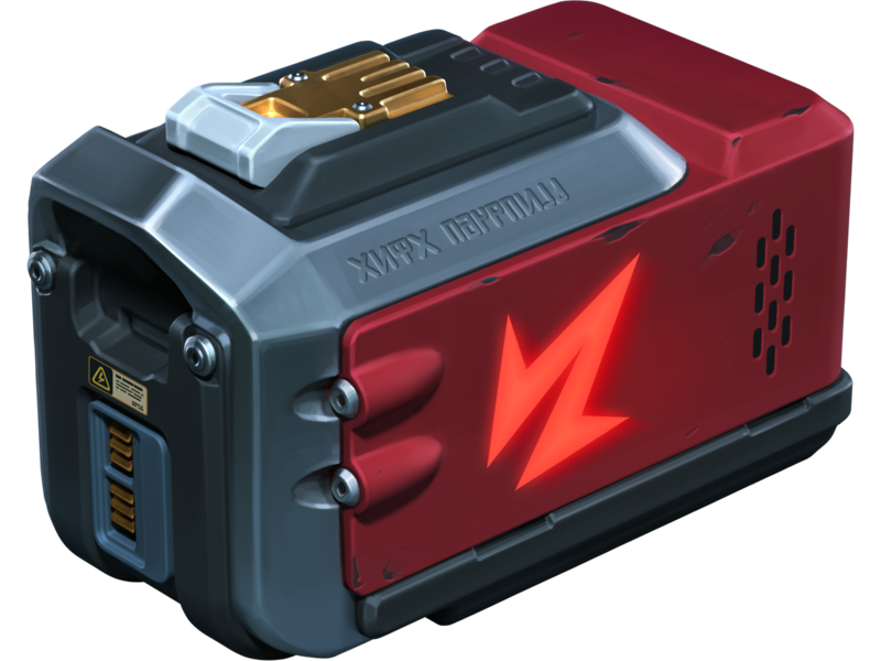
Booster
Important! Booster offer appears in the Shop on the next day after your qualifying purchase.
In the Winter eSports TankiFund, you can level up your personal progress by purchasing the “Booster” special offer.

Booster
Booster is a special offer that allows you to receive rewards from the personal progress bar. One Booster purchase grants one unit of energy, which increases your personal progress level by 1.
Each Booster you buy unlocks a new reward level for you. In total, there are 30 levels with valuable prizes.
Booster
×1
LEVEL
Note: Multiple purchases allowed, up to 30 times
Adds 1400 Rubies to the fund.
Adds 1400 Rubies to the fund.
Price
1400 TANKOINS
Booster purchases do not increase your chances in the Ruby draw.
Booster becomes available only after you purchase at least one of the event’s main special offers.
We will add part of the revenue from “Booster” purchases to the prize pool of the “Winter Major 2025” eSports tournament.
It does not matter which Booster variant you buy from the Shop – No.5 or No.9. The number in the name of the special offer is not related to the level it unlocks. Your progress bar will fill gradually, starting from level 1.
Prizes for the Winter eSports TankiFund
All prizes — Rubies and additional bonuses will be credited after the end of the tournament and after the winners of the draw are determined.
With every 8000 Rubies added to the fund, the number of giveaway winners increases by 1. All winners of the draw will receive equal shares of the Winter eSports TankiFund, and some of you may instantly become truly rich!
Winners of the draw are players randomly chosen from among those who have purchased the event’s special offers. The selection of participants will take place on December 23rd at 1 AM UTC. The number of winners depends on the total number of special offers purchased.
You will be able to track the growth of the fund and the number of giveaway participants on the special event website. The fund will start to grow only after the first purchase is made. For now, there are 0 Rubies in it.
Prizes
Every player who buys at least one of the special offers receives additional bonuses depending on the size of the fund. Every time the amount increases by 1 million Rubies, the Winter eSports TankiFund moves to a new level.

LEVEL 1
«Snowball» GRENADE ×100

LEVEL 2
COMMON KEY ×15
LEVEL 3
Mammoth
Excelsior
Excelsior
LEVEL 4
RARE KEY ×15
LEVEL 5
Railgun Excelsior

LEVEL 6
EPIC KEY ×15
LEVEL 7
«Crisis» drone
LEVEL 8
EPIC KEY ×15

LEVEL 9
«Tsar» GRENADE ×100
LEVEL 10
«Armadillo» module
LEVEL 11
LEGENDARY Key ×1
LEVEL 12
HUNTER SP
Rewards for purchasing the “Booster” offer
LEVEL 1
EPIC KEY ×30
LEVEL 2
NUCLEAR ENERGY ×15
LEVEL 3
EPIC KEY ×30
LEVEL 4
«Snowball» GRENADE ×100
LEVEL 5
EPIC KEY ×30

LEVEL 6
«Tsar» GRENADE ×10
LEVEL 7
EPIC KEY ×30
LEVEL 8
NUCLEAR ENERGY ×15
LEVEL 9
EPIC KEY ×30

LEVEL 10
«Snowball» GRENADE ×100
LEVEL 11
EPIC KEY ×30
LEVEL 12
«Tsar» GRENADE ×10
LEVEL 13
EPIC KEY ×30
LEVEL 14
NUCLEAR ENERGY ×15
LEVEL 15
EPIC KEY ×30
LEVEL 16
«Snowball» GRENADE ×100
LEVEL 17
EPIC KEY ×30
LEVEL 18
«Tsar» GRENADE ×10
LEVEL 19
EPIC KEY ×30

LEVEL 20
LEGENDARY key ×1
LEVEL 21
EPIC KEY ×30
LEVEL 22
NUCLEAR ENERGY ×15
LEVEL 23
EPIC KEY ×30
LEVEL 24
«Snowball» GRENADE ×100
LEVEL 25
EPIC KEY ×30
LEVEL 26
«Tsar» GRENADE ×10
LEVEL 27
EPIC KEY ×30
LEVEL 28
NUCLEAR ENERGY ×15
LEVEL 29
EPIC KEY ×30
LEVEL 30
LEGENDARY key ×1
Match livestreams
To fully feel the atmosphere of this intense eSports event, watch the eSports livestreams on our Twitch channels.
Remember that for 30 minutes of watch time, you can receive a special Twitch Drop containing 1 EPIC Key — and another one for 60 minutes of watch time.
Livestreams start at 5 PM and 6 PM UTC. You can follow the match schedule on the TankiSport website.
The event is held in accordance with the Regulations and General Rules for Promotions and Contests.
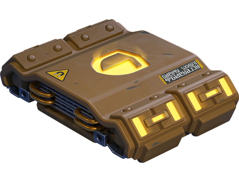
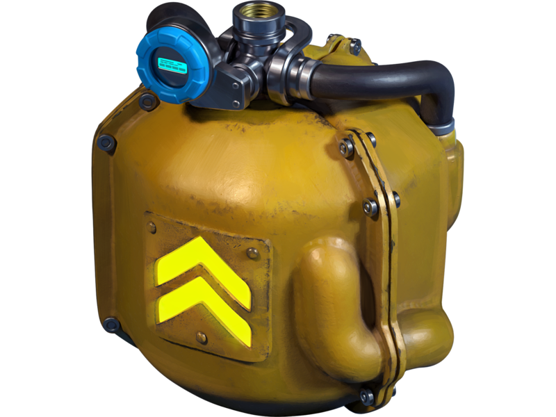
Magnum HD Skin
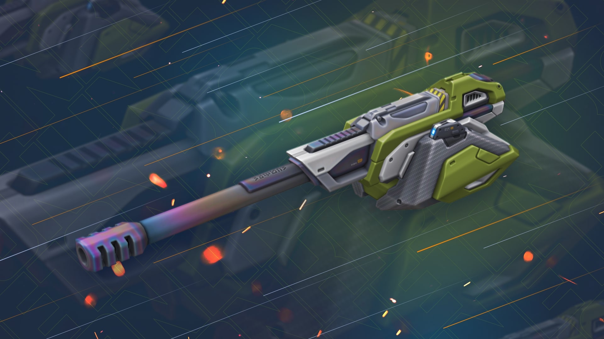
We continue to add new HD skins into the game!
This Friday, a new detailed skin for Magnum will appear in the game.
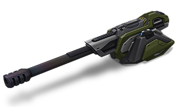
Magnum HD
The HD skins series is a collection of exclusive visuals for different tanks, each of which has a unique look.
The HD version of Magnum features not only improved detail, but also a unique animation that even the most elaborate versions like Steampunk don’t have.
Now, when firing, the breech block moves back, and a shell casing is ejected from the port.
From November 21st, the turret visuals will update to the HD version automatically and for free for all of its owners.
Enter the game and share your impressions!
The Freezer Games 2025

“The Freezer Games” are back!
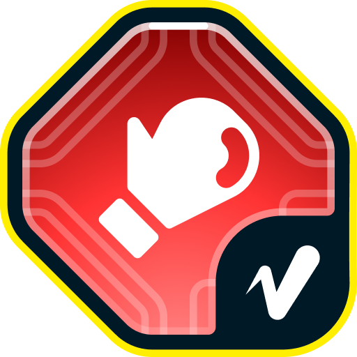
From November 14th, the fight for survival in permafrost will continue, in which every warrior of the Snow Empire will be ready to lay down their lives for the ownership of Ice Coins. As a reward for your heroic deeds, you will be able to earn precious prizes: A variety of Augments, among which there are “Pulsar” for Gauss and the new “Boxer” augment for Gauss, Grenades, Supplies, Epic and Legendary Keys, and the main prize will be the IC skin for Gauss!
Event Dates: November 14th, 2 AM — November 27th, 2 AM UTC
How to participate
To take part in the «The Freezer Games» event, you will need to entrust your fate in (purchase) the “North Star”. It will tell you which faction you belong to by right of birth.

Immediately after purchasing the Pass, you will be randomly assigned to one of the three factions: Cunning, Rage or Madness.

Cunning

Rage

Madness
Once the event begins, a special event website will become available. Both team and personal progress of participants will be displayed on it.
Event Rules
After being assigned to a faction, you will have to fight for victory. It can be achieved by collecting the highest number of Ice Coins.
Ice Coins
Ice Coins are a special crystalline compound capable of storing energy in permafrost conditions. Ice Coins are a special event currency. Get them for completing missions or purchase them in the Shop for Crystals or Rubies. There is also a special offer where Ice Coins are available for Rubies.
Special Missions
Only tankers who have purchased the ”North Star” special offer get access to these missions.
We have prepared a lot of missions, and each of them become available with a new day of the event, and you can complete them until the end of the event. The more missions you complete, the more personal prizes you will receive and the more chances your faction has to win!
You can complete the missions and get the coveted coins from November 14th 2AM UTC to November 27th 2AM UTC.
Important: Every day throughout the event, 1 new mission becomes available.
PRESTIGE
TASK
Get a new rank. IMPORTANT: The mission is only available for «Event Pass» owners.
REWARD

×1
ICE COIN
ICE COIN
A PART OF THE WHOLE
TASK
Be in the winning team of 5 battles in any matchmaking battles. IMPORTANT: The mission is only available for «Event Pass» owners.
REWARD
×1
ICE COIN
ICE COIN
SURVIVOR
TASK
Get into the TOP-3 2 times in any matchmaking battles. IMPORTANT: The mission is only available for «Event Pass» owners.
REWARD
×1
ICE COIN
ICE COIN
SNOW TRAP
TASK
Destroy 2 tanks using mines in any matchmaking battles. IMPORTANT: The mission is only available for «Event Pass» owners.
REWARD
×1
ICE COIN
ICE COIN
WARRIOR’S PATH
TASK
Earn 5000 reputation points in any matchmaking battles. IMPORTANT: The mission is only available for «Event Pass» owners.
REWARD
×1
ICE COIN
ICE COIN
GAME OF ADVANCEMENT
TASK
Destroy 3 tanks using grenades in any matchmaking battles. IMPORTANT: The mission is only available for «Event Pass» owners.
REWARD
×1
ICE COIN
ICE COIN
FROSTBITE
TASK
Destroy 30 tanks using critical damage in any matchmaking battles. IMPORTANT: The mission is only available for «Event Pass» owners.
REWARD
×1
ICE COIN
ICE COIN
MINIMUM REQUIREMENTS
TASK
Open 15 Common Containers. IMPORTANT: The mission is only available for «Event Pass» owners.
REWARD
×1
ICE COIN
ICE COIN
BLOODY AVALANCHE
TASK
Destroy 50 tanks in any matchmaking battles. IMPORTANT: The mission is only available for «Event Pass» owners.
REWARD
×1
ICE COIN
ICE COIN
AT FULL FORCE
TASK
Use any supply 100 times in any matchmaking battles. IMPORTANT: The mission is only available for «Event Pass» owners.
REWARD
×1
ICE COIN
ICE COIN
ICE SHARDS
TASK
Earn 10000 crystals in any matchmaking battles. IMPORTANT: The mission is only available for «Event Pass» owners.
REWARD
×1
ICE COIN
ICE COIN
FULL LOAD
TASK
Open 15 Epic Containers. IMPORTANT: The mission is only available for «Event Pass» owners.
REWARD
×1
ICE COIN
ICE COIN
WARM CLOTHES
TASK
Make any purchase in the game’s Shop. IMPORTANT: The mission is only available for «Event Pass» owners.
REWARD
×1
ICE COIN
ICE COIN
Coin Packs
Ice Coin Packs will be on sale for the duration of the entire event in the Shop:

×1 ICE COIN
200 000 CRYSTALS
×3 ICE COINs
400 000 CRYSTALS
×5 ICE COINs
600 000 CRYSTALS
×1 ICE COIN
500 RUBIES
×3 ICE COINs
1000 RUBIES
×5 ICE COINs
1500 RUBIES
Special Offer
Purchase the special offer and make a significant contribution to your faction’s victory!

Prizes
There is something to compete for! There will be several prizes!
Team Progress
The faction of players that obtains the most amount of Ice Coins will win and get the main rewards — Gauss IC skin and the “Pulsar” augment for Gauss.

GAUSS
IC

GAUSS
PULSAR
- In team progress, all the obtained Ice Coins are counted for the current faction that the player is in.
The participation of every tanker is necessary for victory!
Individual Progress
- Each player receives a collection of individual missions. Completing these helps the player move forward in the personal standings (completion of one level = 1 Coin).
- The more Ice Coins a player has, the more missions the player has completed and the more prizes the player will be able to obtain.
- For each completed mission, upon the completion of the event, a player receives the prizes (all prizes are listed on the website): A lot of Keys, Grenades, Supplies, a variety of Augments, among which there is the new “Boxer” augment for Gauss, and a Legendary Key.

SHAFT
Stellarator

RAILGUN
«Excalibur» Rounds

SMOKY
CAMPER

GAUSS
BOXER
“BOXER” FOR GAUSS
Salvo impact force and arcade impact force are increased. Aiming and reload takes more time.
Each blast from this augment delivers a punch-like impact to enemy armor. The Boxer can forcibly spin enemy tanks, severely disrupting their ability to return fire.
Important: All prizes will be added to the winners’ accounts after the end of the event.
Winter is coming, let the battle begin!
The event is held by APL Publishing Ltd. in accordance with the General Rules for Promotions and Contests (https://tankionline.com/en/general-rules-contests-promotions/) and Event’s Regulation.
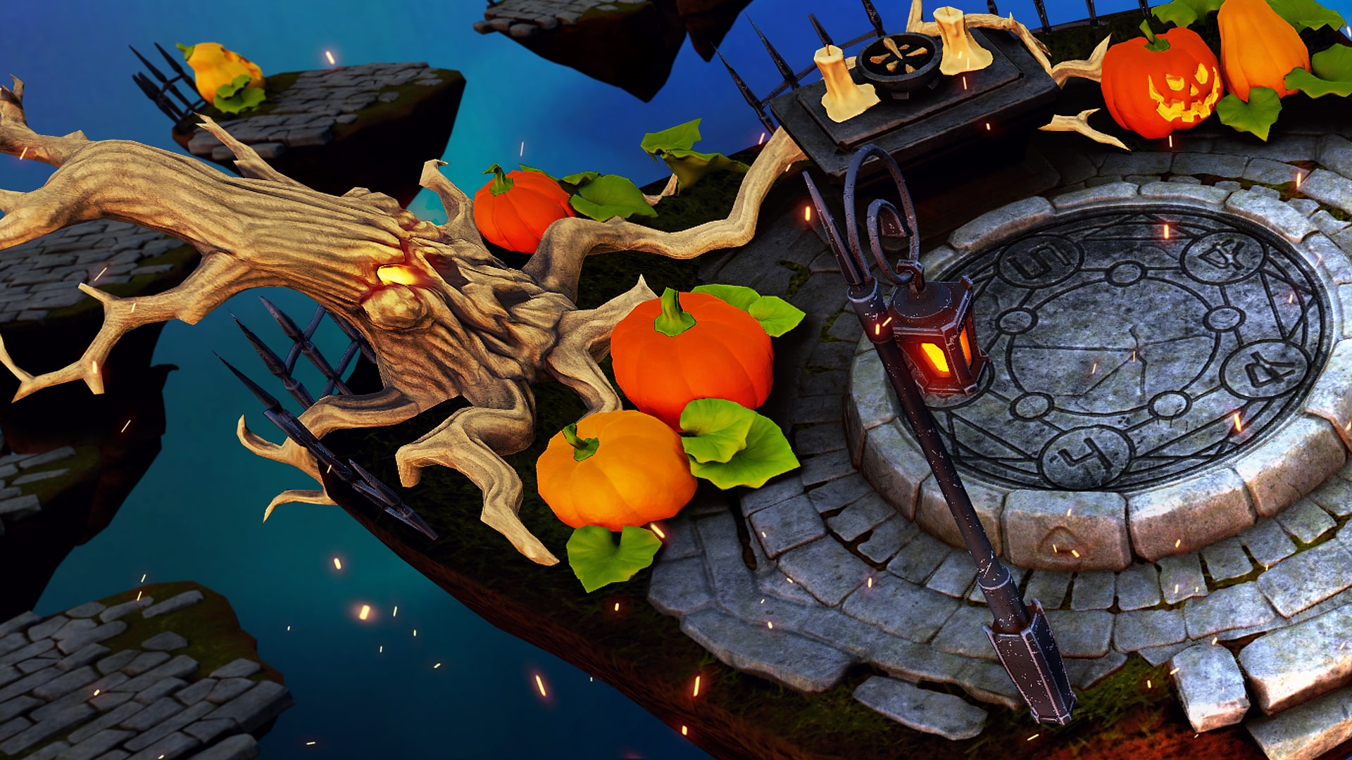
Day of the Dead 2025
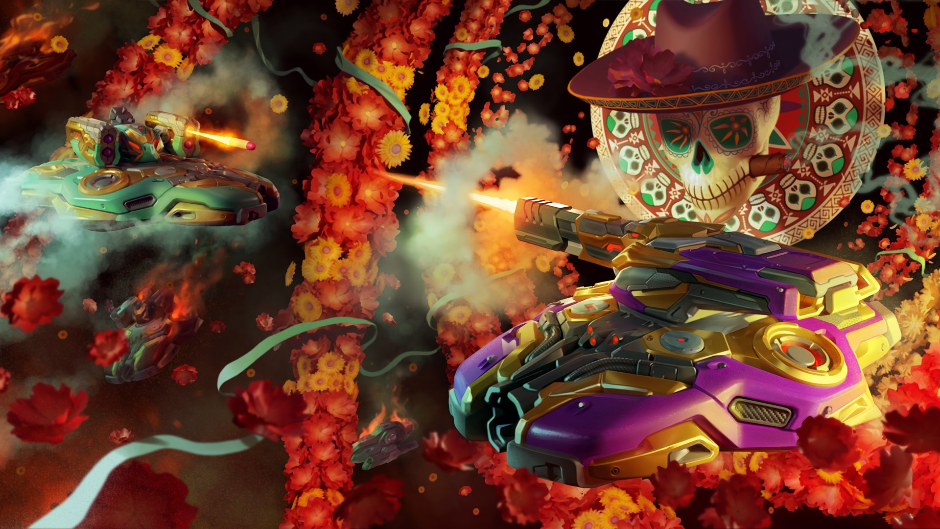
The long awaited “Day of the Dead” celebration begins in Tanki Online – it’s the time when the energy of other worlds gets into every battle.
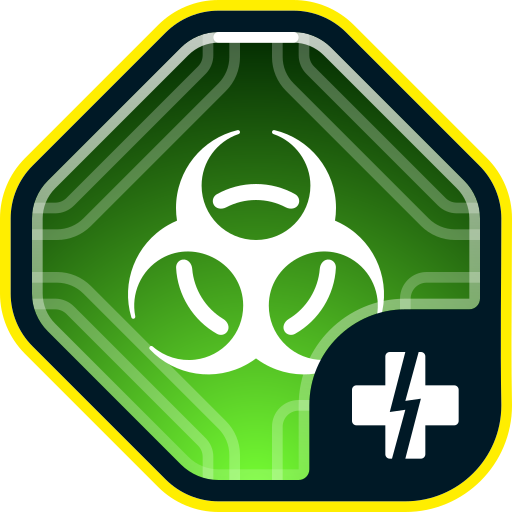
When the boundaries between the worlds get thin, even the bravest tankers feel the breath of other powers. There are special “Pyromaniac”, “Big Fight”, and “Team Arms Race” battle modes, favorable 30% discounts, XT skins and augments for Scorpion and Crusader in Epic Containers, new Elite Pass with a Legendary Key, and the “Excelsior” augment for Tesla in rewards, as well as lots of festive missions with precious prizes.
Event dates: from November 7th, 2 AM UTC till November 28th, 2 AM UTC.
Discounts
Take advantage of the great discounts from November 7th to November 10th.
All discounts start and end with the server restart at 2 AM UTC.
For 3 whole days, you will be able to obtain the following items with a 30% discount:
-30%
Shop (7.11 — 10.11)
Crystals

Stars
Early Access Items
Premium Pass
-30%
Garage (7.11 — 10.11)
Augments
Supplies
Paints
Drones
Modules
Grenades
-30%
Upgrades (7.11 — 10.11)
Special Event modes
Three exciting game modes will be waiting for you in the game!
Important: Boosted battle funds and experience are only active within the festive weekend game modes.
Each mode starts and ends with the server restart at 2 AM UTC.
SPECIAL MODE
PYROMANIAC
November 7th — November 10th
Mode
CP
Turret
Firebird
Hull
Wasp
Bonus Boxes
Upgrades
Augments
Gold Boxes
Equipment Change
Overdrives
Supplies
Nuclear Energy
Smart Supplies
Drones
Protection Modules
Groups
Grenades
More Gold Boxes
Burn everyone and capture the points to win! While you move between points, capture gold boxes!
- Polygon MM
SPECIAL MODE
BIG FIGHT
November 14th — November 17th
Mode
DM
Turret
Terminator
Hull
Juggernaut
Bonus Boxes
Upgrades
Augments
Gold Boxes
Equipment Change
Overdrives
Supplies
Nuclear Energy
Smart Supplies
Drones
Protection Modules
Groups
Grenades
More Gold Boxes
«Big fight» — Every tanker will be able to feel like the main boss in the battle because everyone gets the «Juggernaut» super tank.
- Parma Remastered (Autumn)
- Brest MM
SPECIAL MODE
TEAM ARMS RACE
November 21st — November 24th
Mode
Team Arms Race
Turret
Changes Every 3 Kills
Hull
Viking
Bonus Boxes
Upgrades
Augments
Gold Boxes
Equipment Change
Overdrives
Supplies
Nuclear Energy
Smart Supplies
Drones
Protection Modules
Groups
Grenades
More Gold Boxes
Crush enemies with BO-NK in the updated team mode and catch a lot of gold boxes, because this weekend, we have increased their dropping frequency!
- Highland Remastered (Autumn)
- Solikamsk MM
Special offers
What’s any holiday without some great deals at awesome prices?
November 7th — November 24th
November 7th — November 28th
Daily Ruby Pass
×500
TANKOINS*

×4500
Rubies**
500 Tankoins instantly.
** For 30 days, each day the player can access a pre-completed mission upon logging in, from which they can claim a reward of 150 Rubies.
Note: One-time purchase
** For 30 days, each day the player can access a pre-completed mission upon logging in, from which they can claim a reward of 150 Rubies.
Note: One-time purchase
PURCHASE
Ritual Set
×15
EPIC KEY
×4
PREMIUM PASS
×1
Nuclear Energy

November 14th — November 28th
Deathly Hallows
×15
EPIC KEY
×1
Nuclear Energy

×1
RARE KEY
November 21st — November 28th

Epic Containers
Treat yourself with the updated content of Epic Containers!
- SKIN Scorpion XT
- SKIN Crusader XT
- Scorpion’s “Uranium Shells” augment
- Scorpion’s “Missile launcher «Spear»” augment
- Hammer’s “Boxer” augment
- Crusader’s “Excelsior” augment
- Crusader’s “Lifeguard” augment
- And everything you can get from Common Containers
Special missions
We have prepared a plethora of exciting missions which will make the event more exciting!
Your progress in completing missions is only counted from the moment you first enter the “Missions” screen after the event begins.
Missions follow the Encore system, with the second set of missions appearing only after the first set is completed.
SPECIAL
Part 1. November 7th — November 14th
Part 2. November 14th — November 21st
Part 3. November 21st — November 28th
SANTA MUERTE. PART 1
TASK
Be in the winning team of 1 battle in any matchmaking battles.
IMPORTANT: The mission is only available for «Premium Pass» owners.
REWARD
×1
EPIC KEY
EPIC KEY
ONE-WAY TICKET. PART 1
TASK
Finish 3 battles in any matchmaking battles.
IMPORTANT: The mission is only available for «Battle Pass» owners.
REWARD
×1
EPIC KEY
EPIC KEY
FAREWELL PARTY. PART 1
TASK
Earn 500 reputation points in the festive «Pyromaniac» mode.
REWARD
×1
EPIC KEY
EPIC KEY
SANTA MUERTE. PART 2
TASK
Be in the winning team of 1 battle in any matchmaking battles.
IMPORTANT: The mission is only available for «Premium Pass» owners.
REWARD
×1
EPIC KEY
EPIC KEY
ONE-WAY TICKET. PART 2
TASK
Finish 3 battles in any matchmaking battles.
IMPORTANT: The mission is only available for «Battle Pass» owners.
REWARD
×1
EPIC KEY
EPIC KEY
FAREWELL PARTY. PART 2
TASK
Earn 500 reputation points in the festive «Big Fight» mode.
REWARD
×1
EPIC KEY
EPIC KEY
SANTA MUERTE. PART 3
TASK
Be in the winning team of 1 battle in any matchmaking battles.
IMPORTANT: The mission is only available for «Premium Pass» owners.
REWARD
×1
EPIC KEY
EPIC KEY
ONE-WAY TICKET. PART 3
TASK
Finish 3 battles in any matchmaking battles.
IMPORTANT: The mission is only available for «Battle Pass» owners.
REWARD
×1
EPIC KEY
EPIC KEY
FAREWELL PARTY. PART 3
TASK
Earn 500 reputation points in the festive «Team Arms race» mode.
REWARD
×1
EPIC KEY
EPIC KEY
SET 1
Set 1. November 7th — November 28th
SUPERMISSION: ETERNAL PATH. PART 1
TASK
Complete «Revival. Part 1», «Old Soul. Part 1», «In the Moment. Part 1», «Oblivion. Part 1», «Soul Mates. Part 1», «The Last Purchase. Part 1», «Altar», «Resuscitation», «Experience of Generations», «7 Days» and «Grave Robber» missions.
REWARD
×5
EPIC KEY
EPIC KEY
×1
RARE KEY
RARE KEY
×1000
EXPERIENCE POINTS
EXPERIENCE POINTS
REVIVAL. PART 1
TASK
Enter the game at least once.
REWARD
×1
COMMON KEY
COMMON KEY
×100
EXPERIENCE POINTS
EXPERIENCE POINTS
OLD SOUL. PART 1
TASK
Earn 5000 reputation points in any matchmaking battles.
REWARD
×1
COMMON KEY
COMMON KEY
×100
EXPERIENCE POINTS
EXPERIENCE POINTS
IN THE MOMENT. PART 1
TASK
Earn 3000 reputation points in Quick Battle mode in any matchmaking battles.
REWARD
×1
COMMON KEY
COMMON KEY
×100
EXPERIENCE POINTS
EXPERIENCE POINTS
OBLIVION. PART 1
TASK
Finish 10 battles in any matchmaking battles.
REWARD
×1
COMMON KEY
COMMON KEY
×100
EXPERIENCE POINTS
EXPERIENCE POINTS
SOUL MATES. PART 1
TASK
Be in the winning team of 2 battles in any matchmaking battles.
REWARD
×1
COMMON KEY
COMMON KEY
×100
EXPERIENCE POINTS
EXPERIENCE POINTS
THE LAST PURCHASE. PART 1
TASK
Make any purchase in the game’s Shop.
REWARD
×1
COMMON KEY
COMMON KEY
×100
EXPERIENCE POINTS
EXPERIENCE POINTS
ALTAR
TASK
Earn 1000 reputation points in CP mode in matchmaking battles.
REWARD
×1
COMMON KEY
COMMON KEY
×100
EXPERIENCE POINTS
EXPERIENCE POINTS
RESUSCITATION
TASK
Use repair kit 150 times in any matchmaking battles.
REWARD
×1
COMMON KEY
COMMON KEY
×100
EXPERIENCE POINTS
EXPERIENCE POINTS
EXPERIENCE OF GENERATIONS
TASK
Earn 3000 experience points in any matchmaking battles.
REWARD
×1
COMMON KEY
COMMON KEY
×100
EXPERIENCE POINTS
EXPERIENCE POINTS
7 DAYS
TASK
Complete 3 Weekly missions.
REWARD
×1
COMMON KEY
COMMON KEY
×100
EXPERIENCE POINTS
EXPERIENCE POINTS
GRAVE ROBBER
TASK
Open 15 any Containers.
REWARD
×1
COMMON KEY
COMMON KEY
×100
EXPERIENCE POINTS
EXPERIENCE POINTS
SET 2
Set 2. November 14th — November 28th
SUPERMISSION: ETERNAL PATH. PART 2
TASK
Complete «Revival. Part 2», «Old Soul. Part 2», «In the Moment. Part 2», «Oblivion. Part 2», «Soul Mates. Part 2», «The Last Purchase. Part 2», «As I Live and Breathe», «Rage», «Family Values», «Here and Now» and «Fatal Blow» missions.
REWARD
×5
EPIC KEY
EPIC KEY
×1
RARE KEY
RARE KEY
×1000
EXPERIENCE POINTS
EXPERIENCE POINTS
REVIVAL. PART 2
TASK
Enter the game at least once.
REWARD
×1
COMMON KEY
COMMON KEY
×100
EXPERIENCE POINTS
EXPERIENCE POINTS
OLD SOUL. PART 2
TASK
Earn 5000 reputation points in any matchmaking battles.
REWARD
×1
COMMON KEY
COMMON KEY
×100
EXPERIENCE POINTS
EXPERIENCE POINTS
IN THE MOMENT. PART 2
TASK
Earn 3000 reputation points in Quick Battle mode in any matchmaking battles.
REWARD
×1
COMMON KEY
COMMON KEY
×100
EXPERIENCE POINTS
EXPERIENCE POINTS
OBLIVION. PART 2
TASK
Finish 10 battles in any matchmaking battles.
REWARD
×1
COMMON KEY
COMMON KEY
×100
EXPERIENCE POINTS
EXPERIENCE POINTS
SOUL MATES. PART 2
TASK
Be in the winning team of 2 battles in any matchmaking battles.
REWARD
×1
COMMON KEY
COMMON KEY
×100
EXPERIENCE POINTS
EXPERIENCE POINTS
THE LAST PURCHASE. PART 2
TASK
Make any purchase in the game’s Shop.
REWARD
×1
COMMON KEY
COMMON KEY
×100
EXPERIENCE POINTS
EXPERIENCE POINTS
AS I LIVE AND BREATHE
TASK
Earn 1000 reputation points in TJR mode in matchmaking battles.
REWARD
×1
COMMON KEY
COMMON KEY
×100
EXPERIENCE POINTS
EXPERIENCE POINTS
RAGE
TASK
Use boosted damage 150 times in any matchmaking battles.
REWARD
×1
COMMON KEY
COMMON KEY
×100
EXPERIENCE POINTS
EXPERIENCE POINTS
FAMILY VALUES
TASK
Earn 4000 crystals in any matchmaking battles.
REWARD
×1
COMMON KEY
COMMON KEY
×100
EXPERIENCE POINTS
EXPERIENCE POINTS
HERE AND NOW
TASK
Complete 15 Daily missions.
REWARD
×1
COMMON KEY
COMMON KEY
×100
EXPERIENCE POINTS
EXPERIENCE POINTS
FATAL BLOW
TASK
Use overdrive 10 times in any matchmaking battles.
REWARD
×1
COMMON KEY
COMMON KEY
×100
EXPERIENCE POINTS
EXPERIENCE POINTS
SET 3
Set 3. November 21st — November 28th
SUPERMISSION: ETERNAL PATH. PART 3
TASK
Complete «Revival. Part 3», «Old Soul. Part 3», «In the Moment. Part 3», «Oblivion. Part 3», «Soul Mates. Part 3», «The Last Purchase. Part 3», «Reincarnation», «Deathtrap», «The Last Wish», «The Last Surprise» and «Kiss of Death» missions.
REWARD
×5
EPIC KEY
EPIC KEY
×1
RARE KEY
RARE KEY
×1000
EXPERIENCE POINTS
EXPERIENCE POINTS
REVIVAL. PART 3
TASK
Enter the game at least once.
REWARD
×1
COMMON KEY
COMMON KEY
×100
EXPERIENCE POINTS
EXPERIENCE POINTS
OLD SOUL. PART 3
TASK
Earn 5000 reputation points in any matchmaking battles.
REWARD
×1
COMMON KEY
COMMON KEY
×100
EXPERIENCE POINTS
EXPERIENCE POINTS
IN THE MOMENT. PART 3
TASK
Earn 3000 reputation points in Quick Battle mode in any matchmaking battles.
REWARD
×1
COMMON KEY
COMMON KEY
×100
EXPERIENCE POINTS
EXPERIENCE POINTS
OBLIVION. PART 3
TASK
Finish 10 battles in any matchmaking battles.
REWARD
×1
COMMON KEY
COMMON KEY
×100
EXPERIENCE POINTS
EXPERIENCE POINTS
SOUL MATES. PART 3
TASK
Be in the winning team of 2 battles in any matchmaking battles.
REWARD
×1
COMMON KEY
COMMON KEY
×100
EXPERIENCE POINTS
EXPERIENCE POINTS
THE LAST PURCHASE. PART 3
TASK
Make any purchase in the game’s Shop.
REWARD
×1
COMMON KEY
COMMON KEY
×100
EXPERIENCE POINTS
EXPERIENCE POINTS
REINCARNATION
TASK
Earn 1000 reputation points in RGB mode in matchmaking battles.
REWARD
×1
COMMON KEY
COMMON KEY
×100
EXPERIENCE POINTS
EXPERIENCE POINTS
DEATHTRAP
TASK
Use mines 150 times in any matchmaking battles.
REWARD
×1
COMMON KEY
COMMON KEY
×100
EXPERIENCE POINTS
EXPERIENCE POINTS
THE LAST WISH
TASK
Earn 45 stars in any matchmaking battles.
REWARD
×1
COMMON KEY
COMMON KEY
×100
EXPERIENCE POINTS
EXPERIENCE POINTS
THE LAST SURPRISE
TASK
Use any grenade 10 times in any matchmaking battles.
REWARD
×1
COMMON KEY
COMMON KEY
×100
EXPERIENCE POINTS
EXPERIENCE POINTS
KISS OF DEATH
TASK
Destroy 10 tanks using critical damage in any matchmaking battles.
REWARD
×1
COMMON KEY
COMMON KEY
×100
EXPERIENCE POINTS
EXPERIENCE POINTS
Advent Calendar
We are launching the festive advent calendar for you!
Attention! The Advent Calendar and its missions become available only after purchasing the “Advent Calendar” special offer.
After purchasing the “Advent Calendar” special offer, you will get access to:
- 5 standard missions
- 1 Supermission with unique rewards!
All you need to do is log into the game during the event and claim your gifts.
Task: Complete all «One More Day» missions that appear after November 7th. Completing 5 standard missions will unlock the final supermission.
Supermission
Recruit
PAINT
×200
Rubies
Mission
×12
EPIC KEY
×400
Rubies
Elite Pass
The most luxurious pass is here! It will consist of 20 levels.
Your goal is to earn stars to unlock new levels, and for each level you reach, you will receive additional prizes.
In order to complete the whole pass and reach the main prize, you will need to earn 1000 stars.

Elite Pass
Important: All stars earned during the event will be counted. Progress begins with the start of the event. Stars earned before the purchase of the «Elite Pass» will also be counted. The «Elite Pass» itself is required to claim the prizes. By purchasing it, you will be able to claim all the unlocked prizes to your Garage!
The Main Prizes are the “Excelsior” augment for Tesla and a LEGENDARY Key!
The price of this «Elite Pass» is 2300 Rubies.
Festive Decorations
- Festive paint on cargo drones
- Holiday paint
- Festive Gold Box drop zones
- Festive loading screen
- Updated billboards
Let the spirits of luck be on your side!
Tanki Online V-LOG: Episode 537
In today’s episode, we will be announcing the Day of the Dead event. We’ll also be showing the new Magnum HD skin and preparing iOS release.
Winter Major 2025
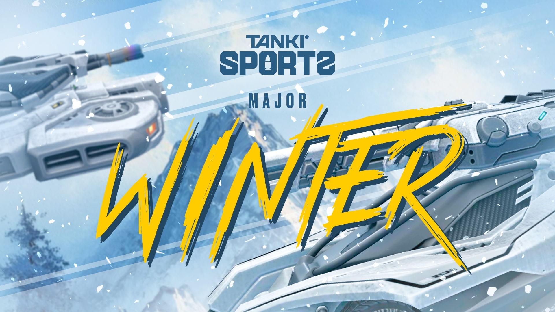
Winter Major 2025 is coming!
There are just a few days left until the start of the biggest eSports tournament this winter, so now is the right time to share all the details of the upcoming event!
What is eSports up to nowadays?
eSports nowadays consists of two seasons per year, and each of them includes a series of qualifying ranking tournaments and finishes with a Major event.
The 24 best teams (according to rating points) have taken part in three rating (qualifying) tournaments to get a place in the main tournament of the half-year – Major, and to compete for a solid cash prize.
I don’t play eSports, what can I do?
Don’t worry. All the qualifying tournaments of the year are over, and the teams participating in the final tournament have been determined, which means it’s time to become a viewer!
Join livestreams on our Twitch channels, follow them, watch eSports matches, and keep track of results.
Twitch Drops
For watching eSports livestreams, we reward each tanker with Epic Keys on each broadcast. To have your watch time counted, you first must link your Twitch account in the game settings.
Read more about how the «Twitch Drops» system works in the special article.
Follow the news in the game so as not to miss our livestreams!
When will it start?
The «Challengers» Stage begins on November 6th and will last until November 17th.
The 16 lowest-rated teams out of the total 24 will take part in this stage. The best 8 have already received a place in the next stage.
Next, we will have the «Legends» Stage from November 25th until December 6th. The top 8 teams that have automatically advanced to this stage will join the 8 best teams from the Challengers Stage. These 16 teams will compete for a spot in the «Champions» Stage.
Will there be Tanki Fund?
Of course, what is eSports without the Tanki Fund? In addition to the Epic Keys you receive for each livestream, right before the start of the «Legends» Stage, we will announce the «eSports Tanki Fund».
In the «Legends» Stage, you can choose your favorite team, purchase special offers in the Shop, and thus not only help your favorite team but also get a chance to win Rubies as well as receive guaranteed prizes from Tanki Fund levels.
When will The Grand Finals take place?
The last 14 matches will happen in the «Champions» stage, and the 8 best teams will fight for cash prizes from December 15th to December 22nd.
The hottest matches and the fate of the cash prize lie in these final matches!
Anyone who has seen at least one Grand Finals livestream before knows that no one should miss it!
Don’t miss the livestreams of eSports matches on our Twitch channels! Root for your favorite teams, watch interesting matches, and get yourself some cool rewards!
“Trick-or-Treat” mini-game 2025
The “Trick-or-Treat” mini-game has become a Halloween tradition in our game, and this year is no exception!
On October 24th, we invite you to take part in our dangerous journey to search for valuable prizes: themed paint, grenades, rare augments, keys and the main prize — the new Demonic skin for Isida!
Let’s find out more about this event:
With the server restart on Friday, we are launching the “Trick-or-Treat” mini-game on the special website that will last from October 24th, 2 AM UTC until November 20th, 2 AM UTC. You will conquer demonic islands in the afterlife and get prizes for doing so!
But to get your tank moving between mysterious islands, you will need fuel — Lollipops.
Lollipops

EVENT CURRENCY
Lollipops are the special event currency. You can track the number of your Lollipop reserves in the interface of the mini-game.
Here are the ways you can get Lollipops:
- Complete event contracts
- Catch a Lollipop Gold Box
- Complete special event missions
You can track the current number of Lollipops you have on the event’s website.
To make a move, you need 10 Lollipops.
Contracts

Contract
A Contract is a mission that requires earning reputation points in matchmaking battles.
Contracts can be purchased from October 24th, 2 AM UTC until November 19th, 2 AM UTC in the Shop for Crystals or Rubies.
After the purchase, open the “Contracts” section in the “Missions” menu and activate the contract.
There are 3 types of contracts in the event:
- Condition: Earn 5000 reputation points in battles.
- Reward: ×2 Lollipops ×1 Bronze Contract
- Time to complete: until November 19th, 2 AM UTC
- Time to collect the prize: until November 19th, 2 AM UTC
- Alternative reward if not completed in time: ×1000
Crystals - Alternative reward if the reward is not collected in time: 1000 Crystals
- Early completion: you may choose not to complete the contract and buy its completion instead. Price depends on the progress already made.
- Early completion price: From 300 Rubies to 1 Ruby.
- Condition: Earn 5000 reputation points in battles.
- Reward: ×10 Lollipops
- Time to complete: until November 19th, 2 AM UTC
- Time to collect the prize: until November 19th, 2 AM UTC
- Alternative reward if not completed in time: ×49900
Crystals - Alternative reward if the reward is not collected in time: ×49900
Crystals - Early completion: you may choose not to complete the contract and buy its completion instead. Price depends on the progress already made.
- Early completion price: From 300 Rubies to 1 Ruby
- Condition: Earn 5000 reputation points in battles.
- Reward: ×50 Lollipops
- Time to complete: until November 19th, 2 AM UTC
- Time to collect the prize: until November 19th, 2 AM UTC
- Alternative reward if not completed in time: ×290 Rubies
- Alternative reward if the reward is not collected in time: ×290
Rubies - Early completion: you may choose not to complete the contract and buy its completion instead. Price depends on the progress already made.
- Early completion price: From 1500 Rubies to 1 Ruby.
IMPORTANT information:
- You can only have 1 contract activated at the same time.
- If you have already completed the contract requirement and earned 5000 reputation points, the reward should be claimed immediately, otherwise a new contract cannot be activated.
- At the end of the event, if you completed a contract, but didn’t claim its reward, you can receive an alternative reward depending on the contract’s price.
- After November 19th, all contracts will become unavailable and expire. They will be marked with a red color.
Before completing a contract, DON’T FORGET to activate it.
Special Missions
We have prepared special missions that, by completing, you will receive lollipops.
SLIGHT SHOCK
TASK
Destroy 100 tanks using light hulls (Wasp, Hornet, Hopper) in any matchmaking battles.
REWARD
×1
EPIC KEY
EPIC KEY

×12
Lollipops
PANIC ATTACK
TASK
Destroy 100 tanks using medium hulls (Hunter, Viking, Crusader, Paladin, Dictator) in any matchmaking battles.
REWARD
×1
EPIC KEY
EPIC KEY
×12
Lollipops
DEADLY STUPOR
TASK
Destroy 100 tanks using heavy hulls (Ares, Titan, Mammoth) in any matchmaking battles.
REWARD
×1
EPIC KEY
EPIC KEY
×12
Lollipops
LAST EMBRACE
TASK
Destroy 100 tanks using melee-range turrets (Firebird, Freeze, Isida, Tesla, Hammer) in any matchmaking battles.
REWARD
×1
EPIC KEY
EPIC KEY
×12
Lollipops
COLD BREATH
TASK
Destroy 100 tanks using medium-range turrets (Smoky, Striker, Vulcan, Thunder, Twins, Ricochet) in any matchmaking battles.
REWARD
×1
EPIC KEY
EPIC KEY
×12
Lollipops
CURSE
TASK
Destroy 100 tanks using long-range turrets (Shaft, Gauss, Magnum, Railgun, Scorpion) in any matchmaking battles.
REWARD
×1
EPIC KEY
EPIC KEY
×12
Lollipops
How to play
Authorization
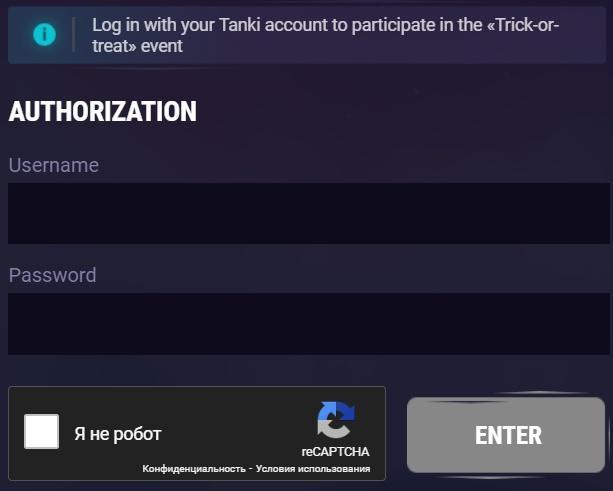
To start your journey, you need to log in to the mini-game website, using the nickname and the password of your in-game account.
If you use Facebook or Google to log in to your account, you will need to contact our customer service to get a password for your account to enter the website.
Islands
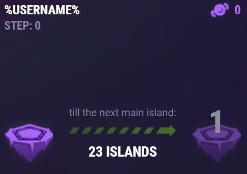
Islands
The mini-game map consists of islands, and on each of them, either a trick or treat awaits you.
Let’s start with the treats — Keys, Grenades, and Supplies. When you visit an island, a treat is sent to a special storage at the Checkpoint, and is not immediately credited to your in-game account.
When you make a move, 10 Lollipops are consumed to move one or two islands forward.
And now let’s talk about the tricks — there will be special “Islands of Fortune” on your way. By entering them, you can move either forward, or go 2 islands back. Within the same lap, each trap can only work once, so if you hit an “Island of Fortune” and are pushed back, that island will not push you back in the same lap again.
Don’t worry, even if luck is not on your side, and you get pushed back, you can receive a reward for each island that you pass twice on your way forward.
Checkpoints
A player starts their journey on the 1st checkpoint. The mini-game ends after 6 laps — when you reach the 7th checkpoint.
After completing a whole lap, a player gets to the checkpoint – the main island. There is a special vault there to store all the prizes that the player received on these islands. When visiting a main island, the player can transfer the prizes from the vault to their in-game account.
Moreover, whenever you visit a checkpoint, we add more unique rewards to your vault.
Prizes
The new prizes are the new Demonic skin for Isida and the themed “Mucus” paint!
Checkpoint №1
PAINT
MUCUS

BRONZE CONTRACT
Checkpoint №2

×10
PUmpkin Grenade
×10
TSAR GRENADE
Checkpoint №3
GAUSS
EXCELSIOR
×15
COMMON KEY
Checkpoint №4
RICOCHET
BOXER
×15
RARE KEY
Checkpoint №5
ISIDA
PULSAR
×15
EPIC KEY
Checkpoint №6
×1
LEGENDARY
KEY
KEY
Checkpoint №7

Isida
demonic
Pumpkin grenade
Special event grenades that you can get as a reward in this Halloween mini-game. You can get them only once a year! Don’t miss your chance!
Features:
- Updated Grenade skin — Pumpkin
- They are a separate type of grenade. In the Garage, they are shown separately and you cannot purchase them
- They have their separate upgrades
- These Grenades set fire to tanks that are in their blast radius
«BOXER» AUGMENT FOR RICOCHET
Impact force is significantly increased, and energy reload speed is accelerated. Projectile speed is significantly reduced, and gradually increases after the shot is fired.
Each blast from this augment delivers a punch-like impact to enemy armor. The Boxer can forcibly spin enemy tanks, severely disrupting their ability to return fire.
Checkpoints not only give you the opportunity to claim your rewards but they are also your savepoints. If you are thrown backward, you cannot be thrown further back than your checkpoint!
Earn Lollipops, reach checkpoints, and get cool rewards!
Good hunting and unforgettable emotions to everyone!
Isida Demonic

A long-awaited addition to the Demonic series!
We present to you the Demonic skin for Isida! It can only be obtained in the “Trick or Treat” mini-game by reaching the 7th checkpoint.
Isida Demonic
Let the demonic power awaken in the depths of your turret: its dark shell radiates an aura of evil, adorned with bone patterns and bloody veins. It seems to breathe darkness, transforming into a cursed artifact that craves destruction.
Every shot is the embodiment of infernal fury, piercing armor and shattering the enemy’s will. This skin not only terrifies with its appearance but also emphasizes your ruthlessness on the battlefield. Let your enemies tremble upon seeing it.
Expand your collection of premium Demonic skins, join the celebration, and play the “Trick-or-Treat” mini-game!
Good luck!
Invite a friend #4
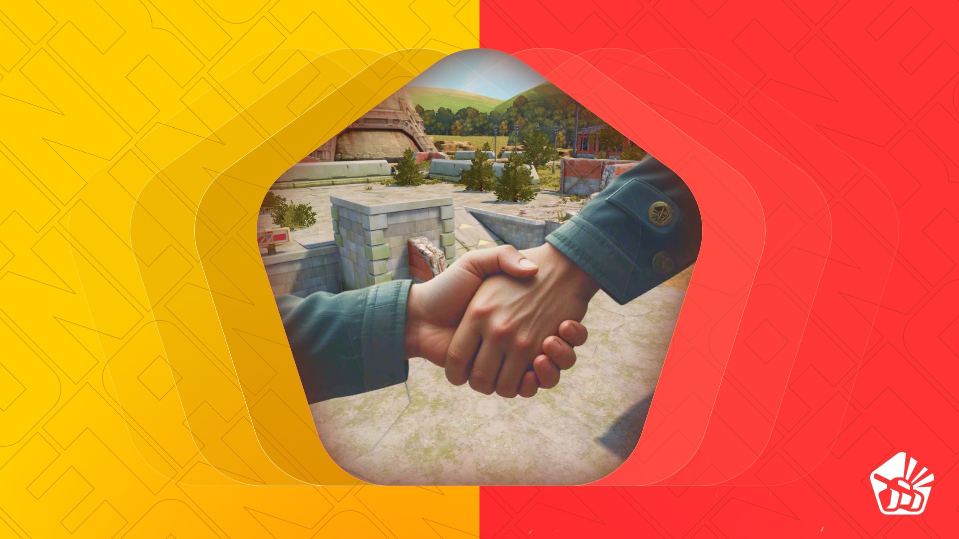
Invite friends to the game and get rewards!
We are launching a new referral event! During this event, you can get rewards for inviting new players or players who stopped playing the game. Also, as the friends you’ve invited complete special missions, you will receive additional bonuses!
Dates: From October 10th 2 AM to November 24th 2 AM UTC
Let’s get into the details:
How to invite
IMPORTANT: The option to invite new players is only available to accounts created before the start of the event, October 10th 2 AM.
Referrals are players who you invited to the game.
You need to follow these steps to make a new player your referral:
STEP 1 Your rank should be at least Master Sergeant.
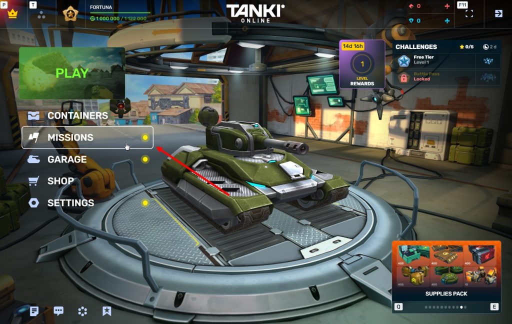
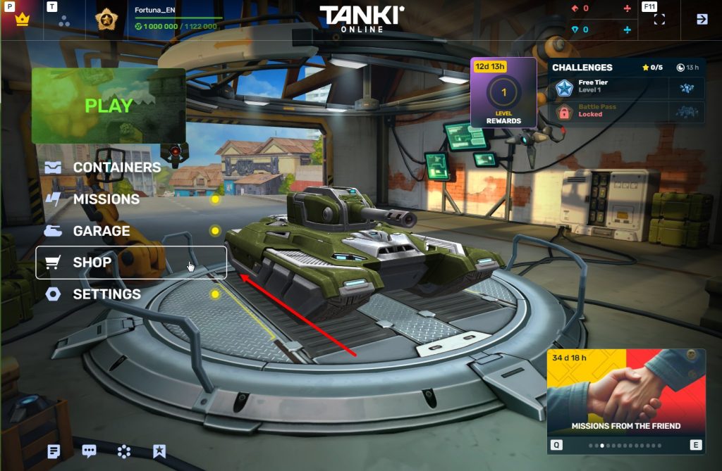
STEP 2 You need to enter the game and go to the Missions menu.
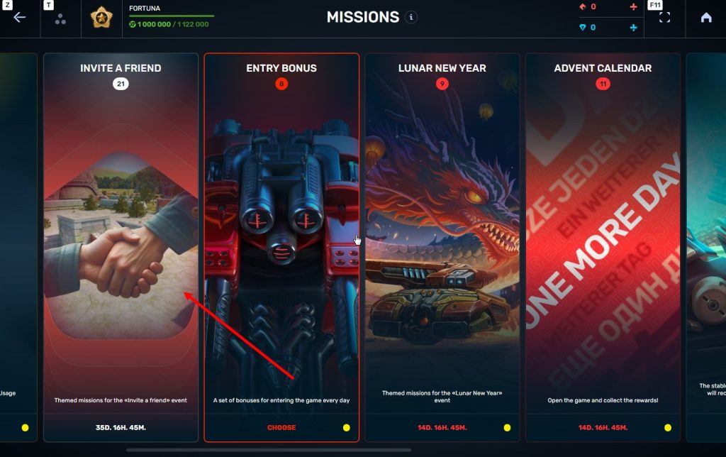
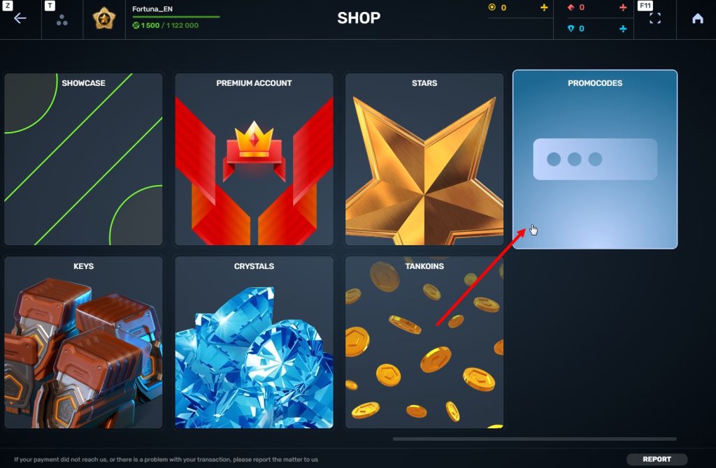
STEP 3 There, you need to open the special «Invite a friend» category of missions.
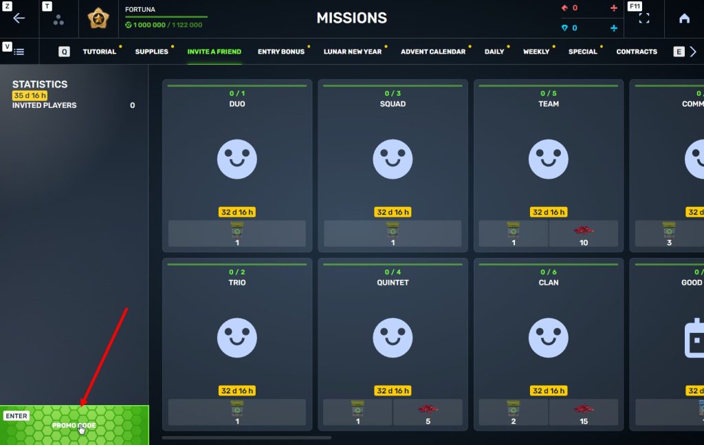
STEP 4 In that section, you need to generate a special invite promo code.
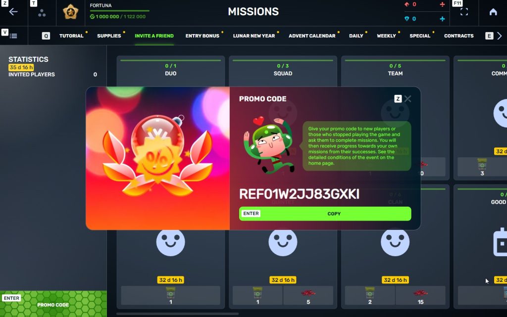
STEP 5 Share this Promocode with people you want to invite to the game and tell them how they can activate it (read below).
IMPORTANT: If you are a player who was invited to the game during this referral event, you cannot generate your own promo code to invite other players.
Who can become your referral
There are two types of players who can become your referrals:
- Players who created their account from October 10th 2 AM to November 24th 2 AM UTC.
- Player who last entered the game before August 25th 2 AM UTC.
Pay attention to the fact that in order to activate an invite promo code, a player should have at least Private rank.
Important: A player who generated a promo code to send it to other players cannot activate their own promo code or a Promocode of any other player.
What do I get for inviting players?
- Once you generate your invite promo code, send it to your friends and acquaintances.
- In the special «Invite a friend» category of missions, you will get a set of special missions.
3. Once they activate your promo code, players who have been invited will also get a set of their own special missions in the «Missions from a friend» category. In your «Invite a friend» category you can track how your referrals complete their missions, and thus your missions get completed and you can claim rewards for the efforts of the players you have referred.
Missions for those who invite
There are two types of missions for inviting players. The first type gives you rewards for players who just activated your promo code. The second type gives you rewards once your invited players complete the required missions.
Bonuses for inviting players
Important: An invited player is counted towards mission progress only once they activate your promocode.
Duo
TASK
Invite 1 player to the game.
REWARD
×1
COMMON KEY
COMMON KEY
×100
EXPERIENCE POINTS
EXPERIENCE POINTS
Trio
TASK
Invite 2 players to the game.
REWARD
×1
COMMON KEY
COMMON KEY
×100
EXPERIENCE POINTS
EXPERIENCE POINTS
Squad
TASK
Invite 3 players to the game.
REWARD
×1
COMMON KEY
COMMON KEY
×100
EXPERIENCE POINTS
EXPERIENCE POINTS
Quintet
TASK
Invite 4 players to the game.
REWARD
×1
COMMON KEY
COMMON KEY
×100
EXPERIENCE POINTS
EXPERIENCE POINTS
×5
RUBY
RUBY
Team
TASK
Invite 5 players to the game.
REWARD
×1
COMMON KEY
COMMON KEY
×100
EXPERIENCE POINTS
EXPERIENCE POINTS
×10
RUBY
RUBY
Clan
TASK
Invite 6 players to the game.
REWARD
×2
COMMON KEY
COMMON KEY
×100
EXPERIENCE POINTS
EXPERIENCE POINTS
×15
RUBY
RUBY
Community
TASK
Invite 7 players to the game.
REWARD
×3
COMMON KEY
COMMON KEY
×100
EXPERIENCE POINTS
EXPERIENCE POINTS
×40
RUBY
RUBY
Bonuses for efforts of your referrals
Important: An invited player is counted towards mission progress only once they activate your promocode and complete the required referral missions.
Good Start
TASK
Invited players completed 10 referral event missions
REWARD
×1
RARE KEY
RARE KEY
×100
EXPERIENCE POINTS
EXPERIENCE POINTS
Makes Progress
TASK
Invited players completed 20 referral event missions
REWARD
×1
RARE KEY
RARE KEY
×100
EXPERIENCE POINTS
EXPERIENCE POINTS
Can Play Together
TASK
Invited players completed 30 referral event missions
REWARD
×1
RARE KEY
RARE KEY
×100
EXPERIENCE POINTS
EXPERIENCE POINTS
×5
RUBY
RUBY
They Trust You
TASK
Invited players completed 40 referral event missions
REWARD
×1
RARE KEY
RARE KEY
×100
EXPERIENCE POINTS
EXPERIENCE POINTS
×10
RUBY
RUBY
Social Butterfly
TASK
Invited players completed 50 referral event missions
REWARD
×1
RARE KEY
RARE KEY
×100
EXPERIENCE POINTS
EXPERIENCE POINTS
×15
RUBY
RUBY
Influencer
TASK
Invited players completed 60 referral event missions
REWARD
×2
RARE KEY
RARE KEY
×100
EXPERIENCE POINTS
EXPERIENCE POINTS
×20
RUBY
RUBY
Celebrity
TASK
Invited players completed 80 referral event missions
REWARD
×3
RARE KEY
RARE KEY
×100
EXPERIENCE POINTS
EXPERIENCE POINTS
×60
RUBY
RUBY
Full Pack
TASK
Invited players completed 1 referral event supermission
REWARD
×1
EPIC KEY
EPIC KEY
×100
EXPERIENCE POINTS
EXPERIENCE POINTS
Aspiring Expert
TASK
Invited players completed 2 referral event supermissions
REWARD
×1
EPIC KEY
EPIC KEY
×100
EXPERIENCE POINTS
EXPERIENCE POINTS
×5
RUBY
RUBY
Forward to Victory
TASK
Invited players completed 3 referral event supermissions
REWARD
×1
EPIC KEY
EPIC KEY
×100
EXPERIENCE POINTS
EXPERIENCE POINTS
×10
RUBY
RUBY
Good Mentor
TASK
Invited players completed 4 referral event supermissions
REWARD
×1
EPIC KEY
EPIC KEY
×100
EXPERIENCE POINTS
EXPERIENCE POINTS
×15
RUBY
RUBY
Thunderstorm of Matchmaking
TASK
Invited players completed 5 referral event supermissions
REWARD
×1
EPIC KEY
EPIC KEY
×100
EXPERIENCE POINTS
EXPERIENCE POINTS
×20
RUBY
RUBY
Preparing for eSports
TASK
Invited players completed 6 referral event supermissions
REWARD
×2
EPIC KEY
EPIC KEY
×100
EXPERIENCE POINTS
EXPERIENCE POINTS
×60
RUBY
RUBY
Professional Referrer
TASK
Invited players completed 7 referral event supermissions
REWARD
×3
EPIC KEY
EPIC KEY
×700
RUBY
RUBY

×1
LEGENDARY KEY
LEGENDARY KEY
How it works for referrals
Once you invite a friend and give them your promo code, your friend should do the following:
STEP 1 Create an account (or log into an existing one, if it meets the criteria)
STEP 2 Get the «Private» rank. It won’t take much time.
STEP 3 Enter the Shop
STEP 4 Go to the «Promocode» section
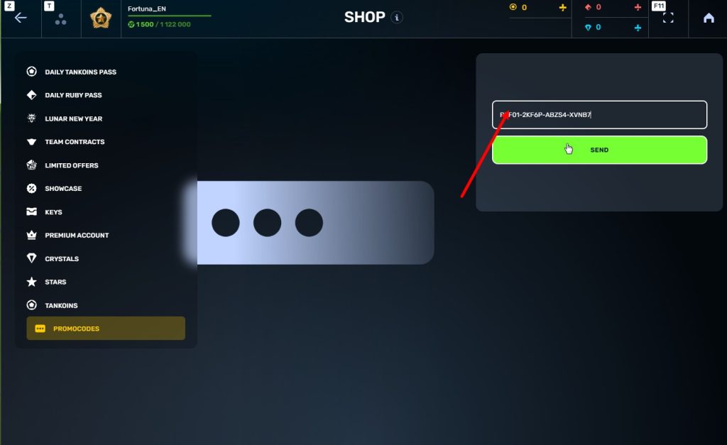
STEp 5 Activate the promo code
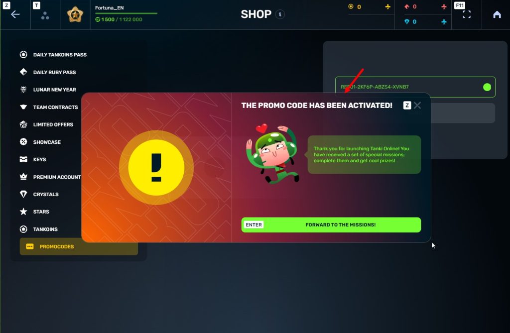
STEP 6 Press the «Forward to the missions!» button
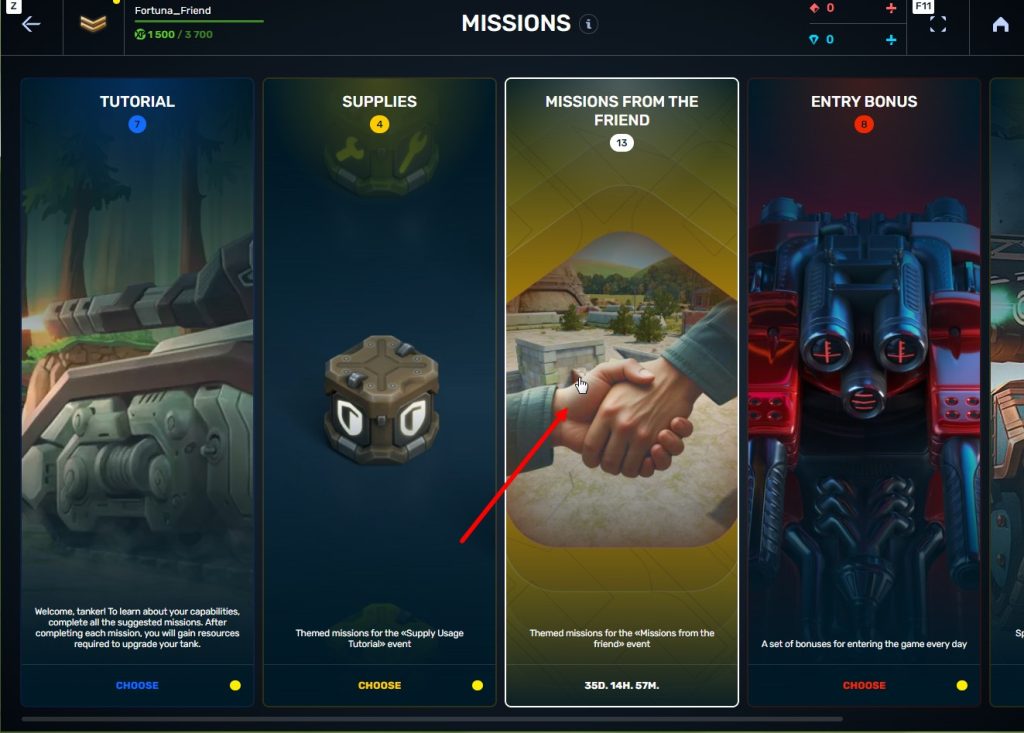
STEP 7 In the Missions menu, there will be a section called «Missions from the friend» with a set of special missions to complete
STEP 8 Complete the missions and claim the rewards
Important: During a referral event, a player can become a referral of only one player (activate only one referral promo code).
Bonuses for referrals for completing missions
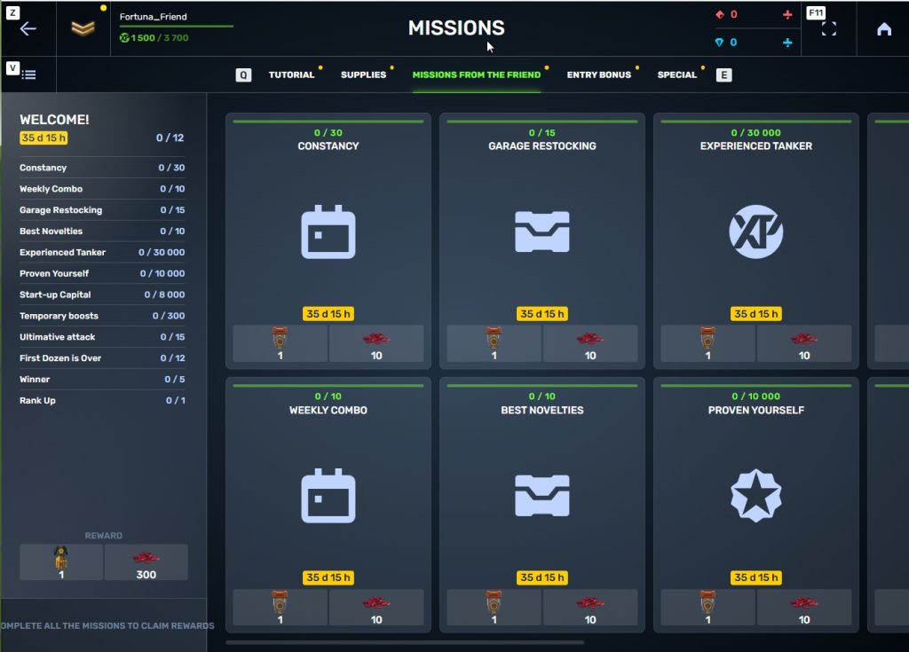
WELCOME!
TASK
Supermission. Complete all referral missions.
REWARD
×1
legendary key
×300
ruby
CONSTANCY
TASK
Complete 30 daily missions.
REWARD
×1
epic key
×100
EXPERIENCE POINTS
EXPERIENCE POINTS
×10
ruby
WEEKLY COMBO
TASK
Complete 15 weekly missions.
REWARD
×1
epic key
×100
EXPERIENCE POINTS
EXPERIENCE POINTS
×10
ruby
GARAGE RESTOCKING
TASK
Open 15 Common Containers
REWARD
×1
epic key
×100
EXPERIENCE POINTS
EXPERIENCE POINTS
×10
ruby
BEST NOVELTIES
TASK
Open 10 Epic Containers.
REWARD
×1
epic key
×100
EXPERIENCE POINTS
EXPERIENCE POINTS
×10
ruby
EXPERIENCED TANKER
TASK
Earn 30 000 experience points.
REWARD
×1
epic key
×100
EXPERIENCE POINTS
EXPERIENCE POINTS
×10
ruby
PROVEN YOURSELF
TASK
Earn 15 000 reputation points.
REWARD
×1
epic key
×100
EXPERIENCE POINTS
EXPERIENCE POINTS
×10
ruby
START-UP CAPITAL
TASK
Earn 10 000 crystals.
REWARD
×1
epic key
×100
EXPERIENCE POINTS
EXPERIENCE POINTS
×10
ruby
TEMPORARY BOOSTS
TASK
Activate supplies 300 times.
REWARD
×1
epic key
×100
EXPERIENCE POINTS
EXPERIENCE POINTS
×10
ruby
ULTIMATIVE ATTACK
TASK
Use overdrive 15 times.
REWARD
×1
epic key
×100
EXPERIENCE POINTS
EXPERIENCE POINTS
×10
ruby
FIRST DOZEN IS OVER
TASK
Finish 20 battles.
REWARD
×1
epic key
×100
EXPERIENCE POINTS
EXPERIENCE POINTS
×10
ruby
WINNER
TASK
Be in the winning team of 5 battles.
REWARD
×1
epic key
×100
EXPERIENCE POINTS
EXPERIENCE POINTS
×10
ruby
RANK UP
TASK
Get a new rank.
REWARD
×1
epic key
×100
EXPERIENCE POINTS
EXPERIENCE POINTS
×10
ruby
You can track the progress of completing missions by your referrals in the «Statistics» column of the «Invite a friend» category in missions.
Invite friends and get rewards!
Recommended Posts