 Jump to content
 EN
EN
Blockopolis
1/9
Tanker’s Day 2026
2/9
Viking and Thunder VT
3/9
Tanki Online V-LOG: Episode 555
4/9
The “Challenge Accepted” website is temporarily unavailable.
5/9
Masters of Parkour 2026
6/9
Winter Major Rankings II 2026
7/9
New English Instagram Account ‼️
8/9
Tanki Classic mass test
9/9


Blockopolis

Tankers, we present a new web event – Blockopolis!
Test your wits! Place pieces on the game board, form complete lines, earn event points, and claim valuable rewards!
Blockopolis is a game where you place pieces to form complete lines. Each completed line earns you event points that can be exchanged for rewards.
The event will run for 21 days: from September 18th, 2 AM to October 9th, 2 AM UTC.
How to Participate?
To access Blockopolis, you need to purchase the “Event Pass” special offer.
Event Pass

Access to the Event
After purchasing the pass, you will be able to log in to the event website and start playing.
Energy

Energy
Energy is the special currency of the event that can be received by completing contracts.
For 1 unit of energy, you get 3 random pieces. Place them one by one on empty cells of the game board. After all three pieces are used, you can spend another 1 unit of energy to get a new set of pieces.
You can track your current energy supply on the event website.
Contracts

Contract
A Contract is a task that requires earning Reputation points in Matchmaking battles.
Contracts are available from September 18th, 2 AM to October 9th, 2 AM UTC.
After purchasing a Contract, it is required to enter the “Contracts” category in the “Missions” section and “Activate” the contract.
There are 3 types of Contracts in the event:
Bronze Contract

Condition: Earn 5000 reputation points in battle
Reward: ×15 Energy
Multiple-time purchase.
Reward: ×15 Energy
Multiple-time purchase.
Price
49900 CRYSTALS
- Time to complete: October 9th, 2 AM UTC
- Time to collect the prize: October 9th, 2 AM UTC
- Alternative reward if not completed in time or if the reward is not collected in time: ×49 900 crystals
- Early completion: instead of earning points, you may purchase contract early completion. The price of early completion depends on your progress toward completing the contract.
- Early completion price: Rubies ×175-1
Silver Contract

Condition: Earn 5000 reputation points in battle
Reward: ×25 Energy
Multiple-time purchase.
Reward: ×25 Energy
Multiple-time purchase.
Price
290 Rubies
- Time to complete: October 9th, 2 AM UTC
- Time to collect the prize: October 9th, 2 AM UTC
- Alternative reward if not completed in time or if the reward is not collected in time: ×290 Rubies
- Early completion: instead of earning points, you may purchase contract early completion. The price of early completion depends on your progress toward completing the contract.
- Early completion price: Rubies ×700-1
Gold Contract
Condition: Earn 3000 reputation points in battle
Reward: ×75 Energy
Multiple-time purchase.
Reward: ×75 Energy
Multiple-time purchase.
Price
990 Rubies
- Time to complete: October 9th, 2 AM UTC
- Time to collect the prize: October 9th, 2 AM UTC
- Alternative reward if not completed in time or if the reward is not collected in time: ×990 Rubies
- Early completion: instead of earning points, you may purchase contract early completion. The price of early completion depends on your progress toward completing the contract.
- Early completion price: Rubies ×1000-1
IMPORTANT information:
- Only one Contract can be activated at a time.
- If you have already completed the Contract conditions and earned the required number of Reputation points, the reward should be collected immediately, otherwise a new Contract cannot be activated.
- After the event is over, you will get an alternative reward for any completed but not claimed Contracts depending on the Contract’s price.
- After October 9th, 2 AM UTC all Contracts will be inactive and expired — they will be highlighted in red.
Before starting on a Contract, DO NOT FORGET to activate it.
How to Play?
Everything happens on a 10×10 grid board.

On the right side, you have three random pieces. Your task is to drag them onto empty cells and form fully filled horizontal and vertical lines. A completed line disappears, freeing up space for the next pieces. For completing full lines, you earn event points.

After you place all three available pieces, you can spend 1 unit of energy to get a new set of three pieces.
Pieces appear randomly and can be rotated to one of four orientations. You cannot manually rotate the pieces you receive.
Plan your moves in advance and try to leave enough free space for the next pieces!
Important: The game does not automatically detect whether there are any possible moves left on the board. If you get stuck or want to start over, you can manually start a new game for 10 units of energy.
Bombs
At the start of the game, bombs are already present on the board. Additionally, there is a 20% chance that a new bomb will appear on a random cell with each move.
A cell with a bomb is considered occupied — you cannot place a piece on it.
There are two ways to remove a bomb:
- Free: Complete a line passing through the bomb cell twice. The first time removes the lock from the bomb, the second time detonates and removes it.
- For Energy: Click on the bomb and spend 1 unit of energy to instantly remove it from the board.
The explosion of a bomb does not destroy adjacent cells.
Bonuses
When regular pieces aren’t enough, special bonuses come to the rescue.
1×1 Piece

Get a single block, useful for filling an empty cell.
Price: 1 Energy
2×2 Piece

Get a square piece of 2×2 cells.
Price: 10 Rubies
Mine

Place a mine on the board and destroy blocks in a 3×3 area around it. The mine also affects bombs: two explosions are required to destroy a bomb.
Price: 50 Rubies
Bonuses can be used at the right moment to get out of a difficult situation and continue playing.
Point Rewards
By completing fully filled horizontal and vertical lines, you will earn event points.
Earn points, fill the progress bar, and unlock new rewards. The more points you earn, the further you progress along the bar and the more prizes you receive.
All progress stages and their corresponding rewards are displayed on the event website.

3,000 points
×10 Medic Grenades
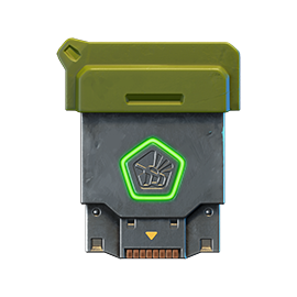
6,000 points
×15 Common Keys

9,000 points
×8 Nuclear Energy
12,000 points
×15 Common Keys
15,000 points
×100 Medic Grenades
18,000 points
×15 Common Keys

21,000 points
×3 Tsar Grenades
24,000 points
×15 Common Keys
27000 points
×24 Nuclear Energy
30,000 points
×15 Common Keys
33,000 points
×30 Tsar Grenades
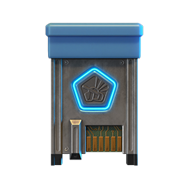
36,000 points
×15 Rare Keys

39,000 points
Shaft «PULSAR»
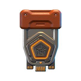
42,000 points
×15 Epic Keys

45,000 points
WASP VT skin
48,000 points
×15 Epic Keys

51,000 points
Tesla «Hadouken»
54,000 points
×15 Epic Keys
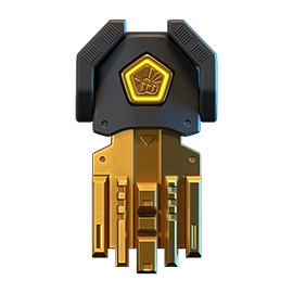
57,000 points
×1 Legendary Key

60,000 points
Smoky VT skin
“Hadouken” augment for Tesla
Accelerates the reload of Ball Lightning, but Chain Lightning effects no longer occur.
Emitter guides have been adapted for stable operation with Ball Lightning instead of Chain Lightning. Ball Lightning can now be launched so frequently that using the primary mode becomes almost unnecessary. Projectiles fly faster, hit harder, are launched more frequently. You just need to practice predicting the enemy’s position.
This is one of those combat techniques that deals more psychological damage than physical damage.
Leaderboard
Throughout the event, players compete for positions in the overall ranking. After Blockopolis concludes, the top participants will receive additional rewards.
Best players of the event will get to the Leaderboard and receive extra rewards depending on the final positions.

1st place
Animated “Holi” paint
1–10 places
×3 Legendary Keys
1–30 places
×120 Epic Keys
1–100 places
×30 Rare Keys
Rewards are cumulative. The player who takes 1st place will receive rewards for all corresponding leaderboard ranges.
You need to press the “Claim your prize” button on the website to claim your prizes for the leaderboard. The button is available till October 12th, 2 AM UTC.
Good luck!
Tanker’s Day 2026

September 13 is Tanker’s Day!
So, let’s celebrate one of our main holidays with fun and excitement!
So, let’s celebrate one of our main holidays with fun and excitement!
A festive program awaits you in Tanki: great 50% discounts, augments and new VT skins for Thunder and Viking in Epic Containers, an Elite Pass with a Legendary Key and Tsar Grenades as rewards, a new festive Garage, awesome game modes, special offers, and plenty of missions!
Event dates: September 4th, 2 AM — September 25th, 2 AM UTC.
Discounts – Half Price!
Stock up with big savings from September 4th to September 7th.
All discounts start and end with the server restart at 2 AM UTC.
For three days, 50% discounts will apply simultaneously to the following:
-50%
SHOP (04.09 — 07.09)
Crystals

Stars

Early Access items

Premium Pass

-50%
GARAGE (04.09 — 07.09)
Augments

Supplies

Paints

Modules

Drones

Grenades

-50%
Upgrades (04.09 — 07.09)
Special Modes
Three exciting modes await you in the game!
Important: Boosted battle funds and experience are available only in the festive weekend game modes.
Each mode starts and ends with the server restart at 2 AM UTC.
SPECIAL MODE
OLD SCHOOL
September 4th – September 7th
Mode
CTF
Turret
Smoky
Hull
Wasp
Bonus Boxes
Upgrades
Augments
Gold Boxes
Equipment Change
Overdrives
Supplies
Nuclear Energy
Smart Supplies
Drones
Protection Modules
Groups
Grenades
More Gold Boxes
Don’t miss the special «Old school» mode with Wasp and Smoky auto-equipped and gold boxes will fall more often.
- Deck-9 PRO
- Farm PRO
- Bridges PRO
SPECIAL MODE
CARNAGE
September 11th – September 14th
Mode
CP
Turret
Any
Hull
Any
Bonus Boxes
Upgrades
Augments
Gold Boxes
Equipment Change
Overdrives
Supplies
Nuclear Energy
Smart Supplies
Drones
Protection Modules
Groups
Grenades
More Gold Boxes
Display superiority over your opponents! Crush everyone on the battlefield using a variety of equipments, supplies and your own skill. Large maps, lots of players, what can be cooler for an epic fight? Do not pity anyone, crush them all!
- Berlin MM
- Lost Temple MM
- Yorkshire MM
SPECIAL MODE
ARMS RACE
September 18th – September 21st
Mode
Arms Race
Turret
Changes Every 3 Kills
Hull
Viking
Bonus Boxes
Upgrades
Augments
Gold Boxes
Equipment Change
Overdrives
Supplies
Nuclear Energy
Smart Supplies
Drones
Protection Modules
Groups
Grenades
More Gold Boxes
Where else can you show everyone who is the boss while destroying enemy tanks using every turret available in the game and knocking out the last victim with the destructive B0-NK?
- Brest PRO
- Deathtrack PRO
- Solikamsk PRO
Special Offers
Hurry and grab these great deals at awesome prices!
September 4th — September 21st:

September 4th — September 25th:
Daily Ruby Pass

×500
Tankoins*
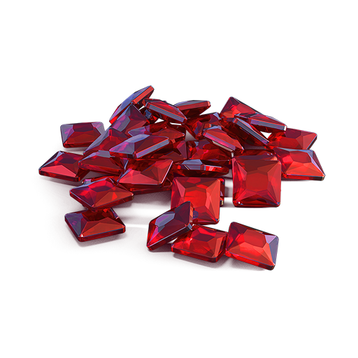
×4500
Rubies**
500 Tankoins instantly.
** For 30 days, players can access a pre-completed mission each day when they log in and claim a reward of 150 Rubies.
Note: One-time purchase.
** For 30 days, players can access a pre-completed mission each day when they log in and claim a reward of 150 Rubies.
Note: One-time purchase.
PURCHASE
Berserker

Thunder
Mk3

Viking
Mk3

Eternity
paint

Thunder
Sledgehammer rounds

Viking
Engineer
Combat Reserve
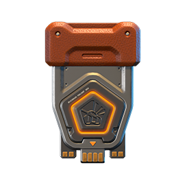
×15
EPIC key
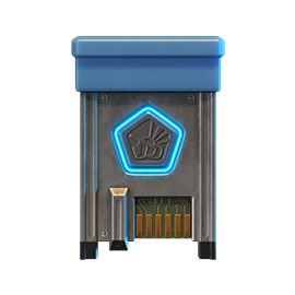
×1
RARE key
×7
Premium Pass

September 11th — September 25th:
Safety Margin
×20
EPIC key
×7
Premium Pass
×1
Nuclear Energy
September 18th — September 25th:

Epic Containers
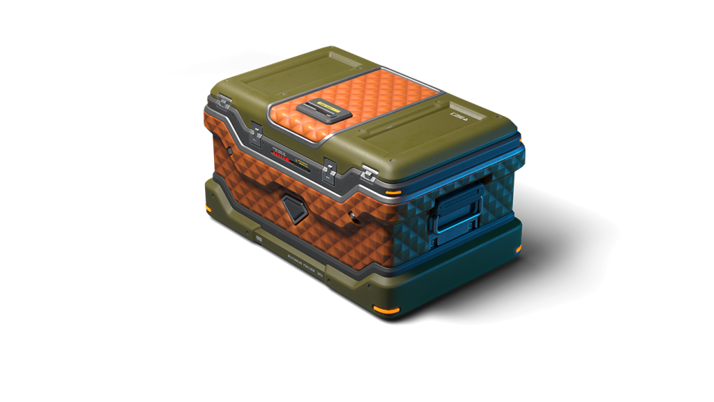
Treat yourself to the updated contents of Epic Containers!
- NEW Thunder VT skin
- NEW Viking VT skin
- “Adaptive Reload” augment for Thunder
- “Yamato” augment for Thunder
- “Excelsior” augment for Thunder
- “Driver” augment for Viking
- “Excelsior” augment for Viking
- And everything you can get from Common Containers
Special Missions
We’ve prepared a large list of missions where everyone can find something for themselves!
Your progress in completing missions is only counted from the moment you first enter the “Missions” screen after the event begins.
Missions follow the Encore system, with the second set of missions appearing only after the first set is completed.
SPECIAL
Part 1: September 4th – September 11th
Part 2: September 11th – September 18th
Part 3: September 18th – September 25th
VETERAN
TASK
Finish 2 battles in the festive mode.
REWARD
×3
EPIC KEY
EPIC KEY
EVERYONE IS HERE!
TASK
Finish 2 battles in the festive mode.
REWARD
×3
EPIC KEY
EPIC KEY
CHOICE WITHOUT A CHOICE
TASK
Finish 2 battles in the festive mode.
REWARD
×3
EPIC KEY
EPIC KEY
Set 1
Set 1: September 4th – September 25th
SUPERMISSION: EXAMPLE OF HONOR! PART 1
TASK
Complete «Back in the Ranks. Part 1», «Legend. Part 1», «Without Further Ado. Part 1», «It’s Not About Winning! Part 1», «The Best of the Best! Part 1», «Supplying. Part 1», «Mechanic», «A Matter of Experience», «Game of Preemption» and «Fury» missions.
REWARD
×5
EPIC KEY
EPIC KEY
×1
RARE KEY
RARE KEY

×1000
EXPERIENCE POINTS
EXPERIENCE POINTS
BACK IN THE RANKS. PART 1
TASK
Enter the game at least once.
REWARD
×1
COMMON KEY
COMMON KEY
×100
EXPERIENCE POINTS
EXPERIENCE POINTS
LEGEND. PART 1
TASK
Earn 5000 reputation points in matchmaking battles.
REWARD
×1
COMMON KEY
COMMON KEY
×100
EXPERIENCE POINTS
EXPERIENCE POINTS
WITHOUT FURTHER ADO. PART 1
TASK
Earn 3000 reputation points in Quick Battle mode in matchmaking battles.
REWARD
×1
COMMON KEY
COMMON KEY
×100
EXPERIENCE POINTS
EXPERIENCE POINTS
IT’S NOT ABOUT WINNING! PART 1
TASK
Finish 10 battles in matchmaking battles.
REWARD
×1
COMMON KEY
COMMON KEY
×100
EXPERIENCE POINTS
EXPERIENCE POINTS
THE BEST OF THE BEST! PART 1
TASK
Be in the winning team of 2 battles in matchmaking battles.
REWARD
×1
COMMON KEY
COMMON KEY
×100
EXPERIENCE POINTS
EXPERIENCE POINTS
SUPPLYING. PART 1
TASK
Make any purchase in the game’s Shop.
REWARD
×1
COMMON KEY
COMMON KEY
×100
EXPERIENCE POINTS
EXPERIENCE POINTS
MECHANIC
TASK
Use repair kit 150 times in matchmaking battles.
REWARD
×1
COMMON KEY
COMMON KEY
×100
EXPERIENCE POINTS
EXPERIENCE POINTS
A MATTER OF EXPERIENCE
TASK
Earn 3000 experience points in matchmaking battles.
REWARD
×1
COMMON KEY
COMMON KEY
×100
EXPERIENCE POINTS
EXPERIENCE POINTS
GAME OF PREEMPTION
TASK
Destroy 1 tank using grenades in matchmaking battles.
REWARD
×1
COMMON KEY
COMMON KEY
×100
EXPERIENCE POINTS
EXPERIENCE POINTS
FURY
TASK
Destroy 10 tanks using critical damage in matchmaking battles.
REWARD
×1
COMMON KEY
COMMON KEY
×100
EXPERIENCE POINTS
EXPERIENCE POINTS
SET 2
Set 2: September 11th – September 25th
SUPERMISSION: EXAMPLE OF HONOR! PART 2
TASK
Complete «Back in the Ranks. Part 2», «Legend. Part 2», «Without Further Ado. Part 2», «It’s Not About Winning! Part 2», «The Best of the Best! Part 2», «Supplying. Part 2», «Deadly Trap», «Safety Margin», «Meteor Shower» and «Red Button» missions.
REWARD
×5
EPIC KEY
EPIC KEY
×1
RARE KEY
RARE KEY
×1000
EXPERIENCE POINTS
EXPERIENCE POINTS
BACK IN THE RANKS. PART 2
TASK
Enter the game at least once.
REWARD
×1
COMMON KEY
COMMON KEY
×100
EXPERIENCE POINTS
EXPERIENCE POINTS
LEGEND. PART 2
TASK
Earn 5000 reputation points in matchmaking battles.
REWARD
×1
COMMON KEY
COMMON KEY
×100
EXPERIENCE POINTS
EXPERIENCE POINTS
WITHOUT FURTHER ADO. PART 2
TASK
Earn 3000 reputation points in Quick Battle mode in matchmaking battles.
REWARD
×1
COMMON KEY
COMMON KEY
×100
EXPERIENCE POINTS
EXPERIENCE POINTS
IT’S NOT ABOUT WINNING! PART 2
TASK
Finish 10 battles in matchmaking battles.
REWARD
×1
COMMON KEY
COMMON KEY
×100
EXPERIENCE POINTS
EXPERIENCE POINTS
THE BEST OF THE BEST! PART 2
TASK
Be in the winning team of 2 battles in matchmaking battles.
REWARD
×1
COMMON KEY
COMMON KEY
×100
EXPERIENCE POINTS
EXPERIENCE POINTS
SUPPLYING. PART 2
TASK
Make any purchase in the game’s Shop.
REWARD
×1
COMMON KEY
COMMON KEY
×100
EXPERIENCE POINTS
EXPERIENCE POINTS
DEADLY TRAP
TASK
Use mines 150 times in matchmaking battles.
REWARD
×1
COMMON KEY
COMMON KEY
×100
EXPERIENCE POINTS
EXPERIENCE POINTS
SAFETY MARGIN
TASK
Earn 4000 crystals in matchmaking battles.
REWARD
×1
COMMON KEY
COMMON KEY
×100
EXPERIENCE POINTS
EXPERIENCE POINTS
METEOR SHOWER
TASK
Earn 45 stars in matchmaking battles.
REWARD
×1
COMMON KEY
COMMON KEY
×100
EXPERIENCE POINTS
EXPERIENCE POINTS
RED BUTTON
TASK
Use overdrive 10 times in matchmaking battles.
REWARD
×1
COMMON KEY
COMMON KEY
×100
EXPERIENCE POINTS
EXPERIENCE POINTS
SET 3
Set 3: September 18th – September 25th
SUPERMISSION: EXAMPLE OF HONOR! PART 3
TASK
Complete «Back in the Ranks. Part 3», «Legend. Part 3», «Without Further Ado. Part 3», «It’s Not About Winning! Part 3», «The Best of the Best! Part 3», «Supplying. Part 3», «Forced March», «The Punisher», «Deadly Hailstorm» and «Unpacking» missions.
REWARD
×5
EPIC KEY
EPIC KEY
×1
RARE KEY
RARE KEY
×1000
EXPERIENCE POINTS
EXPERIENCE POINTS
BACK IN THE RANKS. PART 3
TASK
Enter the game at least once.
REWARD
×1
COMMON KEY
COMMON KEY
×100
EXPERIENCE POINTS
EXPERIENCE POINTS
LEGEND. PART 3
TASK
Earn 5000 reputation points in matchmaking battles.
REWARD
×1
COMMON KEY
COMMON KEY
×100
EXPERIENCE POINTS
EXPERIENCE POINTS
WITHOUT FURTHER ADO. PART 3
TASK
Earn 3000 reputation points in Quick Battle mode in matchmaking battles.
REWARD
×1
COMMON KEY
COMMON KEY
×100
EXPERIENCE POINTS
EXPERIENCE POINTS
IT’S NOT ABOUT WINNING! PART 3
TASK
Finish 10 battles in matchmaking battles.
REWARD
×1
COMMON KEY
COMMON KEY
×100
EXPERIENCE POINTS
EXPERIENCE POINTS
THE BEST OF THE BEST! PART 3
TASK
Be in the winning team of 2 battles in matchmaking battles.
REWARD
×1
COMMON KEY
COMMON KEY
×100
EXPERIENCE POINTS
EXPERIENCE POINTS
SUPPLYING. PART 3
TASK
Make any purchase in the game’s Shop.
REWARD
×1
COMMON KEY
COMMON KEY
×100
EXPERIENCE POINTS
EXPERIENCE POINTS
FORCED MARCH
TASK
Use speed boost 150 times in matchmaking battles.
REWARD
×1
COMMON KEY
COMMON KEY
×100
EXPERIENCE POINTS
EXPERIENCE POINTS
THE PUNISHER
TASK
Destroy 30 tanks in matchmaking battles.
REWARD
×1
COMMON KEY
COMMON KEY
×100
EXPERIENCE POINTS
EXPERIENCE POINTS
DEADLY HAILSTORM
TASK
Use any grenade 10 times in matchmaking battles.
REWARD
×1
COMMON KEY
COMMON KEY
×100
EXPERIENCE POINTS
EXPERIENCE POINTS
UNPACKING
TASK
Open 15 any Containers.
REWARD
×1
COMMON KEY
COMMON KEY
×100
EXPERIENCE POINTS
EXPERIENCE POINTS
Advent Calendar
We are launching the festive Advent Calendar for you!
Attention! The Advent Calendar and its missions become available only after you purchase the “Advent Calendar” special offer.
After purchasing the “Advent Calendar” special offer, you will get access to:
- 5 standard missions
- 1 Supermission with unique rewards!
All you need to do is log in to the game during the event and claim your gifts.
Task: Complete all “One More Day” missions that appear after September 4th.
Completing 5 standard missions will unlock the final Supermission.
Supermission
×1
“Recruit” paint
×200
Rubies
One More Day
×12
EPIC Key
×200
Rubies
Elite Pass
The most luxurious pass is here! It consists of 20 levels.
Your goal is to earn stars and unlock new levels. For each level reached, you will receive additional prizes!
To complete the whole pass and unlock the main prizes, you will need to earn 1,000 stars.

Elite Pass
Important: All stars earned during the event will be counted. Progress begins at the start of the event. Stars earned before you purchase the Elite Pass will also be counted. The Elite Pass itself is required to claim the prizes. Once you purchase it, you can claim all unlocked prizes, which will be added to your Garage!
The main prizes are ×1 Legendary Key and the ×3 Tsar Grenades!
The price of this «Elite Pass» is 2300 Rubies.
Festive Decorations
- Festive paint on drones
- Festive paint
- Festive Gold Box drop zone skin
- Festive Loading screen
- Updated billboards
- “Gear” Gold Box skin
- New festive Garage
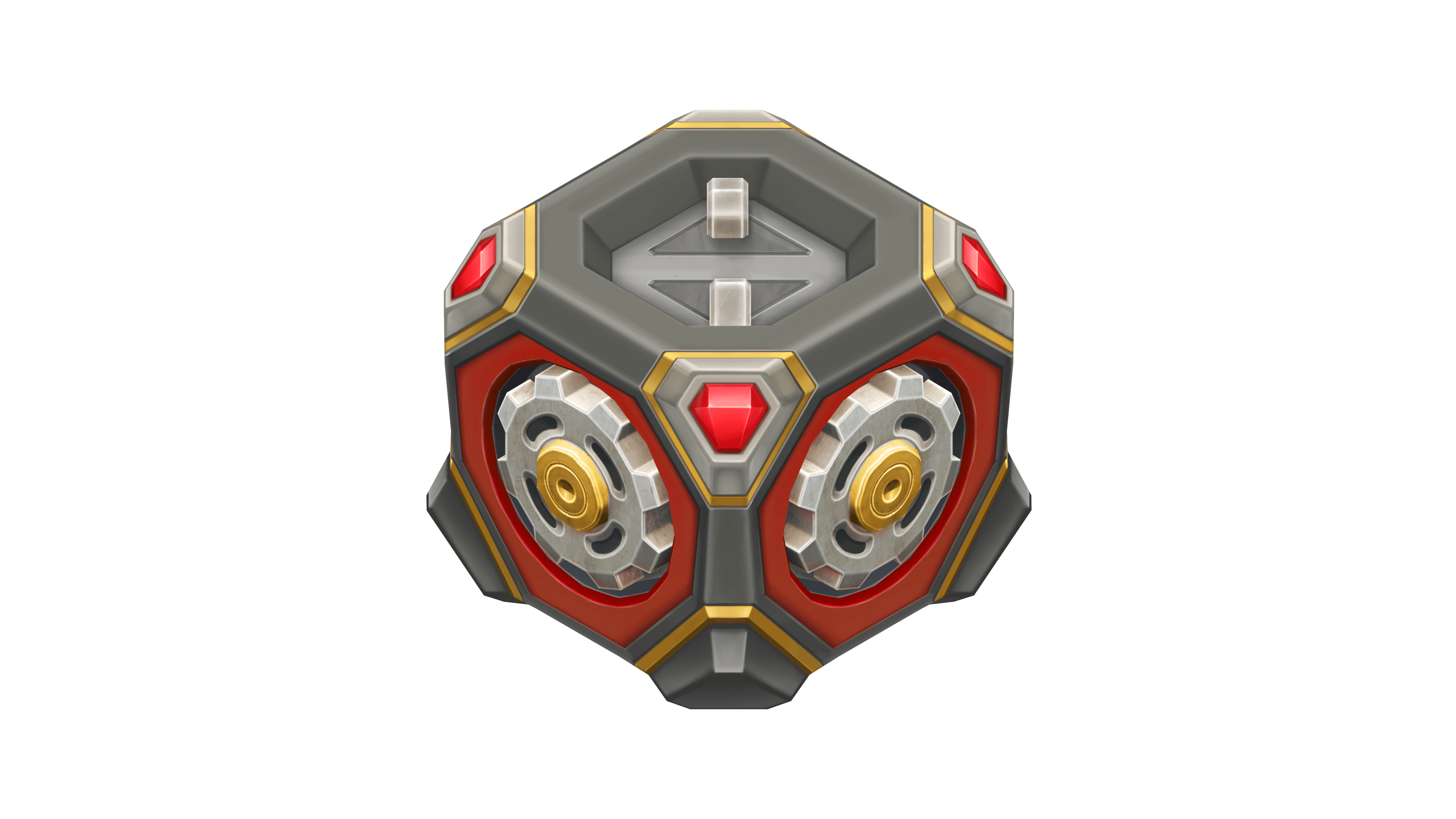
“Gear” Gold Box skin
Have a great celebration, tankers!
Viking and Thunder VT

The Veteran skin collection continues to expand!
Now, the series includes Viking and Thunder. The VT line is for those who value not outward showiness, but depth, resilience, and character that stands the test of time.


How to obtain
The skins can be obtained from updated Epic Containers as part of the Tanker’s Day 2026 celebration.
These skins will be a great addition to any collection and will certainly help you stand out on the battlefield!
Tanki Online V-LOG: Episode 555
In today’s episode, we will be celebrating Tanker’s Day with festive events and discounts. We’ll also be showcasing new VT skins for Thunder and Viking and giving an update on Masters of Parkour.
The “Challenge Accepted” website is temporarily unavailable.

Due to technical issues, rewards for the second August challenge will be credited later, and the launch of the first September challenge is postponed.
We will let you know as soon as the website is back online and the new challenge is launched.
Thank you for your understanding! ❤️
Masters of Parkour 2026

The long-awaited «Masters of Parkour» contest is back!
Get ready to exhibit your parkour skills to the whole Tanki community! As always, cool prizes and a lot of emotions are waiting for you!
Details
The contest consists of two stages — the qualifying stage and the finals.

qualifying stage
In the qualifying stage, everyone can participate. Participants need to form a team of up to 4 members and shoot a spectacular parkour video. The video must be uploaded to Youtube, and the link must be submitted through the special form. After the qualifying stage, the jury will pick the top-12 teams that will move on to the finals.

The finals
The finals will be broadcasted live on the official Twitch channel. The finalists must perform their tricks during the live broadcast with limited time. The team with the most skilled and fastest parkourists will win.
In the videos for the first stage of the contest, the criteria being rated are:
- Compliance with contest rules
- Showiness, difficulty and spectacle of the tricks
- Video quality
The contest is united for all locales.
Rules
- Stunts must be shot with standard gravity settings. Stunts performed in Space mode will not be considered.
- The parkour team must have at least 3 and at most 4 tankers.
- All team members must have a minimum rank of Warrant Officer 1.
- The parkour team size is at most 4 tankers. The team can decide whether the video is to be shot by a team member or an independent spectator.
- The video must be exclusively shot for this contest. All team members must equip the ”Master of Parkour 2026” paint. Before the finals, the paint will be removed from the garages of all tankers except for finalists.

- Entries must be uploaded to YouTube. Video links are to be submitted via the dedicated form. When submitting your video, make sure you include the nicknames of all team members. If your team wins, only the listed players will be rewarded.
- Your video must not be longer than 60 seconds.
- The nicknames of all team members must be visible and readable in all tricks.
- A participant can be a member of only one team.
- The video must not contain any violation of the Game Rules.
Prizes
Each member of a team gets the prize.
Prizes for all finalists
MASTERS OF PARKOUR
PAINT*
×3000
ALL SUPPLIES**
×10
NUCLEAR ENERGY
1st place
×2
skins of player’s choice***
×100
Epic Keys
×3000
Rubies
2nd place
×1
skins of player’s choice***
×70
Epic Keys
×2000
Rubies
3rd place
×1
skins of player’s choice***
×50
Epic Keys
×1000
Rubies
4th-12th place
×30
Epic Keys
×700
Rubies
** Repair Kit, Boosted Armor, Boosted Damage, Speed Boost, and Mine.
*** Only from the list of skins available in the Skin Container. If a player has all the skins available in the Skin Container, the player may choose any DC, SP, RF, VT, or IC skin. If the player has all the skins available from the Skin Container and all the DC, SP, RF, VT, or IC skins, compensation will not be provided.
*** Only from the list of skins available in the Skin Container. If a player has all the skins available in the Skin Container, the player may choose any DC, SP, RF, VT, or IC skin. If the player has all the skins available from the Skin Container and all the DC, SP, RF, VT, or IC skins, compensation will not be provided.
Dates
Paint
The paint will be sold in the Garage from August 28th, 2 AM UTC till September 28th, 2 AM UTC. Price — 10 rubies.
- Entries will be accepted up until September 28th, 2 AM UTC.
- On September 29th, the contest finalists will be announced, and the “Master of Parkour 2026” paint will be removed from the Garages of everyone except for the finalists.
- The finals will take place during the October 2nd – 4th weekend, the exact date and time will be disclosed when the finalists are announced.
- Prizes will be issued after the finals are over.
Good luck, parkourists!
This event is held by APL Publishing Ltd. in accordance with the General Rules for Promotions and Contests (https://tankionline.com/en/general-rules-contests-promotions/).
Winter Major Rankings II 2026

Winter Major Rankings I 2026 is finished so we are ready to announce the second ranking tournament of the Winter season!
If you’re still unsure whether to participate in tournaments or not, then now is the time to decide! After all, as we said earlier, the eSport format is designed to simplify participation in eSports, which means that everyone has a chance to compete for impressive in-game rewards and even for real cash rewards.
Who knows, perhaps it will be you and your team that will achieve the highest results.
We also want to remind you that in order to simplify the search for players and teams, we have updated our eSports website and added a special section in which teams search for players, and players search for teams.
Tournament rules
- Ranks: First Sergeant — Legend
- The team consists of 7 players.
- In battle – 5 tankers from each team.
- Your garage doesn’t matter as battles are played in Sport mode.
- On the battlefield, in each team, hulls and turrets should not be repeated. For example, if you use Hornet and Ricochet, no one else from your team should be in the battle with Ricochet or Hornet.
- More detailed rules can be found on the tournament page on the eSports portal.
Prizes
- Unique «Prism» paint
- 96,000 Rubies
- 88,000,000 crystals
- 2,835 epic keys
- 1,071 days of «Premium Pass»
- TMR points
Tournament dates
- Tournament registration will last from 13:00 UTC on August 12th till 17:00 UTC on August 28th.
- The first match will start on August 29th.
- The tournament will end before September 24th.
- The transfer is open and will last until 17:00 UTC on August 28th.
The tournament will be attended by 32 to 128 teams.
Almost immediately after the second rating tournament, we will announce the third one and after all the rating tournaments there will be a Major one. In the Major tournament, they will fight not only for in-game rewards, but also for real cash.
Go to the eSports portal, create your team, read the rules, register and get ready for the next rating tournament! And if you have any questions, visit our eSports Discord server, they will definitely help you.
See you on the battlefields and eSports broadcasts!
New English Instagram Account ‼️

Our old Instagram account was blocked due to reasons beyond our control.
So we’ve created a new page — and we’re waiting for you there!
We will be publishing some of the upcoming posts on our new Instagram account exclusively one hour earlier than anywhere else.
Event announcements, development news, exclusive content, game highlights, and much more — all in one place for you.
Follow us to stay updated on all the game news and events ❤️
Tanki Classic mass test

We are officially launching the “Tanki Classic” mass test!
During the test, you will be able to get onto separate “Tanki Classic” test servers, if you have purchased one of the early access special offers.
How to get there?
You can get onto “Tanki Classic” only through the announcement window in the main game lobby.
Attention! There are no other ways to get onto the game. Other sites you see on the Internet are scams and are made to steal your account details. You do not need to enter your password to log into the Tanki Classic test servers. If someone asks for your password to access Tanki Classic, it is definitely a scam. Be careful.
You will only have access if you are an early access participant.
How to get Early Access?
The special Early Access offers for “Tanki Classic” were only available for a limited time. With the start of the mass testing phase, we are bringing these special offers back on sale. This is your chance to become a part of the legendary “Tanki Classic” project ahead of everyone else!
Early Access offers are available from rank 8.
Personalized
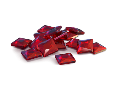
×1000
(TO) Rubies

(TO) Bronze medal Tanki Classic
(TC) Nickname reservation
Nostalgia
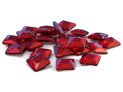
×3000
(TO) Rubies

(TO) SILVER medal Tanki Classic
(TC) Nickname reservation
(TC) VETERAN PAINT
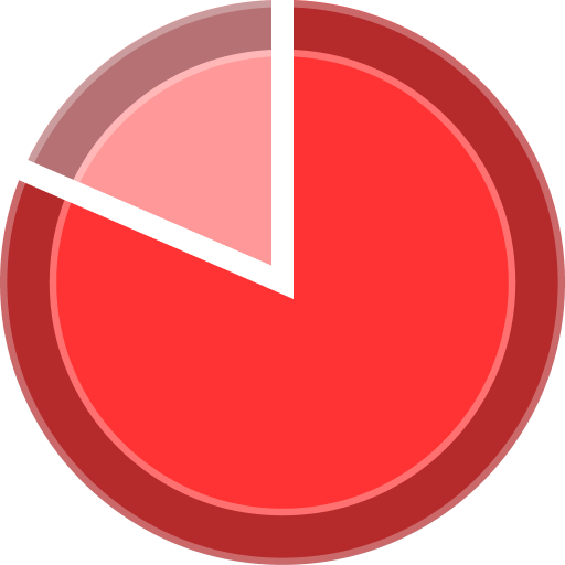
(TC) EARLY ACCESS

(TC) Voting option
Old School
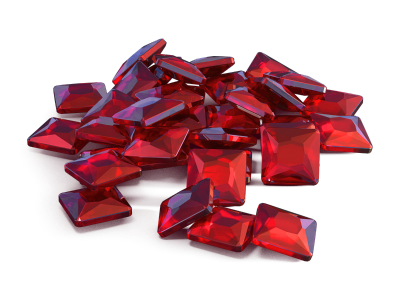
×10000
(TO) Rubies

(TO) Gold medal Tanki Classic
(TC) Nickname reservation
(TC) VETERAN PAINT
(TC) EARLY ACCESS
(TC) Voting option
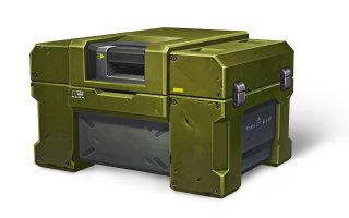
×200
(TC) CONTAINERS
What is there in the game?
This is a test version of the game. It is possible to encounter bugs, issues, unfinished features, and anomalies.
During the test, we will restart the game several times and even temporarily pause the testing process.
We will also wipe the test server database several times, which will reset all your progress.
For testing Tanki Classic, we use new server infrastructure. This may cause unstable server performance during the first weeks of testing. We will be configuring and fixing everything.
Is this early access already?
No. Early access will be announced separately, 2 weeks before the game is released. You will be able to get access to the game earlier than anybody else and progress your account earlier than others.
What is the “Development Plans” section on the Tanki Classic website?
Alongside the launch of Tanki Classic testing, we are adding a special “Development Plans” section to the project’s website. From now on, this section will be the primary, first-source of information on the development of the Tanki Classic project.
There, we will announce the key development areas of the project earlier than anywhere else.
Please note: the presented plans reflect our current goals and may be adjusted based on your feedback and voting results.
In the future, we will launch the promised polls for the game mechanics. You, the players, will define the future of “Tanki Classic!”
Feedback can be left on the forum topic of this news.

Recommended Posts
Please sign in to comment
You will be able to leave a comment after signing in
Sign In Now